Introduction
This document describes how to produce a set of graphics and perform the associated statistical tests that describe trends in daily streamflow at a single streamgage. The trends depicted cover the full range of quantiles of the streamflow distribution, from the lowest discharge of the year, through the median discharge, up through the highest discharge of the year. The method is built around the R package EGRET Exploration and Graphics for RivEr Trends. It makes it possible to consider trends over any portion of the time period for which there are daily streamflow records, and any period of analysis (the portion of the year to be considered, e.g. the entire year or just the summer months).
Getting Started
First, the EGRET package needs to be installed and loaded. Then, you’ll need need to create an eList object, which contains site information and daily discharge data for streamgage. Page 13 of the EGRET user guide here.
For this post, we will use the Choptank River in Maryland as our first example. There is an example data set included in EGRET. The data set consists of site information, daily discharge data, and water quality data, but this application does not use the water quality data. Refer to the section near the end of this document called Downloading the data for your site of interest to see how you can set up an eList object for any USGS streamgage.
There are two limitations that users should know about this application before proceeding any further.
The code was designed for discharge records that are complete (no gaps). This is usually not a problem with USGS discharge records unless there is a major gap (typically years in length) when the streamgage was not operating. If records have a number of small gaps, users could use some established method for filling in missing data to create a gap-free record.
The discharge on every day should be a positive value (not zero or negative). The
EGRETcode that is used here to read in new data has a “work around” for situations where there are a very small number of non-positive discharge values. It adds a small constant to all the discharge data so they will all be positive. This should have almost no impact on the results provided the number of non-positive days is very small, say less than 0.1% of all the days. That translates to about 11 days out of 30 years. For data sets with more zero or negative flow days different code would need to be written (we would appreciate it if an user could work on developing such a set of code).
To start, the following R commands are needed.
library(EGRET)
eList <- Choptank_eList
Just to get some sense about the data we will look a portion of the metadata (gage ID number, name, and drainage area in square kilometers) and also see a summary of the discharge data (discharge in in cubic meters per second).
print(eList$INFO$site.no)
## [1] "01491000"
print(eList$INFO$shortName)
## [1] "Choptank River"
print(eList$INFO$drainSqKm)
## [1] 292.6687
print(summary(eList$Daily$Date))
##         Min.      1st Qu.       Median         Mean      3rd Qu.
## "1979-10-01" "1987-09-30" "1995-09-30" "1995-09-30" "2003-09-30"
##         Max.
## "2011-09-30"
print(summary(eList$Daily$Q))
##      Min.   1st Qu.    Median      Mean   3rd Qu.      Max.
##   0.00991   0.93446   2.40693   4.08658   4.61565 246.35656
Loading the necessary packages and other R code
To run the analysis and produce the graphs you will need a few R functions in addition to the EGRET package. You can copy the entire block of code shown below here and paste it into your workspace (all as a single copy and paste) or you can create an .R file from the code that you will source each time you want to use it. Let’s say you call it flowTrends.R, then each time you want to use it you need to “source” the object flowTrends.R.
In addition to EGRET the functions use the packages rkt, zyp, lubridate, and Kendall. Make sure you have installed all of them.
Show/Hide Code
library(rkt)
library(zyp)
library(lubridate)

#########################################################################################
########## this is the function you will use to make a single trend graph  ##############
#########################################################################################

plotFlowTrend <- function (eList, istat, startDate = NA, endDate = NA,
                           paStart = 4, paLong = 12, window = 30, qMax = NA,
                           printTitle = TRUE, tinyPlot = FALSE,
                           customPar = FALSE, runoff = FALSE,
                           qUnit = 2, printStaName = TRUE, printPA = TRUE,
                           printIstat = TRUE, cex = 0.8, cex.axis = 1.1,
                           cex.main = 1.1, lwd = 2, col = "black", ...){
  localDaily <- getDaily(eList)
  localINFO <- getInfo(eList)
  localINFO$paStart <- paStart
  localINFO$paLong <- paLong
  localINFO$window <- window
  start <- as.Date(startDate)
  end <- as.Date(endDate)

  if(is.na(startDate)){
    start <- as.Date(localDaily$Date[1])
  }

  if(is.na(endDate)){
    end <- as.Date(localDaily$Date[length(localDaily$Date)])
  }

  localDaily <- subset(localDaily, Date >= start & Date <= end)
  eList <- as.egret(localINFO,localDaily)
  localAnnualSeries <- makeAnnualSeries(eList)
  qActual <- localAnnualSeries[2, istat, ]
  qSmooth <- localAnnualSeries[3, istat, ]
  years <- localAnnualSeries[1, istat, ]
  Q <- qActual
  time <- years
  LogQ <- log(Q)
  mktFrame <- data.frame(time,LogQ)
  mktFrame <- na.omit(mktFrame)
  mktOut <- rkt::rkt(mktFrame$time,mktFrame$LogQ)
  zypOut <- zyp::zyp.zhang(mktFrame$LogQ,mktFrame$time)
  slope <- mktOut$B
  slopePct <- 100 * (exp(slope)) - 100
  slopePct <- format(slopePct,digits=2)
  pValue <- zypOut[6]
  pValue <- format(pValue,digits = 3)

  if (is.numeric(qUnit)) {
    qUnit <- qConst[shortCode = qUnit][[1]]
  } else if (is.character(qUnit)) {
    qUnit <- qConst[qUnit][[1]]
  }

  qFactor <- qUnit@qUnitFactor
  yLab <- qUnit@qUnitTiny

  if (runoff) {
    qActual <- qActual * 86.4/localINFO$drainSqKm
    qSmooth <- qSmooth * 86.4/localINFO$drainSqKm
    yLab <- "Runoff in mm/day"
  } else {
    qActual <- qActual * qFactor
    qSmooth <- qSmooth * qFactor
  }

  localSeries <- data.frame(years, qActual, qSmooth)


  yInfo <- generalAxis(x = qActual, maxVal = qMax, minVal = 0,
                       tinyPlot = tinyPlot)
  xInfo <- generalAxis(x = localSeries$years, maxVal = decimal_date(end),
                       minVal = decimal_date(start), padPercent = 0, tinyPlot = tinyPlot)

  line1 <- localINFO$shortName
  nameIstat <- c("minimum day", "7-day minimum", "30-day minimum",
                 "median daily", "mean daily", "30-day maximum", "7-day maximum",
                 "maximum day")

  line2 <-  paste0("\n", setSeasonLabelByUser(paStartInput = paStart,
                                              paLongInput = paLong), "  ", nameIstat[istat])

  line3 <- paste0("\nSlope estimate is ",slopePct,"% per year, Mann-Kendall p-value is ",pValue)

  if(tinyPlot){
    title <- paste(nameIstat[istat])
  } else {
    title <- paste(line1, line2, line3)
  }

  if (!printTitle){
    title <- ""
  }

  genericEGRETDotPlot(x = localSeries$years, y = localSeries$qActual,
                      xlim = c(xInfo$bottom, xInfo$top), ylim = c(yInfo$bottom,
                                                                  yInfo$top), xlab = "", ylab = yLab, customPar = customPar,
                      xTicks = xInfo$ticks, yTicks = yInfo$ticks, cex = cex,
                      plotTitle = title, cex.axis = cex.axis, cex.main = cex.main,
                      tinyPlot = tinyPlot, lwd = lwd, col = col, ...)
  lines(localSeries$years, localSeries$qSmooth, lwd = lwd,
        col = col)
}

#########################################################################################
###### this the the function you will use to make the Quantile Kendall Plot #############
#########################################################################################

plotQuantileKendall <- function(eList, startDate = NA, endDate = NA,
                      paStart = 4, paLong = 12,
                      legendLocation = "topleft", legendSize = 1.0,
                      yMax = NA, yMin = NA) {
  localDaily <- eList$Daily
  localINFO <- eList$INFO
  localINFO$paStart <- paStart
  localINFO$paLong <- paLong
  start <- as.Date(startDate)
  end <- as.Date(endDate)

  if(is.na(startDate)){
    start <- as.Date(localDaily$Date[1])
  }

  if(is.na(endDate)){
    end <- as.Date(localDaily$Date[length(localDaily$Date)])
  }

  localDaily <- subset(localDaily, Date >= start & Date <= end)
  eList <- as.egret(localINFO,localDaily)
  eList <- setPA(eList, paStart=paStart, paLong=paLong)

  v <- makeSortQ(eList)
  sortQ <- v[[1]]
  time <- v[[2]]
  results <- trendSortQ(sortQ, time)
  pvals <- c(0.001,0.01,0.05,0.1,0.25,0.5,0.75,0.9,0.95,0.99,0.999)
  zvals <- qnorm(pvals)
  name <- eList$INFO$shortName
#  ymax <- trunc(max(results$slopePct)*10)
#  ymax <- max(ymax + 2, 5)
#  ymin <- floor(min(results$slopePct)*10)
#  ymin <- min(ymin - 2, -5)
#  yrange <- c(ymin/10, ymax/10)
#  yticks <- axisTicks(yrange, log = FALSE)
  ymax <- max(results$slopePct + 0.5, yMax, na.rm = TRUE)
  ymin <- min(results$slopePct - 0.5, yMin, na.rm = TRUE)
  yrange <- c(ymin, ymax)
  yticks <- axisTicks(yrange, log = FALSE, nint =7)
  p <- results$pValueAdj
  color <- ifelse(p <= 0.1,"black","snow3")
  color <- ifelse(p < 0.05, "red", color)
  pvals <- c(0.001,0.01,0.05,0.1,0.25,0.5,0.75,0.9,0.95,0.99,0.999)
  zvals <- qnorm(pvals)
  name <- paste0("\n", eList$INFO$shortName,"\n",
                 start," through ", end, "\n",
                 setSeasonLabelByUser(paStartInput = paStart, paLongInput = paLong))
  plot(results$z,results$slopePct,col = color, pch = 20, cex = 1.0,
       xlab = "Daily non-exceedance probability",
       ylab = "Trend slope in percent per year",
       xlim = c(-3.2, 3.2), ylim = yrange, yaxs = "i",
       las = 1, tck = 0.02, cex.lab = 1.2, cex.axis = 1.2,
       axes = FALSE, frame.plot=TRUE)
  mtext(name, side =3, line = 0.2, cex = 1.2)
  axis(1,at=zvals,labels=pvals, las = 1, tck = 0.02)
  axis(2,at=yticks,labels = TRUE, las = 1, tck = 0.02)
  axis(3,at=zvals,labels=FALSE, las = 1, tck=0.02)
  axis(4,at=yticks,labels = FALSE, tick = TRUE, tck = 0.02)
  abline(h=0,col="blue")
  legend(legendLocation,c("> 0.1","0.05 - 0.1","< 0.05"),col = c("snow3",                                            "black","red"),pch = 20, title = "p-value",
         pt.cex=1.0, cex = legendSize * 1.5)
}

#########################################################################################
############  This next function combines four individual trend graphs (for mimimum day,
########### median day, mean day, and maximum day) along with the quantile kendall graph
#########################################################################################

plotFiveTrendGraphs <- function(eList, startDate = NA, endDate = NA,
                                paStart = 4, paLong = 12, qUnit = 2, window = 30,
                                legendLocation = "topleft", legendSize = 1.0) {
  localDaily <- eList$Daily
  localINFO <- eList$INFO
  localINFO$paStart <- paStart
  localINFO$paLong <- paLong
  localINFO$window <- window

  start <- as.Date(startDate)
  end <- as.Date(endDate)

  if(is.na(startDate)){
    start <- as.Date(localDaily$Date[1])
  }

  if(is.na(endDate)){
    end <- as.Date(localDaily$Date[length(localDaily$Date)])
  }

  localDaily <- subset(localDaily, Date >= start & Date <= end)

  eList <- as.egret(localINFO,localDaily)
  eList <- setPA(eList, paStart=paStart, paLong=paLong, window=window)
  # this next line of code is inserted so that when paLong = 12, we always use the
  # climate year when looking at the trends in the annual minimum flow
  paStart1 <- if(paLong == 12)  4 else paStart
  plotFlowTrend(eList, istat = 1, qUnit = qUnit, paStart = paStart1, paLong = paLong, window = window)
  plotFlowTrend(eList, istat = 4, qUnit = qUnit, paStart = paStart, paLong = paLong, window = window)
  plotFlowTrend(eList, istat = 8, qUnit = qUnit, paStart = paStart, paLong = paLong, window = window)
  plotFlowTrend(eList, istat = 5, qUnit = qUnit, paStart = paStart, paLong = paLong, window = window)
  # now the quantile kendall
  plotQuantileKendall(eList, startDate = startDate, endDate = endDate, paStart = paStart,
                      paLong = paLong, legendLocation = legendLocation, legendSize = legendSize)

}

#########################################################################################
########### makeSortQ creates a matrix called Qsort.
############It sorted from smallest to largest over dimDays
############(if working with full year dimDays=365),
#############and also creates other vectors that contain information about this array.
#########################################################################################

makeSortQ <- function(eList){
  localINFO <- getInfo(eList)
  localDaily <- getDaily(eList)
  paStart <- localINFO$paStart
  paLong <- localINFO$paLong
  # determine the maximum number of days to put in the array
  numDays <- length(localDaily$DecYear)
  monthSeqFirst <- localDaily$MonthSeq[1]
  monthSeqLast <- localDaily$MonthSeq[numDays]
  # creating a data frame (called startEndSeq) of the MonthSeq values that go into each year
  Starts <- seq(paStart, monthSeqLast, 12)
  Ends <- Starts + paLong - 1
  startEndSeq <- data.frame(Starts, Ends)
  # trim this list of Starts and Ends to fit the period of record
  startEndSeq <- subset(startEndSeq, Ends >= monthSeqFirst & Starts <= monthSeqLast)
  numYearsRaw <- length(startEndSeq$Ends)
  # set up some vectors to keep track of years
  good <- rep(0, numYearsRaw)
  numDays <- rep(0, numYearsRaw)
  midDecYear <- rep(0, numYearsRaw)
  Qraw <- matrix(nrow = 366, ncol = numYearsRaw)
  for(i in 1: numYearsRaw) {
    startSeq <- startEndSeq$Starts[i]
    endSeq <- startEndSeq$Ends[i]
    startJulian <- getFirstJulian(startSeq)
    # startJulian is the first julian day of the first month in the year being processed
    # endJulian is the first julian day of the month right after the last month in the year being processed
    endJulian <- getFirstJulian(endSeq + 1)
    fullDuration <- endJulian - startJulian
    yearDaily <- localDaily[localDaily$MonthSeq >= startSeq & (localDaily$MonthSeq <= endSeq), ]
    nDays <- length(yearDaily$Q)
    if(nDays == fullDuration) {
      good[i] <- 1
      numDays[i] <- nDays
      midDecYear[i] <- (yearDaily$DecYear[1] + yearDaily$DecYear[nDays]) / 2
      Qraw[1:nDays,i] <- yearDaily$Q
    }   else {
      numDays[i] <- NA
      midDecYear[i] <- NA
    }
  }
  # now we compress the matrix down to equal number of values in each column
  j <- 0
  numGoodYears <- sum(good)
  dayCounts <- ifelse(good==1, numDays, NA)
  lowDays <- min(dayCounts, na.rm = TRUE)
  highDays <- max(dayCounts, na.rm = TRUE)
  dimYears <- numGoodYears
  dimDays <- lowDays
  sortQ <- matrix(nrow = dimDays, ncol = dimYears)
  time <- rep(0,dimYears)
  for (i in 1:numYearsRaw){
    if(good[i]==1) {
      j <- j + 1
      numD <- numDays[i]
      x <- sort(Qraw[1:numD, i])
      # separate odd numbers from even numbers of days
      if(numD == lowDays) {
        sortQ[1:dimDays,j] <- x
      } else {
        sortQ[1:dimDays,j] <- if(odd(numD)) leapOdd(x) else leapEven(x)
      }
      time[j] <- midDecYear[i]
    }
  }

  sortQList = list(sortQ,time)

  return(sortQList)
}
#########################################################################################
########## Another function trendSortQ needed for Quantile Kendall
#########################################################################################

trendSortQ <- function(Qsort, time){
  # note requires packages zyp and rkt
  nFreq <- dim(Qsort)[1]
  nYears <- length(time)
  results <- as.data.frame(matrix(ncol=9,nrow=nFreq))
  colnames(results) <- c("slopeLog","slopePct","pValue","pValueAdj","tau","rho1","rho2","freq","z")
  for(iRank in 1:nFreq){
    mkOut <- rkt::rkt(time,log(Qsort[iRank,]))
    results$slopeLog[iRank] <- mkOut$B
    results$slopePct[iRank] <- 100 * (exp(mkOut$B) - 1)
    results$pValue[iRank] <- mkOut$sl
    outZYP <- zyp.zhang(log(Qsort[iRank,]),time)
    results$pValueAdj[iRank] <- outZYP[6]
    results$tau[iRank] <- mkOut$tau
    # I don't actually use this information in the current outputs, but the code is there
    # if one wanted to look at the serial correlation structure of the flow series
    serial <- acf(log(Qsort[iRank,]), lag.max = 2, plot = FALSE)
    results$rho1[iRank] <- serial$acf[2]
    results$rho2[iRank] <- serial$acf[3]
    frequency <- iRank / (nFreq + 1)
    results$freq[iRank] <- frequency
    results$z[iRank] <- qnorm(frequency)
  }
  return(results)
}
#########################################################################################
################################## getFirstJulian finds the julian date of first day
################################## of a given month
#########################################################################################

getFirstJulian <- function(monthSeq){
  year <- 1850 + trunc((monthSeq - 1) / 12)
  month <- monthSeq - 12 * (trunc((monthSeq-1)/12))
  charMonth <- ifelse(month<10, paste0("0",as.character(month)), as.character(month))
  theDate <- paste0(year,"-",charMonth,"-01")
  Julian1 <- as.numeric(julian(as.Date(theDate),origin=as.Date("1850-01-01")))
  return(Julian1)
}

#########################################################################################
########### leapOdd  is a function for deleting one value
############when the period that contains Februaries has a length that is an odd number
#########################################################################################

leapOdd <- function(x){
  n <- length(x)
  m <- n - 1
  mid <- (n + 1) / 2
  mid1 <- mid + 1
  midMinus <- mid - 1
  y <- rep(NA, m)
  y[1:midMinus] <- x[1:midMinus]
  y[mid:m] <- x[mid1:n]
  return(y)}

#########################################################################################
########### leapEven  is a function for deleting one value
############when the period that contains Februaries has a length that is an even number
#########################################################################################

leapEven <- function(x){
  n <- length(x)
  m <- n - 1
  mid <- n / 2
  y <- rep(NA, m)
  mid1 <- mid + 1
  mid2 <- mid + 2
  midMinus <- mid - 1
  y[1:midMinus] <- x[1:midMinus]
  y[mid] <- (x[mid] + x[mid1]) / 2
  y[mid1:m] <- x[mid2 : n]
  return(y)
}

#########################################################################################
####### determines if the length of a vector is an odd number ###########################
#########################################################################################

odd <- function(x) {(!(x %% 2) == 0)}

#########################################################################################
########### calcWY calculates the water year and inserts it into a data frame
#########################################################################################


calcWY <- function (df) {
  df$WaterYear <- as.integer(df$DecYear)
  df$WaterYear[df$Month >= 10] <- df$WaterYear[df$Month >=
                                                 10] + 1
  return(df)
}
#########################################################################################
##### calcCY calculates the climate year and inserts it into a data frame
#########################################################################################

calcCY <- function (df){
  df$ClimateYear <- as.integer(df$DecYear)
  df$ClimateYear[df$Month >= 4] <- df$ClimateYear[df$Month >=
                                                    4] + 1
  return(df)
}
#########################################################################################
######## smoother is a function does the trend in real discharge units and not logs.
######## It is placed here so that users wanting to run this alternative have it available
######## but it is not actually called by any function in this document
#########################################################################################

smoother <- function(xy, window){
  edgeAdjust <- TRUE
  x <- xy$x
  y <- xy$y
  n <- length(y)
  z <- rep(0,n)
  x1 <- x[1]
  xn <- x[n]
  for (i in 1:n) {
    xi <- x[i]
    distToEdge <- min((xi - x1), (xn - xi))
    close <- (distToEdge < window)
    thisWindow <- if (edgeAdjust & close)
      (2 * window) - distToEdge
    else window
    w <- triCube(x - xi, thisWindow)
    mod <- lm(xy$y ~ x, weights = w)
    new <- data.frame(x = x[i])
    z[i] <- predict(mod, new)
  }
  return(z)
}
Making a graph of the trend in a single flow statistic
Now all we need to do is to run the plotFlowTrend function that was the first part of the code we just read in. First we will run it in its simplest form, we will use the entire discharge record and our period of analysis will be the full climatic year. A climatic year is the year that starts on April 1 and ends on March 31. It is our default approach because it tends to avoid breaking a long-low flow period into two segments, one in each of two adjacent years. We will first run it for the annual minimum daily discharge.
To use it you will need to know about the index of flow statistics used in EGRET. They are called istat and the statistics represented by istat are: (1) 1-day minimum, (2) 7-day minimum, (3) 30-day minimum, (4) median (5) mean, (6) 30-day maximum, (7) 7-day maximum, and (8) 1-day maximum. So to run the annual minimum daily discharge statistic we would set istat = 1. To run the plotFlowTrend function it in its simplest form the only arguments we need are the eList (which contains the metadata and the discharge data), and istat.
plotFlowTrend(eList, istat = 1)
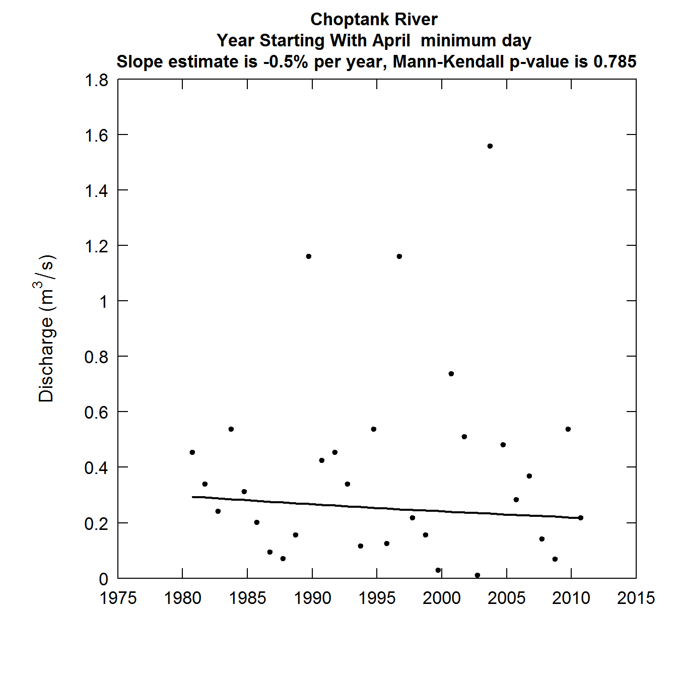
Explanation of the FlowTrend Plot, annual minimum day
The dots indicate the discharge on the minimum day of each climate year in the period of record. The solid curve is a smoothed representation of those data. It is specifically the smoother that is defined in the EGRET user guide (pages 16-18) with a 30-year window. For record as short as this one (only 32 years) it will typically look like a straight line or a very smooth curve. For longer records it can display some substantial changes in slope and even be non-monotonic. At the top of the graph we see two pieces of information. A trend slope expressed in percent per year and a p-value for the Mann-Kendall trend test of the data. The slope is computed using the Thiel-Sen slope estimator. It is discussed on pages 266-274 of Helsel and Hirsch, 2002, which can be found here although it is called the “Kendall-Theil Robust Line” in that text. It is calculated on the logarithms of the discharge data and then transformed to express the trend in percent per year. The p-value for the Mann-Kendall test is computed using the adjustment for serial correlation introduced in the zyp R package (David Bronaugh and Arelia Werner for the Pacific Climate Impacts Consortium (2013). zyp: Zhang + Yue-Pilon trends package. R package version 0.10-1. https://CRAN.R-project.org/package=zyp).
A few more FlowTrend Plots
We can do some other similar plots. In this case we will do the annual median day istat = 4, the annual maximum day istat = 8, and the annual mean day istat = 5.
The annual median day
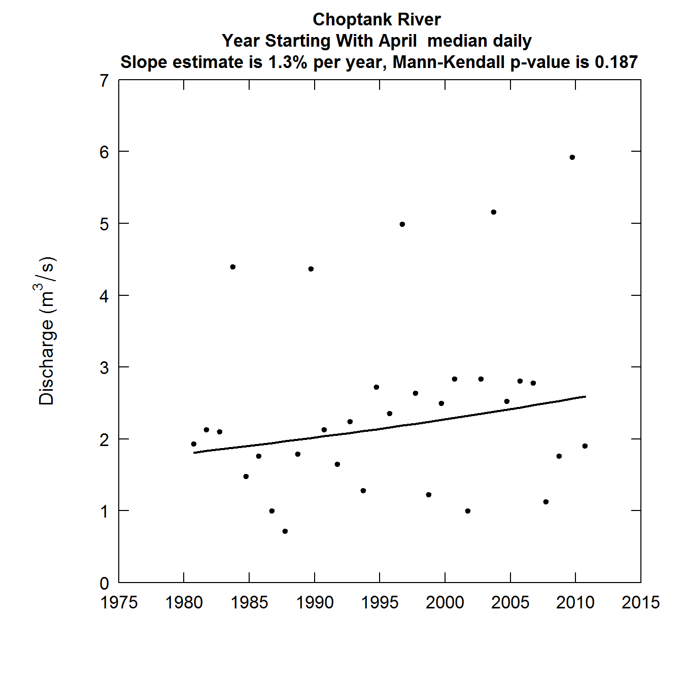
The median day is computed for each year in the record.It is the middle day, that is 182 values had discharges lower than it and 182 values had discharges greater than it (for a leap year it is the average of the 183rd and 184th ranked values). Everything else about it is the same as the first plot. Here is the annual median day discharge record.
plotFlowTrend(eList, istat = 4)
The annual maximum day
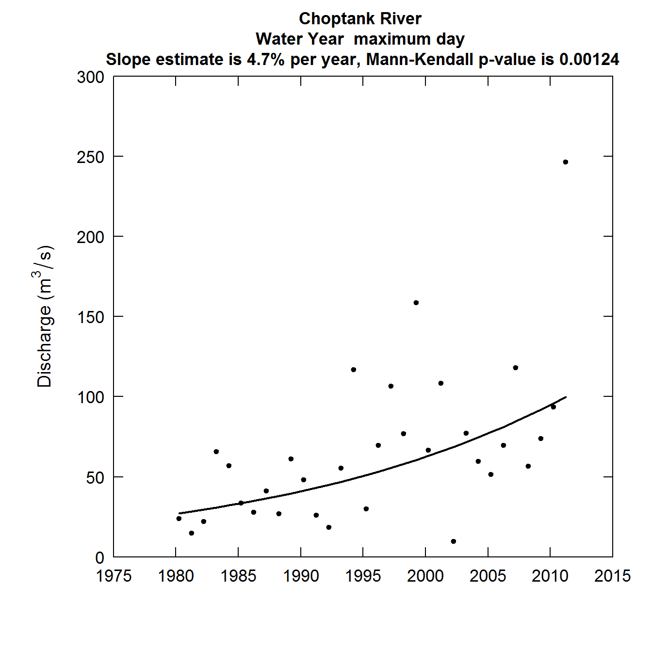
The third plot is for the maximum day of the year. Otherwise it is exactly the same in its construction as the first two plots. Note that this is the maximum daily average discharge and in general it will be smaller than the annual peak discharge, which is the maximum instantaneous discharge for the year, whereas this is the highest daily average discharge. For very large rivers the annual maximum day discharge tends to be very close to the annual peak discharge and can serve as a rough surrogate for it in a trend study. For a small stream, where discharges may rise or fall by a factor of 2 or more in the course of a day, these maximimum day values can be very different from the annual peak discharge.
At this point we will add one more concept, which is the period of analysis. In the first two plots the data were organized by climate year. But, when we look at annual maximum or annual mean discharge the standard approach is to use the water year. To do this we need to designate that we want our period of analysis to start with the month of October (month 10). To do this we need to add one more argument to our call to the function. paStart = 10. We did not need to specify the paStart in the first two plots, because the default is paStart = 4. Notice that this change in the period of analysis is noted in the text on the graphic.
plotFlowTrend(eList, istat = 8, paStart = 10)
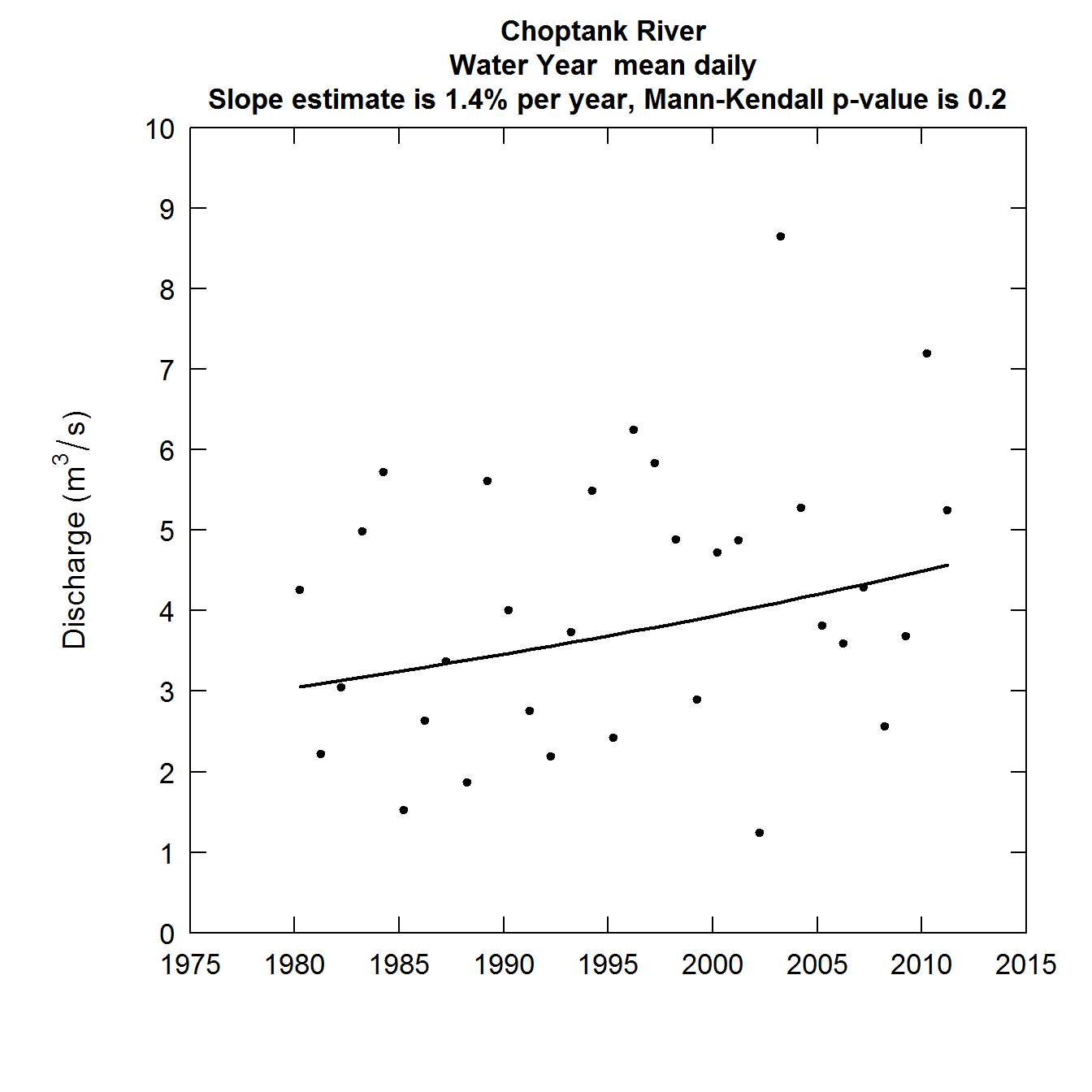
The fourth plot is the annual mean discharge. It is constructed in exactly the same manner as the previous three, but it represents the mean streamflow for all of the days in the year rather than a single order statistic such as minimum, median, or maximum. We will also use the water year for this analysis.
plotFlowTrend(eList, istat = 5, paStart = 10)
Some observations about these figures
It is interesting to note that the minimum discharge values have been trending downwards, although not a statistically significant trend. The other three discharge statistics are all trending upwards and this is most notable in terms of the annual maximum daily discharge, both in terms of slope +4.7% per year, and a p-value that is well below 0.001. This raises many questions about how the variability of discharge might be changing over time and what the drivers are of the trends that are happening in various parts of the probability distribution of discharge (which we commonly call the flow duration curve). We will turn our focus to a way of summarizing these changes after we look at a few more variations on this plotFlowTrend graphic.
Variations on the simplest example
The call to the function plotFlowTrend has many arguments (you can see them all in the code shown above) but here we will just focus on a few that may be most useful to the data analyst:
plotFlowTrend(eList, istat, startDate = NA, endDate = NA, paStart = 4, paLong = 12, window = 30, qMax = NA, qUnit = 2, runoff = FALSE)
Here is a list of the optional arguments that are available to the user.
startDate If we want to evaluate the trend for a shorter period than what is contained in the entire Daily data frame, then we can specify a different starting date. For example, if we wanted the analysis to start with Water Year 1981, then we would say: startDate = “1980-10-01”. By leaving out the startDate argment we are requesting the analysis to start where the data starts (which in this case is 1979-10-01).
endDate If we want to evalute the trend for a period that ends before the end of the data set we can specify that with endDate. So if we wanted to end with Water Year 2009 we would say: endDate = “2009-09-30”.
paStart is the starting month of the period of analysis. For example if we were interested in the trends in streamflow in a series of months starting with August, we would say paStart = 8. The default is paStart = 4, which starts in April.
paLong is the duration of the period of analysis. So, an analysis that covers all 12 months would have paLong = 12 (the default). A period that runs for the months of August - November would have paStart = 8 and paLong = 4. See pages 14 and 15 of the user guide for more detail on paStart and paLong.
window The smoothness of the curve plotted depends on the size of the window (which is measured in years). If window were much smaller (say 10) then the curve shown would be rather jagged, and as it becomes longer it causes the curve to converge to a straight line. The default value of 30 works well and is also roughly consistant with the convention used in the climate science community, when they discuss a 30-year normal period. The precise meaning of window is described in the User Guide (pages 16 - 18). It has no effect on the reported trend slope or p-value.
qMax is an argument that allows the user to set the maximum value on the vertical axis. If it is left out, the graphic scales itself. But for a set of similar graphics it may be useful to set qMax.
qUnit is an argument that allows the user to pick different discharge units. The default is qUnit = 2 which is cubic meters per second. The other most common unit to use is qUnit = 1 which is cubic feet per second.
runoff is a logical argument. The default is runoff = FALSE. In some studies it is nice to express discharge in runoff terms (discharge per unit area) amd setting runoff = TRUE can cause it to be expressed in terms of runoff.
Here is an example that shows the use of several of these arguments. Say we want to see what would happen if we only looked at annual maximum daily discharge from 1983 - 2010 (trimming off three low years at the start and one high year at the end), and used a shorter smoothing window, and expressed our results as runoff in mm/day
plotFlowTrend(eList, istat = 8, startDate = "1982-10-01", endDate = "2010-09-30", window = 15, runoff = TRUE)
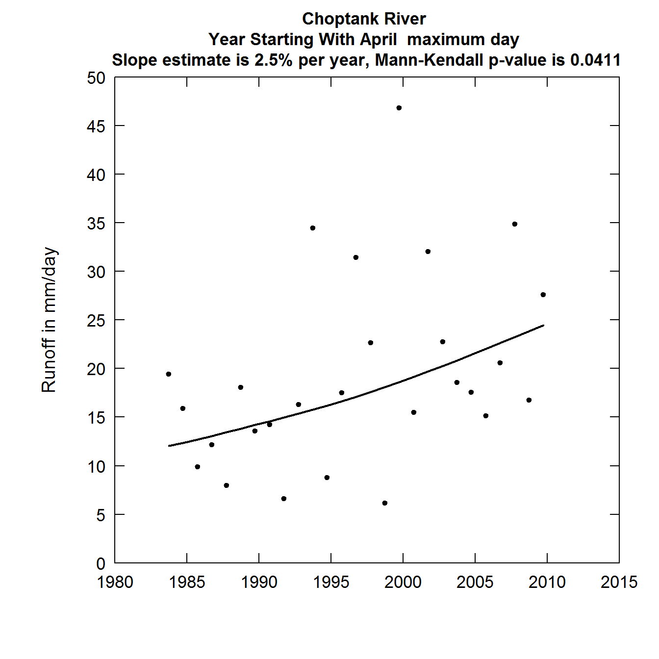
It is worth noting here that compared to the previous plot of the annual maximum daily discharges, the removal of four particular years brought about a substantial change in the slope and the significance of the trend. This is a common issue in trend analysis with relatively short records.
The Quantile-Kendall Plot
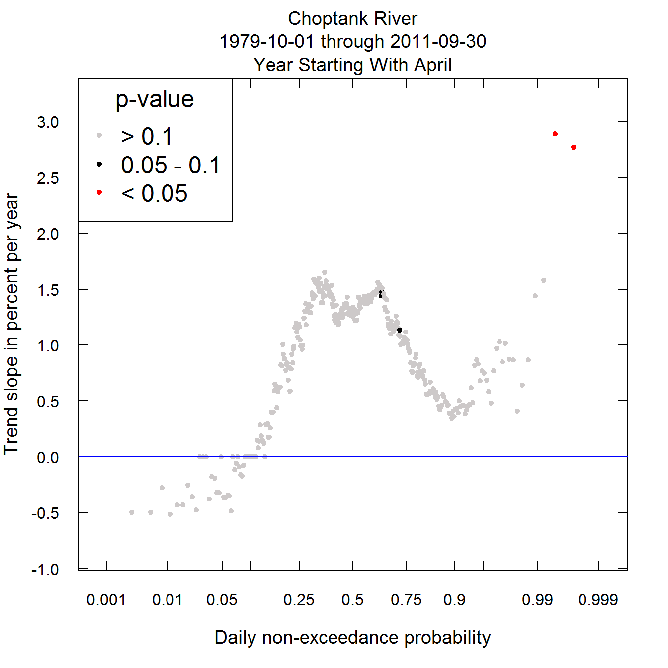
Now we will look at a new kind of plot called the Quantile-Kendall plot. Each plotted point on the plot is a trend slope (computed in the same manner as in the previous plots) for a given order statistic. The point at the far left edge is the first order statistic, which is the annual minimum daily discharge. This is the result described on the first plot. The next point to its right is the trend slope for the second order statistic (second lowest daily discharge for each year), and it continues to the far right being the trend slope for the 365th order statistic (annual maximum daily discharge). Their placement with respect to the x-axis is based on the z-statistic (standard normal deviate) associated with that order statistic. It is called the daily non-exceedance probability. It is a scale used for convenience. It in no-way assumes that the data follow any particular distribution. It is simply used to provide the greatest resolution near the tails of the daily discharge distribution. The color represents the p value for the Mann-Kendall test for trend as described above. Red indicates a trend that is significant at alpha = 0.05. Black indicates an attained significance between 0.05 and 0.1. The grey dots are trends that are not significant at the alpha level of 0.1.
Here is what it looks like for the Choptank data set. What we see is that generally across the probability distribution the changes are generally not statistically significant except for the highest and second highest days of the year. The trends are slightly negative at the low end of the distribution (the lowest 10%). Near the median they are positive and modestly large (around 1.5% per year). Then near the 90th percentile they drop to near zero slope and only above about the 99th percentile do they seem to be particularly large.
plotQuantileKendall(eList)
There is one special manipulation of the data that is needed to account for leap years (this is a detail about the computation but is not crucial to understanding the plots). The 366 daily values observed in a leap year are reduced by one so that all years have 365 values. The one value eliminated is accomplished by replacing the two middle values in the ranked list of values by a single value which is the average of the two. A similar approach is used when the period of analysis is any set of months that contains the month of February. The number of leap year values are reduced by one and the reduction takes place at the median value for the year.
Variations on the Quantile Kendall
We might be interested in particularly looking at trends in a certain season of the year. In the case of the Choptank we know that tropical storm generated floods have been particularly significant in the later part of this record and these have been mostly in August, September and October. Or, if our interest were related to the flows happening in the spring and early summer, which is the period of time during which the delivery to the Chesapeake Bay (into which the Choptank River flows) then we might want to run our analysis on the period March through June. To do that we can use paStart = 3 and paLong = 4.
plotQuantileKendall(eList, paStart = 3, paLong = 4)
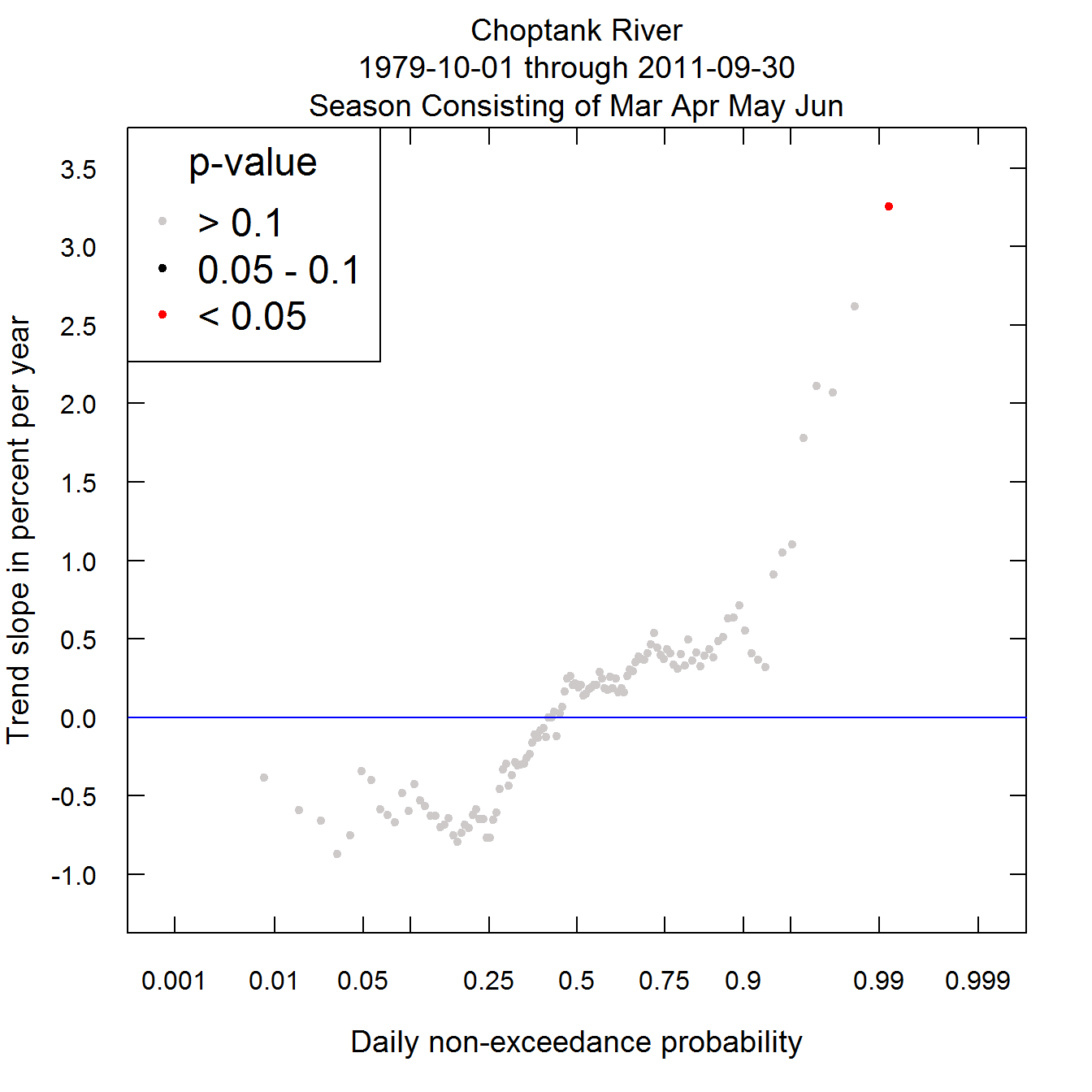
What we can see is that for this portion of the year, the discharge trends are rather minimal and certainly not statistically significant, except that the 5 or so highest flow days in the season do show rather large trends and the annual maximum trend is the largest of all (in percent per year) and is the only one that is significcant.
There are a few other arguments for the plotQuantileKendall function. As mentioned in the discussion of the plotFlowTrend function, it has the startDate and endDate arguments. If they aren’t specified then it is assumed that the analysis covers the whole period in the Daily data frame.
There are two arguments that relate to the appearance of the graph.
legendLocation this argument simply determines where in the graph the legend is placed. It sometimes happens that the legend obscures the data so we may need to move it to another part of the graph. The argument can take on names such as “bottomleft”, “topright” or “bottomright”. The default is “topleft”. If you don’t want a legend (say you are making many Quantile Kendall plots in a single job and can’t go in and adjust each one), then you can specify legendLocation = NA.
legendSize this argument determines the size of the legend. The default is legendSize = 1.0. If you want to decrease the dimensions of the legend you decrease this value. For example a 25% reduction would be achieved by setting legendSize = 0.75. Typically one wouldn’t want to go below about 0.4.
yMax and yMin are two more optional arguments to set up the limits on the y-axis. If you don’t specify them (just leave them out) then the data will dictate the minimum and maximum values on the y-axis (it will extend slightly beyond the highest and lowest values). But, if you are doing many graphs you may want them to have consistent axes, so a quick look at the graph will tell you if the trends are large or small, then you can set these two values. For example, say you want every graph to have a maximum value of 5 and a minimum value of -5, then the arguments would just be: yMax = 5, yMin = 5. There is a “fail safe” mechanism in the code if the trends are bigger than the specified values. Let’s say we set yMax = 5 but in one particular graph there is a trend slope of 7.2 % per year. In this case the y-axis would extend out slightly beyond a value of 7.2. Thus, no value is ever out of range. All of the slopes will be plotted.
Here is an example bringing all of the arguments into play. It is for a case where we want to consider the time period 1982-08-01 through 2010-11-30, for only the months of August through October, and we want the legend to go in the bottom right and be only half the size of what we saw in the first example.
plotQuantileKendall(eList, startDate = "1982-08-01", endDate = "2010-11-30",
paStart = 8, paLong = 3, legendLocation = "bottomright", legendSize = 0.5, yMax = 4, yMin = -4)
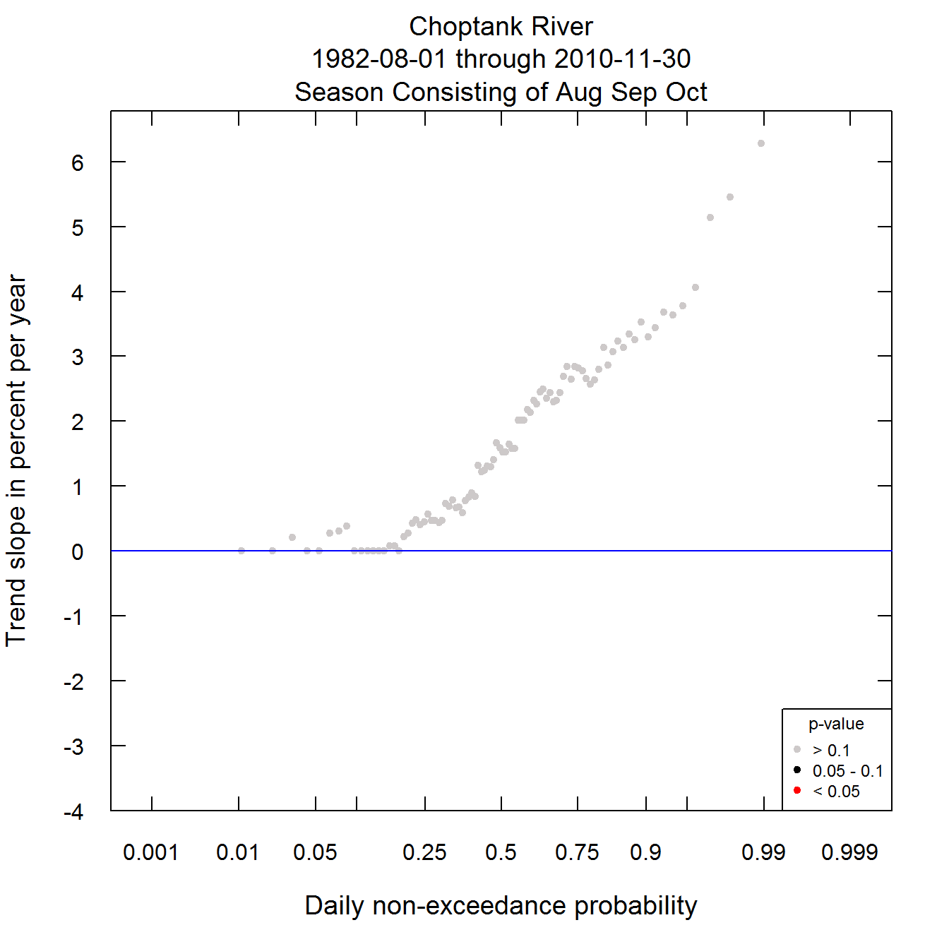
What this graph shows us is that unlike the year as a whole, this late summer to fall period has been one of very substantially increasing discharge. From about the median of the distribution to the top, the trends are greater than 3% per year and many are significant at least at the alpha level of 0.1. There is one feature of this figure that may look odd. That is the fact that at the lower end of the distribution there are many trend slopes that are exactly zero. Using the gray dot at the far left as an example, the trend slope estimation method uses all pairwise comparisons of the lowest discharge of each year. Because of the USGS reporting conventions, many of these discharge values cluster around a few specific values, so that in the comparisons, there are many ties. The slope estimate is the median of all the pairwise slopes and since a significant number of these slopes are zero, the slope estimate is zero.
Putting it all together into a set of five graphs
This post also provides an additional function that produces a total of five graphics from a single command. It does the four trend plots and then the Quantile-Kendall. It is called plotFiveTrendGraphs. The arguments are all ones that we have seen before: eList, startDate, endDate, paStart, paLong, qUnit, window, legendLocation, and legendSize. In its simplest form it would look like this (output not plotted here).
plotFiveTrendGraphs(eList)
Downloading the data for your site of interest
The steps for downloading data from USGS web services (or obtaining it from user supplied information) and also for creating and saving the eList are described on pages 4-13 of the EGRET user guide. Here is a simple example:
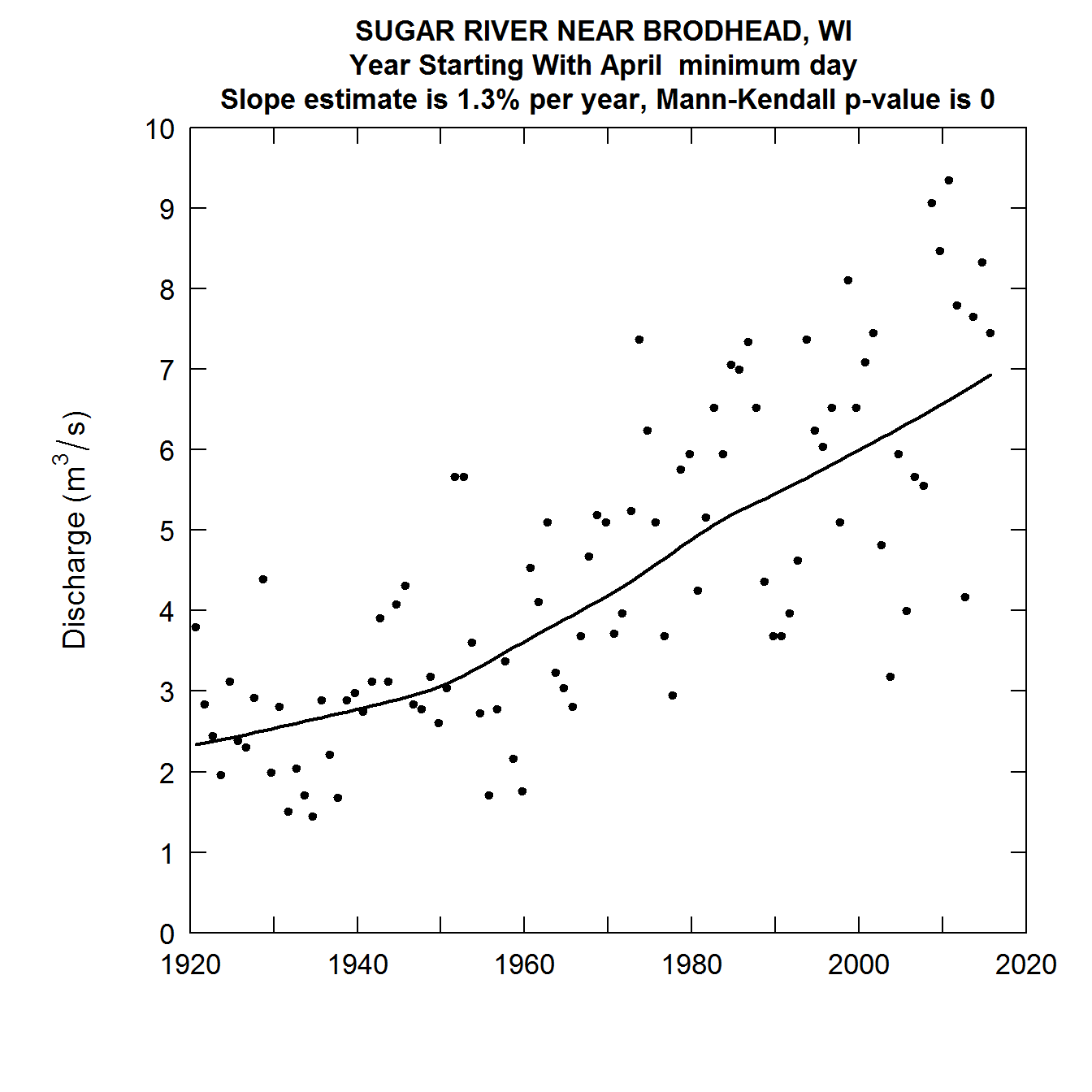
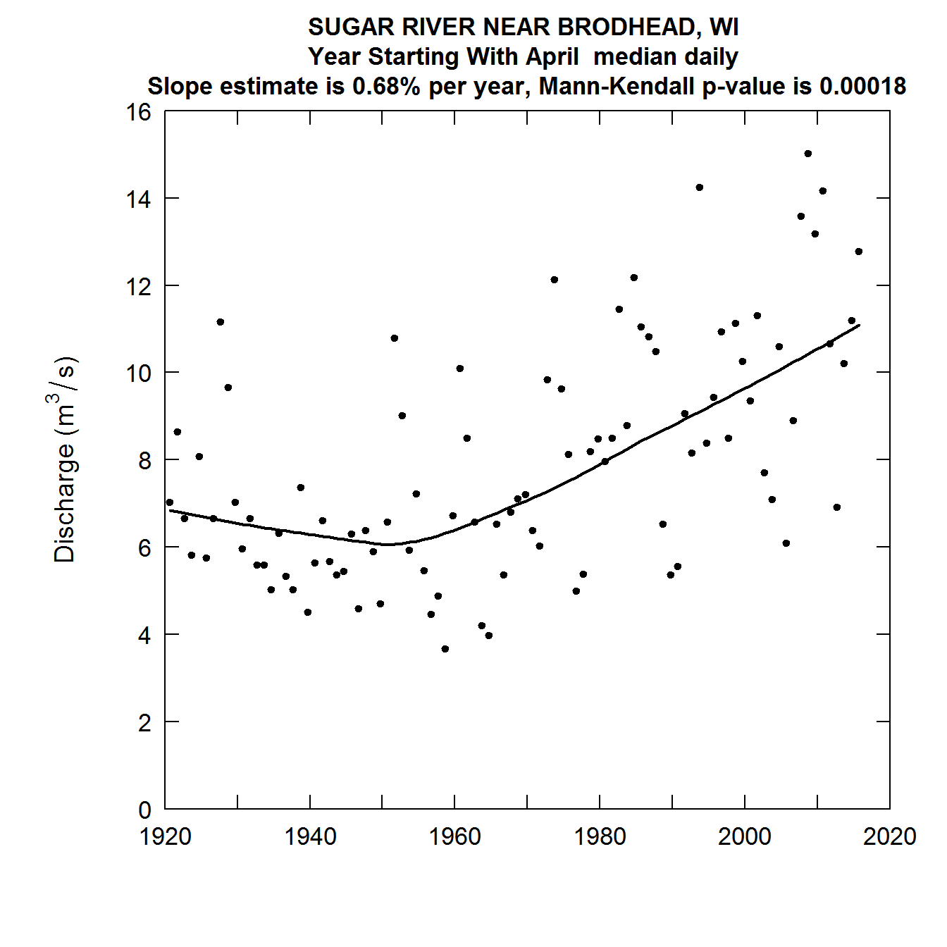
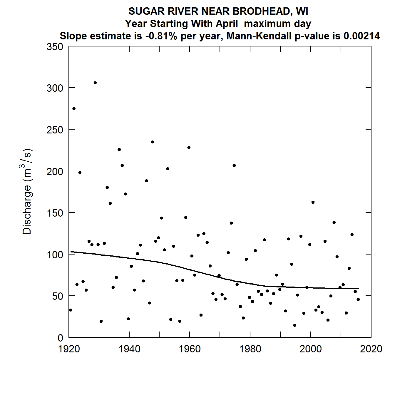
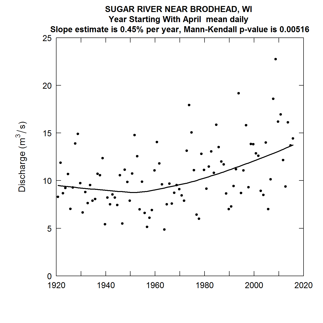
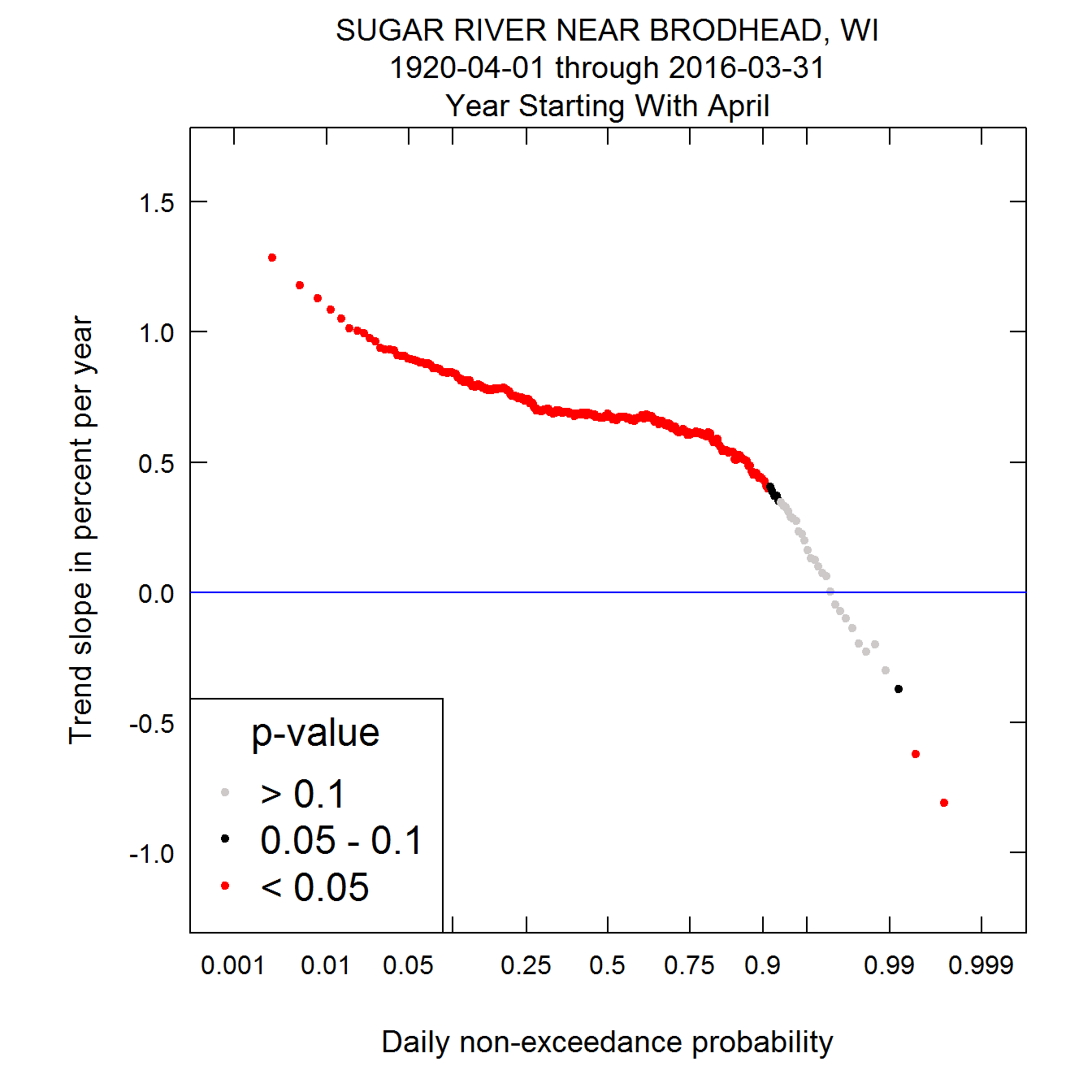
Say we want to look at USGS station number 01646500 (Sugar River near Brodhead, WI) and we want to consider data from Climate Years 1921 through 2016. Note that this much longer period of record causes the computations to take a good deal more time than the previous cases, but it should still take well under a minute to complete the whole job. The following commands would do what is needed.
library(EGRET)
sta <- "05436500"
param <- "00060" # this is the parameter code for daily discharge
startDate <- "1920-04-01"
endDate <- "2016-03-31"
INFO <- readNWISInfo(siteNumber = sta, parameterCd = param, interactive = FALSE)
Daily <- readNWISDaily(siteNumber = sta, parameterCd = param, startDate = startDate,
endDate = endDate, verbose =  FALSE)
eList <- as.egret(INFO, Daily)
plotFiveTrendGraphs(eList, legendLocation = "bottomleft")
Final thoughts
This last set of plots is particularly interesting. What we see is that for the lowest 90 percent of the distribution, discharges have been rising over most of this record, and particularly so since about 1950. But in the highest 1% of the distribution discharges have been falling thoughout the record. As a consequence the overall variablity of streamflow in this agricultural watershed has generally been declining over time. This is generally thought to be related to the increasing use of conservation practices in the watershed.
It is worth noting that we can express the percentage changes per year in other ways than as percent per year, for example percentage change per decade or percentage change over the entire period of record. Take, for example, the estimated trend slope for the median in this last example. It is 0.68% per year. If we were to express that as percentage change per decade it would be 7% per decade (the change can be computed as 1.0068^10, or 1.070, which is a 7% increase). If we expressed it for the entire 96 year record it would be about a 92% increase over that period (computed as 1.0068^96, which is 1.9167 or and increase of about 92%).
These graphical tools are one way of summarizing what we might call a signature of change for any given watershed. It shows the changes, or lack of changes, that have taken place through all parts of the probability distribution of streamflow. This has potential as a tool for evaluating hydrologic or linked climate and hydrologic models. Observing the patterns on these graphs for the actual data versus the patterns seen when simulated data are used, can provide insights on the ability of the models used to project hydrologic changes into the future.
If you have questions or comments on the concepts or the implementation please contact the author rhirsch@usgs.gov.
