
Exploring ggplot2 boxplots - Defining limits and adjusting style
Identifying boxplot limits and styles in ggplot2.
Boxplots are often used to show data distributions, and ggplot2 is often used to visualize data. A question that comes up is what exactly do the box plots represent? The ggplot2 box plots follow standard Tukey representations, and there are many references of this online and in standard statistical text books. The base R function to calculate the box plot limits is boxplot.stats. The help file for this function is very informative, but it’s often non-R users asking what exactly the plot means. Therefore, this post breaks down the calculations into (hopefully!) easy-to-follow chunks of code for you to make your own box plot legend if necessary. Some additional goals here are to create boxplots that come close to USGS style. Features in this post take advantage of enhancements to ggplot2 in version 3.0.0 or later.
First, let’s get some data that might be typically plotted in a USGS report using a boxplot. Here we’ll use chloride data (parameter code “00940”) measured at a USGS station on the Fox River in Green Bay, WI (station ID “04085139”). We’ll use the package dataRetrieval to get the data (see this tutorial
for more information on dataRetrieval), and plot a simple boxplot by month using ggplot2:
library(dataRetrieval)
library(ggplot2)

# Get chloride data using dataRetrieval:
chloride <- readNWISqw("04085139", "00940")
# Add a month column:
chloride$month <- month.abb[as.numeric(format(chloride$sample_dt, "%m"))]
chloride$month <- factor(chloride$month, levels = month.abb)
# Pull out the official parameter and site names for labels:
cl_name <- attr(chloride, "variableInfo")[["parameter_nm"]]
cl_site <- attr(chloride, "siteInfo")[["station_nm"]]
# Create basic ggplot graph:
ggplot(data = chloride,
       aes(x = month, y = result_va)) +
  geom_boxplot() +
  xlab("Month") +
  ylab(cl_name) +
  labs(title = cl_site)

ggplot2 defaults for boxplots.
Is that graph great? YES! And for presentations and/or journal publications, that graph might be appropriate. However, for an official USGS report, USGS employees need to get the graphics approved to assure they follow specific style guidelines. The approving officer would probably come back from the review with the following comments:
| Reviewer's Comments | ggplot2 element to modify |
|---|---|
| Remove background color, grid lines | Adjust theme |
| Add horizontal bars to the upper and lower whiskers | Add stat_boxplot |
| Have tick marks go inside the plot | Adjust theme |
| Tick marks should be on both sides of the y axis | Add sec.axis to scale_y_continuous |
| Remove tick marks from discrete data | Adjust theme |
| y-axis needs to start exactly at 0 | Add expand_limits |
| y-axis labels need to be shown at 0 and at the upper scale | Add breaks and limits to scale_y_continuous |
| Add very specific legend | Create function ggplot_box_legend |
| Add the number of observations above each boxplot | Add custom stat_summary |
| Change text size | Adjust geom_text defaults |
| Change font (we'll use "serif" in this post, although that is not the official USGS font) | Adjust geom_text defaults |
As you can see, it will not be as simple as creating a single custom ggplot theme to comply with the requirements. However, we can string together ggplot commands in a list for easy re-use. This post is not going to get you perfect compliance with the USGS standards, but it will get much closer. Also, while these style adjustments are tailored to USGS requirements, the process described here may be useful for other graphic guidelines as well.
So, let’s skip to the exciting conclusion and use some code that will be described later (boxplot_framework and ggplot_box_legend) to create the same plot, now closer to those USGS style requirements:
library(cowplot)

# NOTE! This is a preview of the FUTURE!
# We'll create the functions ggplot_box_legend and boxplot_framework
# later in this post.
# So....by the end of this post, you will be able to:
legend_plot <- ggplot_box_legend()

chloride_plot <- ggplot(data = chloride,
       aes(x = month, y = result_va)) +
  boxplot_framework(upper_limit = 70) +
  xlab(label = "Month") +
  ylab(label = cl_name) +
  labs(title = cl_site)

plot_grid(chloride_plot,
          legend_plot,
          nrow = 1, rel_widths = c(.6,.4))
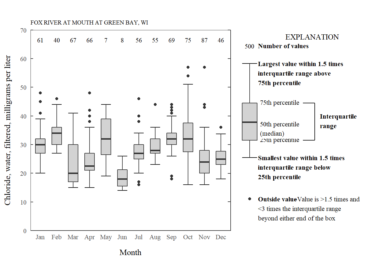
Chloride by month styled.
As can be seen in the code chunk, we are now using a function ggplot_box_legend to make a legend, boxplot_framework to accommodate all of the style requirements, and the cowplot package to plot them together.
boxplot_framework: Styling the boxplot
Let’s get our style requirements figured out. First, we can set some basic plot elements for a theme. We can start with the theme_bw and add to that. Here we remove the grid, set the size of the title, bring the y-ticks inside the plotting area, and remove the x-ticks:
theme_USGS_box <- function(base_family = "serif", ...){
  theme_bw(base_family = base_family, ...) +
  theme(
    panel.grid = element_blank(),
    plot.title = element_text(size = 8),
    axis.ticks.length = unit(-0.05, "in"),
    axis.text.y = element_text(margin=unit(c(0.3,0.3,0.3,0.3), "cm")),
    axis.text.x = element_text(margin=unit(c(0.3,0.3,0.3,0.3), "cm")),
    axis.ticks.x = element_blank(),
    aspect.ratio = 1,
    legend.background = element_rect(color = "black", fill = "white")
  )
}
Next, we can change the defaults of the geom_text to a smaller size and font.
update_geom_defaults("text",
                   list(size = 3,
                        family = "serif"))
We also need to figure out what other ggplot2 functions need to be added. The basic ggplot code for the chloride plot would be:
n_fun <- function(x){
  return(data.frame(y = 0.95*70,
                    label = length(x)))
}

ggplot(data = chloride,
       aes(x = month, y = result_va)) +
  stat_boxplot(geom ='errorbar', width = 0.6) +
  geom_boxplot(width = 0.6, fill = "lightgrey") +
  stat_summary(fun.data = n_fun, geom = "text", hjust = 0.5) +
  expand_limits(y = 0) +
  theme_USGS_box() +
  scale_y_continuous(sec.axis = dup_axis(label = NULL,
                                         name = NULL),
                     expand = expand_scale(mult = c(0, 0)),
                     breaks = pretty(c(0,70), n = 5),
                     limits = c(0,70))
Breaking that code down:
| Function | What's happening? |
|---|---|
| stat_boxplot(geom ='errorbar') | The "errorbars" are used to make the horizontal lines on the upper and lower whiskers. This needs to happen first so it is in the back of the plot. |
| geom_boxplot | Regular boxplot |
| stat_summary(fun.data = n_fun, geom = "text", hjust = 0.5) | The stat_summary function is very powerful for adding specific summary statistics to the plot. In this case, we are adding a geom_text that is calculated with our custom n_fun. That function comes back with the count of the boxplot, and puts it at 95% of the hard-coded upper limit. |
| expand_limits | This forces the plot to include 0. |
| theme_USGS_box | Theme created above to help with grid lines, tick marks, axis size/fonts, etc. |
| scale_y_continuous | A tricky part of the USGS requirements involve 4 parts: Add ticks to the right side, have at least 4 "pretty" labels on the left axis, remove padding, and have the labels start and end at the beginning and end of the plot. Breaking that down further: |
| scale_y_continuous(sec.axis = dup_axis | Handy function to add tick marks to the right side of the graph. |
| scale_y_continuous(expand = expand_scale(mult = c(0, 0)) | Remove padding |
| scale_y_continuous(breaks = pretty(c(0,70), n = 5)) | Make pretty label breaks, assuring 5 pretty labels if the graph went from 0 to 70 |
| scale_y_continuous(limits = c(0,70)) | Assure the graph goes from 0 to 70. |
Let’s look at a few other common boxplots to see if there are other ggplot2 elements that would be useful in a common boxplot_framework function.
Logrithmic boxplot
For another example, we might need to make a boxplot with a logarithm scale. This data is for phosphorus measurements on the Pheasant Branch Creek in Middleton, WI.
site <- "05427948"
pCode <- "00665"

# Get phosphorus data using dataRetrieval:
phos_data <- readNWISqw(site, pCode)
# Create a month column:
phos_data$month <- month.abb[as.numeric(format(phos_data$sample_dt, "%m"))]
phos_data$month <- factor(phos_data$month, levels = month.abb)
# Get site name and paramter name for labels:
phos_name <- attr(phos_data, "variableInfo")[["parameter_nm"]]
phos_site <- attr(phos_data, "siteInfo")[["station_nm"]]

n_fun <- function(x){
    return(data.frame(y = 0.95*log10(50),
                      label = length(x)))
}

prettyLogs <- function(x){
  pretty_range <- range(x[x > 0])
  pretty_logs <- 10^(-10:10)
  log_index <- which(pretty_logs < pretty_range[2] &
                       pretty_logs > pretty_range[1])
  log_index <- c(log_index[1]-1,log_index, log_index[length(log_index)]+1)
  pretty_logs_new <-  pretty_logs[log_index]
  return(pretty_logs_new)
}

fancyNumbers <- function(n){
  nNoNA <- n[!is.na(n)]
  x <-gsub(pattern = "1e",replacement = "10^",
           x = format(nNoNA, scientific = TRUE))
  exponents <- as.numeric(sapply(strsplit(x, "\\^"), function(j) j[2]))

  base <- ifelse(exponents == 0, "1", ifelse(exponents == 1, "10","10^"))
  exponents[base == "1" | base == "10"] <- ""
  textNums <- rep(NA, length(n))
  textNums[!is.na(n)] <- paste0(base,exponents)

  textReturn <- parse(text=textNums)
  return(textReturn)
}


phos_plot <- ggplot(data = phos_data,
       aes(x = month, y = result_va)) +
  stat_boxplot(geom ='errorbar', width = 0.6) +
  geom_boxplot(width = 0.6, fill = "lightgrey") +
  stat_summary(fun.data = n_fun, geom = "text", hjust = 0.5) +
  theme_USGS_box() +
  scale_y_log10(limits = c(0.001, 50),
                expand = expand_scale(mult = c(0, 0)),
                labels=fancyNumbers,
                breaks=prettyLogs) +
  annotation_logticks(sides = c("rl")) +
  xlab("Month") +
  ylab(phos_name) +
  labs(title = phos_site)

phos_plot
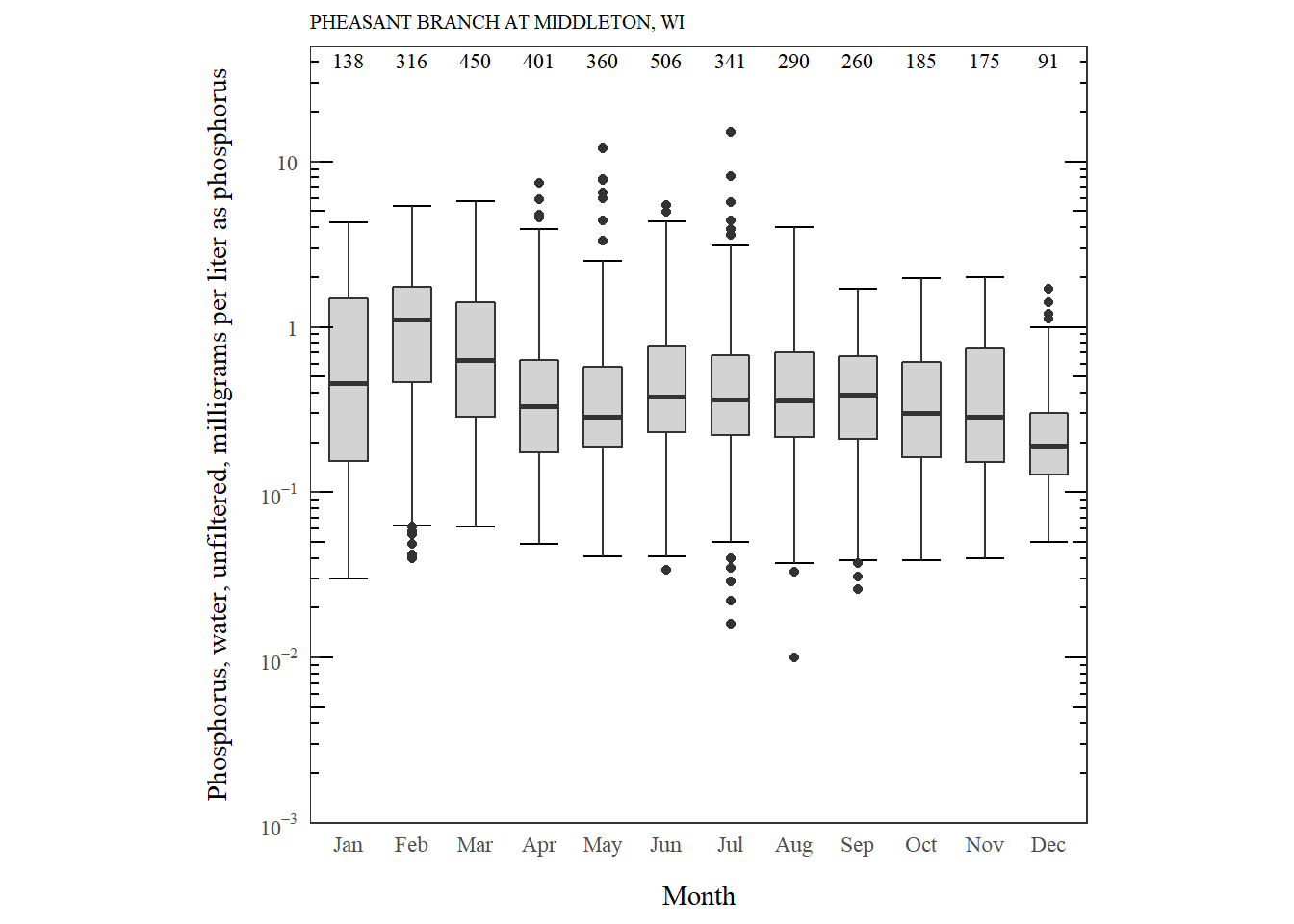
Phosphorus distribution by month.
What are the new features we have to consider for log scales?
| Function | What's happening? |
|---|---|
| stat_boxplot | The stat_boxplot function is the same, but our custom function to calculate counts need to be adjusted so the position would be in log units. |
| scale_y_log10 | This is used instead of scale_y_continuous. |
| annotation_logticks(sides = c("rl")) | Adds nice log ticks to the right ("r") and left ("l") side. |
| prettyLogs | This function forces the y-axis breaks to be on every 10^x. This could be adjusted if a finer scale was needed. |
| fancyNumbers | This is a custom formatting function for the log axis. This function could be adjusted if other formatting was needed. |
Grouped boxplots
We might also want to make grouped boxplots. In ggplot, it’s pretty easy to add a “fill” to the aes argument. Here we’ll plot temperature distributions at 4 USGS stations. We’ll group the measurements by a “daytime” and “nighttime” factor. Temperature might be a parameter that would not be required to start at 0.
library(dplyr)

# Get water temperature data for a variety of USGS stations
temp_q_data <- readNWISuv(siteNumbers = c("04026561", "04063700",
                                          "04082400", "05427927"),
                          parameterCd = '00010',
                          startDate = "2018-06-01",
                          endDate = "2018-06-03")

temperature_name <- attr(temp_q_data, "variableInfo")[["variableName"]]

# add an hour of day to create groups (daytime or nighttime)
temp_q_data <- temp_q_data %>%
  renameNWISColumns() %>%
  mutate(hourOfDay = as.numeric(format(dateTime, "%H")),
         timeOfDay = case_when(hourOfDay < 20 & hourOfDay > 6 ~ "daytime",
                               TRUE ~ "nighttime" # catchall
  ))

n_fun <- function(x){
  return(data.frame(y = 0.95*30,
                    label = length(x)))
}

temperature_plot <- ggplot(data = temp_q_data,
       aes(x=site_no, y=Wtemp_Inst, fill=timeOfDay)) +
  stat_boxplot(geom ='errorbar', width = 0.6) +
  geom_boxplot(width = 0.6) +
  stat_summary(fun.data = n_fun, geom = "text",
               aes(group=timeOfDay),
               hjust = 0.5, position = position_dodge(0.6)) +
  expand_limits(y = 0) +
  scale_y_continuous(sec.axis = dup_axis(label = NULL,
                                         name = NULL),
                     expand = expand_scale(mult = c(0, 0)),
                     breaks = pretty(c(10,30), n = 5),
                     limits = c(10,30)) +
  theme_USGS_box() +
  xlab("Station ID") +
  ylab(temperature_name) +
  scale_fill_discrete(name = "EXPLANATION") +
  theme(legend.position = c(0.175, 0.78))

temperature_plot
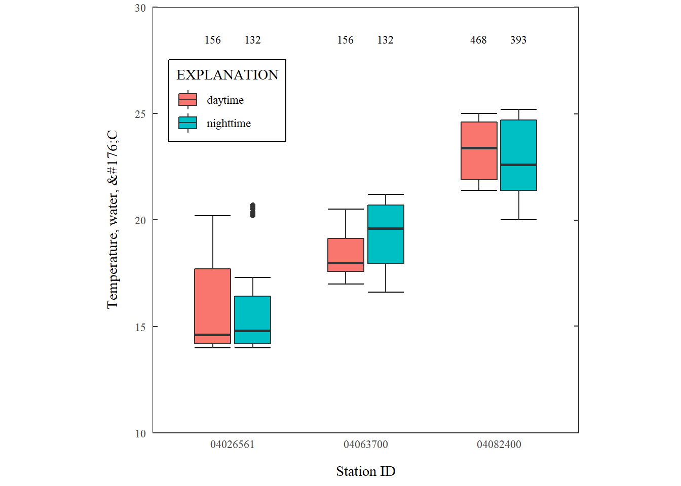
Grouped boxplots.
What are the new features we have to consider for log scales?
| Function | What's happening? |
|---|---|
| stat_summary(position) | We need to move the counts to above the boxplots. This is done by shifting them the same amount as the width. |
| stat_summary(aes(group=timeOfDay)) | We need to include how the boxplots are grouped. |
| scale_fill_discrete | Need include a fill legend. |
Additionally, the parameter name that comes back from dataRetrieval could use some formatting. The following function can fix that for both ggplot2 and base R graphics:
unescape_html <- function(str){
  fancy_chars <- regmatches(str, gregexpr("&#\\d{3};",str))

  unescaped <- xml2::xml_text(xml2::read_html(paste0("<x>", fancy_chars, "</x>")))

  fancy_chars <- gsub(pattern = "&#\\d{3};",
                      replacement = unescaped, x = str)

  fancy_chars <- gsub("Â","", fancy_chars)
  return(fancy_chars)
}
We’ll use this function in the next section.
Framework function
Finally, we can bring all of those elements together into a single list for ggplot2 to use. While we’re at it, we can create a function that is flexible for both linear and logarithmic scales, as well as grouped boxplots. It’s a bit clunky because you need to specify the upper and lower limits of the plot. Much of the USGS style requirements depend on specific upper and lower limits, so I decided this was an acceptable solution for this post. There’s almost certainly a slicker way to do that, but for now, it works:
boxplot_framework <- function(upper_limit,
                              family_font = "serif",
                              lower_limit = 0,
                              logY = FALSE,
                              fill_var = NA,
                              fill = "lightgrey", width = 0.6){

  update_geom_defaults("text",
                     list(size = 3,
                          family = family_font))

  n_fun <- function(x, lY = logY){
    return(data.frame(y = ifelse(logY, 0.95*log10(upper_limit), 0.95*upper_limit),
                      label = length(x)))
  }

  prettyLogs <- function(x){
    pretty_range <- range(x[x > 0])
    pretty_logs <- 10^(-10:10)
    log_index <- which(pretty_logs < pretty_range[2] &
                         pretty_logs > pretty_range[1])
    log_index <- c(log_index[1]-1,log_index,
                   log_index[length(log_index)]+1)
    pretty_logs_new <-  pretty_logs[log_index]
    return(pretty_logs_new)
  }

  fancyNumbers <- function(n){
    nNoNA <- n[!is.na(n)]
    x <-gsub(pattern = "1e",replacement = "10^",
             x = format(nNoNA, scientific = TRUE))
    exponents <- as.numeric(sapply(strsplit(x, "\\^"), function(j) j[2]))

    base <- ifelse(exponents == 0, "1", ifelse(exponents == 1, "10","10^"))
    exponents[base == "1" | base == "10"] <- ""
    textNums <- rep(NA, length(n))
    textNums[!is.na(n)] <- paste0(base,exponents)

    textReturn <- parse(text=textNums)
    return(textReturn)
  }

  if(!is.na(fill_var)){
      basic_elements <- list(stat_boxplot(geom ='errorbar', width = width),
                            geom_boxplot(width = width),
                            stat_summary(fun.data = n_fun,
                                         geom = "text",
                                         position = position_dodge(width),
                                         hjust =0.5,
                                         aes_string(group=fill_var)),
                            expand_limits(y = lower_limit),
                            theme_USGS_box())
  } else {
      basic_elements <- list(stat_boxplot(geom ='errorbar', width = width),
                            geom_boxplot(width = width, fill = fill),
                            stat_summary(fun.data = n_fun,
                                         geom = "text", hjust =0.5),
                            expand_limits(y = lower_limit),
                            theme_USGS_box())
  }

  if(logY){
    return(c(basic_elements,
              scale_y_log10(limits = c(lower_limit, upper_limit),
                  expand = expand_scale(mult = c(0, 0)),
                  labels=fancyNumbers,
                  breaks=prettyLogs),
              annotation_logticks(sides = c("rl"))))
  } else {
    return(c(basic_elements,
              scale_y_continuous(sec.axis = dup_axis(label = NULL,
                                                     name = NULL),
                                 expand = expand_scale(mult = c(0, 0)),
                                 breaks = pretty(c(lower_limit,upper_limit), n = 5),
                                 limits = c(lower_limit,upper_limit))))
  }
}
Examples with our framework
Let’s see if it works! Let’s build the last set of example figures using our new function boxplot_framework. I’m also going to use the ‘cowplot’ package to print them all together. I’ll also include the ggplot_box_legend which will be described in the next section.
legend_plot <- ggplot_box_legend()

chloride_plot <- ggplot(data = chloride,
       aes(x = month, y = result_va)) +
  boxplot_framework(upper_limit = 70) +
  xlab(label = "Month") +
  ylab(label = cl_name) +
  labs(title = cl_site)

phos_plot <- ggplot(data = phos_data,
       aes(x = month, y = result_va)) +
  boxplot_framework(upper_limit = 50,
                    lower_limit = 0.001,
                    logY = TRUE) +
  xlab(label = "Month") +
  #Shortened label since the graph area is smaller
  ylab(label = "Phosphorus in milligraphs per liter") +
  labs(title = phos_site)

temperature_plot <- ggplot(data = temp_q_data,
       aes(x=site_no, y=Wtemp_Inst, fill=timeOfDay)) +
  boxplot_framework(upper_limit = 30,
                    lower_limit = 10,
                    fill_var = "timeOfDay") +
  xlab(label = "Station ID") +
  ylab(label = unescape_html(temperature_name)) +
  labs(title = "Daytime vs Nighttime Temperature Distribution") +
  scale_fill_discrete(name = "EXPLANATION") +
  theme(legend.position = c(0.225, 0.72),
        legend.title =  element_text(size = 7))

plot_grid(chloride_plot,
          phos_plot,
          temperature_plot,
          legend_plot,
          nrow = 2)
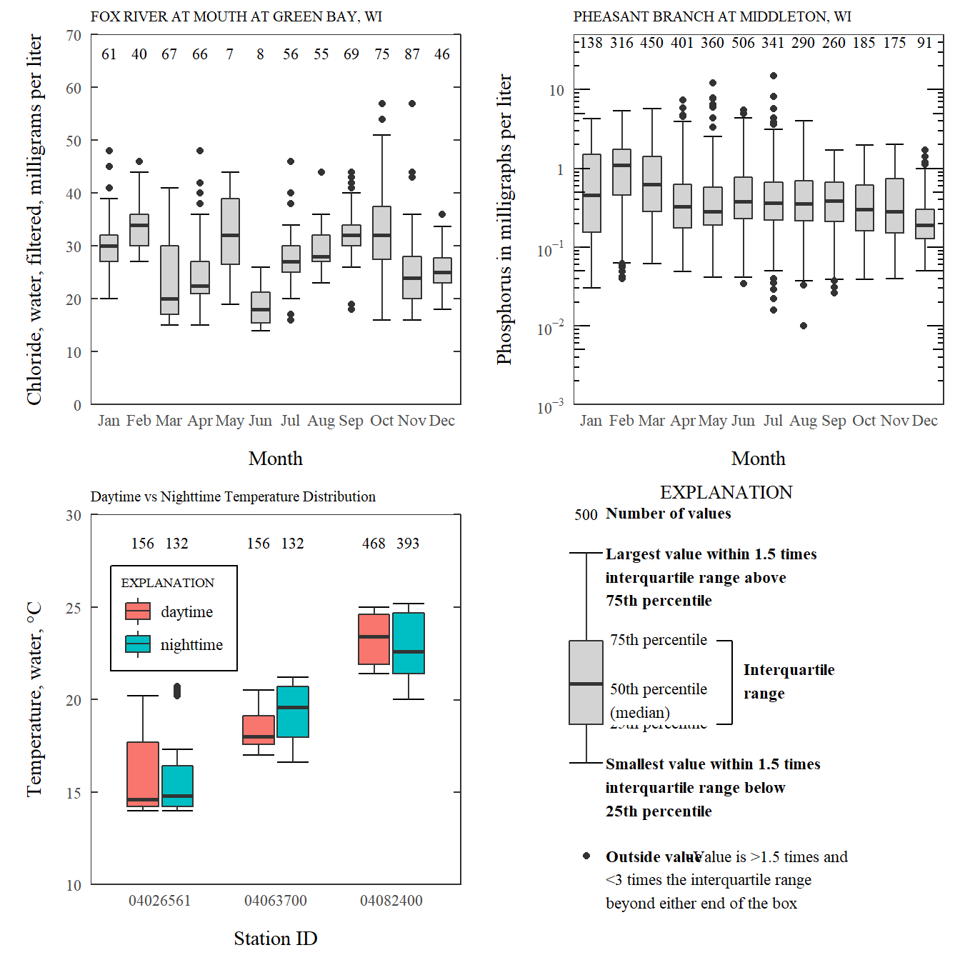
Combining boxplots using framework function and cowplot's plot_grid.
ggplot_box_legend: What is a boxplot?
A non-trivial requirement to the USGS boxplot style guidelines is to make a detailed, prescribed legend. In this section we’ll first verify that ggplot2 boxplots use the same definitions for the lines and dots, and then we’ll make a function that creates the prescribed legend. To start, let’s set up random data using the R function sample and then create a function to calculate each value.
set.seed(100)

sample_df <- data.frame(parameter = "test",
                        values = sample(500))

# Extend the top whisker a bit:
sample_df$values[1:100] <- 701:800
# Make sure there's only 1 lower outlier:
sample_df$values[1] <- -350
Next, we’ll create a function that calculates the necessary values for the boxplots:
ggplot2_boxplot <- function(x){

  quartiles <- as.numeric(quantile(x,
                                   probs = c(0.25, 0.5, 0.75)))

  names(quartiles) <- c("25th percentile",
                        "50th percentile\n(median)",
                        "75th percentile")

  IQR <- diff(quartiles[c(1,3)])

  upper_whisker <- max(x[x < (quartiles[3] + 1.5 * IQR)])
  lower_whisker <- min(x[x > (quartiles[1] - 1.5 * IQR)])

  upper_dots <- x[x > (quartiles[3] + 1.5*IQR)]
  lower_dots <- x[x < (quartiles[1] - 1.5*IQR)]

  return(list("quartiles" = quartiles,
              "25th percentile" = as.numeric(quartiles[1]),
              "50th percentile\n(median)" = as.numeric(quartiles[2]),
              "75th percentile" = as.numeric(quartiles[3]),
              "IQR" = IQR,
              "upper_whisker" = upper_whisker,
              "lower_whisker" = lower_whisker,
              "upper_dots" = upper_dots,
              "lower_dots" = lower_dots))
}

ggplot_output <- ggplot2_boxplot(sample_df$values)
What are those calculations?
- Quartiles (25, 50, 75 percentiles), 50% is the median
- Interquartile range is the difference between the 75th and 25th percentiles
- The upper whisker is the maximum value of the data that is within 1.5 times the interquartile range over the 75th percentile.
- The lower whisker is the minimum value of the data that is within 1.5 times the interquartile range under the 25th percentile.
- Outlier values are considered any values over 1.5 times the interquartile range over the 75th percentile or any values under 1.5 times the interquartile range under the 25th percentile.
Let’s check that the output matches boxplot.stats:
# Using base R:
base_R_output <- boxplot.stats(sample_df$values)

# Some checks:

# Outliers:
all(c(ggplot_output[["upper_dots"]],
      ggplot_output[["lowerdots"]]) %in%
    c(base_R_output[["out"]]))
## [1] TRUE
# whiskers:
ggplot_output[["upper_whisker"]] == base_R_output[["stats"]][5]
## [1] TRUE
ggplot_output[["lower_whisker"]] == base_R_output[["stats"]][1]
## [1] TRUE
Boxplot Legend
Let’s use this information to generate a legend, and make the code reusable by creating a standalone function that we used in earlier code (ggplot_box_legend). There is a lot of ggplot2 code to digest here. Most of it is style adjustments to approximate the USGS style guidelines for a boxplot legend.
Show/Hide Code
ggplot_box_legend <- function(family = "serif"){

  # Create data to use in the boxplot legend:
  set.seed(100)

  sample_df <- data.frame(parameter = "test",
                        values = sample(500))

  # Extend the top whisker a bit:
  sample_df$values[1:100] <- 701:800
  # Make sure there's only 1 lower outlier:
  sample_df$values[1] <- -350

  # Function to calculate important values:
  ggplot2_boxplot <- function(x){

    quartiles <- as.numeric(quantile(x,
                                     probs = c(0.25, 0.5, 0.75)))

    names(quartiles) <- c("25th percentile",
                          "50th percentile\n(median)",
                          "75th percentile")

    IQR <- diff(quartiles[c(1,3)])

    upper_whisker <- max(x[x < (quartiles[3] + 1.5 * IQR)])
    lower_whisker <- min(x[x > (quartiles[1] - 1.5 * IQR)])

    upper_dots <- x[x > (quartiles[3] + 1.5*IQR)]
    lower_dots <- x[x < (quartiles[1] - 1.5*IQR)]

    return(list("quartiles" = quartiles,
                "25th percentile" = as.numeric(quartiles[1]),
                "50th percentile\n(median)" = as.numeric(quartiles[2]),
                "75th percentile" = as.numeric(quartiles[3]),
                "IQR" = IQR,
                "upper_whisker" = upper_whisker,
                "lower_whisker" = lower_whisker,
                "upper_dots" = upper_dots,
                "lower_dots" = lower_dots))
  }

  # Get those values:
  ggplot_output <- ggplot2_boxplot(sample_df$values)

  # Lots of text in the legend, make it smaller and consistent font:
  update_geom_defaults("text",
                     list(size = 3,
                          hjust = 0,
                          family = family))
  # Labels don't inherit text:
  update_geom_defaults("label",
                     list(size = 3,
                          hjust = 0,
                          family = family))

  # Create the legend:
  # The main elements of the plot (the boxplot, error bars, and count)
  # are the easy part.
  # The text describing each of those takes a lot of fiddling to
  # get the location and style just right:
  explain_plot <- ggplot() +
    stat_boxplot(data = sample_df,
                 aes(x = parameter, y=values),
                 geom ='errorbar', width = 0.3) +
    geom_boxplot(data = sample_df,
                 aes(x = parameter, y=values),
                 width = 0.3, fill = "lightgrey") +
    geom_text(aes(x = 1, y = 950, label = "500"), hjust = 0.5) +
    geom_text(aes(x = 1.17, y = 950,
                  label = "Number of values"),
              fontface = "bold", vjust = 0.4) +
    theme_minimal(base_size = 5, base_family = family) +
    geom_segment(aes(x = 2.3, xend = 2.3,
                     y = ggplot_output[["25th percentile"]],
                     yend = ggplot_output[["75th percentile"]])) +
    geom_segment(aes(x = 1.2, xend = 2.3,
                     y = ggplot_output[["25th percentile"]],
                     yend = ggplot_output[["25th percentile"]])) +
    geom_segment(aes(x = 1.2, xend = 2.3,
                     y = ggplot_output[["75th percentile"]],
                     yend = ggplot_output[["75th percentile"]])) +
    geom_text(aes(x = 2.4, y = ggplot_output[["50th percentile\n(median)"]]),
              label = "Interquartile\nrange", fontface = "bold",
              vjust = 0.4) +
    geom_text(aes(x = c(1.17,1.17),
                  y = c(ggplot_output[["upper_whisker"]],
                        ggplot_output[["lower_whisker"]]),
                  label = c("Largest value within 1.5 times\ninterquartile range above\n75th percentile",
                            "Smallest value within 1.5 times\ninterquartile range below\n25th percentile")),
                  fontface = "bold", vjust = 0.9) +
    geom_text(aes(x = c(1.17),
                  y =  ggplot_output[["lower_dots"]],
                  label = "Outside value"),
              vjust = 0.5, fontface = "bold") +
    geom_text(aes(x = c(1.9),
                  y =  ggplot_output[["lower_dots"]],
                  label = "-Value is >1.5 times and"),
              vjust = 0.5) +
    geom_text(aes(x = 1.17,
                  y = ggplot_output[["lower_dots"]],
                  label = "<3 times the interquartile range\nbeyond either end of the box"),
              vjust = 1.5) +
    geom_label(aes(x = 1.17, y = ggplot_output[["quartiles"]],
                  label = names(ggplot_output[["quartiles"]])),
              vjust = c(0.4,0.85,0.4),
              fill = "white", label.size = 0) +
    ylab("") + xlab("") +
    theme(axis.text = element_blank(),
          axis.ticks = element_blank(),
          panel.grid = element_blank(),
          aspect.ratio = 4/3,
          plot.title = element_text(hjust = 0.5, size = 10)) +
    coord_cartesian(xlim = c(1.4,3.1), ylim = c(-600, 900)) +
    labs(title = "EXPLANATION")

  return(explain_plot)

}

ggplot_box_legend()
ggplot2 box plot with explanation.
Bring it together
What’s nice about leaving this in the world of ggplot2 is that it is still possible to use other ggplot2 elements on the plot. For example, let’s add a reporting limit as horizontal lines to the phosphorous graph:
phos_plot_with_DL <- phos_plot +
  geom_hline(linetype = "dashed",
             yintercept = 0.01)

explain_plot_DL <- ggplot_box_legend() +
  geom_segment(aes(y = -650, yend = -650,
               x = 0.6, xend = 1.6),
           linetype="dashed") +
  geom_text(aes(y = -650, x = 1.8, label = "Reporting Limit"))

plot_grid(phos_plot_with_DL,
          explain_plot_DL,
          nrow = 1, rel_widths = c(.6,.4))
Boxplot with additional ggplot2 features.
I hoped you like my “deep dive” into ggplot2 boxplots. Many of the techniques here can be used to modify other ggplot2 plots.
Categories:
Related Posts
Beyond Basic R - Mapping
August 16, 2018
Introduction
There are many different R packages for dealing with spatial data. The main distinctions between them involve the types of data they work with — raster or vector — and the sophistication of the analyses they can do. Raster data can be thought of as pixels, similar to an image, while vector data consists of points, lines, or polygons. Spatial data manipulation can be quite complex, but creating some basic plots can be done with just a few commands. In this post, we will show simple examples of raster and vector spatial data for plotting a watershed and gage locations, and link to some other more complex examples.
Beyond Basic R - Plotting with ggplot2 and Multiple Plots in One Figure
August 9, 2018
R can create almost any plot imaginable and as with most things in R if you don’t know where to start, try Google. The Introduction to R curriculum summarizes some of the most used plots, but cannot begin to expose people to the breadth of plot options that exist.There are existing resources that are great references for plotting in R:
Duplicating Quarto elements with code templates to reduce copy and paste errors
May 20, 2025
Introduction
It is a common situation in data science and analysis: We want to create a series of figures, tables, or summary statistics for a set of data. Maybe we’re studying different species of irises or penguins or the current flow conditions for various streamgages (the example used below), and we want a different summary figure or table for each. One common approach is to write code for one set of the data, such as setting up the graphing parameters in a
ggplotdata visualization or calculating a series of statistics for a single species/streamgage. Then, once happy with that, copying and pasting the code for each entity, modifying the code slightly for each iteration.Jazz up your ggplots!
July 21, 2023
At Vizlab , we make fun and accessible data visualizations to communicate USGS research and data. Upon taking a closer look at some of our visualizations, you may think:
Recreating the U.S. River Conditions animations in R
March 29, 2021
For the last few years, we have released quarterly animations of streamflow conditions at all active USGS streamflow sites . These visualizations use daily streamflow measurements pulled from the USGS National Water Information System (NWIS) to show how streamflow changes throughout the year and highlight the reasons behind some hydrologic patterns. Here, I walk through the steps to recreate a similar version in R.