Beyond Basic R - Data Munging
More advanced data munging techniques in R that were not covered in the Intro to R class.
What we couldn’t cover
In the data cleaning portion of our Intro to R class
, we cover a variety of common data manipulation tasks. Most of these were achieved using the package dplyr, including removing or retaining certain columns (select), filtering out rows by column condition (filter), creating new columns (mutate), renaming columns (rename), grouping data by categorical variables (group_by), and summarizing data (summarize).
But often, data users need to do more complex manipulation of their data, like changing the shape of the data or creating a new column conditional on values in another column. In this post, we will use USGS stream data to demonstrate data munging techniques that are beyond the basics taught in our Intro to R course. If you’re following along and see a new function and want to learn more, a reminder that you can see the help file for that function by executing a ? followed by the function name in your console to see the help file and examples.
What we want to achieve
In this example, a data user is interested in how nutrient concentrations are related to discharge in a stream within a mixed use watershed of urban and agricultural land use. The site is located in Dane County near Madison, WI, and we’re focusing on daily values from a 20-year period from 1998 to 2017. We’ll use these data to demonstrate a variety of data munging techniques that are beyond the basics.
How to get there
Get the data
The first step falls within what we’ve already learned in the Intro to R class: pull data from NWIS using the USGS package dataRetrieval, select the columns we want to keep, and rename columns.
# load libraries
library(dplyr)
library(dataRetrieval)
library(lubridate)
library(tidyr)
library(ggplot2)
library(viridis)

# Get data for the Yahara River at Windsor in Dane County, Wisconsin
yahara_no <- '05427718'

# define parameters of interest, and get those parameter names
params <- c('00060', '00671', '80154', '00665')

# get daily values from NWIS
yahara_dat <- readNWISdv(siteNumbers = yahara_no, parameterCd = params,
                         startDate = '1997-10-01', endDate = '2017-09-30')

# rename columns using renameNWISColumns from package dataRetrieval
yahara_dat <- renameNWISColumns(yahara_dat,
                                p00665 = "TP_mgL",
                                p00671 = "Orthophosphate_mgL",
                                p80154 = "SS_mgL")
You may be seeing the pipe (%>%) for the first time in the above code snippet. The pipe comes from the package magrittr and is used in dplyr to connect commands. dplyr functions generally take arguments in the same order: the dataframe you want to manipulate, and what you want to do it. A pipe upstream of a command “pipes in” the results of the upstream function; that is, you no longer have to specify the dataframe you want to manipulate. It’s an efficient way to code if you don’t care to create intermediate data objects. You can read more about the history and functionality of the pipe in R from DataCamp’s tutorial on pipes
.
Match strings
Notice that in our new dataset, we have retained code columns, or those that end in “_cd”. How can we quickly identify which columns contain that string? Here, we’ll introduce you to pattern matching functions (including grep and gsub) which have wide application to data munging. First, we’ll use grep to return the index of the string or the string itself that contains “_cd”.
# use function `grep` to identify which columns are code columns
yahara_names <- names(yahara_dat)
grep('_cd', yahara_names) # returns the index of the match
## [1] 1 5 7 9 11
grep('_cd', yahara_names, value = TRUE) # returns the matched elements themselves
## [1] "agency_cd"             "Flow_cd"               "TP_mgL_cd"
## [4] "Orthophosphate_mgL_cd" "SS_mgL_cd"
# change the code column names to be more explicit about what they contain
# using function gsub
gsub('_cd', '_code', yahara_names)
##  [1] "agency_code"             "site_no"
##  [3] "Date"                    "Flow"
##  [5] "Flow_code"               "TP_mgL"
##  [7] "TP_mgL_code"             "Orthophosphate_mgL"
##  [9] "Orthophosphate_mgL_code" "SS_mgL"
## [11] "SS_mgL_code"
The package dplyr also has some handy pattern matching functions built in. For example, we can use the function contains in select to exclude those columns with the “_cd” string.
yahara_dat <- select(yahara_dat, -contains('_cd'))
head(yahara_dat)
##    site_no       Date Flow TP_mgL Orthophosphate_mgL SS_mgL
## 1 05427718 1997-10-01   11   0.05                 NA   18.8
## 2 05427718 1997-10-02   11   0.05                 NA   18.6
## 3 05427718 1997-10-03   12   0.05                 NA   18.5
## 4 05427718 1997-10-04   11   0.04                 NA   18.5
## 5 05427718 1997-10-05   11   0.04                 NA   18.4
## 6 05427718 1997-10-06   11   0.04                 NA   18.4
These functions use regular expression to evaluate matches, and can be used to find much more complex patterns. We’ve only scratched the surface here on what can be done with pattern matching. Further reading on the topic of regular expression in R that we recommend include RStudio’s regular expression cheat sheet and the “strings” section from the R for Data Science book .
Create new variables to summarize by water year
First, let’s compare discharge across water years. The current data frame only has dates, so we’ll need to create a water year and a day of water year variable to use in our comparisons. We can use the handy addWaterYear function from dataRetrieval to do so. Next, we’ll calculate cumulative discharge by day for each year using group_by and mutate.
# add water year variable "waterYear" to our dataframe
yahara_dat <- addWaterYear(yahara_dat)

# calculate cumulative discharge for each year by first grouping by water year,
# and then using the "cumsum" function. Add day of water year for plotting purposes.
# These steps will build a new dataframe, with the existing information in yahara_dat
# but with two additional columns.
cumulative_dat <- group_by(yahara_dat, waterYear) %>%
  mutate(cumulative_dis = cumsum(Flow),
         wy_doy = seq(1:n()))

# visually compare cumulative discharge across years
ggplot(cumulative_dat, aes(x = wy_doy, y = cumulative_dis, group = waterYear)) +
  geom_line(aes(color = waterYear)) +
  scale_color_viridis_c() +
  scale_x_continuous(breaks = c(1, 93, 184, 275), labels = c("Oct 1", "Jan 1", "Apr 1", "July 1")) +
  theme_bw() +
  labs(color = "Water Year", x = "", y = "Cumulative Discharge")
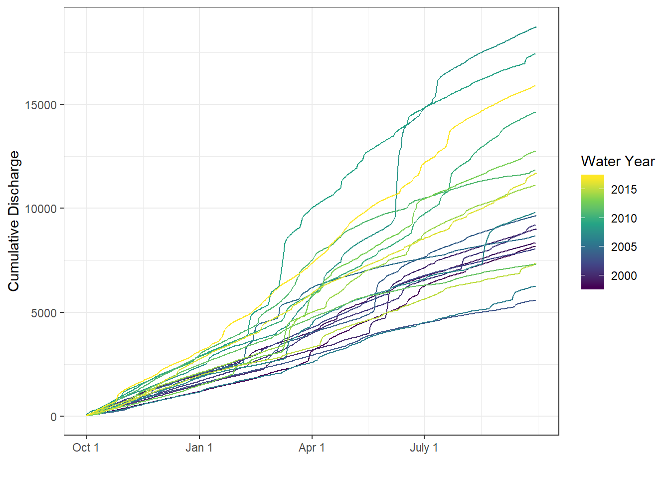
Cumulative discharge (by water year) in the Yahara River.
Create categorical variables from continuous data
There is variability year-to-year in cumulative discharge and the timing of large discharge events. As we look at the nutrient ~ discharge relationships, we may want to keep track of which years were wet versus dry. That is, we want to categorize years based on the total annual discharge. Below, we show several ways to create a categorical variable from continuous data.
# sum discharge by water year, also check to be sure each year has
# data for every day by counting observations in a year
year_sums <- yahara_dat %>%
  filter(!is.na(Flow)) %>%
  group_by(waterYear) %>%
  summarize(yearly_discharge = sum(Flow, na.rm = TRUE),
            ndays = n())
First, we’ll use an ifelse statement to create a categorical variable based on TRUE or FALSE conditions.
# use ifelse to create a categorical variable that has two conditions
median_yearly_discharge <- median(year_sums$yearly_discharge)
year_sums <- mutate(year_sums, discharge_high_low = ifelse(yearly_discharge <= median_yearly_discharge, 'low', 'high'))

# we should get equal group sizes of "low" and "high"
summary(as.factor(year_sums$discharge_high_low))
## high  low
##   10   10
Now suppose you want to create a variable with three categories: dry, normal, and wet. We’ll use the cut function to do this so we can give multiple numeric break points to create the categories. We’ll arbitrarily use the 25th and 75th percentiles to define our cutoffs values.
cut_vals <- quantile(year_sums$yearly_discharge, probs = c(0.25, 0.75), na.rm = TRUE)
year_sums <- mutate(year_sums,
                    discharge_dry_normal_wet = cut(yearly_discharge,
                                                 breaks = c(-Inf, cut_vals, Inf),
                                                 labels = c("dry", "normal", "wet")))

# we expect roughly twice as many "normal" years as "wet" or "dry" years
summary(as.factor(year_sums$discharge_dry_normal_wet))
##    dry normal    wet
##      5     10      5
In some instances, you may want to create categorical variables based on a more complex set of rules. For example, if there was an important management action in this watershed that occurred in the year 2000, you may want your low/high discharge categories to be further classified as before/after. We’ll use the function case_when to use multiple rules to define our categories.
year_sums <- year_sums %>%
  mutate(discharge_before_after = case_when(
    yearly_discharge > median_yearly_discharge & waterYear > 2000 ~ "High Discharge, After",
    yearly_discharge > median_yearly_discharge & waterYear <= 2000 ~ "High Discharge, Before",
    yearly_discharge <= median_yearly_discharge & waterYear <= 2000 ~ "Low Discharge, Before",
    yearly_discharge <= median_yearly_discharge & waterYear > 2000 ~ "Low Discharge, After"
  ))

# check how many years of data fall into each category
summary(as.factor(year_sums$discharge_before_after))
## High Discharge, After  Low Discharge, After Low Discharge, Before
##                    10                     7                     3
Gather or stack variables in long data frame using gather
We can plot the variables through time to see major discharge and concentration events. With our current data structure, we could easily create individual plots of all constituents and discharge through time - e.g., this plot of TP through time:
 ggplot(cumulative_dat, aes(x = Date, y = TP_mgL)) +
  geom_point() +
  labs(x = "Date", y = 'TP (mg/L)') +
  theme_bw()
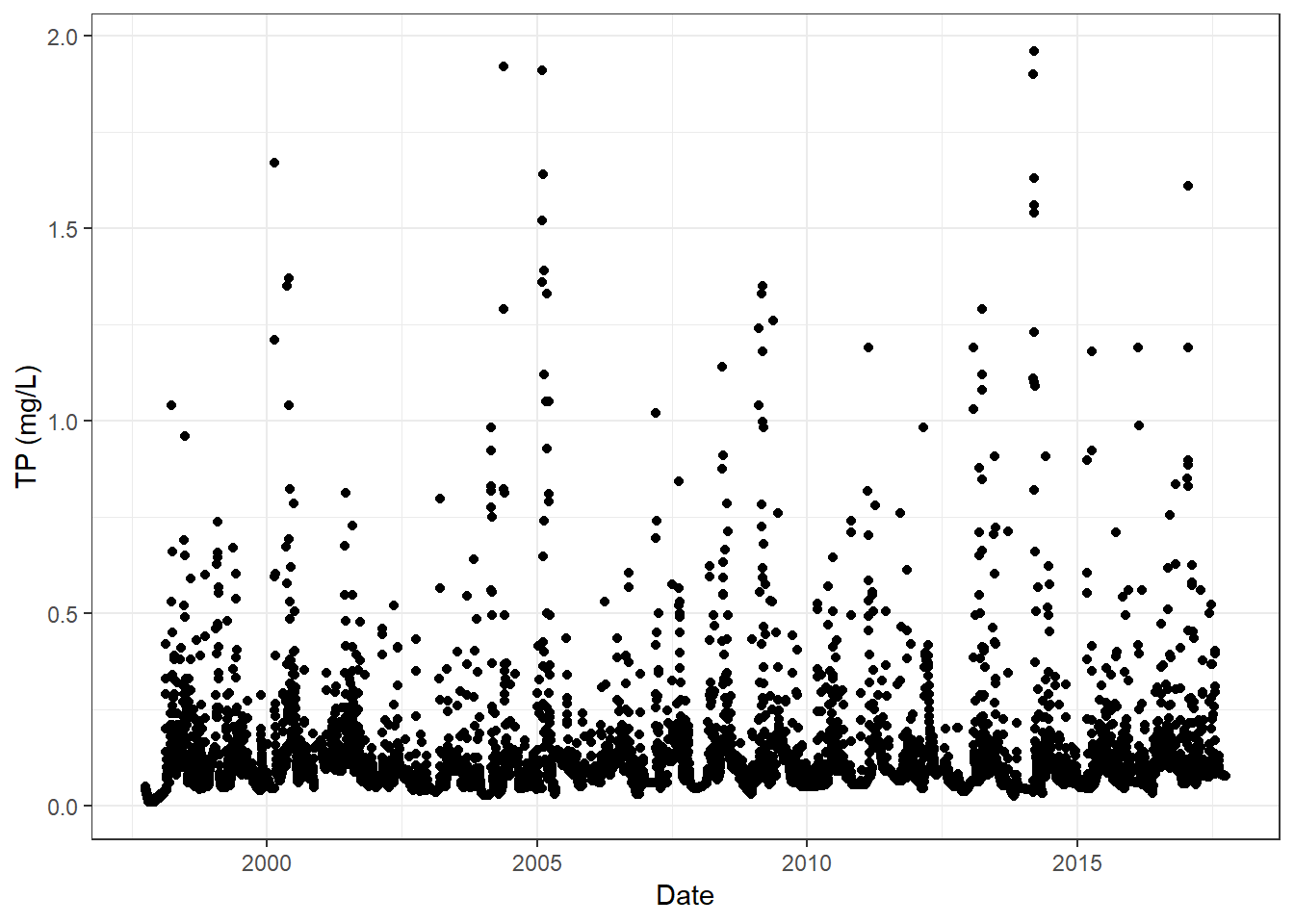
Total phosphorus concentration through time in the Yahara River.
But what if we wanted to stack this figure with a discharge through time plot, where the panels are aligned by date and share x-axis labels? We can do this by faceting in ggplot, but our current data structure is wide (each variable is in its own column), and we need a single “variable” column with an associated “value” that is presented in long format. To get our data in long format, we will gather (from the package tidyr) the nutrient and discharge columns.
For the gather function, we need to provide a key name which will become the column where the measured parameter names are stored. We also provide a value name, which will become the column where the measured values are stored. Finally, we tell the gather function which columns we do (by listing) or do not (by list with a negative sign) want to gather by adding a negative sign to those column names.
yahara_long <- cumulative_dat %>%
  gather(key = measured_parameter, value = value, Flow, TP_mgL, Orthophosphate_mgL, SS_mgL)

head(yahara_long)
## # A tibble: 6 x 7
## # Groups:   waterYear [1]
##   site_no  Date       waterYear cumulative_dis wy_doy measured_parameter
##   <chr>    <date>         <dbl>          <dbl>  <int> <chr>
## 1 05427718 1997-10-01      1998             11      1 Flow
## 2 05427718 1997-10-02      1998             22      2 Flow
## 3 05427718 1997-10-03      1998             34      3 Flow
## 4 05427718 1997-10-04      1998             45      4 Flow
## 5 05427718 1997-10-05      1998             56      5 Flow
## 6 05427718 1997-10-06      1998             67      6 Flow
## # ... with 1 more variable: value <dbl>
Now, we can use ggplot to plot all values against time and facet_wrap by the “variable” column to create panels of data.
 ggplot(yahara_long, aes(x = Date, y = value)) +
  geom_point() +
  facet_wrap(~measured_parameter, ncol = 1, scales = 'free_y') +
  labs(x = "Date", y = '') +
  theme_bw()
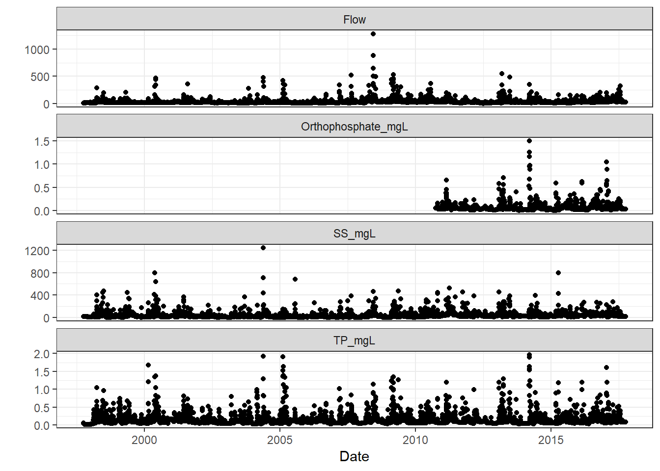
Nutrients and discharge through time in the Yahara River.
ggplot command, stating you’ve removed rows due to missing data. Not all variables had the same temporal coverage, and are therefore “missing” during certain time periods. The plot still should have generated, and the message serves as an “FYI” to what was going on behind the scenes.
Spreading data to pair observations using spread
We can see that large discharge events are generally associated with increases in concentration, but we suspect that dissolved and particulate nutrients may behave differently during large events. Dissolved P is of particular concern in the basin as the downstream lakes are eutrophic, and so we are interested in the relative amount of total phosphorus that is entering the systems as dissolved P, and how that ratio is affected by the magnitude of the runoff event. We can also evaluate these relationships in the context of wet and dry years, which we determined in the steps above.
The first step is to create a TP:OrthoP variable, but in our long dataset, our two P variables are no longer paired by date (i.e., row). Let’s spread our dataset back out into wide format using the spread function from package tidyr.
yahara_wide <- yahara_long %>%
  spread(key = measured_parameter, value = value) %>%
  mutate(TP_OrthoP = TP_mgL/Orthophosphate_mgL)

# again, gather the phosphorus variables
# merge with our wet/dry variable of interest
p_dat <- ungroup(yahara_wide) %>%
  select(Date, TP_mgL, Orthophosphate_mgL, TP_OrthoP, Flow, waterYear) %>%
  gather(key = P_variables, value = value, -Date, -Flow, -waterYear) %>%
  left_join(select(year_sums, discharge_dry_normal_wet, waterYear))

# visualize phosphorus ~ discharge relationships and color code
# by wet/dry year
ggplot(p_dat, aes(x = Flow, y = value)) +
  geom_point(aes(color = discharge_dry_normal_wet), alpha = 0.3) +
  facet_wrap(~P_variables, ncol = 1, scales = 'free_y') +
  geom_smooth(aes(group = discharge_dry_normal_wet, color = discharge_dry_normal_wet),
              alpha = 0.5, method = 'lm') +
  scale_y_log10() +
  scale_x_log10() +
  annotation_logticks() +
  theme_bw() +
  labs(x = "Discharge (cfs)", color = "Annual Hydrologic \nCondition")
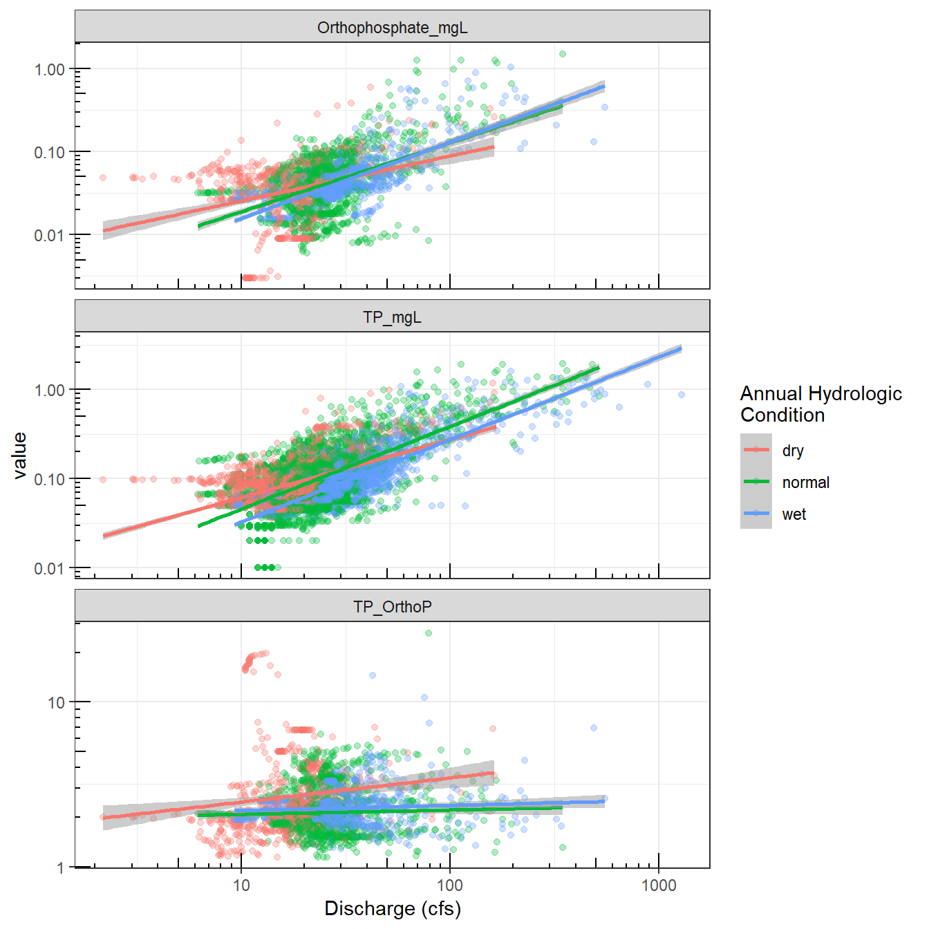
The relationship between discharge and various measures of phosphorus in the Yahara River.
Operations by row using rowwise
In some instances, you may want make a calculation or manipulate data by row. Many functions, such as min and max, operate on the column. For example, there is an another USGS site on the Yahara, and you want to know which site has greater TP concentrations on a daily scale. Below, we’ll grab the additional data, merge it to the original site data, and calculate which site has the maximum TP value each day. We’ll use the function which.max, which returns the index of the maximum value. We’ll use that index to return the name of the site with the highest value.
# set USGS site and pull data
yahara_site2 <- '05427850'

yahara_dat2 <- readNWISdv(siteNumbers = yahara_site2, parameterCd = '00665',
                          startDate = '1997-10-01', endDate = '2017-09-30') %>%
  select(Date, TP_Yah_Hwy113 = X_00665_00003)

# merge the two Yahara TP datasets
yahara_combo <- left_join(yahara_dat2, select(yahara_dat, TP_Yah_Windsor = TP_mgL, Date))

# find which site has has the maximum value by row
yahara_highest <- yahara_combo %>%
  rowwise() %>%
  mutate(max_tp_site =
           c('Yahara_at_Hwy113', 'Yahara_at_Windsor')[which.max(c(TP_Yah_Hwy113, TP_Yah_Windsor))])

summary(as.factor(yahara_highest$max_tp_site))
##  Yahara_at_Hwy113 Yahara_at_Windsor
##              1527              1759
Happy data munging!
We hope these examples can help you navigate common data munging tasks in R. There are certainly many more tricks, tips, and functions that can be used for data munging, but we hope that our Intro to R material on data cleaning , along with this post, have given you a jump start.
Categories:
Related Posts
Beyond Basic R - Version Control with Git
August 24, 2018
Depending on how new you are to software development and/or R programming, you may have heard people mention version control, Git, or GitHub. Version control refers to the idea of tracking changes to files through time and various contributors. Git is an example of a version control tool, and GitHub is a popular web interface for Git. That’s it. Easy!
Beyond Basic R - Mapping
August 16, 2018
Introduction
There are many different R packages for dealing with spatial data. The main distinctions between them involve the types of data they work with — raster or vector — and the sophistication of the analyses they can do. Raster data can be thought of as pixels, similar to an image, while vector data consists of points, lines, or polygons. Spatial data manipulation can be quite complex, but creating some basic plots can be done with just a few commands. In this post, we will show simple examples of raster and vector spatial data for plotting a watershed and gage locations, and link to some other more complex examples.
Beyond Basic R - Plotting with ggplot2 and Multiple Plots in One Figure
August 9, 2018
R can create almost any plot imaginable and as with most things in R if you don’t know where to start, try Google. The Introduction to R curriculum summarizes some of the most used plots, but cannot begin to expose people to the breadth of plot options that exist.There are existing resources that are great references for plotting in R:
Beyond Basic R - Introduction and Best Practices
July 30, 2018
We queried more than 60 people who have taken the USGS Introduction to R class over the last two years to understand what other skills and techniques are desired, but not covered in the course. Though many people have asked for an intermediate level class, we believe that many of the skills could be best taught through existing online materials. Instead of creating a stand-alone course, we invested our time into compiling the results of the survey, creating short examples, and linking to the necessary resources within a series of posts. This is the first in a series of 5 posts called Beyond basic R.
A map that glows with the vocabulary of water
February 27, 2026
English is the official language and authoritative version of all federal information.
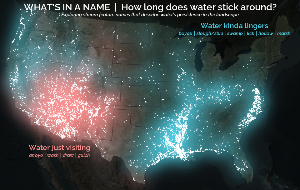
A map that glows with the vocabulary of water
What is your first impression of the map above? To me, it is the shimmer. Thousands of points of light, each one a stream or river, illuminating a darkened basemap. Look closely and a pattern emerges: the country’s waterways form a linguistic constellation. These points are classified not from population data or even explicitly by hydrology. They glow strictly according to the vocabulary used to name them and what can be implied about the hydrology of these streams based on their names.

