
Jazz up your ggplots!
Useful tricks to elevate your data viz via `ggplot` extension packages in R
What's on this page
At Vizlab , we make fun and accessible data visualizations to communicate USGS research and data. Upon taking a closer look at some of our visualizations, you may think:
- “How can I add annotations to my chart?”
- “How can I use more custom effects in my chart design?”
- “How can I animate my chart?”
With the use of ggplot2 and ggplot2 extension packages we can customize our data visualizations with consistent syntax. Users can customize plot appearance in every way within the ggplot2 ecosystem, making chart design fully reproducible and reducing the need for external design software. Our water data visualization team, USGS VizLab, loves the customization that the ggplot ecosystem allows. For example, Hayley
added custom arrows and labels in this recently shared #DataViz
and Cee
added custom text directly onto this curved path of a recently shared-out animation
.
Here are some of our favorite functions and tricks to customize ggplot design, with complete code examples to try on your own. We demonstrate:
- Custom theme and fonts
- Arrows with
geom_curve - Annotations with
geomtextpath - Special effects with
ggfx - Shapes with
ggimage - Highlighting geom elements with
gghighlight - Plot animation with
gganimate - Chart composition with
cowplot - Additional packages for custom chart design
- Takeaways
How to read this blog
As you read through this blog, you will find sections like this:
Click here
paste("hello world")
By clicking the icon on the left, data wrangling steps behind the example will unfold. This contains all of the packages and pre-plotting methods for each example.
To collapse the code chunk, simply click the icon again. In order to recreate the data visualizations in this blog post, you will need to run all code found in the collapsible chunks of data-wrangling steps. Additionally, you will need to install the following packages:
# Run to install all packages needed in script
install.packages(c('tidyverse', 'remotes','showtext', 'sysfonts', 'cowplot',
'dataRetrieval', 'geomtextpath', 'ggimage', 'rnpn', 'terra', 'raster', 'sf',
'colorspace', 'lubridate', 'geofacet', 'ggfx','gghighlight', 'gganimate',
'snotelr', 'sbtools', 'spData'))

# Install waffle using `remotes`
remotes::install_github("hrbrmstr/waffle")

# Load `tidyverse` (other packages will be loaded in the examples below)
library(tidyverse)
We are now ready to dig into some examples to jazz up your ggplots!
Add a custom theme and fonts to ggplot using theme elements and showtext
One way to customize a plot is to utilize the built in theme controls in ggplot2. The theme call allows users to choose custom colors, font size, background color, grid lines, etc. Here, we will utilize the showtext package to load in free Google Fonts
and supply them in the theme controls.
library(showtext) # For fonts

# Supply custom fonts using `showtext`
font_legend <- 'Merriweather Sans'
font_add_google(font_legend)
showtext_opts(dpi = 300, regular.wt = 300, bold.wt = 800)
showtext_auto(enable = TRUE)

annotate_text <-"Shadows Into Light"
font_add_google(annotate_text)

# Custom plotting theme to apply to waffle chart below
theme_fe <- function(text_size = 16, font_legend){
  theme_void() +
  theme(text = element_text(size = text_size, family = font_legend,
                            color = "black", face = "bold"),
        strip.text = element_text(size = text_size, margin = margin(b = 10)),
        legend.key.width = unit(0.75, "cm"),
        legend.key.height = unit(0.75, "cm"),
        legend.spacing.x = unit(0.65, 'cm'),
        legend.title = element_text(size = text_size*1.5, hjust = 0.5),
        legend.direction = "horizontal",
        legend.position = "top",
        plot.title = element_text(size = text_size*2, hjust = 0.5, margin = margin(t = -10)),
        plot.subtitle = element_text(size = text_size*1.2, hjust = 0.5),
        plot.margin = unit(c(2, -25, 2, -25), "cm"),
        strip.text.x = element_text(hjust = .5),
        panel.spacing = unit(1, "lines"))
}
Check out this documentation
for more details on customizable ggplot theme elements.
Background on showtext
showtext is a package developed by Qiu et al., 2022, that makes it easy to use various types of fonts in R graphs and supports most output formats of R graphics including PNG, PDF and SVG. For more information on showtext see the package documentation
.
Add custom annotations and arrows to ggplot with geom_curve
 A preview of arrow created using | geom_curve allows users to draw a curved line such as the one seen in the example imate to the left. Using the waffle package, we will create waffle charts of Iron (Fe) groundwater contamination across 4 regions (West, Central, Midwest, and East) in the U.S. and add a custom arrow and annotation callout. |
geom_curve wrangling steps
library(cowplot) # For laying out the final plot
library(grid) # For laying out the final plot
library(waffle)

# Read in groundwater trends data
thresholds <- readr::read_csv('https://labs.waterdata.usgs.gov/visualizations/23_chart_challenge/threshold_decadal_gw_reg.csv', show_col_types = FALSE)

# Prep data for plotting
thresholds_fe <- thresholds |>
  filter(parameter %in% c("Fe")) |> # Filter to Iron
  group_by(parameter, region, bins) |>
  summarise(count_bins_sum = sum(count_bins),
            count_obs_sum = sum(count_obs))  |>
  mutate(ratio = round(count_bins_sum/count_obs_sum*100)) |> # Ratio of bins to observations
  # Capitalize region labels
  mutate(region = str_to_title(gsub(",", " ", region))) |>
  arrange(match(bins, c("high", "moderate", "low")))

# Plot
plot_fe <- thresholds_fe |>
  ggplot(aes(values = ratio, fill = bins)) +
  geom_waffle(color = "white", size = 1.125, n_rows = 10,
              make_proportional = TRUE,
              stat = "identity", na.rm = TRUE) +
  facet_wrap(~factor(region, levels = c("West", "Central", "Midwest", "East"))) +
  coord_equal(clip = "off") +
  scale_x_discrete(expand = c(0,0)) +
  scale_y_discrete(expand = c(0,0)) +
  scale_fill_manual(values = c('#36161a', "#b54a56","#e9c9cc"),
                    breaks = c('high', 'moderate', 'low'),
                    labels = c("High", "Moderate", "Low"),
                    name = NULL) +
  labs(title = "Fe",
       subtitle = "Concentration" ) +
  theme_fe(text_size = 18, font_legend = font_legend) +
  guides(fill = guide_legend(title.position = "top"))
library(cowplot) # For laying out the final plot
library(grid) # For laying out the final plot
library(waffle)

# Color scheme
background_color = '#FFFFFF'
font_color = "#000000"

# Background
canvas <- grid::rectGrob(
  x = 0, y = 0,
  width = 16, height = 9,
  gp = grid::gpar(fill = background_color, alpha = 1, col = background_color)
)

# Margins
plot_margin <- 0.05

# Filter to East region to add annotation
thesholds_fe_east <- thresholds_fe |> filter(region == 'East')

# Plot arrow with `geom_curve`
plot_fe_arrow <- ggplot() +
  theme_void() +
  # add arrow using `geom_curve()`
  geom_curve(data = thesholds_fe_east,
             aes(x = 13, y = 5,
                 xend = 11, yend = 3),
             arrow = grid::arrow(length = unit(0.5, 'lines')),
             curvature = -0.3, angle = 100, ncp = 10,
             color ='black')

# Combine all plot elements and add annotation
ggdraw(ylim = c(0,1), # 0-1 bounds make it easy to place viz items on canvas
       xlim = c(0,1)) +
  # a background
  draw_grob(canvas,
            x = 0, y = 1,
            height = 12, width = 12,
            hjust = 0, vjust = 1) +
  # the main plot
  draw_plot(plot_fe,
            x = plot_margin - 0.1,
            y = plot_margin,
            height = 0.94,
            width = 0.94) +
  draw_plot(plot_fe_arrow,
            x = plot_margin + 0.72,
            y = plot_margin + 0.16,
            height = plot_margin + 0.03,
            width = plot_margin + 0.04) +
  # annotation for arrow
  draw_label("Fe deposits in\nnearby limestone\n and dolomite",
             fontfamily = annotate_text,
             x =  plot_margin + 0.82,
             y = plot_margin + 0.3,
             size = 28,
             color = "black")

# Save figure
ggsave("geomcurve.png", width = 12, height = 12, dpi = 300, bg = "white")
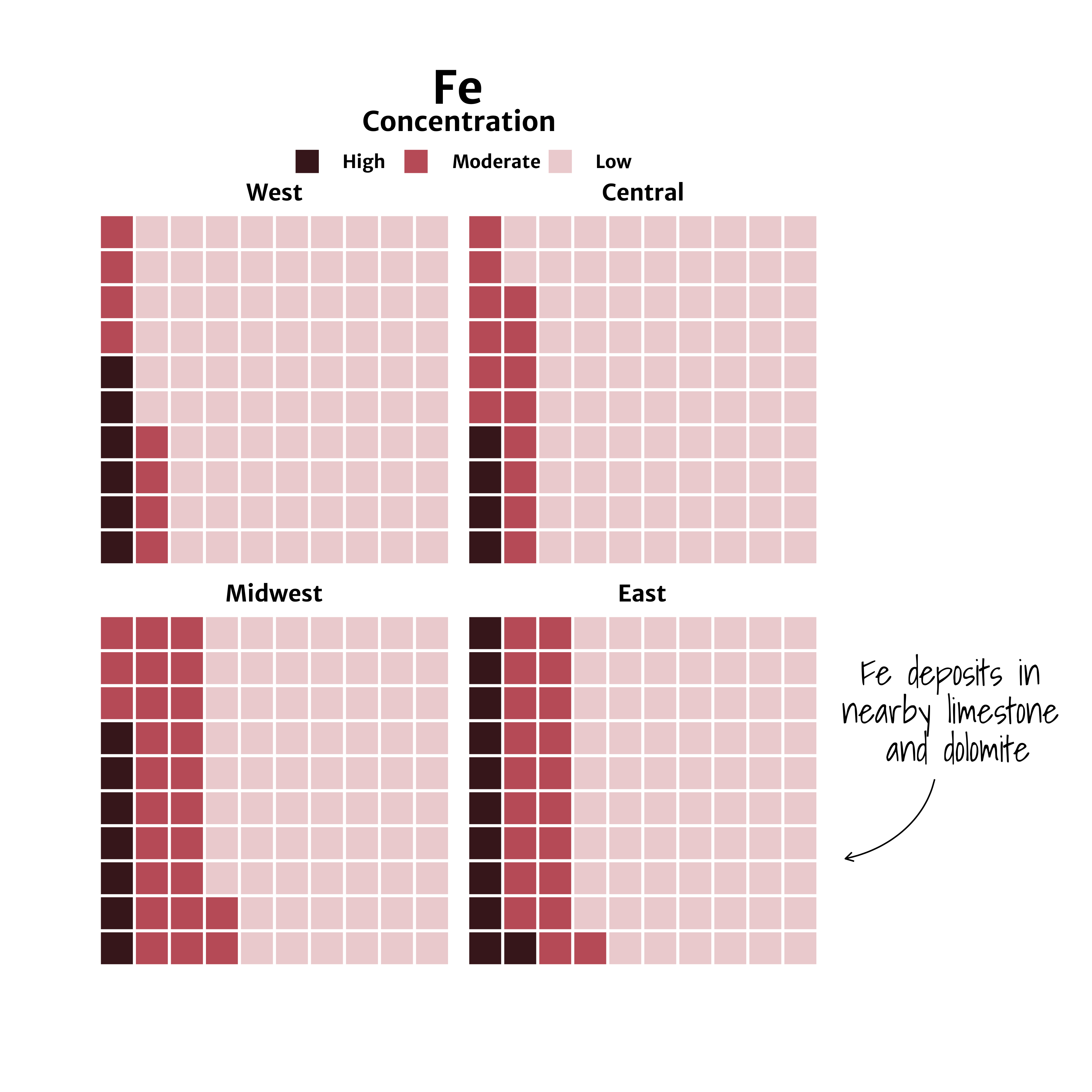
A waffle chart of Iron (Fe) groundwater contaminant concentrations faceted by region (West, Central, Midwest, East).
Background on geom_curve
geom_curve is a function included in the ggplot2 package developed by Wickham et al., 2019 that’s part of the tidyverse. For more information on geom_curve (and associated geom_segment function) see the function documentation
.
Add annotations along a curved path with geomtextpath
 A preview of | Using the rnpn package, we will create a histogram of using spring leaf out data from the USA National Phenology Network
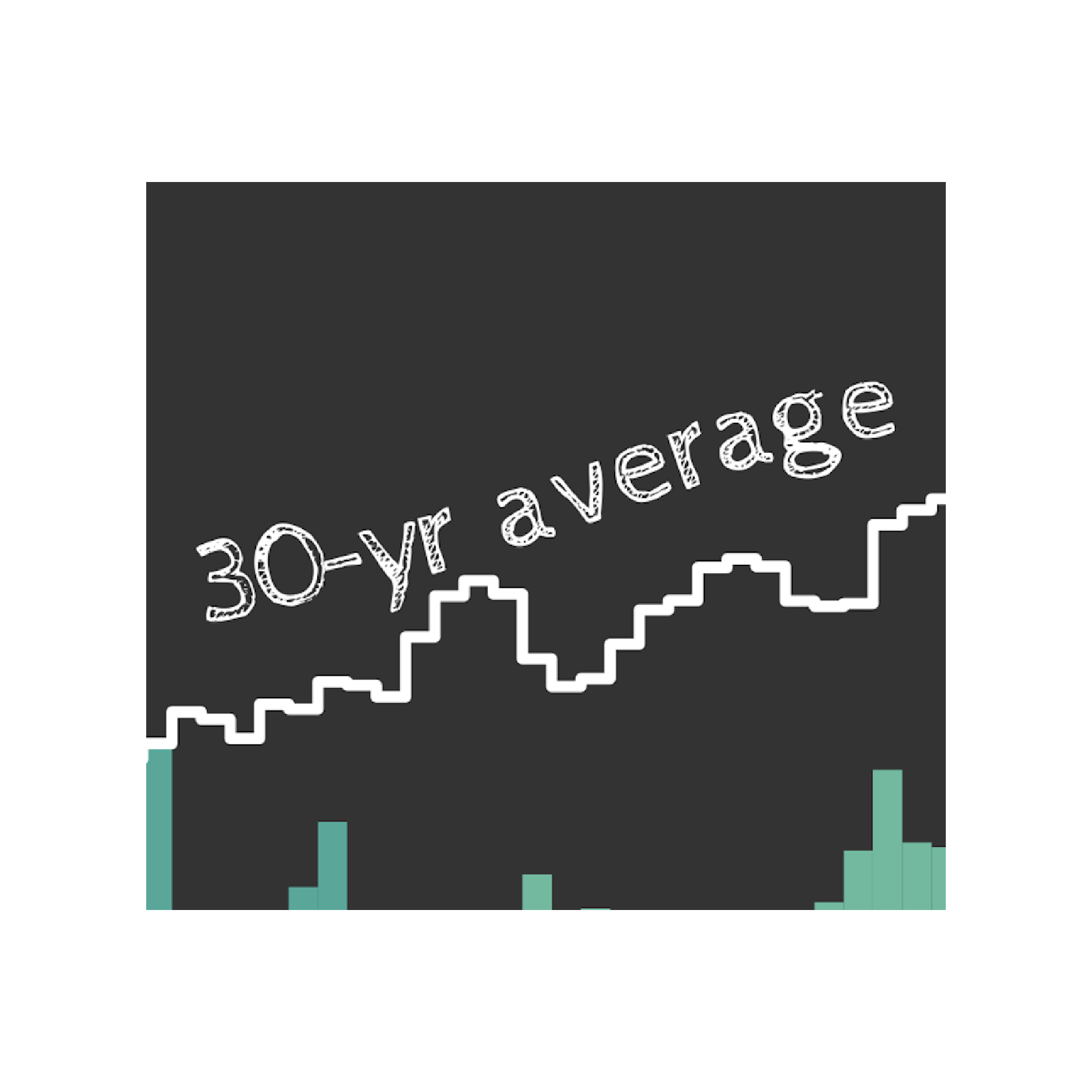
as of May 18, 2023, across CONUS. geomtextpath is used to label directly along a line, which can be seen in the example image to the left. Additional use cases of geomtextpath include adding labels to map contour lines, rivers and roads, trendlines and more. |
geomtextpath wrangling steps
library(rnpn)
library(terra)
library(raster)
library(sf)
library(colorspace)
library(cowplot)
library(geomtextpath)
library(lubridate)
library(spData)

# Set projection
proj_aea <- "+proj=aea +lat_1=29.5 +lat_2=45.5 +lat_0=37.5 +lon_0=-96 +x_0=0 +y_0=0 +ellps=GRS80 +datum=NAD83 +units=m no_defs"

# Load chalkboard style font
font_fam <-'Cabin Sketch'
title_fam <- 'Cabin Sketch'
sysfonts::font_add_google(title_fam, regular.wt = 400, bold.wt = 700)
showtext::showtext_opts(dpi = 300)
showtext::showtext_auto(enable = TRUE)

# Creates a list of all the geospatial layers available through rnpn package
npn_layers <- rnpn::npn_get_layer_details()

# Date to pull most recent data for in "YYYY-MM-DD" format
today <- as.Date("2023-05-18")
year <- lubridate::year(today)

#' Fetch National Phenology network data and save as tiff
#' @param layer_name chr string, the title of the layer to fetch
#' @param npn_layers layers available from rnpn
#' @param layer_date date obj, latest date to use in viz
get_npn_layer <- function(layer_name, npn_layers, layer_date){

  layer_id <- npn_layers |>
    filter(title == layer_name)  |>
    pull(name)

  if(is.null(layer_date)){
    label_date <- 'avg'
  } else{
    label_date <- layer_date
  }
  file_out <- gsub(':', '_', sprintf('static/ggplot-extensions/%s_%s.tiff', layer_id, label_date))
  npn_download_geospatial(coverage_id = layer_id,
                          date = layer_date,
                          format = 'geotiff',
                          output_path = file_out
  )

  return(file_out)
}

# Leaf out anomaly for current  year
daily_anomaly <- get_npn_layer(layer_name = "Spring Indices, Daily Anomaly - Daily Spring Index Leaf Anomaly",
                               npn_layers,
                               layer_date = today)
# Timing of Spring Leaf out
daily_timing <- get_npn_layer(layer_name = "Spring Indices, Current Year - First Leaf - Spring Index",
                              npn_layers,
                              layer_date = today)
# Historic First leaf date
hist_data <- get_npn_layer(layer_name = "Spring Indices, 30-Year Average - 30-year Average SI-x First Leaf Date",
                           npn_layers,
                           layer_date = NULL)

# Prep raster data - round to integers, calculate raster area, convert to df
munge_npn_data <- function(current_timing, proj, year){
  anomaly_rast <- rast(current_timing)  |>
    project(y = proj)

  # Round to day
  values(anomaly_rast) <- round(values(anomaly_rast), 0)

  # Calculate area of each grid cell
  anom_area <- cellSize(anomaly_rast, unit = "km")
  anom_stack<- stack(c(anomaly_rast, anom_area))

  # Convert to df
  anom_df <- anom_stack |>
    as.data.frame(xy = TRUE) |>
    # by default cell values are assigned to 3rd col, after x & y coords
    rename(timing_day = 3) |>
    mutate(timing_day = round(timing_day, 0),
           year = year) |>
    filter(!is.na(timing_day))
}

# Current date anomaly from 30-yr record
spring_timing <- munge_npn_data(daily_timing, proj_aea, year)
# 30-yr historic average
hist_timing <- munge_npn_data(hist_data, proj_aea, year)
spring_anomaly <- munge_npn_data(daily_anomaly, proj_aea, year)

# Calculate daily area "in spring" from current & historical data
find_daily_area <- function(spring_timing, year){
  # Calculate daily area "in spring"
  anom_hist <- spring_timing |>
    group_by(timing_day) |>
    summarize(area = sum(area)) |>
    mutate(date = as.Date(sprintf('%s-01-01', year))+timing_day-1) |>
    mutate(total = cumsum(area))

  # Expand date range in data to extend from Jan 1 to July
  anom_full <- tibble(date = seq.Date(as.Date(sprintf('%s-01-01', year)),
                                      as.Date(sprintf('%s-07-05', year)), by = 1)) |>
    left_join(anom_hist) |>
    # Assign an area of '0' to dates before the first day of spring to draw chart
    mutate(area = ifelse(date < min(anom_hist$date), 0, area),
           timing_day = as.numeric(lubridate::yday(date)))
}

# Calculate daily area "in spring" from current
current_spring_area <- find_daily_area(spring_timing, year)
# Calculate daily area "in spring" from historical
hist_spring_area <- find_daily_area(hist_timing, year)

# Create a tibble to define color palette for time in leaf out map and chart
pal_df <- tibble(
  date = seq.Date(as.Date(sprintf('%s-01-17', year)),
                  as.Date(sprintf('%s-06-16', year)), length.out = 11),
  timing_day = lubridate::yday(date),
  # breaks for ~2 weeks per color with longer tails
  color = c(colorspace::sequential_hcl(10, "BluYl"), "#fffff3"))

# Time frame
all_dates <- seq.Date(as.Date('2023-01-06'), today, by = '1 day')

# Find day with greatest area
area_max <- current_spring_area |>
  arrange(desc(area)) |>
  head(1)

spring_area_today <- current_spring_area |>
  filter(timing_day <= lubridate::yday(all_dates))

# CONUS basemap
state_map <- spData::us_states |> st_transform(proj_aea)

# Annotate when more than 50% of country is in spring
total_area <- units::set_units(sum(st_area(state_map)), km^2)
half_spring <- current_spring_area |>
  filter(total > as.numeric(total_area/2)) |>
  arrange(timing_day) |>
  head(1)
library(rnpn)
library(terra)
library(raster)
library(sf)
library(colorspace)
library(cowplot)
library(geomtextpath)
library(lubridate)
library(spData)

# Create histogram of spring timing by area for current and historic data
plot <- current_spring_area |>
  ggplot() +
  # bars for fill to allow gradient color scale through time
  geom_bar(
  data = spring_area_today,
           stat = 'identity',
           aes(x = date, y = area, fill = timing_day),
           color = NA, width = 1, alpha = 1
           ) +
  geom_segment(aes(x = min(date), xend = min(date), y = 0, yend = 360000),
    color = 'white', linetype = 'dotted', linewidth = 0.5) +
  geom_text(aes(x = min(date), y = 360000,
                label = 'Area'),
            hjust = 0, vjust = 0, family = font_fam,
            color = 'white', size = 8) +

  # Add annotation to historic line that follows the curve of the line
  geomtextpath::geom_textsmooth(data = head(hist_spring_area, 120),
                                aes(x = date, y = area, label = "30-yr average"),
                                color = 'white', size = 8, vjust = -1, hjust = 0.7,
                                family = font_fam,
                                linecolor = NA
  ) +
  # Using tile to make colorbar legend that is parallel to the x-axis
  # Axis doubles as legend for the color ramp - which is also used in map
  # Y and height values need to be adjusted with the scaling of the data
  geom_tile(aes(x=date, y = -5000, height = -10000, fill = timing_day)) +
  # Stepped data showing historic leaf out timing
  geom_step(data = hist_spring_area,
            aes(x = date, y = area),
            direction = 'mid',
            linewidth = 1,
            color = "white"
  ) +
  theme_void() +
  theme(
    plot.background = element_rect(fill = '#333333', color = NA),
    panel.background = element_rect(fill = '#333333', color = NA),
    text = element_text(family = font_fam, color = 'white', hjust = 0, size = 20),
    legend.position = 'none',
    axis.text.x = element_text(vjust = 1),
    axis.ticks = element_line(color = "white", linewidth = 1),
    plot.margin = unit(c(2,2,2,2), "cm")) +
  # Using same color scale as map, set limits so scale mapping is consistent
  scale_color_stepsn(colors = pal_df$color,
                              na.value = NA,
                              show.limits = TRUE,
                              limits = c(1,max(pal_df$timing_day)),
                              breaks = pal_df$timing_day,
                              n.breaks = length(pal_df$color)) +
  scale_fill_stepsn(colors = pal_df$color,
                             na.value = NA,
                             limits = c(1,max(pal_df$timing_day)),
                             breaks = pal_df$timing_day,
                             n.breaks = length(pal_df$color)) +
  scale_x_date(
    expand = c(0,0),
    date_breaks = '1 month',
    date_minor_breaks = "1 week",
    labels = scales::label_date("%b")) +
  # Set y limits to be consistent throughout year as new data comes in
  scale_y_continuous(limits = c(-10000, 370000)) +
  # Add annotation for day with greatest area
  geom_curve(data = area_max,
             aes(xend = date+1, x = date+5,
                 yend = area*1.015, y = area*1.03),
             arrow = grid::arrow(length = unit(0.5, 'lines')),
             curvature = 0.35, angle = 25,
             color = 'white') +
  geom_text(data = area_max,
            aes(x = date+6, y = area*1.03,
                label = sprintf('%s~km^2', round(area, 0))),
            hjust = 0, vjust = 0.5, family = font_fam,
            color = 'white', size = 8, parse = TRUE)

ggsave("geomtextpath.png", width = 16, height = 9)
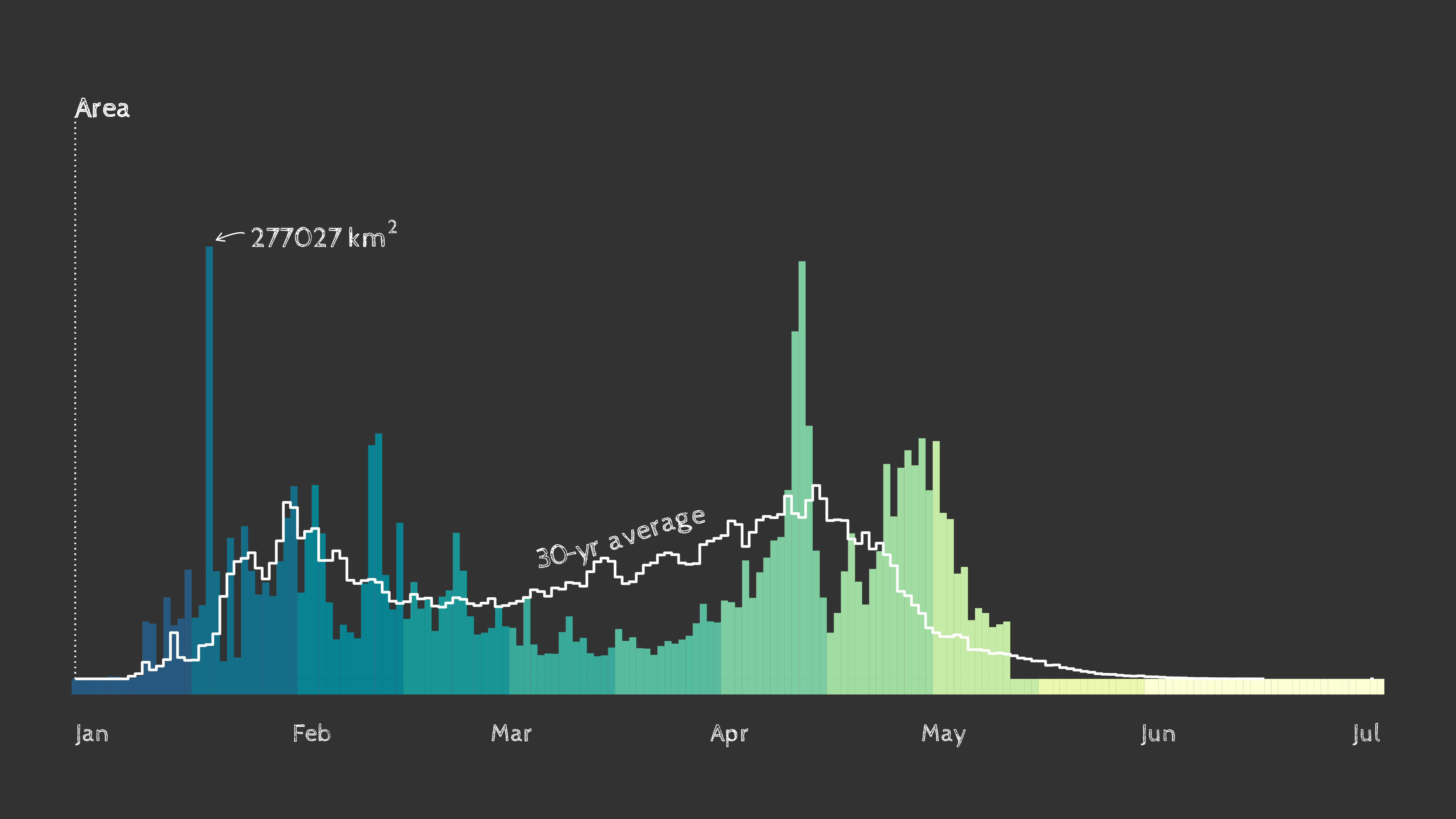
Timing of spring leaf out in the contiguous U.S. as of May 18th, 2023. Data: USA National Phenology Network.
Check out this animated version with a map that displays current spring leaf out timing compared to the 30-year average with data from USA National Phenology Network.
Background on geomtextpath
geomtextpath is a package developed by Allan Cameron and Teun van den Brand. This package makes use of existing text-based geom layers in ggplot (i.e. geom_text and geom_label) and allows users to supply text that can follow any path. For more information on geomtextpath see the package documentation
.
Apply filters and shaders on ggplot2 layers
You may have seen our reoccurring flow percentile visualizations that are shared out every month! These visualizations make use of the ggfx package to add a shadow effect to the faceted state tile map and the national level tile. To create the national level streamflow conditions visualization, check out this repository
.
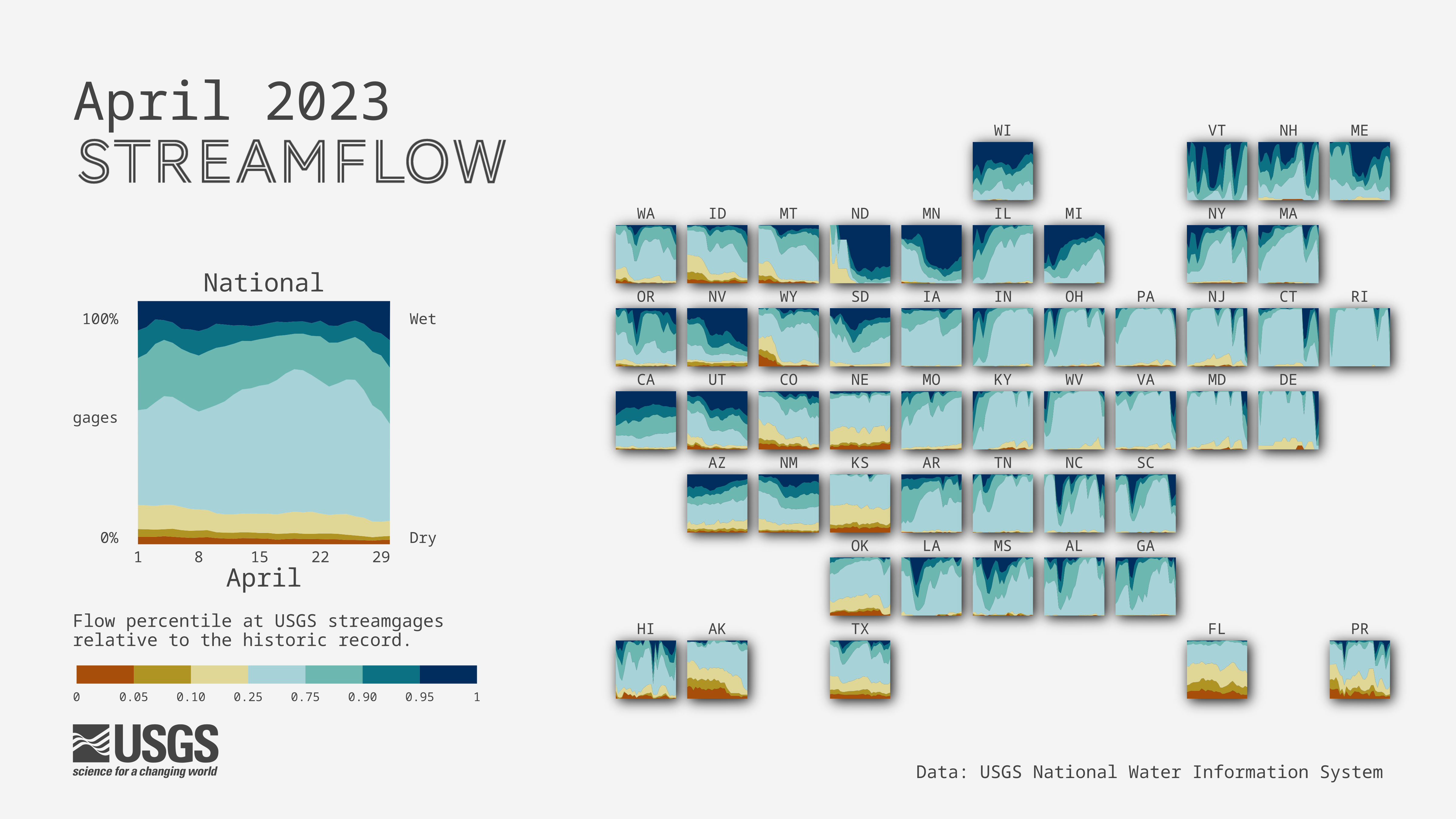
April 2023 streamflow conditions across the United States. Data: USGS Water Data for the Nation.
For this example, we will use the ggfx package to plot streamflow percentiles at USGS streamgages relative to the historic record across California for the month of April. The cartogram will contain a shadow effect using ggfx::with_shadow() demonstrated below.
ggfx wrangling steps
library(lubridate) # for data munging
library(ggfx) # for adding shader effects

# set colors labels
pal_wetdry <- c("#002D5E", "#0C7182", "#6CB7B0", "#A7D2D8", "#E0D796", "#AF9423", "#A84E0B")
percentile_breaks = c(0, 0.05, 0.1, 0.25, 0.75, 0.9, 0.95, 1)
percentile_labels <- c("Driest", "Drier", "Dry", "Normal","Wet","Wetter", "Wettest")

# load data
dv <- read_csv("https://labs.waterdata.usgs.gov/visualizations/data/flow_conditions_202304.csv", col_types = "cTnnnn")

date_start <- as.Date(min(dv$dateTime))
date_end <- as.Date(max(dv$dateTime))+1 # using first date of next month for label positioning

# Bin percentile data
flow <- dv |>
  mutate(date = as.Date(dateTime)) |>
  filter(date >= date_start, date <= date_end, !is.na(per)) |>
  mutate(percentile_bin = cut(per, breaks = percentile_breaks, include.lowest = TRUE),
         percentile_cond = factor(percentile_bin, labels = percentile_labels))

# Find list of all active sites
site_list <- unique(flow$site_no)

# Pull site info (state)
dv_site <- dataRetrieval::readNWISsite(siteNumbers = site_list) |>
  distinct(site_no, state_cd)

# Count the number of sites in states
sites_state <- flow |>
  left_join(dv_site) |>
  group_by(state_cd, date) |>
  summarize(total_gage = length(unique(site_no))) |>
  mutate(fips = as.numeric(state_cd))

# Find the proportion of sites in each flow category by state
flow_state <- flow  |>
  left_join(dv_site) |>  # adds state info for each gage
  group_by(state_cd, date, percentile_cond) |>  # aggregate by state, day, flow condition
  summarize(n_gage = length(unique(site_no))) |>
  left_join(sites_state) |>  # add total_gage
  mutate(prop = n_gage/total_gage) |>  # proportion of gages
  pivot_wider(id_cols = !n_gage, names_from = percentile_cond, values_from = prop, values_fill = 0) |>  # complete data for timepoints with 0 gages
  pivot_longer(cols = c("Normal", "Wet", "Wetter", "Wettest", "Driest", "Drier", "Dry"),
               names_to = "percentile_cond", values_to = "prop")

# Pull fips codes to join state data to grid, filter for California
fips <- maps::state.fips |>
  distinct(fips, abb) |>
  mutate(state_cd = str_pad(fips, 2, "left", pad = "0")) |>
  filter(abb == "CA")
library(lubridate) # for data munging
library(ggfx) # for adding shader effects

# Plot flow timeseries for California
plot_cart <-  flow_state |>
  left_join(fips) |>  # to bind to cartogram grid
  filter(abb == "CA") |>
  ggplot(aes(date, prop)) +
  # add shadowing effect to state level facets
  ggfx::with_shadow(
    geom_area(aes(fill = percentile_cond)),
    colour = "black",
    x_offset = 48,
    y_offset = 48,
    sigma = 24) +
  scale_fill_manual(values = rev(pal_wetdry)) +
  scale_x_continuous(expand = c(0.25, 0.25)) +
  scale_y_continuous(trans = "reverse") +
    theme_void() +
    theme(plot.margin = margin(50, 50, 50, 50, "pt"),
          legend.position = 'none') +
  coord_fixed(ratio = 28)

ggsave("ggfx.png", width = 16, height = 9, dpi = 300, bg = "white")
 April 2023 streamflow conditions in California using |  April 2023 streamflow conditions in California with |
Background on ggfx
ggfx is a package developed by Thomas Lin Pedersen that allows the use of various filters and shaders on ggplot2 layers. For more information on ggfx see the package documentation
.
Add shapes with ggimage
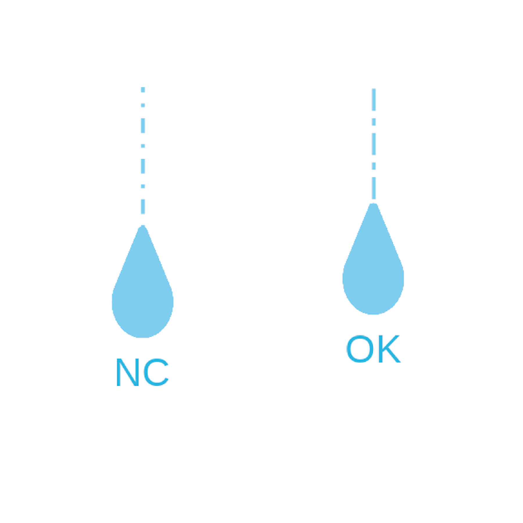 A preview of raindrop images mapped using | Designed to enhance data visualization capabilities by incorporating images into ggplot2 plots, ggimage allows users to map images to aesthetic elements such as points, bars, or polygons, providing a visually appealing way to represent data. Here, we will plot raindrop images using data from Heris et al., 2021
, to display mean rainfall intercepted by urban trees, with larger raindrops indicating states with greater urban tree interception. |
ggimage wrangling steps
# Download rain file from SB (using sbtools::authenticate_sb())
library(sbtools)
# sbtools::authenticate_sb()

rain_file_in <- "static/ggplot-extensions/Rainfall_allDfsLandcover_processe_2016_urbanAreas_v4.csv"
if(!file.exists(rain_file_in)){ # if files don't exist, download
  sbtools::item_file_download(sb_id = "5f6e4cf282ce38aaa24a4bd5",
                              names = "Rainfall_allDfsLandcover_processe_2016_urbanAreas_v4.csv",
                              destinations = rain_file_in,
                              overwrite_file = FALSE)
}

rain_data <- readr::read_csv(rain_file_in)

# Sum up rainfall interception by state
rain_sum_state <- rain_data |>
  group_by(State) |>
  summarise(sumRainfall = sum(interception_mean),
            totalRainfall = sum(Total_Annual_Canopy_Rainfall),
            meanRainfall = mean(interception_mean)) |>
  arrange(-sumRainfall)
The trick to using ggimage with images that are scaled to data by size is to convert the data scale to something that is on the graphing scale. There are a couple ways to do this: one is to simply divide or multiply the size argument within the ggplot geometry call by a constant value (e.g., geom_image(aes(size = I(data_value/3)))). This works well for data that are relatively uniform in distribution (i.e., not skewed).
In the example here, mean rainfall intercepted by urban trees is very skewed, so we will use the quantiles of the values to transform the icon sizes into visually cohesive values (while still mapping to the real values). Otherwise, the states with relatively lower values of rainfall interception would be invisibly small and the values with higher rainfall would cover the whole plot.
# Download rain file from SB (using sbtools::authenticate_sb())
library(sbtools)
# sbtools::authenticate_sb()

# Calculate the quantiles of the mean rainfall
rain_quantiles <- quantile(x = rain_sum_state$meanRainfall,
                           # probabilities of 0.1, 0.3, 0.5, 0.7, 0.9
                           probs = seq(0.1, 0.9, by = 0.2))

# Linetypes to randomly select from
linetypes <- c("dashed", "dotted", "dotdash", "longdash", "twodash",
              "1F", "4C88C488", "12345678")

# Create a lookup table to add in State Abbreviations including DC
state_lookup <- data.frame(State = c(state.name, "District Of Columbia"),
                           State.abbr = c(state.abb, "DC"))

# Add a new column of icon sizes based on quantile breaks
set.seed(34684) # so that random sampling of linetypes will be reproducible
plotting_rain <- rain_sum_state |>
  mutate(image_size = case_when(meanRainfall <= rain_quantiles[1] ~ 0.005,
                                meanRainfall <= rain_quantiles[2] ~ 0.008,
                                meanRainfall <= rain_quantiles[3] ~ 0.011,
                                meanRainfall <= rain_quantiles[4] ~ 0.014,
                                meanRainfall <= rain_quantiles[5] ~ 0.017,
                                meanRainfall > rain_quantiles[5] ~ 0.02,
                                TRUE ~ NA_real_),
         # randomly sampling linetypes
         linetype = sample(linetypes, n(), replace = TRUE)) |>
  # Left-joining state abbreviations
  left_join(state_lookup, by = "State")

# Create the baseplot
rain_plot <- ggplot(data = plotting_rain,
                    aes(x = State, y = meanRainfall)) +
  # Line graph that shows mean rainfall from top
  geom_linerange(aes(ymin = 0, ymax = meanRainfall, linetype = linetype),
                 color = "#7FCDEE") +
  # Scatter plot with raindrop images as points
  ggimage::geom_image(aes(size = I(image_size),
                          # The I() above allows ggimage to read values "as-is"
                          image = 'https://labs.waterdata.usgs.gov/visualizations/23_chart_challenge/raindrop.png'),
                      # Aspect ratio
                      asp = 1.9
  ) +
  # Adding text to indicate which state is which. Added a bit of a buffer so that
  # labels will appear equidistant from images, even though images are all sized
  # differently.
  geom_text(aes(label = State.abbr, y = meanRainfall + (image_size*2000000)),
            size = 4,
            color = "#38B5DF",
            vjust = 2) +
  # Reversing y-scale so that the rain "falls" down from top
  scale_y_reverse() +
  ylab("Mean Annual Intercepted Rainfall (cubic meters)") +
  theme_minimal() +
  theme(legend.position = "none",
        axis.title.x = element_blank(),
        axis.text.x = element_blank(),
        panel.grid.major.x = element_blank(),
        panel.grid.minor.x = element_blank(),
        axis.text.y = element_text(size = 10, color = "#333333"),
        axis.title.y = element_text(size = 16, color = "#333333", margin = margin(r = 20)))

ggsave("ggimage.png", width = 16, height = 9, dpi = 300, bg = "white")
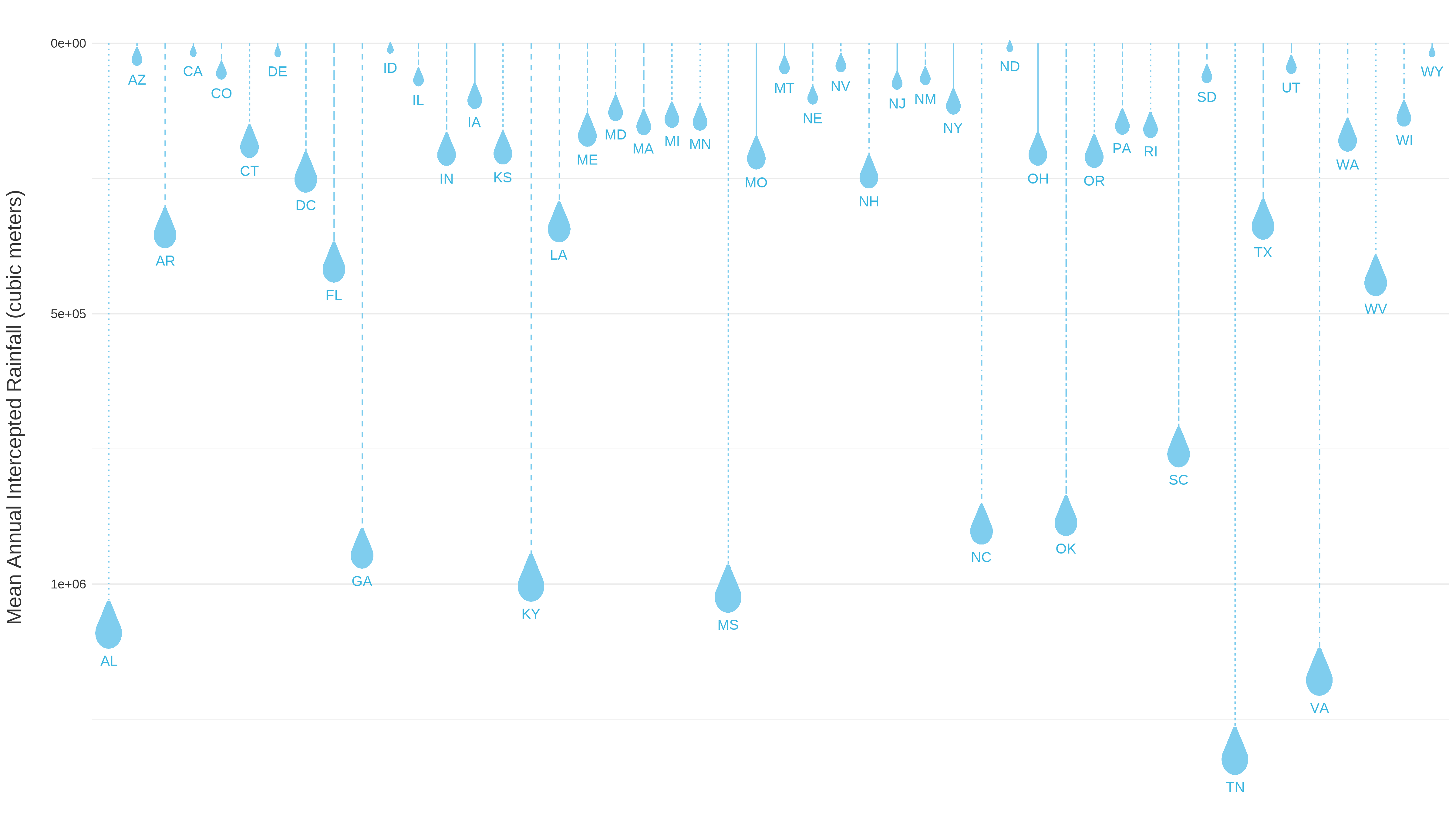
Scatter plot with raindrop points showing mean annual intercepted rainfall (cubic meters) across CONUS.
Background on ggimage
ggimage is a package developed by Guangchuang Yu that supports image files and graphic objects to be visualized in ggplot2 graphic system. For more information on ggimage see the package documentation
.
Highlight geom elements with gghighlight
 A preview of | Using the gghighlight package in conjunction with ggplot2, we’ll now plot snow water equivalent
data for a snow monitoring site in the Sierra Mountains of California. These data are from the U.S. Department of Agriculture Natural Resources Conservation Service Snow Telementry (SNOTEL) network, accessed using the snotelr package
. We’ll use gghighlight to highlight the data for water year
2023, which began October 1, 2022 and will continue until September 30, 2023. The image to the left previews gghighlight functionality by highlighting 2023 snow water equivalent, compared to 32 years of historic data (shown in gray). |
gghighlight wrangling steps
library(snotelr) # To download data from SNOTEL network
library(gghighlight)

# Download data for SNOTEL site 574
# See https://www.nrcs.usda.gov/wps/portal/wcc/home/quicklinks/imap for map of
# SNOTEL sites
site_data <- snotelr::snotel_download(site_id = 574, internal = TRUE)

# Munge data, converting units, determining water year, and setting up a plot
# ate variable
munged_snotel_data <- site_data |>
  mutate(snow_water_equivalent_in = snow_water_equivalent*(1/25.4),
         elev_ft = elev*(1/0.3048),
         date = as.Date(date),
         month = month(date),
         year = year(date),
         # determine water year, for grouping
         wy = case_when(
           month > 9 ~ year + 1,
           TRUE ~ year
         ),
         # fake date for plotting water year on x-axis
         plot_date = case_when(
           month > 9 ~ update(date, year = 2021),
           TRUE ~ update(date, year = 2022)
         ),
         .after = date)
library(snotelr) # To download data from SNOTEL network
library(gghighlight)

snotel_plot <- ggplot(munged_snotel_data) +
  geom_line(aes(x = plot_date, y = snow_water_equivalent_in, group = wy),
            color = 'dodgerblue2', lwd = 0.5) +
  # Highlight timeseries line for WY 2023
  # specify color for unhighlighted lines and for highlighted line label
  gghighlight::gghighlight(wy == 2023,
                           unhighlighted_params = list(color = 'grey90'),
                           label_params = list(color = "dodgerblue2", size = 5,
                           # nudge text label based on desired placement
                                               nudge_y = 6, nudge_x = 13,
                                               min.segment.length = Inf)) +
  scale_x_date(date_labels = "%b %d", expand = c(0,0)) +
  theme_minimal() +
  ylab('Snow water equivalent (inches)') +
  theme(
    axis.title.x = element_blank(),
    panel.grid.minor = element_blank(),
    axis.text = element_text(size = 10),
    axis.title.y = element_text(size = 14),
    plot.subtitle = element_text(size = 14),
    plot.title = element_text(size = 18, face = 'bold')
  ) +
  labs(
    title = sprintf('Snow water equivalent at the %sSNOTEL site, %s - %s',
                    str_to_title(unique(munged_snotel_data$site_name)),
                    min(munged_snotel_data$wy),
                    max(munged_snotel_data$wy)),
    subtitle = sprintf('%s county, %s. Elevation: %s feet',
                       unique(munged_snotel_data$county),
                       unique(munged_snotel_data$state),
                       round(unique(munged_snotel_data$elev_ft))))

ggsave("gghighlight.png", plot = snotel_plot, width = 9,
       height = 5, dpi = 300, bg = "white")
Snow water equivalent at the Leavitt Lake SNOTEL site in Mono County, California from 1990-2023.
Background on gghighlight
gghighlight is a package developed by Hiroaki Yutani that can be used to highlight individual or multiple geometries within a ggplot2 plot. For more information on gghighlight see the package documentation
.
Animate plots with gganimate
We can easily animate the plot we just made by using the gganimate package. By adding just a couple of lines of code, we go from a static plot to a nifty gif!
library(gganimate)

# Add a transition to the plot so that the timeseries line for the highlighted
# year gradually appears
snotel_plot_w_transition <- snotel_plot +
  gganimate::transition_reveal(plot_date)

# Build the animation, pausing on the last frame
animation <- gganimate::animate(snotel_plot_w_transition, end_pause = 20,
                                width = 9, height = 5, units = "in", res = 300)

# Save the animation
gganimate::anim_save("gganimate.gif", animation = animation)
Snow water equivalent at the Leavitt Lake SNOTEL site in Mono County, California from 1990-2023.
Background on gganimate
gganimate is a package developed by Thomas Lin Pedersen and David Robinson that can be used to animate ggplot2 plots. For more information on gganimate see the package documentation
.
Compose data viz with cowplot
As you may notice as you read through this blog, the Vizlab commonly uses cowplot to compose our final data viz. This composition includes not only the ggplot chart but also other common elements like annotation text and arrows, colored backgrounds, and/or images such as logos. We rely heavily on cowplot’s functionality and flexibility when it comes to taking our viz from ggplot to its final, “production-ready” version.
We often start with cowplot composition by first defining the canvas dimensions (example, a common Twitter canvas is 16:9, landscape) and color, the plot margins, and some other common aesthetics such as fonts and color schemes:
library(cowplot)
library(grid)

# Color scheme
background_color = "#DCD5CD"
font_color = "#4A433D"

# Background
canvas <- grid::rectGrob(
  x = 0, y = 0,
  width = 16, height = 9,
  gp = grid::gpar(fill = background_color, alpha = 1, col = background_color)
)

# Margins
plot_margin <- 0.05

# Fonts
font_title <- 'Source Sans Pro'
sysfonts::font_add_google(font_title)
font_annotations <-"Shadows Into Light"
sysfonts::font_add_google(font_annotations)
Then, we use the ggdraw() function to combine the background canvas, plot, annotations, and logo. Here’s a simple template for that:
ggdraw(ylim = c(0,1), # 0-1 bounds make it easy to place viz items on canvas
       xlim = c(0,1)) +
  # a background
  draw_grob(canvas,
            x = 0, y = 1,
            height = 9, width = 16,
            hjust = 0, vjust = 1) +
  # The main plot
  draw_plot(main_plot, # Built upstream with ggplot()
            x = plot_margin,
            y = plot_margin,
            height = 1 - plot_margin) +
  # Title
  draw_label("Title",
             x = plot_margin,
             y = 1 - plot_margin,
             hjust = 0,
             vjust = 1,
             fontfamily = font_title,
             color = font_color,
             size = 55) +
  # Explainer text
  draw_label("Explainer text like the author and/or data source(s)",
             fontfamily = font_annotations,
             x = 1 - plot_margin,
             y = plot_margin,
             size = 14,
             hjust = 1,
             vjust = 0,
             color = font_color) +
  # Add logo
  draw_image('https://labs.waterdata.usgs.gov/visualizations/23_chart_challenge/usgs_logo_black.png',
             x = plot_margin,
             y = plot_margin,
             width = 0.1,
             hjust = 0, vjust = 0,
             halign = 0, valign = 0)

ggsave(file = "cowplot.png", width = 16, height = 9, dpi = 300)
While cowplot is extremely helpful, it can also be a bit frustrating to learn for beginners, so we have compiled a couple tips here and a future blog will go into much more detail. Here are some common tips for beginning cowplot users:
- Some objects, such as
draw_plot()anddraw_text()default to the bottom left coordinates as (x = 0, y = 0) or (0,0). This means that a plot drawn withx = 0.5andy = 0.5would be positioned so that it’s lower left corner is in the center of the canvas. - Other objects, such as
draw_grob(), which is a function used for rendering grid graphical objects (grobs), default to the center of the canvas as (0,0). This means that those placed at (0.5, 0.5) would not be visible on the chart (they would be just off the canvas on the upper right hand side). To get thegrobplaced with its left corner in the plot center, you would need to definex = 0andy = 0. - Try to define your positioning and aesthetic elements (e.g., plot margins, color scheme, font types and sizes, etc) before the
ggdraw()argument so that you any changes in those will be easily reflected throughout the whole cowplotggdraw()call. - For advanced composition, you can use a
purrr::map()function to create text, plot, or grobs that get placed more systematically. This is one of the advanced functions that we’ll highlight in a future blog. For now, there are examples of this in the04_historical_aaarcherand28_trends_msleckmanfolder in the github repository for chart challenge. - Finally, there is a bit of a trick to getting the ggplot text sizes to look good on the final composition with
cowplot. Again, we recommend defining text sizes before building the ggplot items that will go intocowplotso that you can easily iterate those sizes to get your final viz composition looking stellar.
Background on cowplot
cowplot is a package developed by Claus O. Wilke that includes functions to align plots, arrange plots into complex compound figures, annotate plots, and mix plots with images. For more information on cowplot see the package documentation
.
Additional packages for custom chart design
ggpattern- Add custom
ggplot2geoms that support filled areas with geometric and image-based patterns
- Add custom
ggrepel- Supplies geoms for
ggplot2to repel overlapping text labels
- Supplies geoms for
ggthemes- Supplies
ggplot2themes, geoms, and scales
- Supplies
colorBlindness- Simulates color appearance with different color vision deficiencies
scico- Palettes for R based on the Scientific Color-Maps .
Takeaways
The R community is filled with many creative contributors and developers who have helped data visualizations flourish! We hope you enjoyed these useful tricks to jazz up your ggplots by adding custom fonts, arrows, annotations, shapes and even filters/shader options. To view more of our recent data visualizations, check out our blog post on this year’s 30-Day Chart Challenge !
Any use of trade, firm, or product names is for descriptive purposes only and does not imply endorsement by the U.S. Government.
Categories:
Related Posts
Beyond Basic R - Mapping
August 16, 2018
Introduction
There are many different R packages for dealing with spatial data. The main distinctions between them involve the types of data they work with — raster or vector — and the sophistication of the analyses they can do. Raster data can be thought of as pixels, similar to an image, while vector data consists of points, lines, or polygons. Spatial data manipulation can be quite complex, but creating some basic plots can be done with just a few commands. In this post, we will show simple examples of raster and vector spatial data for plotting a watershed and gage locations, and link to some other more complex examples.
Duplicating Quarto elements with code templates to reduce copy and paste errors
May 20, 2025
Introduction
It is a common situation in data science and analysis: We want to create a series of figures, tables, or summary statistics for a set of data. Maybe we’re studying different species of irises or penguins or the current flow conditions for various streamgages (the example used below), and we want a different summary figure or table for each. One common approach is to write code for one set of the data, such as setting up the graphing parameters in a
ggplotdata visualization or calculating a series of statistics for a single species/streamgage. Then, once happy with that, copying and pasting the code for each entity, modifying the code slightly for each iteration.Recreating the U.S. River Conditions animations in R
March 29, 2021
For the last few years, we have released quarterly animations of streamflow conditions at all active USGS streamflow sites . These visualizations use daily streamflow measurements pulled from the USGS National Water Information System (NWIS) to show how streamflow changes throughout the year and highlight the reasons behind some hydrologic patterns. Here, I walk through the steps to recreate a similar version in R.
Exploring ggplot2 boxplots - Defining limits and adjusting style
August 10, 2018
Boxplots are often used to show data distributions, and
ggplot2is often used to visualize data. A question that comes up is what exactly do the box plots represent? Theggplot2box plots follow standard Tukey representations, and there are many references of this online and in standard statistical text books. The base R function to calculate the box plot limits isboxplot.stats. The help file for this function is very informative, but it’s often non-R users asking what exactly the plot means. Therefore, this post breaks down the calculations into (hopefully!) easy-to-follow chunks of code for you to make your own box plot legend if necessary. Some additional goals here are to create boxplots that come close to USGS style. Features in this post take advantage of enhancements toggplot2in version 3.0.0 or later.Beyond Basic R - Plotting with ggplot2 and Multiple Plots in One Figure
August 9, 2018
R can create almost any plot imaginable and as with most things in R if you don’t know where to start, try Google. The Introduction to R curriculum summarizes some of the most used plots, but cannot begin to expose people to the breadth of plot options that exist.There are existing resources that are great references for plotting in R: