
Calculating Moving Averages and Historical Flow Quantiles
Using the R-packages dataRetrieval, dplyr, and ggplot2, a simple discription on how to create a moving-average plot with historical flow quantiles.
This post will show simple way to calculate moving averages, calculate historical-flow quantiles, and plot that information. The goal is to reproduce the graph at this link: PA Graph. The motivation for this post was inspired by a USGS colleague that that is considering creating these type of plots in R. We thought this plot provided an especially fun challenge - maybe you will, too!
First we get the data using the dataRetrieval package. The siteNumber and parameterCd could be adjusted for other sites or measured parameters. In this example, we are getting discharge (parameter code 00060) at a site in PA.
It may be important to note that this script is a bit lazy in handling leap days.
Get data using dataRetrieval
library(dataRetrieval)

#Retrieve daily Q
siteNumber<-c("01538000")
parameterCd <- "00060" #Discharge
dailyQ <- readNWISdv(siteNumber, parameterCd)
dailyQ <- renameNWISColumns(dailyQ)
stationInfo <- readNWISsite(siteNumber)
Calculate moving average
Next, we calculate a 30-day moving average on all of the flow data:
library(dplyr)

#Check for missing days, if so, add NA rows:
if(as.numeric(diff(range(dailyQ$Date))) != (nrow(dailyQ)+1)){
  fullDates <- seq(from=min(dailyQ$Date),
                   to = max(dailyQ$Date), by="1 day")
  fullDates <- data.frame(Date = fullDates,
                          agency_cd = dailyQ$agency_cd[1],
                          site_no = dailyQ$site_no[1],
                          stringsAsFactors = FALSE)
  dailyQ <- full_join(dailyQ, fullDates,
                      by=c("Date","agency_cd","site_no")) %>%
    arrange(Date)
}

ma <- function(x,n=30){stats::filter(x,rep(1/n,n), sides=1)}

dailyQ <- dailyQ %>%
  mutate(rollMean = as.numeric(ma(Flow)),
         day.of.year = as.numeric(strftime(Date,
                                           format = "%j")))
Calculate historical percentiles
We can use the quantile function to calculate historical percentile flows. Then use the loess function for smoothing. The argument smooth.span defines how much smoothing should be applied. To get a smooth transistion at the start of the graph, we can add include an earlier year which is not plotted at the end.
summaryQ <- dailyQ %>%
  group_by(day.of.year) %>%
  summarize(p75 = quantile(rollMean, probs = .75, na.rm = TRUE),
            p25 = quantile(rollMean, probs = .25, na.rm = TRUE),
            p10 = quantile(rollMean, probs = 0.1, na.rm = TRUE),
            p05 = quantile(rollMean, probs = 0.05, na.rm = TRUE),
            p00 = quantile(rollMean, probs = 0, na.rm = TRUE))

current.year <- as.numeric(strftime(Sys.Date(), format = "%Y"))

summary.0 <- summaryQ %>%
  mutate(Date = as.Date(day.of.year - 1,
                        origin = paste0(current.year-2,"-01-01")),
         day.of.year = day.of.year - 365)
summary.1 <- summaryQ %>%
  mutate(Date = as.Date(day.of.year - 1,
                        origin = paste0(current.year-1,"-01-01")))
summary.2 <- summaryQ %>%
  mutate(Date = as.Date(day.of.year - 1,
                        origin = paste0(current.year,"-01-01")),
         day.of.year = day.of.year + 365)

summaryQ <- bind_rows(summary.0, summary.1, summary.2)

smooth.span <- 0.3

summaryQ$sm.75 <- predict(loess(p75~day.of.year, data = summaryQ, span = smooth.span))
summaryQ$sm.25 <- predict(loess(p25~day.of.year, data = summaryQ, span = smooth.span))
summaryQ$sm.10 <- predict(loess(p10~day.of.year, data = summaryQ, span = smooth.span))
summaryQ$sm.05 <- predict(loess(p05~day.of.year, data = summaryQ, span = smooth.span))
summaryQ$sm.00 <- predict(loess(p00~day.of.year, data = summaryQ, span = smooth.span))

summaryQ <- select(summaryQ, Date, day.of.year,
                   sm.75, sm.25, sm.10, sm.05, sm.00) %>%
  filter(Date >= as.Date(paste0(current.year-1,"-01-01")))

latest.years <- dailyQ %>%
  filter(Date >= as.Date(paste0(current.year-1,"-01-01"))) %>%
  mutate(day.of.year = 1:nrow(.))
Plot using base R
Many of the graphical requirements defined by the USGS are difficult to achieve in ggplot2. Base R plotting can be used to obtain these types of graphs:
title.text <- paste0(stationInfo$station_nm,"\n",
        "Provisional Data - Subject to change\n",
        "Record Start = ", min(dailyQ$Date),
        "  Number of years = ",
        as.integer(as.numeric(difftime(time1 = max(dailyQ$Date),
        time2 = min(dailyQ$Date),
        units = "weeks"))/52.25),
        "\nDate of plot = ",Sys.Date(),
        "  Drainage Area = ",stationInfo$drain_area_va, "mi^2")

mid.month.days <- c(15, 45, 74, 105, 135, 166, 196, 227, 258, 288, 319, 349)
month.letters <- c("J","F","M","A","M","J","J","A","S","O","N","D")
start.month.days <- c(1, 32, 61, 92, 121, 152, 182, 214, 245, 274, 305, 335)
label.text <- c("Normal","Drought Watch","Drought Warning","Drought Emergency")

summary.year1 <- data.frame(summaryQ[2:366,])
summary.year2 <- data.frame(summaryQ[367:733,])

plot(latest.years$day.of.year, latest.years$rollMean,
     ylim = c(1, 1000), xlim = c(1, 733),
     log="y", axes=FALSE, type="n", xaxs="i",yaxs="i",
     ylab = "30-day moving ave",
     xlab = "")
title(title.text, cex.main = 0.75)
polygon(c(summary.year1$day.of.year,rev(summary.year1$day.of.year)),
        c(summary.year1$sm.75, rev(summary.year1$sm.25)),
        col = "darkgreen", border = FALSE)
polygon(c(summary.year2$day.of.year,rev(summary.year2$day.of.year)),
        c(summary.year2$sm.75, rev(summary.year2$sm.25)),
        col = "darkgreen", border = FALSE)
polygon(c(summary.year1$day.of.year,rev(summary.year1$day.of.year)),
        c(summary.year1$sm.25, rev(summary.year1$sm.10)),
        col = "yellow", border = FALSE)
polygon(c(summary.year2$day.of.year,rev(summary.year2$day.of.year)),
        c(summary.year2$sm.25, rev(summary.year2$sm.10)),
        col = "yellow", border = FALSE)
polygon(c(summary.year1$day.of.year,rev(summary.year1$day.of.year)),
        c(summary.year1$sm.10, rev(summary.year1$sm.05)),
        col = "orange", border = FALSE)
polygon(c(summary.year2$day.of.year,rev(summary.year2$day.of.year)),
        c(summary.year2$sm.10, rev(summary.year2$sm.05)),
        col = "orange", border = FALSE)
polygon(c(summary.year1$day.of.year,rev(summary.year1$day.of.year)),
        c(summary.year1$sm.05, rev(summary.year1$sm.00)),
        col = "red", border = FALSE)
polygon(c(summary.year2$day.of.year,rev(summary.year2$day.of.year)),
        c(summary.year2$sm.05, rev(summary.year2$sm.00)),
        col = "red", border = FALSE)
lines(latest.years$day.of.year, latest.years$rollMean,
      lwd=2, col = "black")
abline(v = 366)
axis(2, las=1, at=c(1,100, 1000), tck = -0.02)
axis(2, at = c(seq(1,90, by = 10)), labels = NA, tck = -0.01)
axis(2, at = c(seq(100,1000, by = 100)), labels = NA, tck = -0.01)
axis(1, at =  c(mid.month.days,365+mid.month.days),
     labels = rep(month.letters,2),
     tick = FALSE, line = -0.5, cex.axis = 0.75)
axis(1, at = c(start.month.days, 365+start.month.days),
     labels = NA, tck = -0.02)
axis(1, at = c(182,547), labels = c(current.year-1,current.year),
     line = .5, tick = FALSE)
legend("bottom", label.text, horiz = TRUE,
       fill = c("darkgreen","yellow","orange","red"),
       inset = c(0, 0), xpd = TRUE, bty = "n", cex = 0.75)
box()
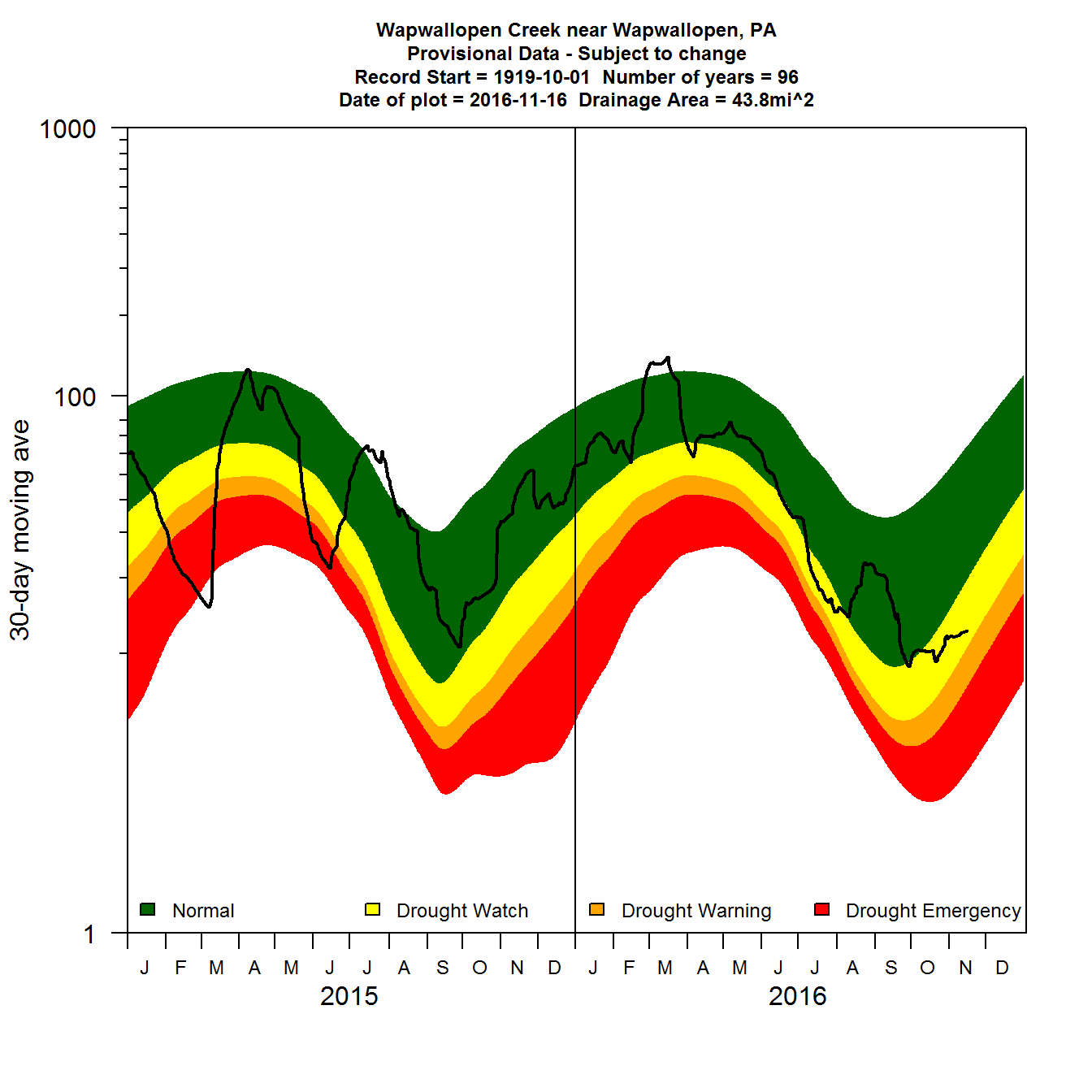
Simple 30-day moving average daily flow plot using base R
Plot using ggplot2
Finally, we can also try to create the graph using the ggplot2 package. The following script shows a simple way to re-create the graph in ggplot2 with no effort on imitating desired style:
library(ggplot2)

simple.plot <- ggplot(data = summaryQ, aes(x = day.of.year)) +
  geom_ribbon(aes(ymin = sm.25, ymax = sm.75, fill = "Normal")) +
  geom_ribbon(aes(ymin = sm.10, ymax = sm.25, fill = "Drought Watch")) +
  geom_ribbon(aes(ymin = sm.05, ymax = sm.10, fill = "Drought Warning")) +
  geom_ribbon(aes(ymin = sm.00, ymax = sm.05, fill = "Drought Emergency")) +
  scale_y_log10(limits = c(1,1000)) +
  geom_line(data = latest.years, aes(x=day.of.year, y=rollMean, color = "30-Day Mean"),size=2) +
  geom_vline(xintercept = 365)

simple.plot
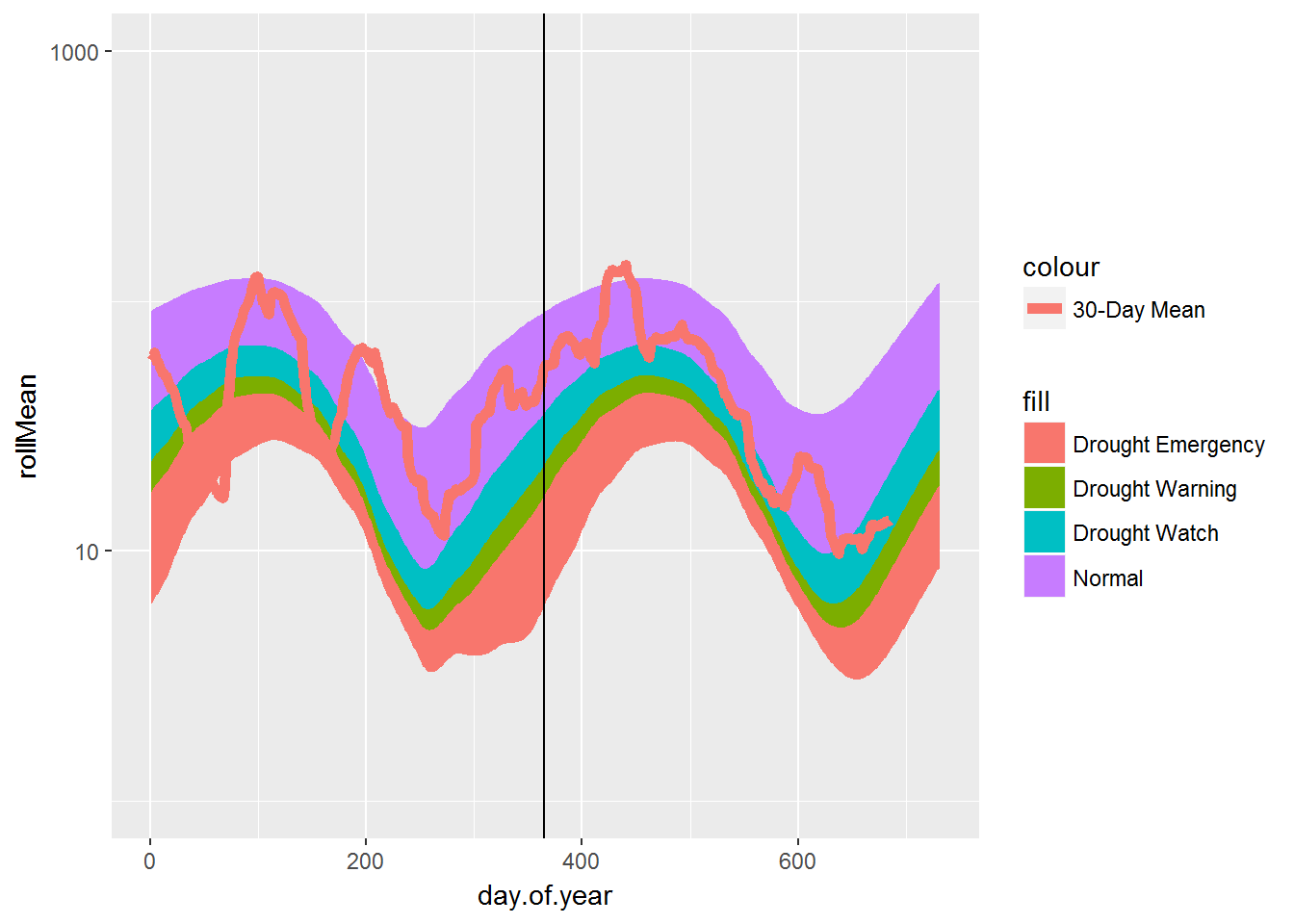
Simple 30-day moving average daily flow plot using ggplot2
Next, we can play with various options to do a better job to imitate the style:
styled.plot <- simple.plot+
  scale_x_continuous(breaks = c(mid.month.days,365+mid.month.days),
                   labels = rep(month.letters,2),
                   expand = c(0, 0),
                   limits = c(0,730)) +
  annotation_logticks(sides="l") +
  expand_limits(x=0) +
  annotate(geom = "text",
           x = c(182,547),
           y = 1,
           label = c(current.year-1,current.year), size = 4) +
  theme_bw() +
  theme(axis.ticks.x=element_blank(),
        panel.grid.major = element_blank(),
        panel.grid.minor = element_blank()) +
  labs(list(title=title.text,
            y = "30-day moving ave", x="")) +
  scale_fill_manual(name="",breaks = label.text,
                    values = c("red","orange","yellow","darkgreen")) +
  scale_color_manual(name = "", values = "black") +
   theme(legend.position="bottom")

styled.plot
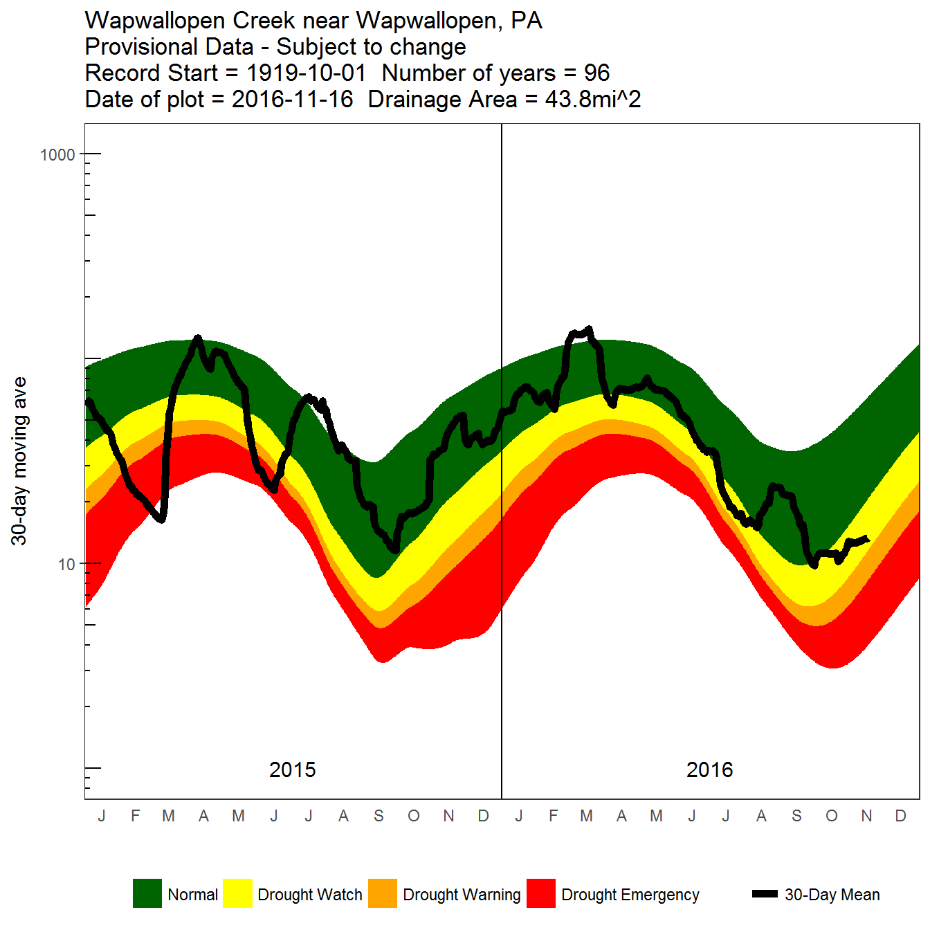
Detailed 30-day moving average daily flow plot
Questions
Please direct any questions or comments on dataRetrieval to: https://github.com/USGS-R/dataRetrieval/issues
Categories:
Keywords:
Related Posts
Using the dataRetrieval Stats Service
October 5, 2016
Introduction This script utilizes the new dataRetrieval package access to the USGS Statistics Web Service. We will be pulling daily mean data using the daily value service in readNWISdata, and using the stats service data to put it in the context of the site’s history.
Using Leaflet and htmlwidgets in a Hugo-generated page
August 23, 2016
We are excited to use many of the JavaScript data visualizations in R using the htmlwidgets package in future posts. Having decided on using Hugo, one of our first tasks was to figure out a fairly straightforward way to incorporate these widgets.
Hydrologic Analysis Package Available to Users
July 26, 2022
A new R computational package was created to aggregate and plot USGS groundwater data, providing users with much of the functionality provided in Groundwater Watch and the Florida Salinity Mapper.
Large sample pulls using dataRetrieval
July 26, 2022
dataRetrieval is an R package that provides user-friendly access to water data from either the Water Quality Portal (WQP) or the National Water Information Service (NWIS).
dataRetrieval Tutorial - Using R to Discover Data
January 8, 2021
R is an open-source programming language. It is known for extensive statistical capabilities, and also has powerful graphical capabilities. Another benefit of R is the large and generally helpful user-community.