
Easy hydrology mapping with nhdplusTools, geoconnex, and ggplot2
Plotting hydrography data has never been easier with the latest versions of nhdplusTools and ggplot2. This blog demonstrates how to fetch and map National Hydrography Dataset (NHD) rivers and waterbodies with several reproducible examples.
What's on this page
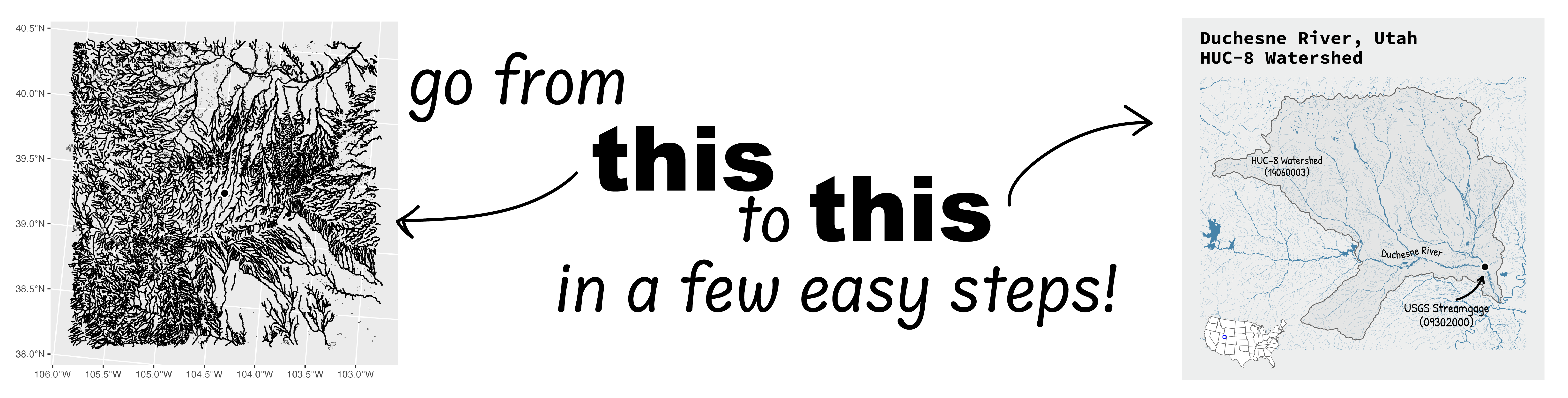
Go from hard-to-read default visuals to easy-to-read river maps in a few easy steps!
Summary
This blog demonstrates how to create maps of USGS National Hydrography Dataset (NHD) lakes and streams using ggplot2 for mapping, USGS packages nhdplusTools and dataRetrieval, and the USGS API service geoconnex. Readers should only need a beginner-level understanding of R to follow along with these reproducible examples.
Background
National Hydrography Data (NHD)
The National Hydrography Dataset (NHD)
is a digital vector dataset used by Geographic Information Systems (GIS) to define the spatial locations of surface waters and is designed to provide comprehensive coverage of surface water data for the U.S. The NHD contains features such as lakes, ponds, streams, rivers, canals, dams, and stream gages in a relational database model system.
In 2024, the USGS shifted from maintaining the National Hydrography Dataset (NHD), the Watershed Boundary Dataset (WBD), and the NHDPlus High-Resolution to production of 3D Hydrography Program products. While these legacy products are no longer updated, they are provided as downloadable products and are useful for general mapping purposes.
Example map of NHD waterbodies in the Potomac River watershed.
Highlights about the main packages we will use for these demos:
- nhdplusTools : We are using v1.3.1, which uses the new Water Data APIs services .
- dataRetrieval
: We are using v2.7.21, which also uses the new Water Data APIs services
. The new services default to downloading the gage data as a spatial feature, which is a great improvement for easy
ggplot2mapping. - ggplot2
: We are using v4.0
, which was just released to CRAN. We use the new features in this latest release to improve some of the mapping steps.
- Note:
ggplot2is automatically loaded when you load thetidyverse(e.g., usinglibrary(tidyverse)).
- Note:
- cowplot : We are using v1.2.0. We use this package to combine maps and annotations into one visual.
- sysfonts
: We are using v0.8.9. This package allows us to add custom fonts to the map. In our examples, we use some free fonts available through Google Fonts
.
- On Macs, you may need to install the fonts
Source Code ProandBradley Handmanually to your Font Book. As of the writing of this blog, you will need to navigate to Google Fonts, search for the fonts listed above, click “get font” in the upper right corner of the page, download the font file, and then pull the.ttffile into your Font Book application.
- On Macs, you may need to install the fonts
- geoconnex
: This is not an R package, but is an API service hosted by USGS that allows
sfto read a hydrologic unit (HUC ) shapefile based on a query from R. This is nice if you are downloading only one or two hydrologic units.- If you want to instead download the entire hydrologic unit network for the whole United States, you can download the geodatabase from ScienceBase
Note: to check your package version, run packageVersion("[package_name]") in R.
A full list of packages needed to reproduce these demonstrations is provided in the next section.
Get prepared to map
How to reproduce these maps: The following examples build on each other, so when you see continued from example above you’ll need to run the code in the previous chunk for the subsequent one to work correctly.
For the code in this post to run, you’ll need to install and load the following packages.
library(tidyverse) # For using general "tidy" syntax throughout + ggplot2
library(sf) # For using spatial features
library(nhdplusTools) # For downloading National Hydrography Datasets
library(dataRetrieval) # For locating USGS streamgages
library(tigris) # For adding state lines and boundaries
library(cowplot) # For plot composition
library(grid) # For adding custom arrow annotation to plot
library(geomtextpath) # For adding curved text to river on plot
library(showtext) # For custom fonts
library(sysfonts) # For custom fonts
library(stringr) # Used to extract text for annotations
Next, we always like to globally define some of our aesthetics, such as colors we’ll be using often, and our plotting parameters for the ggsave()
function. Then, we retrieve these settings for the examples below. Run this chunk of code if you’re planning to follow along.
# colors
river_blue <- "#4783A9" # for waterbodies and river lines
png_bkg <- "#EDEEEE" # an off-white background
text_color <- "black"

# ggsave parameters
png_width <- 5 #inches
png_height <- 5 #inches
dpi <- 300 #dots per inch

# For example 3b with cowplot
plot_margin <- 0.05
Exporting the maps: Run the following ggsave() call after any example to save your plots as a png.
# example of ggsave
ggsave(filename = "out/your_plot_name_here.png",
       plot = plot_name, # leave blank to print last map created
       width = png_width, height = png_height,
       dpi = dpi, units = "in")
Example 1: Map rivers around a point of interest based on coordinates
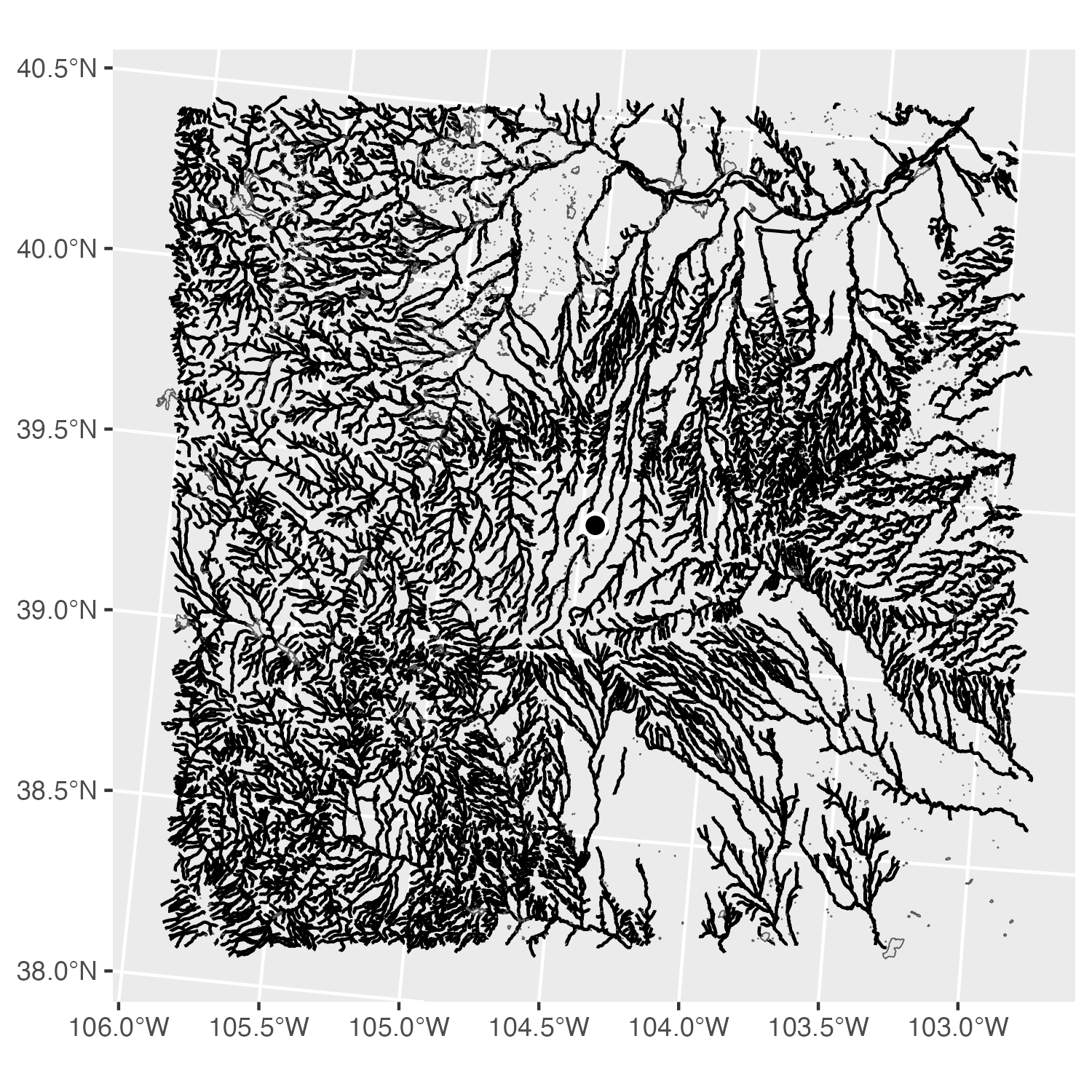
Example 1a: Default ggplot2 map of lakes and streams from the National Hydrography Dataset

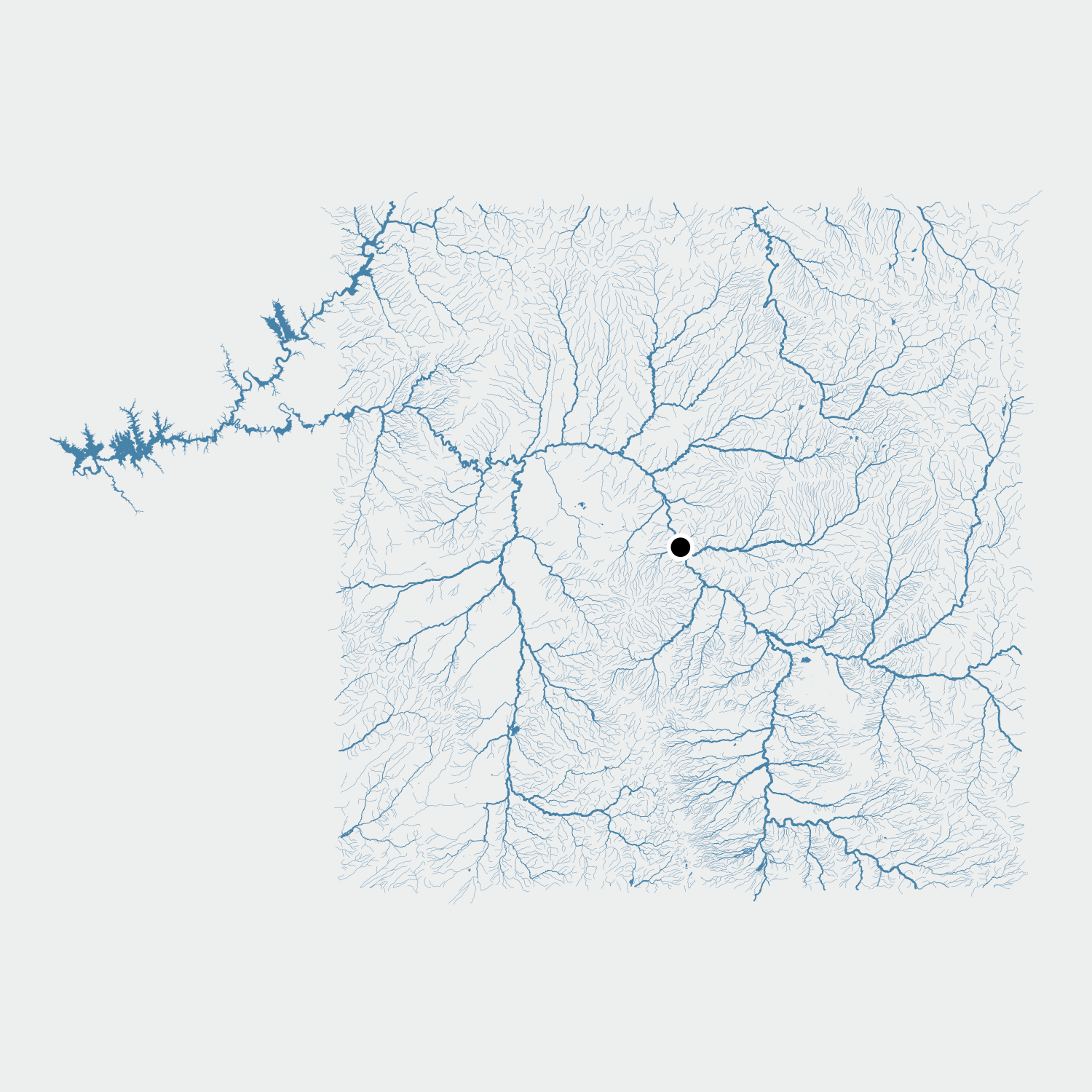
Example 1b: Map with lakes and streams from the National Hydrography Dataset shown in blue using line widths to represent stream order.
Example 1a: Basic map
In this example, we begin with a point of interest based on latitude and longitude coordinates. A square buffer is added around the point to define the mapping extent, area of interest. Using the nhdplusTools package, we retrieve the NHD waterbodies and rivers for the entire area of interest, with the get_nhdplus()
and the get_waterbodies() functions. Finally, we use ggplot2::ggplot() to create the map.
Wait, I downloaded data in a square buffer, so why isn’t the edge a perfect square?
Any NHD features, whether hydrolines or polygons, that fall within your buffer will be fetched. In this example, there are some small features that are partially in the buffer and partially outside it. We're plotting all the fetched data in this example for simplicity. However, you can change your plotting parameters to cut those off the map or even use geospatial functions in R to remove them from your data if you'd like.
# example lat long coordinates in EPSG 4326
simple_coords <- tibble::tibble(
  lat = -104.450226,
  lon = 39.365151
)

# convert coordinates to spatial feature
location_sf <- sf::st_as_sf(simple_coords,
                            coords = c("lat", "lon"),
                            crs = 4326) |>
  # make sure it's projected nicely for plotting
  sf::st_transform(crs = 5070)

# add buffer
location_buffer <- sf::st_buffer(location_sf,
                                 endCapStyle = "SQUARE",
                                 dist = 130000) # distance in meters

# query NHD for flowlines (non high resolution) in buffered area
location_nhd <- nhdplusTools::get_nhdplus(AOI = location_buffer,
                                          realization = "flowline")
location_nhd_wb <- nhdplusTools::get_waterbodies(AOI = location_buffer)

# default ggplot2 map
ggplot(data = location_nhd) +
  geom_sf() +
  geom_sf(data = location_nhd_wb) +
  geom_sf(data = location_sf, color = "white", fill = "black",
  shape = 21, stroke = 1, size = 3)
Example 1b: Mapping streamorder
In this example, we begin with the same steps as above and update it to enhance the appearance of the river network. To make larger, downstream rivers more visually prominent and upstream tributaries smaller, we map the stream order attribute from the NHD dataset to flowline width. We also use color to tie the rivers and waterbodies together while improving the visual hierarchy so that the streamgage location is easier to see.
Note: NHD geometries are fairly high resolution and may be more complex than is needed, depending on the scale and resolution of your map output. Simplifying geometries before plotting can help reduce file sizes and speed up plotting or processing time without any noticeable visual effect. The rmapshaper::ms_simplify() can be used for topologically-aware geometry simplification.
# ... code continued from above (example 1a) ...


# update map by adding nice colors and line thicknesses
ggplot() +
  # hydrolines: map stream order categories to factor labels
  geom_sf(
    data = location_nhd,
    aes(
      linewidth = factor(case_when(
        streamorde >= 5 ~ "major",
        streamorde == 4 ~ "large",
        streamorde == 3 ~ "medium",
        TRUE ~ "small"))
      ),
    color = river_blue) +
  # assign linewidth values using `scale_linewidth_manual()`
  scale_linewidth_manual(
    values = c(
      major = 0.3,
      large = 0.2,
      medium = 0.1,
      small = 0.04),
  # hide legend
    guide = "none") +
  # water bodies
  geom_sf(data = location_nhd_wb, color = river_blue,
    fill  = river_blue, linewidth = 0.01) +
  # dot in the middle for our main location of interest
  geom_sf(data = location_sf, color = "white", fill = "black",
  shape = 21, stroke = 1, size = 3) +
  theme_void()
Example 2: Map rivers around a streamgage
Example 2a: Map of the downloaded National Hydrography Dataset rivers and waterbodies plotted with variable line thicknesses mapped to stream order.
Example 2b: Map of the downloaded National Hydrography Dataset rivers and waterbodies plotted with variable line thicknesses mapped to stream order. The map is updated to include state boundaries, labels, and a zoomed in view.
Example 2a: Basic map
In this example, we start by obtaining a USGS streamgage location in lieu of a set of coordinates. Using the dataRetrieval package, we can download the gage as a simple feature object and transform point into a projection that works well for mapping purposes. Next, we create a square buffer around the gage using a set distance value, which then defines our area of interest. Within this buffered area, we use nhdplusTools to retrieve both flowlines (rivers and streams) and waterbodies (lakes and reservoirs). Finally, we can compile these data layers with ggplot2 with the rivers mapped by stream order so larger downstream channels appear thicker.
# Retrieve a USGS streamgage as an sf
#     This gage is San Juan River at Four Corners, CO
# !! note: if this errors, make sure you have the latest version of dataRetrieval
gage_sf <- dataRetrieval::read_waterdata_monitoring_location(
  monitoring_location_id = "USGS-09371010") |>
  sf::st_transform(crs = 5070)

# add buffer
gage_buffer <- sf::st_buffer(gage_sf,
                             endCapStyle = "SQUARE",
                             dist = 120000) # distance in meters

# query NHD for flowlines (non high resolution) in buffered area
gage_nhd <- nhdplusTools::get_nhdplus(AOI = gage_buffer,
                                      realization = "flowline")
gage_nhd_wb <- nhdplusTools::get_waterbodies(AOI = gage_buffer)

ggplot() +
   # hydrolines: map stream order categories to factor labels
  geom_sf(
    data = gage_nhd,
    aes(
      linewidth = factor(case_when(
        streamorde >= 5 ~ "major",
        streamorde == 4 ~ "large",
        streamorde == 3 ~ "medium",
        TRUE ~ "small"))
      ),
    color = river_blue) +
  # assign linewidth values using `scale_linewidth_manual()`
  scale_linewidth_manual(
    values = c(
      major  = 0.3,
      large  = 0.2,
      medium = 0.1,
      small  = 0.04
    ),
  # hide legend
   guide = "none"
  ) +
  # waterbodies
  geom_sf(data = gage_nhd_wb, color = river_blue,
    fill  = river_blue, linewidth = 0.01) +
  geom_sf(data = gage_sf, color = "white", fill = "black",
  shape = 21, stroke = 1, size = 3) +
  theme_void()
Example 2b: Mapping rivers across state boundaries
In this example, we build on the map above by defining the cartographic elements to be more readable and informative. We start by adding state boundaries, using the tigris package, clipped to our buffered extent so that only relevant states appear on the map. We then label each state using a custom loaded font. Finally, we use coord_sf to zoom in closer to the buffered area, reducing empty margins and keeping the focus on the hydrography and gage location. Together, these additions produce a cleaner, more informative map that situates the streamgage within its broader geographic context.
Note: If your type face appears different on your map, or if you get errors related to the font_title, you may need to install the "Source Code Pro" font manually.
# ... code continued from above (example 2a) ...

# Updated plot with states and labels
# add TIGER/Line states as sf with matching crs
states <- tigris::states(cb = TRUE,
                         resolution = "20m",
                         progress_bar = FALSE) |>
  sf::st_transform(crs = 5070)

# keep only states that touch buffered map
#   (this helps ensure the labels land on the map)
states_clip <- sf::st_intersection(x = states, y = gage_buffer)

# load custom font
font_title <- 'Source Code Pro'
sysfonts::font_add_google(font_title)
showtext::showtext_opts(dpi = dpi, regular.wt = 200, bold.wt = 700)
showtext::showtext_auto(enable = TRUE)

ggplot() +
  # state outlines
  geom_sf(data = states_clip, fill = png_bkg) +
  # hydrolines: map stream order categories to factor labels
   geom_sf(
    data = gage_nhd,
    aes(
      linewidth = factor(case_when(
        streamorde >= 5 ~ "major",
        streamorde == 4 ~ "large",
        streamorde == 3 ~ "medium",
        TRUE ~ "small"))
      ),
    color = river_blue) +
  # assign linewidth values using `scale_linewidth_manual()`
  scale_linewidth_manual(
    values = c(
      major  = 0.3,
      large  = 0.2,
      medium = 0.1,
      small  = 0.04
    ),
  # hide legend
    guide = "none"
  ) +
  # waterbodies
  geom_sf(data = gage_nhd_wb, color = river_blue,
    fill  = river_blue, linewidth = 0.01) +
  # gage location
  geom_sf(data = gage_sf, color = "white", fill = "black",
  shape = 21, stroke = 1, size = 3) +
  # state labels
  geom_sf_text(data = states_clip, aes(label = NAME),
               size = 5, color = "gray20",
               family = font_title, fontface = "bold") +
  # set up zoom to move in on the plot *without* dropping any geometries
  #   we want to zoom in just into the bounding box
  coord_sf(xlim = c(sf::st_bbox(gage_buffer)["xmin"] +12000,
                    sf::st_bbox(gage_buffer)["xmax"] -12000),
           ylim = c(sf::st_bbox(gage_buffer)["ymin"] +12000,
                    sf::st_bbox(gage_buffer)["ymax"] -12000)) +
  theme_void() +
  # use new border feature with ggplot2 v4.0
  theme(
    geom = element_geom(
      borderwidth = 0.5
    )
  )
Example 3: Map a watershed

Example 3a: Map of the Duchesne River HUC-8 Watershed boundary and river network.
Example 3b: Map of the Duchesne River, Utah HUC-8 Watershed boundary and river network with annotations and an inset map.
Example 3a: Basic map
In this example, we expand from plotting rivers and waterbodies around a streamgage to the larger watershed that drains to it. Using the geoconnex service, we query and download the HUC8 basin that contains our gage location, then create a buffered bounding box around that watershed to use as the area of interest. With this extent, we then pull the NHD flowlines and waterbodies along with state boundaries. Finally, we plot the rivers, lakes, watershed boundary, and streamgage. This provides a clear view of how the gage sits within its broader hydrologic unit.
# Retrieve a USGS streamgage as an sf
#     This gage is Duchesne River near Randlett, UT
# !! note: if this errors, make sure you have the latest version of dataRetrieval
gage_sf <- dataRetrieval::read_waterdata_monitoring_location(
  monitoring_location_id = "USGS-09302000")

# Retrieve a USGS river basin (HUC8 level) from geoconnex
# Build URL to query https://geoconnex.us
base_url <- "https://reference.geoconnex.us"
collection <- sprintf("/collections/%s/items?f=json&filter=",
                      "hu08")
query <- sprintf("INTERSECTS(geometry, POINT(%f %f))",
                 sf::st_coordinates(gage_sf)[1, "X"],
                 sf::st_coordinates(gage_sf)[1, "Y"]) |>
  URLencode()
url <- paste0(base_url, collection, query)

read_huc8_sf <- sf::st_read(url, quiet = TRUE)

# fetch sf from url & project to 5070 for buffering/plotting
huc8_sf <- sf::st_transform(read_huc8_sf, crs = 5070)

# buffer for downloading nhd. This time, we want to extract a square
#   around the whole watershed, so need to create bbox first
huc8_bbox <- sf::st_bbox(huc8_sf)
huc8_buffer <- huc8_bbox |>
  # convert to sf
  sf::st_as_sfc() |>
  sf::st_buffer(
    endCapStyle = "SQUARE",
    dist = 24000, # distance in meters
  )

# NHD flowlines in buffer
huc8_nhd <- nhdplusTools::get_nhdplus(AOI = huc8_buffer,
                                      realization = "flowline")
huc8_nhd_wb <- nhdplusTools::get_waterbodies(AOI = huc8_buffer)
# add TIGER/Line states as sf
states <- tigris::states(cb = TRUE,
                         resolution = "20m",
                         progress_bar = FALSE) |>
  sf::st_transform(crs = 5070)

# keep only states that touch buffered map
states_clip <- sf::st_intersection(x = states, y = huc8_buffer)
state_labels <- sf::st_point_on_surface(states_clip)

(riv_basin_zoom <- ggplot() +
  # state outlines
  geom_sf(data = states_clip, fill = png_bkg, color = NA) +
  # state boundary lines
  geom_sf(data = sf::st_boundary(states_clip),
          linewidth = 0.3, color = "gray40") +
  # hydrolines: map stream order categories to factor labels
  geom_sf(
    data = huc8_nhd,
    aes(
      linewidth = factor(case_when(
        streamorde >= 5 ~ "major",
        streamorde == 4 ~ "large",
        streamorde == 3 ~ "medium",
        TRUE ~ "small"))
      ),
    color = river_blue) +
  # assign linewidth values using `scale_linewidth_manual()`
  scale_linewidth_manual(
    values = c(
      major  = 0.3,
      large  = 0.2,
      medium = 0.1,
      small  = 0.04
    ),
  # hide legend
    guide = "none"
  ) +
  # waterbodies
  geom_sf(
    data = huc8_nhd_wb,
    color = river_blue,
    fill  = river_blue,
    linewidth = 0.01
  ) +
  # gage location
  geom_sf(data = gage_sf, color = "white", fill = "black",
  shape = 21, stroke = 1, size = 3) +
  geom_sf(data = huc8_sf, fill = alpha("grey50", 0.08),
          color = "grey40",
          linewidth = 0.4) +
  # set up zoom to move in on the plot *without* dropping any geometries
  #   we want to zoom in just into the bounding box
  coord_sf(xlim = c(huc8_bbox["xmin"] + 1000,
                    huc8_bbox["xmax"] - 1000),
           ylim = c(huc8_bbox["ymin"] + 1000,
                    huc8_bbox["ymax"] - 1000)) +
  theme_void())
Example 3b: Map a watershed with customization
In this example, we turn the basic watershed map into a final figure composition that contains multiple elements using the cowplot package. A curved label is added for the Duchesne River that follows the shape of the river (using geomtextpath). To show where the watershed is located, we add a conterminous United States (CONUS; lower 48 states) inset map to with the buffered region outlined. Finally, focal features are annotated, including hand-drawn style labels and arrow (built with geom_curve).
Plotting a curved label: Here we only want to label the mainstem, so we are going to filter out most of the other hydrolines before adding the curved label. First, we filter the segments that we want to label. To do this, we will choose the two longest lengths of river, which are in the mainstem. Second, we reproject those linesegments to prep them for plotting. Third, we add a geometry layer to the original map with geomtextpath::geom_textpath(). The settings for this function include text_only, which is logical, and text_smoothing, which is numerical. We want only the text, since the river segments are already mapped, and we want the text to be slightly smoother than the actual segment for readability. We thus set text_only = TRUE and text_smoothing = 40 (0 is no smoothing, 100 is complete smoothing). The vjust and hjust allow us to tweak exactly where the text is plotted in relationship to the river segments.
# ... code continued from above (example 3a) ...

# create mainstem line as sf for Duchesne river text path
duch_main <- huc8_nhd |>
  filter(stringr::str_detect(stringr::str_to_lower(gnis_name), "duchesne river")) |>
  st_union() |>
  st_line_merge() |>
  st_cast("LINESTRING") |>
  (\(x) st_sf(geometry = x, crs = 5070))() |>
  mutate(len = st_length(geometry)) |>
  # Keep the 2 longest LINESTRING since the path is closer to gage
  slice_max(len, n = 2) |>
  select(-len)

# convert to coordinates for geom_textpath (more text control) and force a single group
crds <- duch_main |>
  st_coordinates() |>
  as.data.frame() |>
  mutate(group = 1)

# add curved label onto main plot
(riv_basin_path <- riv_basin_zoom +
  geomtextpath::geom_textpath(
    data = crds,
    aes(x = X, y = Y, label = "Duchesne River", group = group),
    family = font_annotations,
    size = 4,
    text_smoothing = 40,
    text_only = TRUE, # remove the path, show text only
    vjust  = -0.1,
    hjust  = 0.63,
    inherit.aes = FALSE,
    color = text_color))
Now that we have updated the main map, we can compose the map, an inset map, and annotations with cowplot.
# ... code continued from previous chunk ...

# Filter states for CONUS inset
states_conus <- states |>
  dplyr::filter(!STUSPS %in% c("AK","HI","PR","VI",
                               "GU","AS","MP"))

# Create conus inset map with gage buffer region for cowplot
(conus_inset <- ggplot() +
  # CONUS
  geom_sf(data = states_conus) +
  # Buffer region
  geom_sf(data = huc8_buffer,  fill = NA,
          color = "blue", linewidth = 0.4) +
  theme_void() +
  # ggplot2 v4.0 allows you to set aesthetics at once for sf objects
  #   (this is rather than setting for each geom_sf layer above)
  theme(
    geom = element_geom(
      linewidth = 0.15,
      color = "grey40",
      fill = "white"
    )
  ))

# Get codes for pasting with cowplot
gage_code <- str_extract(gage_sf$monitoring_location_id[1], "\\d+")
huc8_code <- stringr::str_extract(paste0(huc8_sf$id[1],
                                         huc8_sf$uri[1]), "\\d{8}")

# Load custom fonts
font_title <- 'Source Code Pro'
sysfonts::font_add_google(font_title)
font_annotations <-"Patrick Hand"
sysfonts::font_add_google(font_annotations)
showtext::showtext_opts(dpi = dpi, regular.wt = 200, bold.wt = 700)
showtext::showtext_auto(enable = TRUE)
text_size <- 13

(map <- cowplot::ggdraw(xlim = c(0, 1), ylim = c(0, 1)) +
  # title text
  cowplot::draw_label("Duchesne River, Utah\nHUC-8 Watershed",
                      x = plot_margin,
                      y = 1.01 - plot_margin,
                      fontfamily = font_title,
                      color = text_color,
                      size = 18,
                      hjust = 0, vjust = 1,
                      fontface = "bold") +
  # main watershed and flowlines map and Duchesne River
  cowplot::draw_plot(riv_basin_path,
                     x = 0 + plot_margin,
                     y = 0 - 0.8*plot_margin,
                     width = 1 - 2*plot_margin) +
  # inset map for orientation
  cowplot::draw_plot(conus_inset,
                     x = plot_margin,
                     y = -0.02,
                     width = 0.25,
                     height = 0.25,
                     hjust = 0, vjust = 0) +
  # streamgage arrow
  geom_curve(aes(x = 0.755, y = 0.222,
               xend = 0.83, yend = 0.286),
             curvature = 0.25, ncp = 20,
             arrow = grid::arrow(length = unit(0.5, "lines")),
             color = text_color, linewidth = 1) +
  # streamgage text
  cowplot::draw_label(paste0("USGS Streamgage\n(", gage_code, ")"),
                      fontfamily = font_annotations,
                      x = 0.73,
                      y = 0.18,
                      size = text_size,
                      color = text_color) +
  # Watershed text
  cowplot::draw_label(paste0("HUC-8 Watershed\n(", huc8_code, ")"),
                      fontfamily = font_annotations,
                      x =  0.29,
                      y = 0.59,
                      size = 11,
                      color = text_color))
From data access (nhdplusTools and geoconnex), to composition (ggplot2 and cowplot), we highlight reproducible steps that turn hydrographic data into readable and user-friendly maps. The examples show how small choices, likes projection, stream order styling, and annotations, produce clear mapping results at both site and basin scales.
Further resources and reading
- More ggplot2 customization: “Jazz up your ggplots! ” — tips for extension packages, fonts, and finishing touches
- Explore more water-data visualizations: USGS Vizlab gallery of interactive examples and inspiration
Data citation:
- Blodgett, D.L., 2023, Mainstem Rivers of the Conterminous United States (ver. 2.0, February 2023): U.S. Geological Survey data release, https://doi.org/10.5066/P92U7ZUT .
Any use of trade, firm, or product names is for descriptive purposes only and does not imply endorsement by the U.S. Government.
Categories:
Related Posts
Charting 'tidycensus' data with R
June 24, 2025
In January, 2025, the organizers of the tidytuesday challenge highlighted data that were featured in a previous blog post and data visualization website . Some of us in the USGS Vizlab wanted to participate by creating a series of data visualizations showing these data, specifically the metric “households lacking plumbing.” This blog highlights our data visualizations inspired by the tidytuesday challenge as well as the code we used to create them, based on our previous software release on GitHub .
Duplicating Quarto elements with code templates to reduce copy and paste errors
May 20, 2025
Introduction
It is a common situation in data science and analysis: We want to create a series of figures, tables, or summary statistics for a set of data. Maybe we’re studying different species of irises or penguins or the current flow conditions for various streamgages (the example used below), and we want a different summary figure or table for each. One common approach is to write code for one set of the data, such as setting up the graphing parameters in a
ggplotdata visualization or calculating a series of statistics for a single species/streamgage. Then, once happy with that, copying and pasting the code for each entity, modifying the code slightly for each iteration.A map that glows with the vocabulary of water
February 27, 2026
English is the official language and authoritative version of all federal information.
A map that glows with the vocabulary of water
What is your first impression of the map above? To me, it is the shimmer. Thousands of points of light, each one a stream or river, illuminating a darkened basemap. Look closely and a pattern emerges: the country’s waterways form a linguistic constellation. These points are classified not from population data or even explicitly by hydrology. They glow strictly according to the vocabulary used to name them and what can be implied about the hydrology of these streams based on their names.
Extracting the grammar of U.S. stream names
February 27, 2026
English is the official language and authoritative version of all federal information.
Extracting a stream’s feature
The names of streams (hydronyms ) contain, hidden within them, the power to show us the linguistic patterns within the United States. In the United States, stream names tend to follow a binomial structure: a specific name (“Moose,” “Columbia,” “Snake”) paired with a generic feature word (“creek,” “river,” “fork,” “bayou”). The specific portion is endlessly variable, but the generic part is surprisingly stable. In fact, if you look at stream names across the country, the diversity of generic terms is relatively small, but shaped by centuries of hydrologic realities, settlement history, and local tradition.
Mapping water insecurity in R with tidycensus
December 9, 2024
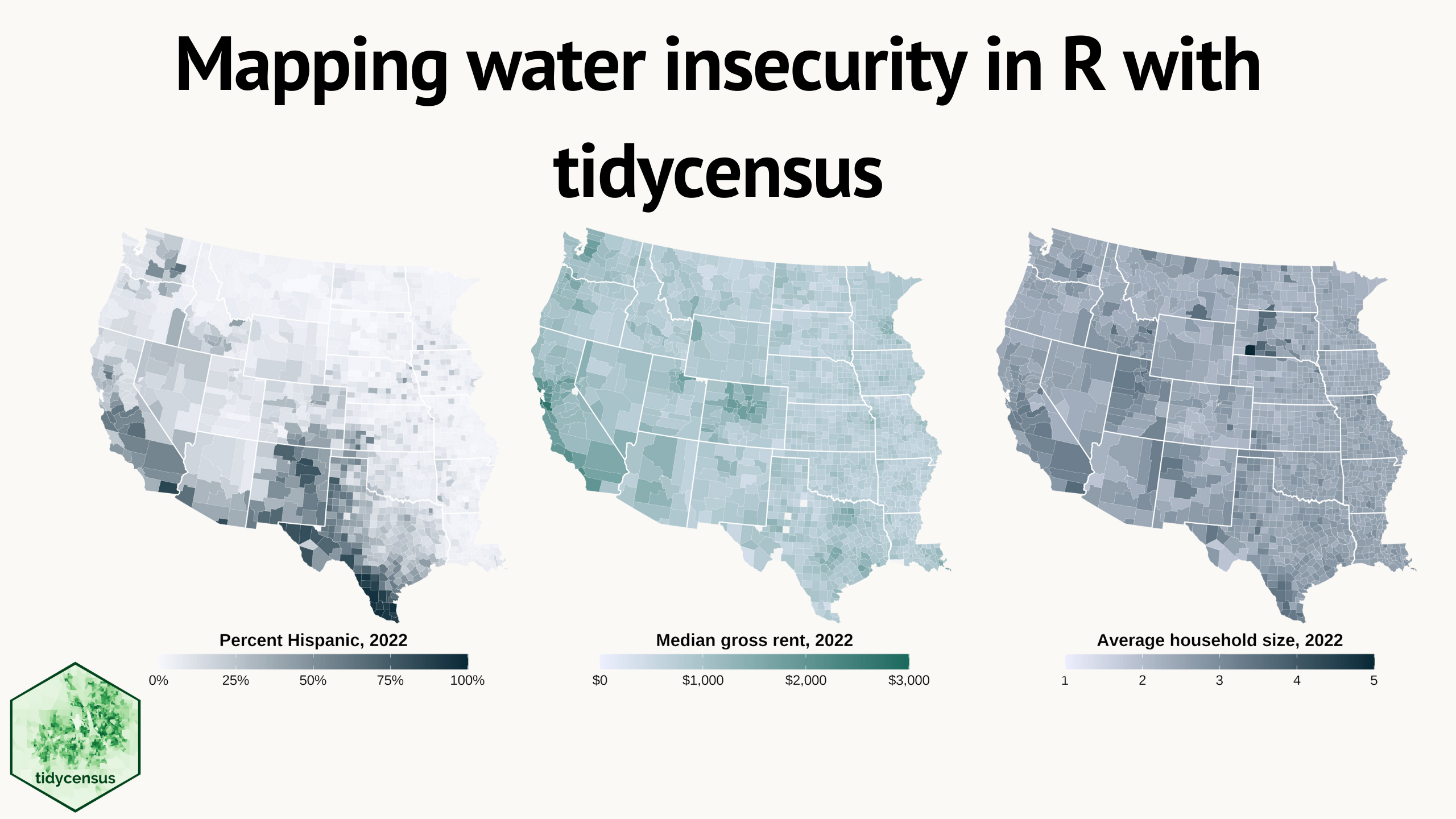
Water insecurity can be influenced by number of social vulnerability indicators—from demographic characteristics to living conditions and socioeconomic status —that vary spatially across the U.S. This blog shows how the
tidycensuspackage for R can be used to access U.S. Census Bureau data, including the American Community Surveys, as featured in the “Unequal Access to Water ” data visualization from the USGS Vizlab. It offers reproducible code examples demonstrating use oftidycensusfor easy exploration and visualization of social vulnerability indicators in the Western U.S.