
Purrrfect mini-maps - Visualizing water availability across the U.S.
The National Water Availability Assessment Data Companion (NWDC) provides nationally-consistent modeled water data, including the surface water supply and use index (SUI), which is an indication of water limitation across the lower 48 United States. In this blog, we demonstrate how to programmatically download data from the Data Companion using R and API web services, process the data for mapping, and create customized data visualizations.
What's on this page
The National Water Availability Assessment Data Companion provides nationally-consistent modeled water data, including the surface water supply and use index (SUI) , which is an indication of water limitation across the lower 48 United States. This tutorial shows how to plot monthly SUI from 2010 to 2020 across the lower 48 United States.
The main data visualization technique is to use purrr
to replicate mini map insets, pair them with timeseries plots, and assemble everything with cowplot
. In the first tutorial (shown below on the left), a timeseries bar chart is created for each region (HUC02) and plotted alongside an inset map. In the second tutorial (below on the right), we follow a similar technique but instead show SUI data with line plots for each region within the Great Basin (HUC02 id “16”). For more information on iterating using purrr, check out our previous post
.
The National Water Availability Assessment evaluated how much water was available for human and ecological needs from 2000 through 2020 and where challenges may arise under future conditions. The Assessment data used in this blog are delivered by the National Water Availability Assessment Data Companion . Read our previous blog post to learn more about the features and capabilities of the Data Companion. Specifically, we’re using the API web services functionality to download the SUI data:
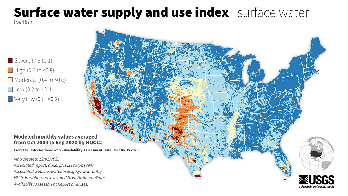
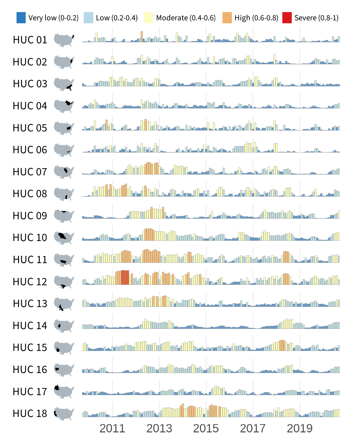
Surface water supply and use index (SUI) across the lower 48 United States.
All the data processing and plotting will be done by hydrologic unit boundaries, which are available for use in R through the USGS nhdplusTools
package. Hydrologic unit codes (HUCs) generally represent catchments of varying sizes. Each catchment is represented by a unique series of numbers with successively smaller hydrologic units nested inside of larger ones. Digits are added as hydrologic units become smaller, such that a 2-digit HUC encompasses multiple 4-digit HUCs, and a 4-digit HUC encompasses multiple 6-digit HUCs, etc. In this visualization, we’ll be relying on the 4-digit “HUC04” and 2-digit “HUC02” boundaries and SUI data provided at the 12-digit HUC12 level. Learn more about HUCs
on our website.
Set up the R environment
Some of the main packages we will use for these demos include:
- tidyverse
— We are using v2.0.0 for data wrangling and plotting.
- Note:
purrr,readr,tidyrandggplot2are automatically loaded when you load thetidyverse(e.g., usinglibrary(tidyverse)).
- Note:
- httr2 — We are using v1.2.2 to download data from the Data Companion using web services.
- nhdplusTools — We are using v1.3.1 to fetch Hydrologic Unit Boundaries.
- cowplot — We are using v1.2.0. We use this package to combine maps and annotations into one visual.
- sysfonts
— We are using v0.8.9. This package allows us to add custom fonts to the map. In our examples, we use some free fonts available through Google Fonts
.
- On Macs, you may need to install the font
Source Code Promanually to your Font Book. As of the writing of this blog, to install this font, navigate to Google Fonts, search for the fonts listed above, click “get font” in the upper right corner of the page, download the font file, and then pull the.ttffile into your Font Book application.
- On Macs, you may need to install the font
# For general tidy data processing, such as dplyr functions
library(tidyverse)

# To read data from Data Companion using web services (APIs)
library(httr2)

# For spatial analysis
library(sf)

# To download hydrologic unit boundaries from USGS
library(nhdplusTools)

# For composing final plot
library(grid)
library(cowplot)
library(sysfonts)
library(showtext)

# Create data folder to place SUI data
dir.create("data", showWarnings = FALSE)

# Create out folder to place final figures
dir.create("out", showWarnings = FALSE)
Data download
Download the SUI data
To download the SUI data from Data Companion, we use web services through the httr2 package.
Here, we’re using a common pattern that we follow when downloading large datasets. We wrap the downloading and saving steps in a test if(!file.exists(...)){} clause that checks to see if we’ve already downloaded the file first. This means the function will only run the first time we fetch the data but won’t have to run again after the data have already been downloaded and saved. This can be a major time saver if you revisit this code later!
# Specify your desired CSV file
BASE_URL <- "https://water.usgs.gov/nwaa-data/data-file-directory?path=data/"
csv_folder <- "integrated-water-availability/iwa-assessment-outputs-conus-2025/sui/"
csv_file <- "sui_iwa-assessment-outputs-conus-2025_CONUS_200910-202009_long.csv"
file_url <- paste0(BASE_URL, csv_folder, csv_file)

# Print the file URL and intended CSV file name
cat(sprintf(
  "File URL: %s \nCSV file to be saved: %s\n",
  file_url,
  csv_file
))

# Use the httr2 package for downloading the CSV
if (!file.exists(sprintf("data/%s", csv_file))) {
  tryCatch(
    {
      # Send a GET request to download the file
      # The CONUS file is large and may exceed the timeout
      # period - adjust as needed
      httr2::request(base_url = file_url) |>
        httr2::req_perform(path = sprintf("data/%s", csv_file))

      cat(sprintf(
        "File '%s' downloaded and saved successfully.\n",
        csv_file
      ))
    },
    error = function(err) {
      # If the status code indicates an error, print the error message
      if (inherits(err, "http_error")) {
        cat(sprintf("HTTP error occurred: %s\n", conditionMessage(err)))
      } else {
        cat(sprintf(
          "An error occurred: %s\n",
          conditionMessage(err)
        ))
      }
    }
  )
}

# Read the CSV file into a data.frame
sui_df <- readr::read_csv(
  sprintf("data/%s", csv_file)
)
Download the hydrologic unit boundaries
Now we are ready to bring in the spatial layers that we need to build the inset maps. This process starts by identifying the full set of HUC02s and HUC04s that are included in the SUI dataset. We can identify the HUC04s by extracting the first four digits of the HUC12 IDs and the HUC02s by extracting the first two digits.
Using nhdplusTools() to get these hydrologic boundaries can take a while, so to prevent any unforeseen timeouts (brief network losses, etc.), the downloading of the HUC04 spatial features is broken down into a function such that they are downloaded and saved by HUC02. The purrr package makes this nice and tidy to run.
Again, we’ll wrap the downloading and saving steps into
file.exists()test clauses to make sure we don’t have to do this more than once.
# First, compress SUI data frame to one unique huc04 per row
sui_huc04s <- sui_df |>
  dplyr::select(huc12_id) |>
  dplyr::distinct() |>
  # and identify HUC02s for splitting later
  dplyr::mutate(
    huc02_id = substr(huc12_id, start = 1, stop = 2),
    huc04_id = substr(huc12_id, start = 1, stop = 4)
  ) |>
  dplyr::select(huc02_id, huc04_id) |>
  dplyr::distinct()

# Wrap with a test to see if you've already downloaded these data.
if(!file.exists("data/huc02.rds")){
  # Download huc02 geography
  huc02_sf <- nhdplusTools::get_huc(
    id = unique(sui_huc04s$huc02_id),
    type = "huc02"
  )

  # Set CRS and select fields to maintain
  huc02_sf_cleaned <- huc02_sf |>
    sf::st_set_crs(value = 4326) |>
    sf::st_transform(crs = 5070) |>
    # simplify saving
    dplyr::select(id, states, huc02_id = huc2, geometry)

  # write huc02s to disc
  saveRDS(huc02_sf_cleaned, file = "data/huc02.rds"
  )
}
huc02_sf_cleaned <- read_rds("data/huc02.rds")

# Create function to download HUC04 spatial feature by HUC02
geo04_download <- function(split_df_by_huc02) {
  temp_huc04_geo <-
    nhdplusTools::get_huc(
      id = split_df_by_huc02$huc04_id,
      type = "huc04"
    )

  # set and transform projection
  temp_huc04_proj <- temp_huc04_geo |>
    sf::st_set_crs(value = 4326) |>
    sf::st_transform(crs = 5070) |>
    # simplify saving
    dplyr::select(id, states, huc04_id = huc4, geometry)

  # write set of HUCs to disc
  saveRDS(temp_huc04_proj,
    file = sprintf(
      "data/huc04_by_huc02/huc04_geo_%s.rds",
      unique(split_df_by_huc02$huc02_id)
    )
  )
}

# Warning, this might take a while.
if (!file.exists("data/huc04_by_huc02/huc04_geo_01.rds")) {
  # Create the directory if it doesn't exist
  dir.create("data/huc04_by_huc02", recursive = TRUE, showWarnings = FALSE)

  split_df_by_huc02 <- split(sui_huc04s, sui_huc04s$huc02_id)
  downloads <- purrr::map(
    split_df_by_huc02,
    ~ geo04_download(split_df_by_huc02 = .x)
  )
}

# load and merge together
huc04_sf <- list.files(
  path = "data/huc04_by_huc02/",
  pattern = "\\.rds",
  full.names = TRUE
) |>
  purrr::map(readRDS) |>
  purrr::list_rbind() |>
  sf::st_as_sf() |>
  dplyr::rename(HUC04 = huc04_id)
Example 1: Plotting timeseries bar charts by HUC02
To create the small-multiples layout, we will blend when (timeseries of SUI) with where (mini region maps). The process is to generate each mini map once, then place them alongside the vertical axis with purrr::imap()
.
We’ll make use of purrr::imap() throughout. This function is a variant of purrr::map()
that exposes each element’s name or index, making it useful when you need to compute on both the value and its position in the list.
Data processing
We shape the cleaned SUI data into the form needed for our small-multiples layout. First, we summarize SUI values by hydrologic unit and month, giving us the mean SUI per HUC02 per time step.
Then we build a named list of region geometries in the display order from top-to-bottom moving approximately east to west. This list becomes the backbone for generating each mini-map automatically with purrr.
# Aggregate SUI to HUC02s ----
sui_by_HUC02 <- sui_df |>
  # match names and left-join
  dplyr::rename(HUC12 = huc12_id) |>
  # define huc02s
  dplyr::mutate(HUC02 = substr(HUC12, start = 1, stop = 2)) |>
  dplyr::select(sui_frac, HUC02, year_month) |>
  # group_by region
  dplyr::group_by(HUC02, year_month) |>
  dplyr::summarize(mean_sui = mean(sui_frac, na.rm = TRUE))

# Prep tidy time fields and ordered factors ----
sui_by_HUC02_wide <- sui_by_HUC02 |>
  tidyr::separate(
    year_month,
    into = c("year", "month"),
    sep = "-",
    convert = TRUE
  ) |>
  dplyr::filter(!is.na(mean_sui)) |>
  dplyr::mutate(
    month_lab = factor(month, levels = 1:12, labels = month.abb),
    date = as.Date(paste(year, month, 1, sep = "-"))
  )

# Background/geometry list for mini maps ----
us_bg <- sf::st_union(huc02_sf_cleaned) # U.S. background

# Named list of HUC02s for ordering our minimaps and plots
HUC02_geom_list <- huc02_sf_cleaned |>
  dplyr::group_split(huc02_id, .keep = TRUE) |>
  purrr::set_names(purrr::map_chr(
    dplyr::group_split(huc02_sf_cleaned, huc02_sf_cleaned$huc02_id, .keep = TRUE),
    ~ sprintf("HUC %s", unique(.x$huc02_id))
  )) |>
  purrr::map(~ .x$geometry)
Set up the environment for plotting
In this code, we set up some global definitions for plotting, such as colors and fonts.
# Color palette parameters ----
sui_breaks <- c(0.2, 0.4, 0.6, 0.8)
sui_limits <- c(0, 1)
sui_colors <- c(
  "#2C7BBC", # Very low (0–0.2)
  "#B4D8E7", # Low (0.2–0.4)
  "#FDFDC4", # Moderate (0.4–0.6)
  "#F1B16E", # High (0.6–0.8)
  "#D7191C" # Severe (0.8–1)
)

# Other main colors
barplot_outline_col <- "grey30"
conus_col <- "#acb6be"
huc_col <- "black"
font_col <- "black"
background_col <- "white"
HUC12_col <- "#9aafc2"
HUC04_mean_col <- "#1a3a5c"

# Typography ----
# Load in custom Google font for labels/axes downstream
font_legend <- "Source Sans 3"
sysfonts::font_add_google(font_legend)
showtext::showtext_opts(dpi = 300, regular.wt = 300, bold.wt = 800)
showtext::showtext_auto(enable = TRUE)
Generate monthly bar plots
First, we visualize monthly mean SUI for each hydrologic unit using a faceted bar chart. Each row represents one region, creating a clean small-multiples view of how water limitation varies over time. The y-axis is removed to minimize visual clutter, with the goal to compare patterns rather than extract precise values.
bars_regions <- ggplot(sui_by_HUC02_wide,
                       aes(x = date, y = mean_sui, fill = mean_sui)) +
  geom_col(color = barplot_outline_col, linewidth = 0.05, width = 28) +
  # Stepped color scale bins for SUI
  scale_fill_stepsn(
    colors = sui_colors,
    breaks = sui_breaks,
    limits = sui_limits,
    values = scales::rescale(c(sui_limits[1], sui_breaks, sui_limits[2])),
    # Legend handled separately
    guide = "none") +
  # One row per HUC02, strip labels disabled
  facet_grid(HUC02 ~ ., switch = "y") +
  scale_x_date(
    date_breaks = "2 years", date_labels = "%Y",
    # No padding at axis ends
    expand = expansion()
  ) +
  coord_cartesian(ylim = c(0, max(sui_by_HUC02_wide$mean_sui))) +
  labs(x = NULL, y = NULL, title = NULL) +
  theme_minimal(base_size = 12) +
  theme(
    # Strip text replaced by mini-maps
    strip.text.y.left = element_blank(),
    strip.background = element_blank(),
    strip.placement = "outside",
    panel.spacing.y = unit(0.35, "lines"),
    axis.text.y = element_blank(),
    axis.ticks.y = element_blank(),
    panel.grid.major.y = element_blank(),
    panel.grid.minor = element_blank(),
    panel.grid.major.x = element_line(linewidth = 0.3),
    # Reduce left margin for adding mini maps column
    plot.margin = margin(l = 2)
  )
This code produces this set of timeseries bar charts:
Timeseries bar charts.
To help these data make more sense spatially, we will add a small inset map for each row and a legend.
Generate HUC02 mini-maps
We now construct a small inset map for each hydrologic region. Each region polygon is plotted over a simplified CONUS background using a fixed spatial extent. Standardizing the bounding box ensures that all thumbnails share identical coordinates, which prevents misalignment when they are stacked alongside the faceted bar charts.
ℹ️ Why purrr::imap() here?
Inside the function, .x is the current geometry and .y is the hydrologic region's name. Having access to both lets us plot each region's shape while simultaneously using its name to label the thumbnail.
# Consistent frame for all thumbnails
bb <- sf::st_bbox(us_bg)
pad <- 0.02
xpad <- (bb["xmax"] - bb["xmin"]) * pad
ypad <- (bb["ymax"] - bb["ymin"]) * pad
xlim <- c(bb["xmin"] - xpad, bb["xmax"] + xpad)
ylim <- c(bb["ymin"] - ypad, bb["ymax"] + ypad)

# Repeat plotting HUC02 over larger US background
plot_hr_geom <- function(region_list, bg, xlim, ylim) {
  purrr::imap(region_list, \(region_poly, region_name) {
    ggplot() +
      geom_sf(
        # Background US silhouette
        data = sf::st_as_sf(dplyr::tibble(geometry = bg)),
        fill = conus_col,
        color = NA
      ) +
      geom_sf(
        # Focal hydrologic region
        data = sf::st_as_sf(dplyr::tibble(geometry = region_poly)),
        fill = huc_col, color = huc_col, linewidth = 0.01
      ) +
      coord_sf(crs = sf::st_crs(5070), xlim = xlim, ylim = ylim, expand = FALSE) +
      theme_void() +
      theme(plot.margin = margin(0, 0, 0, 0))
  })
}

#  Generate one mini-map per region and keep names intact
region_plots <- plot_hr_geom(HUC02_geom_list, us_bg, xlim, ylim)
names(region_plots) <- names(HUC02_geom_list)
Create a legend
Since our bar chart currently has no legend (guide = "none"), we will create a custom one to add to the final visualization using cowplot. The cowplot package makes it easy to layer these different components together with a high level of customization.
# Build horizontal legend ----
sui_labels <- c("Very low (0-0.2)",
                "Low (0.2-0.4)",
                "Moderate (0.4-0.6)",
                "High (0.6-0.8)",
                "Severe (0.8-1)")

legend_df <- dplyr::tibble(
  label = factor(sui_labels, levels = sui_labels),
  color = sui_colors,
  x = c(0.05, 0.23, 0.39, 0.6, 0.76)
)

legend_plot <- ggplot(legend_df) +
  # Squares legend elements
  geom_tile(aes(x = x, y = 0.5, fill = label),
            width = 0.025, height = 0.4) +
  # Text offset slightly to the right
  geom_text(aes(x = x + 0.02, y = 0.5, label = label),
            hjust = 0, vjust = 0.5,
            size = 2.3, family = font_legend, color = font_col) +
  # Customize scales and themes
  scale_fill_manual(values = setNames(sui_colors, sui_labels)) +
  coord_cartesian(xlim = c(0, 1), ylim = c(0, 1), clip = "off") +
  theme_void() +
  theme(
    legend.position = "none",
     # Extra right margin helps text with sbreathing room
    plot.margin = margin(2, 10, 2, 2)
  )
Compose final data visualization
With a complete set of region thumbnails in hand, we’re ready to combine them with the faceted bar charts. We will compose a two-column layout: mini-map and region label on the left and bar chart panel on the right. purrr::reduce() iteratively adds each row to the canvas so spacing stays precise. The composition is built using cowplot functions, which help layer each part of the final composition together piece by piece programmatically.
ℹ️ Quick tip
This layout is a 4:5 ratio, which is awesome for posting visualizations to social media!
# Layout parameters -----
dpi <- 300
plot_margin <- 0.025
width <- 4
height <- 5

# Left-column layout controls
x_map <- plot_margin - 0.15
w_map <- 0.64
# height used for each mini map
h_row <- 0.034

# Helpers to position rows
y0 <- function(i) 1 - (i * regions_spacing) - 0.053
y_mid <- function(i) y0(i) + h_row / 2
x_text <- x_map - 0.06

# Region order and spacing for the stack
ordered_regions <- names(region_plots)
n_regions <- length(region_plots)
regions_spacing <- 0.895 / n_regions

# Background canvas ----
canvas <- grid::rectGrob(
  x = 0, y = 0,
  width = width, height = height,
  gp = grid::gpar(fill = background_col, alpha = 1, col = background_col)
)

# Base layer with canvas using cowplot ----
plot <- ggdraw(
  ylim = c(0, 1),
  xlim = c(0, 1)
) +
  draw_grob(canvas,
    x = 0, y = 1,
    height = 0.37, width = 0.37,
    hjust = 0, vjust = 1
  )

# purrr::reduce() to iteratively add small regions plots, spaced evenly
row_plot <- function(i) {
  left_label <- ggdraw() +
    draw_text(ordered_regions[i],
      x = 1, y = 0.523, hjust = 1,
      size = 9, color = font_col,
      family = font_legend
    )

  # Two-column mini grid
  plot_grid(left_label, region_plots[[i]], ncol = 2, rel_widths = c(3.7, 0.6))
}

# Add one region map row and the bar chart panel to the canvas
add_plot <- function(p, i) {
  p  +
    draw_plot(row_plot(i),
              x = plot_margin - 0.495, y = y0(i) - 0.005,
              width = 0.7, height = h_row) +
    draw_plot(bars_regions,
              x = plot_margin + 0.19,
              y = 0.014,
              height = 0.925,
              width = (1 - plot_margin) - 0.23)
}

# Compose left stack with purrr::reduce(), then add bar panel ----
mini_regions <- purrr::reduce(seq_along(region_plots), add_plot, .init = plot) +
  # Add legend across the top
  draw_plot(legend_plot,
            x = plot_margin - 0.078,
            y = 0.92,
            width = plot_margin + 1.18,
            height = 0.08)

ggsave("out/regional_SUI_bar_charts.png",
       plot = mini_regions,
       width = width, height = height, units = "in",
       bg = background_col, dpi = dpi)
The resulting visualization is optimized to display both the when and where of SUI across the lower 48 United States.
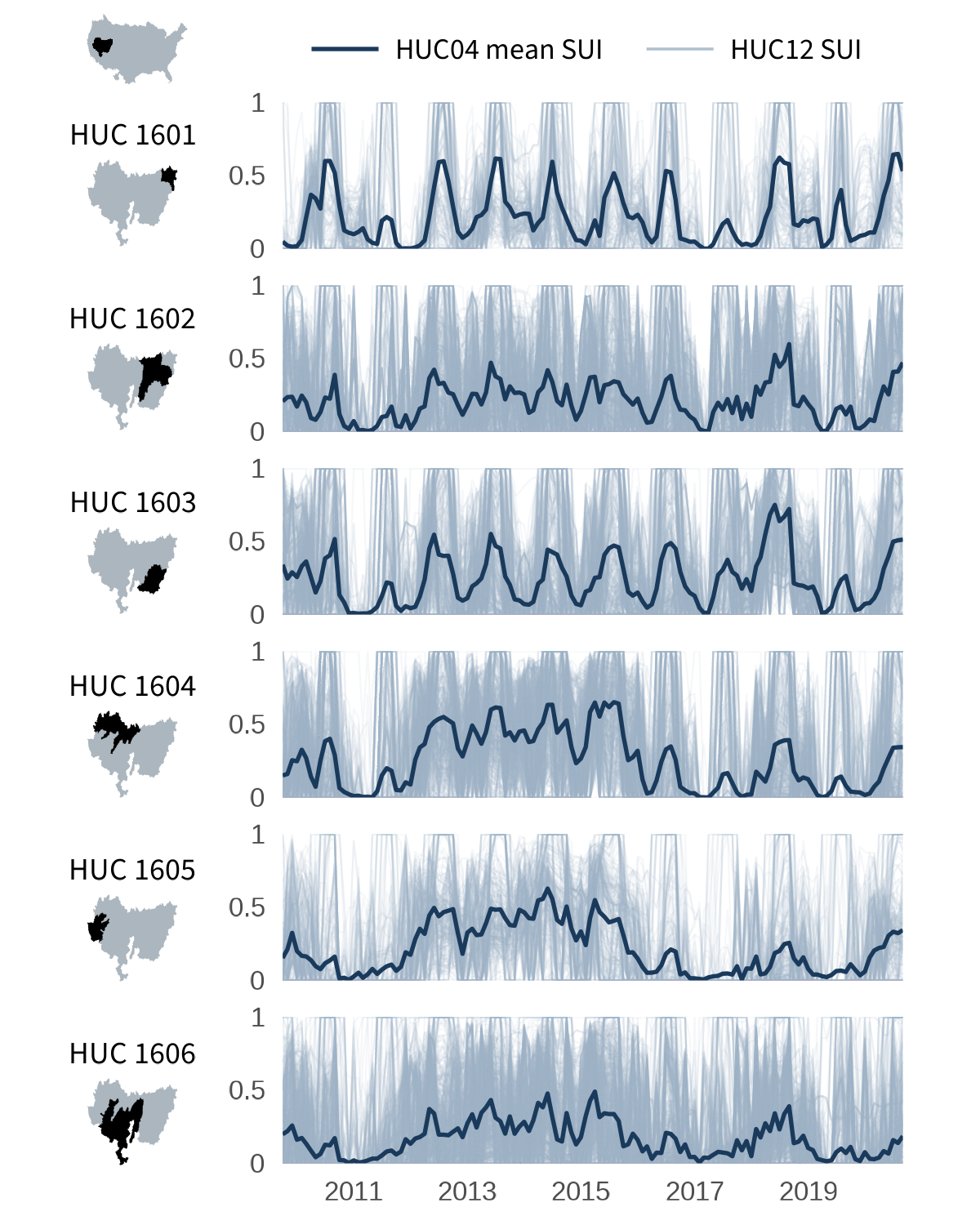
Example 2: Plotting timeseries linechart by HUC04
Now that we’ve seen patterns at the regional level across the lower 48, we will now zoom into one region to see how its sub-basins differ from each other.
The Great Basin (HUC02 16) is one of the most compact HUC02 regions in the lower 48, with only six HUC04 sub-basins. This makes it a nice case for drilling into more regional patterns.
Rather than monthly mean bars, here each panel shows a thin, slightly transparent line for every HUC12 inside the sub-basin, with the HUC04 mean overlaid as a bold highlight. This lets us visualize both the spread of individual sub-watersheds and the mean pattern at a glance.
To make this, we’ll rely on some of the previous code, such as downloading and processing the SUI data and the spatial features. Then, we’ll run through some additional processing code before setting up the graphing code in a parallel structure as the first example.
Filter and summarize SUI data
Here we subset the sui_df to HUC02 16 for the Great Basin and produce two dataframes: one at the HUC12 level (one row per watershed per month, used for thin background lines) and one at the HUC04 level (the mean across HUC12s, used for a thicker highlight on the visuals).
# Filter to Great Basin (HUC02 = "16")
focal_HUC02 <- "16"

# Filter SUI to Great Basin and parse date fields
sui_gb <- sui_df |>
  dplyr::rename(HUC12 = huc12_id) |>
  dplyr::mutate(
    HUC02 = substr(HUC12, 1, 2),
    HUC04 = substr(HUC12, 1, 4)
  ) |>
  dplyr::filter(HUC02 == focal_HUC02) |>
  tidyr::separate(year_month, into = c("year", "month"),
                  sep = "-", convert = TRUE) |>
  dplyr::filter(!is.na(sui_frac)) |>
  dplyr::mutate(date = as.Date(paste(year, month, 1,
                                     sep = "-")))

# Per HUC12 monthly series (thin lines)
sui_gb_huc12 <- sui_gb |>
  dplyr::group_by(HUC12, HUC04, date) |>
  dplyr::summarize(sui = mean(sui_frac, na.rm = TRUE),
                   .groups = "drop")

# Per HUC04 monthly mean (highlight line)
sui_gb_huc04 <- sui_gb_huc12 |>
  dplyr::group_by(HUC04, date) |>
  dplyr::summarize(mean_sui = mean(sui, na.rm = TRUE),
                   .groups = "drop")
Build the timeseries line plots
Now let’s build the time series chart where each facet row is one HUC04. The faint lines will show every HUC12 in that sub-basin and the dark line will show the HUC04 mean.
# Faceted time-series: thin HUC12 lines + bold HUC04 mean
lines_huc04 <- ggplot() +
  # Thin translucent blue lines: one per HUC12
  geom_line(
    data  = sui_gb_huc12,
    aes(x = date, y = sui, group = HUC12),
    color = HUC12_col, linewidth = 0.25, alpha = 0.1
  ) +
  # Bold mean line per huc4
  geom_line(
    data  = sui_gb_huc04,
    aes(x = date, y = mean_sui),
    color = HUC04_mean_col, linewidth = 0.6
  ) +
  facet_grid(HUC04 ~ ., switch = "y") +
  scale_x_date(
    date_breaks = "2 years", date_labels = "%Y",
    expand = expansion()
  ) +
  coord_cartesian(ylim = c(0, 1)) +
  scale_y_continuous(
    breaks = c(0, 0.5, 1),
    labels = c("0", "0.5", "1"),
    limits = c(0, 1),
    expand = expansion()) +
  labs(x = NULL, y = NULL, title = NULL) +
  theme_minimal(base_size = 12) +
  theme(
    strip.text.y.left  = element_blank(),
    strip.background = element_blank(),
    strip.placement = "outside",
    panel.spacing.y = unit(0.75, "lines"),
    axis.text.y = element_text(size = 8),
    axis.text.x = element_text(size = 8),
    axis.ticks.length.y = unit(2, "pt"),
    panel.grid = element_blank()
  )
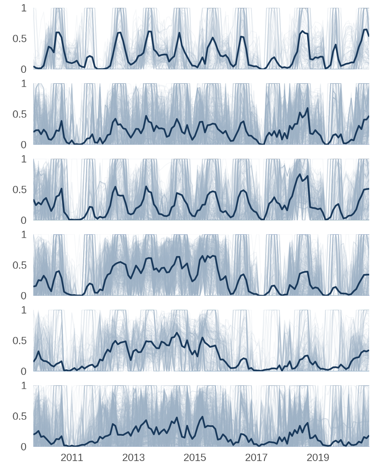
Timeseries line plots.
Generate HUC04 mini-maps
Instead of highlighting each sub-basin against a full CONUS map, we will use the Great Basin HUC02 boundary as the background map. This keeps the thumbnails legible at small sizes since the sub-basins fill more of the frame. The bounding box is computed once so all six thumbnails share the same spatial extent.
# Focal HUC02 boundary as the regional background
gb_bg <- huc02_sf_cleaned |>
  dplyr::filter(huc02_id == focal_HUC02) |>
  sf::st_union()

# Pull just the Great Basin HUC04 geometries
huc04_gb_sf <- huc04_sf |>
  dplyr::filter(substr(HUC04, 1, 2) == focal_HUC02)

# Consistent bounding box for all HUC04 thumbnails
bb_gb  <- sf::st_bbox(gb_bg)
pad_gb <- 0.04
xpad_gb <- (bb_gb["xmax"] - bb_gb["xmin"]) * pad_gb
ypad_gb <- (bb_gb["ymax"] - bb_gb["ymin"]) * pad_gb
xlim_gb <- c(bb_gb["xmin"] - xpad_gb, bb_gb["xmax"] + xpad_gb)
ylim_gb <- c(bb_gb["ymin"] - ypad_gb, bb_gb["ymax"] + ypad_gb)

# Named geometry list (reuses plot_hr_geom() from above)
HUC04_geom_list <- huc04_gb_sf |>
  dplyr::group_split(HUC04, .keep = TRUE) |>
  purrr::set_names(
    purrr::map_chr(
      dplyr::group_split(huc04_gb_sf, huc04_gb_sf$HUC04, .keep = TRUE),
      ~ sprintf("HUC %s", unique(.x$HUC04))
    )
  ) |>
  purrr::map(~ .x$geometry)

# Reuse plot_hr_geom() but swap background for Great Basin map
huc04_plots <- plot_hr_geom(HUC04_geom_list, gb_bg, xlim_gb, ylim_gb)
names(huc04_plots) <- names(HUC04_geom_list)
Build an inset map
We will add a small CONUS overview map placed in the upper-left corner help orient viewers. The full CONUS profile is drawn in grey and the Great Basin HUC02 boundary is filled in a darker blue.
# CONUS/total HUC04 silhouette
conus_bg <- sf::st_as_sf(dplyr::tibble(geometry = us_bg))

# Plot orientation map with conus background
orientation_map <- ggplot() +
  geom_sf(data = conus_bg, fill = conus_col, color = NA) +
  geom_sf(data = huc04_gb_sf, fill = huc_col, color = huc_col) +
  coord_sf(crs = sf::st_crs(5070), xlim = xlim, ylim = ylim, expand = FALSE) +
  theme_void() +
  theme(plot.margin = margin(0, 0, 0, 0))
Create a legend
The line legend mirrors the style of the color legend above. We’ll create a minimal strip that sits across the top of the figure and identifies the thin HUC12 lines and the bold mean line.
# Legend: line types
line_legend_df <- dplyr::tibble(
  label = c("HUC04 mean SUI", "HUC12 SUI"),
  x = c(0.15, 0.55)
)

line_legend_plot <- ggplot(line_legend_df) +
  # thick line (HUC04 mean)
  geom_segment(
    data = line_legend_df[1,],
    aes(x = x, xend = x + 0.08, y = 0.5, yend = 0.5),
    linewidth = 0.6,
    color = HUC04_mean_col) +
  # Thin line (HUC12)
  geom_segment(
    data = line_legend_df[2,],
    aes(x = x, xend = x + 0.08, y = 0.5, yend = 0.5),
    linewidth = 0.4,
    color = HUC12_col,
    alpha = 0.8) +
  # Labels (to the right of lines)
  geom_text(
    aes(x = x + 0.1, y = 0.5, label = label),
    hjust = 0,
    vjust = 0.5,
    size = 3,
    family = font_legend,
    color = font_col
  ) +
  coord_cartesian(xlim = c(0, 1), ylim = c(0, 1), clip = "off") +
  theme_void() +
  theme(
    plot.margin = margin(2, 0, 2, 0)
  )
Compose final data visualization
The layout follows the same purrr::reduce() approach used for the HUC02 figure where each iteration adds one label/map row to the left column while the timeseries panel occupies the right. The legend is placed across the top after the loop.
n_huc04 <- length(huc04_plots)
huc04_spacing <- 0.9 / n_huc04

# Vertical position helpers
y0_h4 <- function(i) {
  1 - (i * huc04_spacing) - 0.052
}
h_row_h4 <- 0.09  # Taller to accommodate stacked label and map

ordered_huc04 <- names(huc04_plots)

# Left column: label stacked above mini-map thumbnail
row_plot_huc04 <- function(i) {
  top_label <- ggdraw() +
    draw_text(
      ordered_huc04[i],
      x = 0.5, y = 1.3, hjust = 0.5,
      size = 9, color = font_col, family = font_legend
    )
  # nrow = 2 stacks label on top, map on bottom
  plot_grid(top_label, huc04_plots[[i]], nrow = 2, rel_heights = c(0.35, 2))
}

# Build the figure row by row
mini_huc04s <- purrr::reduce(seq_along(huc04_plots), function(p, i) {
  p +
    draw_plot(
      lines_huc04,
      x = plot_margin + 0.175, y = -0.002,
      height = 0.935,
      width  = (1 - plot_margin) - 0.233
    ) +
    draw_plot(
      row_plot_huc04(i),
      x = plot_margin, y = y0_h4(i) -0.002,
      width = 0.22, height = h_row_h4
    )
}, .init = ggdraw(ylim = c(0, 1), xlim = c(0, 1)) +
  draw_grob(canvas, x = 0, y = 1, height = 0.37, width = 0.37,
            hjust = 0, vjust = 1)
) +
  # CONUS orientation map
  draw_plot(
    orientation_map,
    x = plot_margin - 0.025, y = 0.93,
    width = 0.28, height = 0.06
  ) +
  # Legend
  draw_plot(
    line_legend_plot,
    x = plot_margin + 0.122, y = 0.93,
    width = 1 - (plot_margin * 2) - 0.01, height = 0.06
  )

ggsave(
  "out/iwaas-sui-huc04-great-basin.png",
  plot = mini_huc04s, dpi = dpi,
  width = width, height = height, units = "in",
  bg = background_col
)
The resulting visualization is optimized to display both the when and where of SUI within one region. This flexible approach is easily adapted to similar examples, such as showing SUI through time in one state and its counties or several states within one region of the U.S.
Takeaways
In this demo, we used purrr to build a reproducible workflow for generating small inset maps and pairing them with faceted time-series plots. By structuring the spatial data and regional summaries up front, we were able to generate one mini-map per hydrologic unit, keep each map aligned through a shared bounding box, and assemble the final figure using cowplot.
By splitting a visualization into reusable components and iterating with map()/imap(), we were able to easily align the mini-maps and the corresponding bar charts or line plots. Whether you are visualizing watersheds, climate zones, ecological regions, or any spatial units with repeated time-series patterns, this approach provides a flexible and automated way to build clean, and organized figures.
Disclaimer
Any use of trade, firm, or product names is for descriptive purposes only and does not imply endorsement by the U.S. Government.
Categories:
Related Posts
A map that glows with the vocabulary of water
February 27, 2026
English is the official language and authoritative version of all federal information.
A map that glows with the vocabulary of water
What is your first impression of the map above? To me, it is the shimmer. Thousands of points of light, each one a stream or river, illuminating a darkened basemap. Look closely and a pattern emerges: the country’s waterways form a linguistic constellation. These points are classified not from population data or even explicitly by hydrology. They glow strictly according to the vocabulary used to name them and what can be implied about the hydrology of these streams based on their names.
Extracting the grammar of U.S. stream names
February 27, 2026
English is the official language and authoritative version of all federal information.
Extracting a stream’s feature
The names of streams (hydronyms ) contain, hidden within them, the power to show us the linguistic patterns within the United States. In the United States, stream names tend to follow a binomial structure: a specific name (“Moose,” “Columbia,” “Snake”) paired with a generic feature word (“creek,” “river,” “fork,” “bayou”). The specific portion is endlessly variable, but the generic part is surprisingly stable. In fact, if you look at stream names across the country, the diversity of generic terms is relatively small, but shaped by centuries of hydrologic realities, settlement history, and local tradition.
Easy hydrology mapping with nhdplusTools, geoconnex, and ggplot2
November 28, 2025
Go from hard-to-read default visuals to easy-to-read river maps in a few easy steps!
Reproducible Data Science in R: Say the quiet part out loud with assertion tests
September 2, 2025

Overview
This blog post is part of the Reprodicuble data science in R series that works up from functional programming foundations through the use of the targets R package to create efficient, reproducible data workflows.
Charting 'tidycensus' data with R
June 24, 2025
In January, 2025, the organizers of the tidytuesday challenge highlighted data that were featured in a previous blog post and data visualization website . Some of us in the USGS Vizlab wanted to participate by creating a series of data visualizations showing these data, specifically the metric “households lacking plumbing.” This blog highlights our data visualizations inspired by the tidytuesday challenge as well as the code we used to create them, based on our previous software release on GitHub .