
Charting 'tidycensus' data with R
This blog shows several different ways to visualize data from the `tidycensus` package for R.
What's on this page
In January, 2025, the organizers of the tidytuesday challenge highlighted data that were featured in a previous blog post and data visualization website . Some of us in the USGS Vizlab wanted to participate by creating a series of data visualizations showing these data, specifically the metric “households lacking plumbing.” This blog highlights our data visualizations inspired by the tidytuesday challenge as well as the code we used to create them, based on our previous software release on GitHub .
Data downloading and preparation
We used functions to download the data from the tidycensus package
in R at the county level for 2022 and 2023. The functions are available from an open-access software release on GitHub
.
These are the U.S. Census Bureau variables we used in these data visualizations (see full citations below):
B01003_001: total population per countyB25049_004: households lacking plumbingB25049_002: total housing units (both owner- and renter-occupied)B25049_003: households with plumbingB19013_001: median household income
We also downloaded complete state and county files from the tigris package
for mapping purposes.
Code to download the data
# Load libraries
library(tidycensus)
library(sf)
library(janitor)
library(tidyverse)
library(rmapshaper)
library(tigris)

# Helper functions -----
#   From Software release:
#     https://github.com/DOI-USGS/vulnerability-indicators/blob/main/2_process/src/data_utils.R
get_census_data <- function(geography, var_names, year, proj, survey_var) {
  df <- get_acs(
    geography = geography,
    variable = var_names,
    year = year,
    geometry = TRUE,
    survey = survey_var) |>
    clean_names() |>
    st_transform(proj) |>
    mutate(year = year)

  return(df)
}

# Grab relevant variables
vars <- c("B25049_002", "B25049_004", "B19013_001", "B25049_003", "B01003_001")

# Pull data for 2023 and 2022 for all US counties ------
plumbing_data_2023 <- get_census_data(
  geography = 'county',
  var_names = vars,
  year = "2023",
  proj = "EPSG:5070",
  survey_var = "acs1"
) |>
  mutate(
    variable_long = case_when(
      variable == "B25049_002" ~ "total_housing",
      variable == "B25049_004" ~ "plumbing",
      variable == "B19013_001" ~ "median_household_income",
      variable == "B25049_003" ~ "units_having_plumbing",
      variable == "B01003_001" ~ "total_pop",
      .default = NA_character_
    )
  ) |>
  select(geoid, name, variable_long, estimate, geometry, year) |>
  pivot_wider(
    names_from = variable_long,
    values_from = estimate
  ) |>
  mutate(
    percent_lacking_plumbing = (plumbing / total_housing) * 100,
    percent_having_plumbing = (units_having_plumbing / total_housing) * 100
  )

plumbing_data_2022 <- get_census_data(
  geography = 'county',
  var_names = vars,
  year = "2022",
  proj = "EPSG:5070",
  survey_var = "acs1"
) |>
  mutate(
    variable_long = case_when(
      variable == "B25049_002" ~ "total_housing",
      variable == "B25049_004" ~ "plumbing",
      variable == "B19013_001" ~ "median_household_income",
      variable == "B25049_003" ~ "units_having_plumbing",
      variable == "B01003_001" ~ "total_pop",
      .default = NA_character_
    )
  ) |>
  select(geoid, name, variable_long, estimate, geometry, year) |>
  pivot_wider(
    names_from = variable_long,
    values_from = estimate
  ) |>
  mutate(
    percent_lacking_plumbing = (plumbing / total_housing) * 100,
    percent_having_plumbing = (units_having_plumbing / total_housing) * 100
  )

# Pull data by the state level

state_plumbing_data_2023 <- get_census_data(
  geography = 'state',
  var_names = vars,
  year = "2023",
  proj = "EPSG:5070",
  survey_var = "acs1"
) |>
  mutate(
    variable_long = case_when(
      variable == "B25049_002" ~ "total_housing",
      variable == "B25049_004" ~ "plumbing",
      variable == "B19013_001" ~ "median_household_income",
      variable == "B25049_003" ~ "units_having_plumbing",
      variable == "B01003_001" ~ "total_pop",
      .default = NA_character_
    )
  ) |>
  select(geoid, name, variable_long, estimate, geometry, year) |>
  pivot_wider(
    names_from = variable_long,
    values_from = estimate
  ) |>
  mutate(
    percent_lacking_plumbing = (plumbing / total_housing) * 100,
    percent_having_plumbing = (units_having_plumbing / total_housing) * 100
  )

counties_sf <-   # download a generalized (1:500k) counties file
  tigris::counties(cb = TRUE) |>
  # set projection
  sf::st_transform("EPSG:5070") |>
  # standardize column names
  janitor::clean_names() |>
  # simplify spatial data
  rmapshaper::ms_simplify(keep = 0.2) |>
  filter(! stusps %in% c("AK", "HI", "PR", "VI", "MP", "GU", "AS"))

state_sf <-
  # download a generalized (1:500k) states file
  tigris::states(cb = TRUE) |>
  # set projection
  st_transform("EPSG:5070") |>
  # standardize column names
  clean_names() |>
  # simplify spatial data
  rmapshaper::ms_simplify(keep = 0.2) |>
  filter(! stusps %in% c("AK", "HI", "PR", "VI", "MP", "GU", "AS"))
Setting up the data visualization framework
We set up a few consistent settings for all of the following data visualizations, such as standard typefaces, colors, and a canvas and margin for plotting with cowplot
. See our “Jazz up your ggplot” blog post
for more cowplot-related plotting tips and tricks.
Code to set up our data visualizations
library(showtext)
library(sysfonts)
library(grid)
library(magick)
library(cowplot)

# Load custom font
font_legend <- "Source Sans Pro"
sysfonts::font_add_google(font_legend)
showtext::showtext_opts(dpi = 300, regular.wt = 200, bold.wt = 700)
showtext::showtext_auto(enable = TRUE)

# Define colors
background_color = "white"
font_color = "black"

# The background canvas for your viz
canvas <- grid::rectGrob(
  x = 0, y = 0,
  width = 9, height = 9,
  gp = grid::gpar(fill = background_color, alpha = 1, col = background_color)
)

# margin for plotting
margin = 0.04

# Load in USGS logo (also a white logo available)
usgs_logo <- magick::image_read("usgs_logo_black.png")
Note: After the cowplot viz are built in the examples below, we then save the visualizations to png using ggsave, such as:
ggsave(filename = "xxx.png", width = 9, height = 9, dpi = 300, units = "in", bg = "white")
Line chart example
This line chart is a simple but beautiful way to compare the rates of plumbing access between 2022 and 2023 for California counties. The top 5 counties in 2023 are highlighted with color and labels, which are nice graphing tricks to improve readability. The colors were from the RColorBrewer
package and the labels were placed with the ggrepel
package.
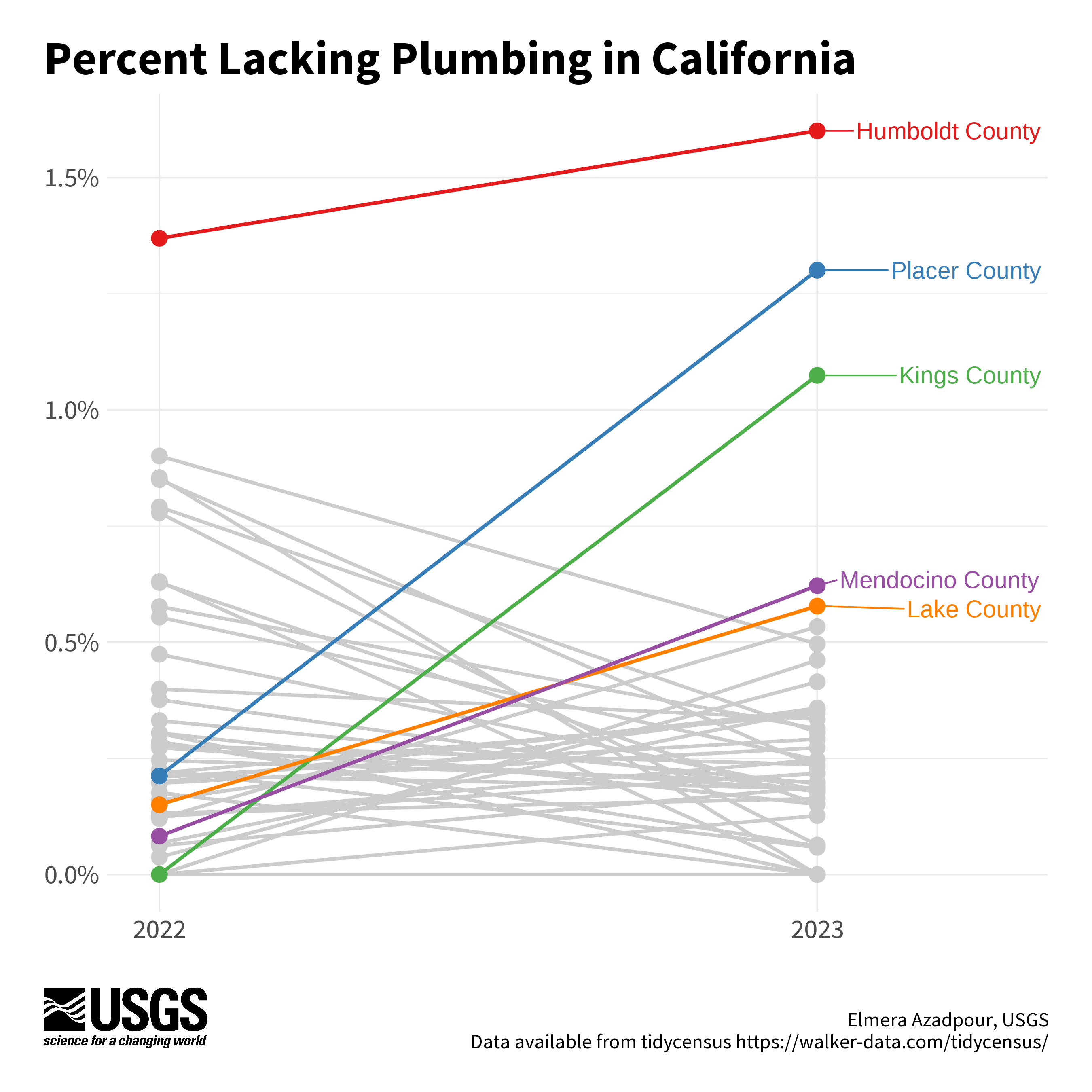
Chart by Elmera Azadpour
Code to reproduce this figure
library(RColorBrewer)
library(ggrepel)
library(scales)

# Get CA data only
plumbing_data_2022_ca <- plumbing_data_2022 |>
  filter(grepl(", California$", name))

plumbing_data_2023_ca <- plumbing_data_2023 |>
  filter(grepl(", California$", name))

# Combine 2022 and 2023 data and drop geometry
combined_data <- bind_rows(plumbing_data_2022_ca, plumbing_data_2023_ca) |>
  st_drop_geometry()

# Pivot to long format for slope chart
long_data_ca <- combined_data |>
  select(name, year, percent_lacking_plumbing) |>
  pivot_wider(names_from = year, values_from = percent_lacking_plumbing) |>
  pivot_longer(cols = c(`2022`, `2023`), names_to = "year", values_to = "percent_lacking_plumbing") |>
  mutate(name = str_remove(name, ",\\s.*"))

# Grab the top 5 counties in 2023
top_5_names <- long_data_ca |>
  filter(year == 2023) |>
  arrange(desc(percent_lacking_plumbing)) |>
  slice(1:5) |>
  pull(name)

# Add a variable to distinguish top 5 counties
long_data_ca <- long_data_ca |>
  mutate(
    top_5_flag = ifelse(name %in% top_5_names, name, "Other")
  )

# Generate a color palette for the top 5 and others
top_5_colors <- RColorBrewer::brewer.pal(5, "Set1")
neutral_color <- "gray80"              # gray color for other counties
palette <- c(setNames(top_5_colors, top_5_names), Other = neutral_color)

# Main plot
(main_plot <- ggplot() +
    # Add gray lines and points first for non-top 5 names
    geom_line(
      data = long_data_ca |> filter(!(name %in% top_5_names)),
      aes(x = year, y = percent_lacking_plumbing, group = name),
      linewidth = 1,
      color = "gray80"
    ) +
    geom_point(
      data = long_data_ca |> filter(!(name %in% top_5_names)),
      aes(x = year, y = percent_lacking_plumbing),
      size = 4,
      color = "gray80"
    ) +
    # Add lines and points for top 5 names
    geom_line(
      data = long_data_ca |> filter(name %in% top_5_names),
      aes(x = year, y = percent_lacking_plumbing, group = name, color = top_5_flag),
      linewidth = 1
    ) +
    geom_point(
      data = long_data_ca |> filter(name %in% top_5_names),
      aes(x = year, y = percent_lacking_plumbing, color = top_5_flag),
      size = 4
    ) +
    # Add labels for top 5 names
    ggrepel::geom_text_repel(
      data = long_data_ca |> filter(year == 2023 & name %in% top_5_names),
      aes(x = year, y = percent_lacking_plumbing, label = name, color = top_5_flag),
      size = 5,
      nudge_x = 0.35,
      show.legend = FALSE
    ) +
    scale_color_manual(values = palette) +
    scale_y_continuous(labels = scales::percent_format(scale = 1)) +
    scale_x_discrete(expand = c(0.08, 0)) +
    labs(
      x = NULL,
      y = NULL
    ) +
    theme_minimal() +
    theme(
      legend.position = "none",
      axis.text.x = element_text(size = 16, family = font_legend),
      axis.text.y = element_text(size = 16, family = font_legend),
      plot.margin = margin(t = 20, r = 20, b = 20, l = 20, unit = "pt")
    )
)

ggdraw(ylim = c(0,1), # 0-1 scale makes it easy to place viz items on canvas
       xlim = c(0,1)) +
  # a background
  draw_grob(canvas,
            x = 0, y = 1,
            height = 9, width = 9,
            hjust = 0, vjust = 1) +
  # the main plot
  draw_plot(main_plot,
            x = margin - 0.03,
            y = margin + 0.065,
            height = 1 - (4*margin),
            width = 1 - (margin/2)) +
  # explainer text (Edit the author name only)
  draw_label("Elmera Azadpour, USGS\n Data available from tidycensus https://walker-data.com/tidycensus/",
             x = 1 - margin,
             y = margin,
             size = 12,
             hjust = 1,
             vjust = 0,
             color = font_color,
             fontfamily = font_legend)+
  # Title
  draw_label("Percent Lacking Plumbing in California",
             x = margin,
             y = 1-margin,
             hjust = 0,
             vjust = 1,
             lineheight = 0.75,
             color = font_color,
             size = 28,
             fontfamily = font_legend,
             fontface = "bold") +
  # Add logo
  draw_image(usgs_logo,
             x = margin,
             y = margin,
             width = 0.15,
             hjust = 0, vjust = 0,
             halign = 0, valign = 0)
Bubble map example
This bubble map visualizes the change in the percent of households lacking plumbing facilities by county from 2022 to 2023. The dots represent both the direction (color) and magnitude (size) of change in the percent of households lacking plumbing from 2022 to 2023. Labels paired with curved arrows highlight two example counties and provide guidance for how to read the chart.
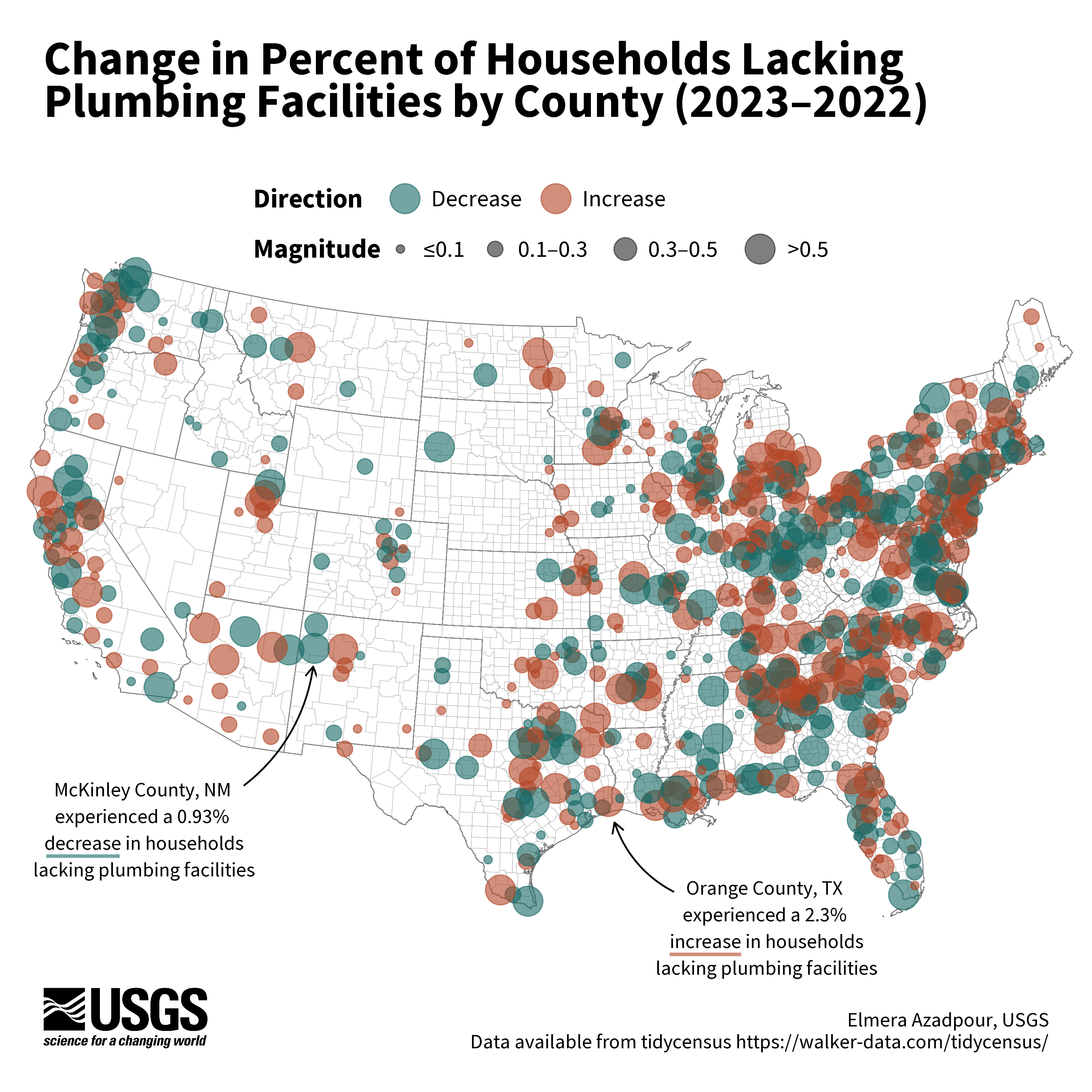
Chart by Elmera Azadpour
Code to reproduce this figure
# Get lower 48 data for 2023
plumbing_data_2023_df <- plumbing_data_2023 |>
  st_drop_geometry() |>
  filter(!str_detect(name, "Hawaii|Alaska|Puerto Rico"))

# Get lower 48 data for 2022
plumbing_data_2022_df <-  plumbing_data_2022 |>
  st_drop_geometry() |>
  filter(!str_detect(name, "Hawaii|Alaska|Puerto Rico"))

# Join 2023 and 2022 data
merged_data <- full_join(plumbing_data_2023_df, plumbing_data_2022_df,
                         by = "geoid",
                         suffix = c("_2023", "_2022"))

merged_data <- merged_data |>
  # Calculate whether the difference between
  # percent_lacking_plumbing_2023 and percent_lacking_plumbing_2022
  # is positive or negative
  mutate(change_direction = ifelse(percent_lacking_plumbing_2023 -
    percent_lacking_plumbing_2022 >= 0, "Increase", "Decrease"),
    # Calculate the absolute value of the difference between
    # percent_lacking_plumbing_2023 and percent_lacking_plumbing_2022
    change_magnitude = abs(percent_lacking_plumbing_2023 -
          percent_lacking_plumbing_2022))

merged_data_with_geometry <- plumbing_data_2023 |>
  # Retain only the geoid and geometry columns
  select(geoid, geometry) |>
  # Then join back with merge_data
  right_join(merged_data, by = "geoid")

# Calculate centroids for each geometry
merged_data_with_geometry <- merged_data_with_geometry |>
  mutate(centroid = st_centroid(geometry))

# Separate centroids for plotting bubbles
centroids <- merged_data_with_geometry |>
  select(geoid, name_2023,change_direction,change_magnitude, centroid) |>
  st_as_sf(sf_column_name = "centroid") |>
  drop_na()

# Edit centroid breaks and labels for legend
centroids <- centroids |>
  mutate(
    magnitude_category = cut(
      change_magnitude,
      breaks = c(0, 0.1, 0.3, 0.5, Inf), # Four bins
      labels = c("≤0.1", "0.1–0.3", "0.3–0.5", ">0.5"), # Corresponding labels
      include.lowest = TRUE
    )
  )

# Main plot
(main_plot <- ggplot() +
    geom_sf(
      color = "white",
      linewidth = 0.05
    ) +
    geom_sf(
      data = state_sf,
      fill = NA,
      color = "black",
      linewidth = 0.2,
      linetype = "solid"
    ) +
    geom_sf(
      data = counties_sf,
      fill = NA,
      color = "grey70",
      linewidth = 0.1,
      linetype = "solid"
    ) +
    geom_sf(
      data = centroids,
      aes(
        geometry = centroid,
        size = magnitude_category,
        color = change_direction
      ),
      alpha = 0.6
    ) +
    scale_color_manual(
      values = c("Increase" = "#B24425", "Decrease" = "#176966"),
      name = "Direction"
    )  +
    scale_size_manual(
      name = "Magnitude",
      values = c(2, 4, 6, 8), # adjust bubble sizes to match categories
      labels = c("≤0.1", "0.1–0.3", "0.3–0.5", ">0.5")
    ) +
    theme_void()
)
# Custom arrows for callouts
plot_tx <- ggplot() +
  theme_void() +
  geom_curve(data =  data.frame(x = 13, y = 5),
             aes(x = 13, y = 5,
                 xend = 12, yend = 8),
             arrow = grid::arrow(length = unit(0.5, 'lines')),
             curvature = -0.2,
             angle = 90,
             ncp = 10,
             color = 'black')

plot_nm <- ggplot() +
  theme_void() +
  geom_curve(data = data.frame(x = 13, y = 5),
             aes(x = 13, y = 5,
                 xend = 14, yend = 8),
             arrow = grid::arrow(length = unit(0.5, 'lines')),
             curvature = 0.2,
             angle = 90,
             ncp = 10,
             color = 'black')

# Custom colored horizontal lines to highlight increase/decrease in labels
increase_line <- ggplot() +
  theme_void() +
  geom_segment(aes(x = 0, y = 0, xend = 2, yend = 0),
               color = "#B24425",
               size = 1,
               alpha = 0.6)

decrease_line <- ggplot() +
  theme_void() +
  geom_segment(aes(x = 0, y = 0, xend = 2, yend = 0),
               color = "#176966",
               size = 1,
               alpha = 0.6)

# Customize legend a bit more
legends <- cowplot::get_plot_component(
  main_plot +
    theme(legend.direction = "horizontal") +
    guides(color = guide_legend(override.aes = list(size = 8),
                                order = 1),
           size = guide_legend(override.aes = list(fill = "gray60",
                               color = "black",
                               alpha = 0.5)),
           order = 2) +
    theme(legend.title = element_text(family = font_legend, face = "bold", size = 16),
          legend.text = element_text(family = font_legend, size = 14)),
  "guide-box", return_all = TRUE)

ggdraw(ylim = c(0,1), # 0-1 scale makes it easy to place viz items on canvas
       xlim = c(0,1)) +
  # a background
  draw_grob(canvas,
            x = 0, y = 1,
            height = 9, width = 9,
            hjust = 0, vjust = 1) +
  # the main plot
  draw_plot(main_plot +  theme(legend.position = "none"),
            x = margin - 0.06,
            y = margin + 0.02,
            height = 1 - (5*margin),
            width = 1.05) +
  # Add legends
  draw_plot(legends[[1]], .442, .72, .115, .15)  +
  # explainer text (Edit the author name only)
  draw_label("Elmera Azadpour, USGS\n Data available from tidycensus https://walker-data.com/tidycensus/",           x = 1 - margin,
             y = margin,
             size = 12,
             hjust = 1,
             vjust = 0,
             color = font_color,
             fontfamily = font_legend)+
  # Title
  draw_label("Change in Percent of Households Lacking\nPlumbing Facilities by County (2023–2022)",
             x = margin,
             y = 1-margin,
             hjust = 0,
             vjust = 1,
             lineheight = 0.75,
             color = font_color,
             size = 28,
             fontfamily = font_legend,
             fontface = "bold") +
  # Add logo
  draw_image(usgs_logo,
             x = margin,
             y = margin,
             width = 0.15,
             hjust = 0, vjust = 0,
             halign = 0, valign = 0)+
  # Add arrow for Orange County, Texas (increase)
  draw_plot(plot_tx,
            x = margin + 0.52,
            y = margin + 0.14,
            height = margin + 0.03,
            width = margin + 0.02) +
  draw_label("Orange County, TX\nexperienced a 2.3%\n increase in households\n lacking plumbing facilities",
             fontfamily = font_legend,
             x =  margin + 0.66,
             y = margin + 0.11,
             size = 12,
             color = "black",
             lineheight = 1.1) +
  # "Underline" increase text
  draw_plot(increase_line,
            x = margin + 0.57,
            y = margin + 0.051,
            height = margin + 0.03,
            width = margin + 0.032) +
  # Add arrow for McKinley County, New Mexico (decrease)
  draw_plot(plot_nm,
            x = margin + 0.18,
            y = margin + 0.235,
            height = margin + 0.08,
            width = margin + 0.03) +
  draw_label("McKinley County, NM\nexperienced a 0.93%\n decrease in households\n lacking plumbing facilities",
             fontfamily = font_legend,
             x =  margin + 0.09,
             y = margin + 0.2,
             size = 12,
             color = "black",
             lineheight = 1.1) +
  # "Underline" decrease text
  draw_plot(decrease_line,
            x = margin - 0.001,
            y = margin + 0.141,
            height = margin + 0.03,
            width = margin + 0.034)
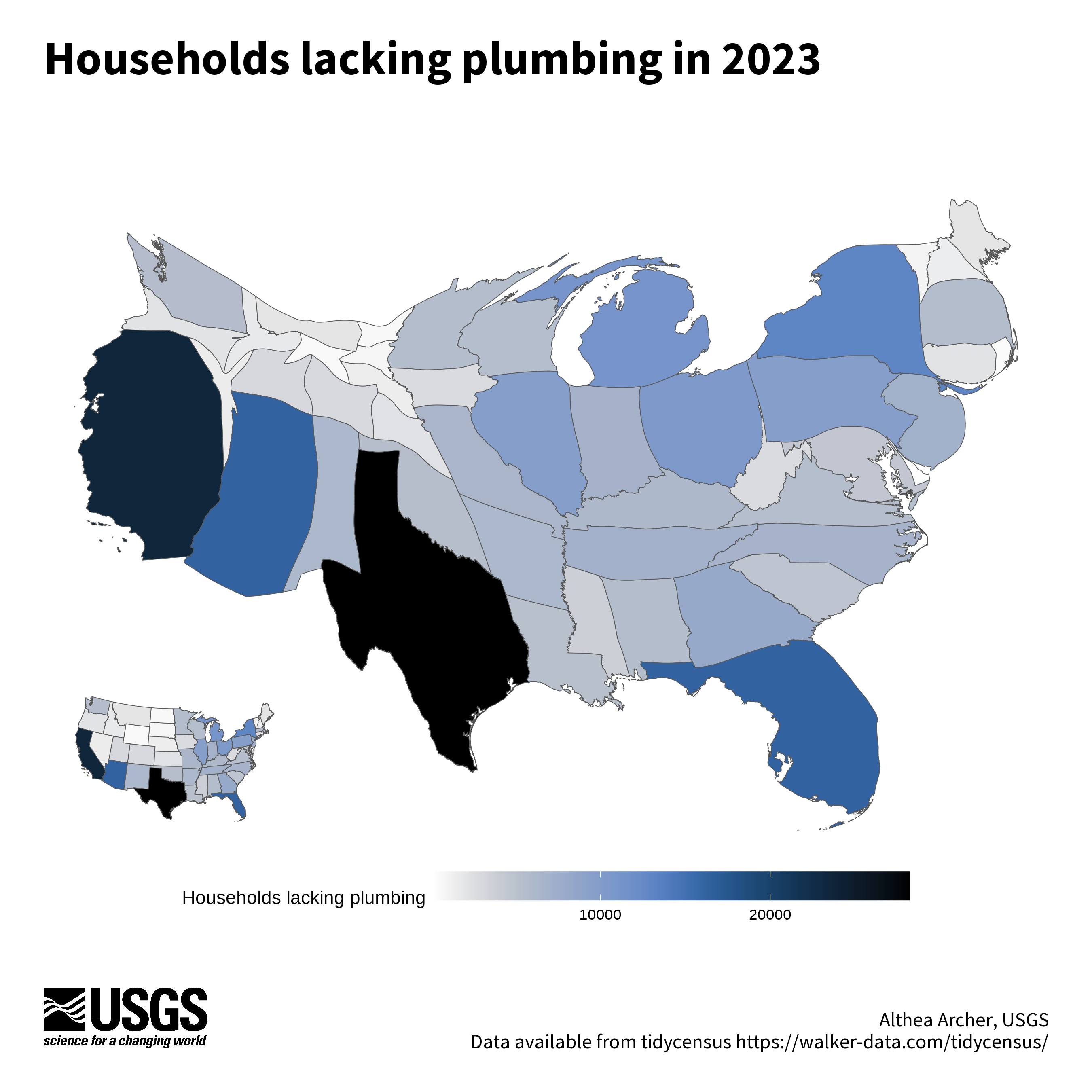
Cartogram example
Here, a cartogram distorts the scale of the states so that those with a large number of households lacking plumbing are larger than they otherwise would based on area alone, creating a warped look to familiar features. The color ramp also represents the households lacking plumbing in 2023, with darker colors in states with higher levels. There is an inset map with geographically-accurate states to provide a comparison against the warped shapes of the cartogram. The package cartogram
was used to create this map.
Code to reproduce this figure
library(cartogram)

# select only the conterminuous (lower 48) states and add USPS code
conus <- state_plumbing_data_2023 |>
  mutate(stusps = state.abb[match(name, state.name)]) |>
  filter(! stusps %in% c("AK", "AS", "HI", "PR", "VI", "MP", "GU"),
         ! name %in% "Puerto Rico")

# Use the cartogram package to create a continuous cartogram,
#   weighted by households lacking plumbing
carto_state <- cartogram::cartogram_cont(conus,
                                         weight = "plumbing")

# Plot the cartogram, with legend
(cartogram_plot <- ggplot(carto_state) +
    geom_sf(aes(fill = plumbing)) +
    scico::scale_fill_scico(palette = "oslo", direction = -1) +
    labs(fill = "Households lacking plumbing") +
    theme_void() +
    theme(legend.position = "bottom",
          legend.key.width=unit(2, "cm")))

# Plot an inset map that is not distorted
(conus_plot <- ggplot(conus) +
    geom_sf(aes(fill = plumbing)) +
    scico::scale_fill_scico(palette = "oslo", direction = -1) +
    theme_void() +
    theme(legend.position = "none"))

ggdraw(ylim = c(0,1), # 0-1 scale makes it easy to place viz items on canvas
       xlim = c(0,1)) +
  # a background
  draw_grob(canvas,
            x = 0, y = 1,
            height = 9, width = 9,
            hjust = 0, vjust = 1) +
  # the main plot
  draw_plot(cartogram_plot,
            x = 0.025,
            y = 0.15,
            width = 0.95,
            height = 0.7) +
  # the inset plot
  draw_plot(conus_plot,
            x = 0.06,
            y = 0.18,
            width = 0.2,
            height = 0.25) +
  # explainer text (Edit the author name only)
  draw_label("Althea Archer, USGS\n Data available from tidycensus https://walker-data.com/tidycensus/",
             x = 1 - margin,
             y = margin,
             size = 12,
             hjust = 1,
             vjust = 0,
             color = font_color,
             fontfamily = font_legend) +
  # Title
  draw_label("The lack of access to plumbing in 2023",
             x = margin,
             y = 1-margin,
             hjust = 0,
             vjust = 1,
             lineheight = 0.75,
             color = font_color,
             size = 28,
             fontfamily = font_legend,
             fontface = "bold") +
  draw_label("Over 200,000 households lack access to plumbing in the lower 48 United States.",
             x = margin,
             y = 1 - 0.1,
             size = 12,
             hjust = 0,
             vjust = 1,
             fontfamily = font_legend,
             color = font_color) +
  # Add logo
  draw_image(usgs_logo,
             x = margin,
             y = margin,
             width = 0.15,
             hjust = 0, vjust = 0,
             halign = 0, valign = 0)
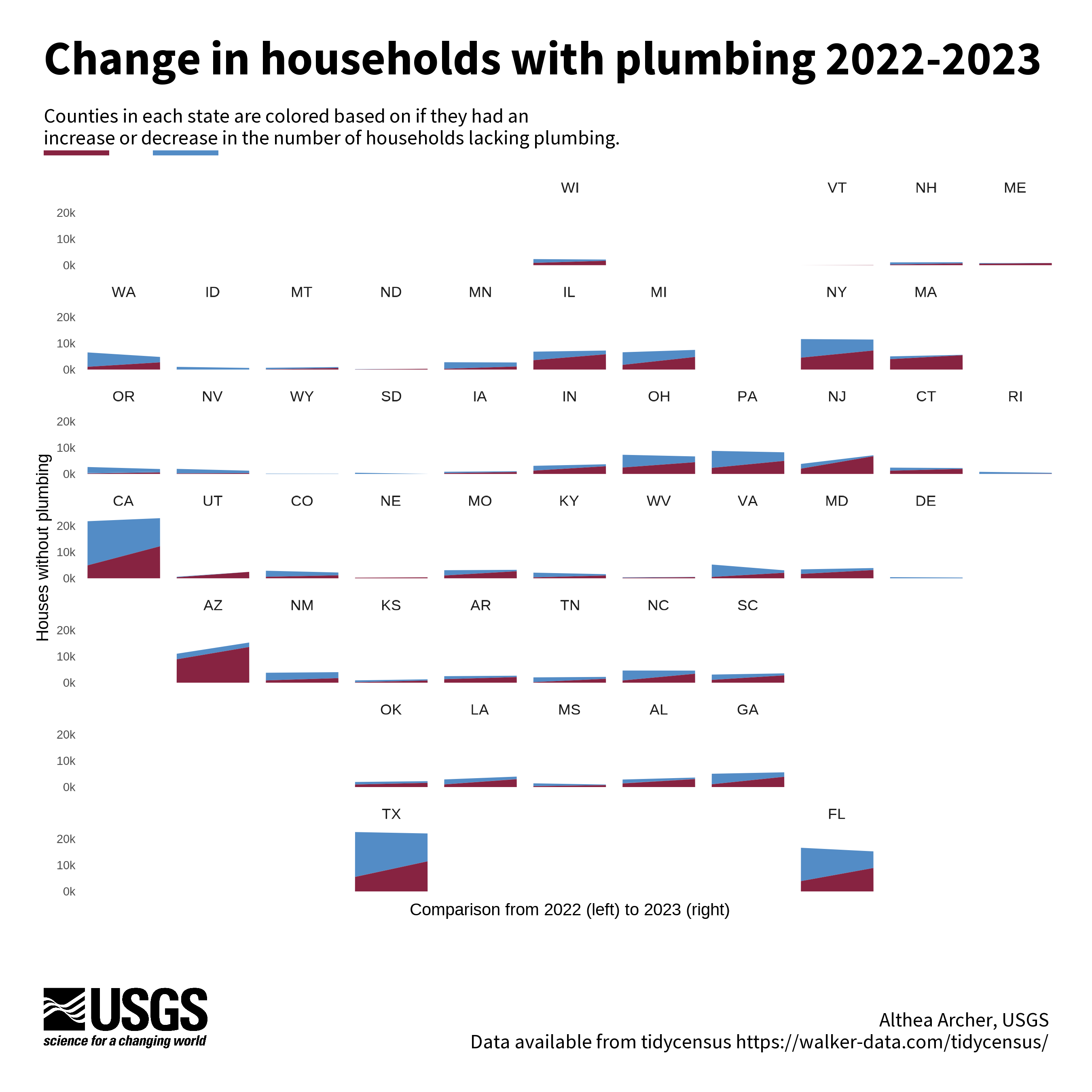
Geofaceted area plot example
Geofacets can be used to create a series of mini charts that are aligned to be consistent with geographic features. This geofacet has a mini-area plot for each state that represents the number of households with plumbing in 2022 compared to 2023. The blue areas are households from all the counties that had a decrease in the number of households from 2022 to 2023, and the red areas are the households from counties with an increase. The package we used to arrange mini charts like this was the geofacet
package.
Code to reproduce this figure
library(geofacet)

# Join 2022 and 2023 data together
joined <- plumbing_data_2022 |>
  sf::st_drop_geometry() |>
  select(-year) |>
  rename_at(vars(-name, -geoid), function(x) paste0(x, "_22")) |>
  inner_join(plumbing_data_2023 |>
              sf::st_drop_geometry() |>
              select(-name, -year) |>
              rename_at(vars(-geoid), function(x) paste0(x, "_23")),
            by = "geoid") |>
  # calculate trends from 2022 to 2023
  mutate(n_change = plumbing_23 - plumbing_22,
         pct_change = percent_lacking_plumbing_23 - percent_lacking_plumbing_22,
         n_change_cat = case_when(n_change > 0 ~ "Increasing",
                                  n_change == 0 ~ "No Change",
                                  n_change < 0 ~ "Decreasing")) |>
  mutate(state_id = substr(geoid, 1, 2))

# get grid for geofacet from the Flow Tiles open software repository
#  https://github.com/DOI-USGS/flow-tiles/blob/3f871a7ca393bd26f2a8e15a3fbd5621eb02e8f1/src/plot_cartogram.R#L2
usa_grid <- readr::read_csv("usa_grid.csv")|>
  filter(! code %in% c("PR", "HI", "AK"))

# Join data with the full counties dataset
joined_all <- joined |>
  left_join(counties_sf |> sf::st_drop_geometry() |> select(stusps, state_name, geoid),
            by = "geoid")

# back to long for plotting
long_join <- joined_all |>
  select(-name, -state_id) |>
  select(n_change_cat, stusps, state_name, geoid, plumbing_22, plumbing_23) |>
  pivot_longer(cols = c(plumbing_22, plumbing_23),
               names_to = "year",
               values_to = "households")

# Summarise by state for plotting
state_summary <- long_join |>
  filter(! is.na(stusps), stusps != "DC") |>
  group_by(stusps, n_change_cat, year) |>
  summarise(households = sum(households, na.rm = TRUE)) |>
  mutate(year_num = case_when(year == "plumbing_22" ~ 2022,
                              year == "plumbing_23" ~ 2023)) |>
  mutate(cat_factor = case_when(n_change_cat == "Increasing" ~ "C",
                                n_change_cat == "Decreasing" ~ "A",
                                TRUE ~ "B"))

(main_plot <- ggplot(data = state_summary,
                     aes(y = households, x = year_num, fill = cat_factor)) +
    geom_area() +
    scale_fill_manual(values = c("#538CC6", "#538CC6", "#872341")) +
    scale_x_continuous(breaks = c(2022, 2023), labels = c("2022", "2023"),
                       name = "Comparison from 2022 (left) to 2023 (right)") +
    scale_y_continuous(breaks = c(0, 10000, 20000), labels = c("0k", "10k", "20k"),
                       name = "Houses without plumbing") +
    geofacet::facet_geo( ~ stusps, grid = usa_grid, move_axes = TRUE) +
    theme_minimal() +
    theme(legend.position = "none",
          panel.background = element_blank(),
          panel.grid = element_blank(),
          axis.text.y = element_text(size = 7),
          axis.text.x = element_blank(),
          axis.title = element_text(size = 10)))

ggdraw(ylim = c(0,1), # 0-1 scale makes it easy to place viz items on canvas
       xlim = c(0,1)) +
  # a background
  draw_grob(canvas,
            x = 0, y = 1,
            height = 9, width = 9,
            hjust = 0, vjust = 1) +
  # the main plot
  draw_plot(main_plot,
            x = 0.025,
            y = 0.15,
            width = 0.95,
            height = 0.7) +
  # explainer text (Edit the author name only)
  draw_label("Althea Archer, USGS\n Data available from tidycensus https://walker-data.com/tidycensus/",
             x = 1 - margin,
             y = margin,
             size = 12,
             hjust = 1,
             vjust = 0,
             color = font_color,
             fontfamily = font_legend) +
  # Title
  draw_label("Change in households with plumbing 2022-2023",
             x = margin,
             y = 1-margin,
             hjust = 0,
             vjust = 1,
             lineheight = 0.75,
             color = font_color,
             size = 28,
             fontfamily = font_legend,
             fontface = "bold") +
  draw_label("Counties in each state are colored based on if they had an",
             x = margin,
             y = 1 - 0.1,
             size = 12,
             hjust = 0,
             vjust = 1,
             fontfamily = font_legend,
             color = font_color) +
  draw_label("increase or decrease in the number of households lacking plumbing.",
             x = margin,
             y = 1 - 0.12,
             size = 12,
             hjust = 0,
             vjust = 1,
             fontfamily = font_legend,
             color = font_color) +
  # "Underline" text
  draw_line(x = c(0.04, 0.10),
            y = c(1 - 0.14, 1 - 0.14),
            color = "#872341",
            linewidth = 1.4) +
  draw_line(x = c(0.14, 0.20),
            y = c(1 - 0.14, 1 - 0.14),
            color = "#538CC6",
            linewidth = 1.4) +
  # Add logo
  draw_image(usgs_logo,
             x = margin,
             y = margin,
             width = 0.15,
             hjust = 0, vjust = 0,
             halign = 0, valign = 0)
Rainfall plot example
This plot uses a paired half-rainfall and half-density plot to show the variation in households with plumbing by region. The plot of variation is paired with an inset map to show where those regions are located. Variation can be easily and beautifully plotted with the use of the ggdist
package, like we did here.
Code to reproduce this figure
library(ggdist)

# Join county data with water data
county_df <- counties_sf |>
  sf::st_drop_geometry() |>
  left_join(plumbing_data_2023 |> select(geoid, year, total_housing, plumbing,
                                       percent_lacking_plumbing),
            by = "geoid") |>
  # add regions
  mutate("CASC" = case_when(state_name %in% c("Minnesota", "Iowa", "Missouri", "Wisconsin", "Illinois", "Indiana", "Michigan", "Ohio") ~ "Midwest",
                            state_name %in% c("Montana", "Wyoming", "Colorado", "North Dakota", "South Dakota", "Nebraska", "Kansas") ~ "North Central",
                            state_name %in% c("Maine", "New Hampshire", "Vermont", "Massachusetts", "Connecticut", "Rhode Island",  "New York", "New Jersey", "Pennsylvania", "Delaware", "Maryland", "West Virginia","Virginia", "Kentucky", "District of Columbia") ~ "Northeast",
                            state_name %in% c("Washington", "Oregon", "Idaho") ~ "Northwest",
                            state_name %in% c("New Mexico", "Texas", "Oklahoma", "Louisiana") ~ "South Central",
                            state_name %in% c("North Carolina", "South Carolina", "Georgia", "Alabama", "Mississippi", "Florida", "Tennessee",                                     "Arkansas") ~ "Southeast",
                            state_name %in% c("Arizona", "California", "Utah", "Nevada") ~ "Southwest", TRUE ~ "not sorted")) |>
  # remove missing data
  filter(! is.na(year))

# join regions to state data
state_region_sf <- state_sf |>
  mutate("CASC" = case_when(name %in% c("Minnesota", "Iowa", "Missouri", "Wisconsin", "Illinois", "Indiana", "Michigan", "Ohio") ~ "Midwest",
                            name %in% c("Montana", "Wyoming", "Colorado", "North Dakota", "South Dakota", "Nebraska", "Kansas") ~ "North Central",
                            name %in% c("Maine", "New Hampshire", "Vermont", "Massachusetts", "Connecticut", "Rhode Island",  "New York", "New Jersey", "Pennsylvania", "Delaware", "Maryland", "West Virginia","Virginia", "Kentucky", "District of Columbia") ~ "Northeast",
                            name %in% c("Washington", "Oregon", "Idaho") ~ "Northwest",
                            name %in% c("New Mexico", "Texas", "Oklahoma", "Louisiana") ~ "South Central",
                            name %in% c("North Carolina", "South Carolina", "Georgia", "Alabama", "Mississippi", "Florida", "Tennessee",                                     "Arkansas") ~ "Southeast",
                            name %in% c("Arizona", "California", "Utah", "Nevada") ~ "Southwest", TRUE ~ "not sorted"))

# State map for inset
(map <- ggplot(state_region_sf) +
    geom_sf(aes(fill = CASC), color = "white", alpha = 0.85) +
    scale_fill_manual(values = pal_hue()(7))+
    theme_void()+
    theme(legend.position = 'none')
)

(main_plot <- ggplot(county_df,
                     aes(y = CASC,
                         x = percent_lacking_plumbing,
                         show.legend = FALSE)) +
    ggdist::stat_dotsinterval(fill = 'black',
                              side = "bottom", quantiles = 30)+
    ggdist::stat_halfeye(mapping = aes(fill = CASC))+
    ylab('Climate Adaptation Science Center (CASC) Region')+
    xlab('Percent of households per county lacking plumbing')+
    theme_void()+
    theme(legend.position = 'none',
          axis.title.x = element_text(size = 14),
          axis.text = element_text(size = 14, hjust = 1))
)

ggdraw(ylim = c(0,1), # 0-1 scale makes it easy to place viz items on canvas
       xlim = c(0,1)) +
  # a background
  draw_grob(canvas,
            x = 0, y = 1,
            height = 9, width = 9,
            hjust = 0, vjust = 1) +
  # the main plot
  draw_plot(main_plot,
            x = margin,
            y = 0.170,
            height = 0.775,
            width = 1) +
  ## inset map
  draw_plot(map,
            x = 0.15,
            y = 0.25,
            height = 0.28) +
  # explainer text (Edit the author name only)
  draw_label("Sharmin Siddiqui, USGS\n Data available from tidycensus https://walker-data.com/tidycensus/",
             x = 1 - margin,
             y = margin,
             size = 12,
             hjust = 1,
             vjust = 0,
             color = font_color,
             fontfamily = font_legend) +
  # Title
  draw_label("Regional differences in access to plumbing, 2023",
             x = margin,
             y = 1-margin,
             hjust = 0,
             vjust = 1,
             lineheight = 0.75,
             color = font_color,
             size = 28,
             fontfamily = font_legend,
             fontface = "bold") +
  # Add logo
  draw_image(usgs_logo,
             x = margin,
             y = margin,
             width = 0.15,
             hjust = 0, vjust = 0,
             halign = 0, valign = 0)
Grid chart example
This chart uses an overall grid-layout to compare income versus plumbing access. The chart is divided into counties that saw an increase or decrease in median household income (left versus right) and into counties that saw an increase or decrease in the percent of households with plumbing (top versus bottom). Each county is then shown with a square, scaled to the total population in that county in 2023. The map author was inspired by this Datawrapper visualization.

Code to reproduce this figure
plumbing_df <- plumbing_data_2022 |>
  inner_join(sf::st_drop_geometry(plumbing_data_2023),
             join_by("geoid", "name"),
             suffix = c("_2022", "_2023")) |>
  mutate(
    change_in_having_per =
      percent_having_plumbing_2023 - percent_having_plumbing_2022,
    change_in_income = median_household_income_2023 - median_household_income_2022,
    category = case_when(
      (change_in_income > 0 & change_in_having_per >= 0) ~ "a",
      (change_in_income > 0 & change_in_having_per < 0) ~ "b",
      (change_in_income < 0 & change_in_having_per >= 0) ~ "c",
      TRUE ~ "d"
    )) |>
  filter(!is.na(change_in_having_per))


# get geoids for SW U.S.
focal_geoids <- counties_sf |>
  filter(state_name %in% c("Arizona", "California", "Utah", "Nevada")) |>
  pull(geoid)

# subset data to SW U.S.
data_subset <- plumbing_df |>
  filter(geoid %in% focal_geoids) |>
  arrange(desc(total_pop_2023))

# get data subsets for annotations
# 49011 Davis County, Utah - lower right
# 04003 Cochise County, Arizona - lower left
# 04005 Coconino County, Arizona - upper right
lower_right <- filter(data_subset, geoid == "49011")
lower_left <- filter(data_subset, geoid == "04003")
upper_right <- filter(data_subset, geoid == "04005")
label_size <- 4

main_plot <- ggplot(data_subset) +
  geom_point(
    aes(x = change_in_income,
        y = change_in_having_per,
        fill = category,
        alpha = 0.2,
        size = total_pop_2023),
    color = "white",
    pch = 22) +
  geom_point(
    data = lower_right,
    aes(x = change_in_income,
        y = change_in_having_per,
        fill = category,
        size = total_pop_2023),
    color = "black",
    pch = 22
  ) +
  geom_point(
    data = lower_left,
    aes(x = change_in_income,
        y = change_in_having_per,
        fill = category,
        size = total_pop_2023),
    color = "black",
    pch = 22
  ) +
  geom_point(
    data = upper_right,
    aes(x = change_in_income,
        y = change_in_having_per,
        fill = category,
        size = total_pop_2023),
    color = "black",
    pch = 22
  ) +
  scale_fill_manual(values = c("steelblue2", "tomato3", "mediumaquamarine", "orange"),
                    aesthetics = c("fill", "color")) +
  scale_x_continuous(expand = c(0.02, 0.02)) +
  scale_y_continuous(expand = c(0.01, 0.01)) +
  scale_size_continuous(range = c(1.5, 15)) +
  theme_void() +
  geom_hline(yintercept = 0, linetype = "dotted", color = "grey80",
             linewidth = 0.5) +
  geom_vline(xintercept = 0, linetype = "dotted", color = "grey80",
             linewidth = 0.5) +
  geom_text(data = head(data_subset, 1),
            aes(x = max(data_subset$change_in_income, na.rm = TRUE) * 0.05,
                y = min(data_subset$change_in_having_per, na.rm = TRUE) * 1.1,
                label = "MORE INCOME →"),
            hjust = 0,
            color = "#6E6E6E") +
  geom_text(data = head(data_subset, 1),
            aes(x = max(data_subset$change_in_income, na.rm = TRUE) * -0.05,
                y = min(data_subset$change_in_having_per, na.rm = TRUE) * 1.1,
                label = "← LESS INCOME"),
            hjust = 1,
            color = "#6E6E6E") +
  geom_text(data = head(data_subset, 1),
            aes(x = min(data_subset$change_in_income, na.rm = TRUE) * 1.1,
                y = min(data_subset$change_in_having_per, na.rm = TRUE) * 0.16,
                label = "LESS PLUMBING"),
            hjust = 0,
            vjust = 1,
            color = "#6E6E6E") +
  geom_text(data = head(data_subset, 1),
            aes(x = min(data_subset$change_in_income, na.rm = TRUE) * 1.1,
                y = max(data_subset$change_in_having_per, na.rm = TRUE) * 0.1,
                label = "MORE PLUMBING"),
            hjust = 0,
            vjust = 0,
            color = "#6E6E6E") +
  geom_text(data = head(data_subset, 1),
            aes(x = min(data_subset$change_in_income, na.rm = TRUE) * 1.09,
                y = max(data_subset$change_in_having_per, na.rm = TRUE) * 0.18,
                label = "↑"),
            hjust = 0,
            vjust = 0,
            color = "#6E6E6E") +
  geom_text(data = head(data_subset, 1),
            aes(x = min(data_subset$change_in_income, na.rm = TRUE) * 1.09,
                y = min(data_subset$change_in_having_per, na.rm = TRUE) * 0.25,
                label = "↓"),
            hjust = 0,
            vjust = 1,
            color = "#6E6E6E") +
  geom_text(data = lower_right,
            aes(
              x = change_in_income,
              y = change_in_having_per * 1.06,
              label = paste(name, paste0("pop. ", formatC(total_housing_2023, format = "d", big.mark=",")), sep = "\n")),
            size = label_size,
            vjust = 1) +
  geom_text(data = lower_left,
            aes(
              x = change_in_income,
              y = change_in_having_per * 1.18,
              label = paste(name, paste0("pop. ", formatC(total_housing_2023, format = "d", big.mark=",")), sep = "\n")),
            size = label_size,
            vjust = 1) +
  geom_text(data = upper_right,
            aes(
              x = change_in_income,
              y = change_in_having_per * 0.965,
              label = paste(name, paste0("pop. ", formatC(total_housing_2023, format = "d", big.mark=",")), sep = "\n")),
            size = label_size,
            vjust = 1) +
  theme(
    legend.position = "none"
  )

map <- ggplot() +
  geom_sf(data = state_sf, color = "white", fill = "grey90") +
  geom_sf(data = filter(state_sf,
                        name %in% c("Arizona", "California", "Utah", "Nevada")),
          color = "white", fill = "grey30") +
  theme_void()

ggdraw(ylim = c(0,1), # 0-1 scale makes it easy to place viz items on canvas
       xlim = c(0,1)) +
  # a background
  draw_grob(canvas,
            x = 0, y = 1,
            height = 9, width = 9,
            hjust = 0, vjust = 1) +
  # the main plot
  draw_plot(main_plot,
            x = margin,
            y = margin * 3,
            height = 1 - (8 * margin),
            width = 1 - (2 * margin)) +
  draw_plot(map,
            x = margin,
            y = margin * 6,
            width = 0.2) +
  # explainer text (Edit the author name only)
  draw_label("Hayley Corson-Dosch, USGS\n Data available from tidycensus https://walker-data.com/tidycensus/",
             x = 1 - margin,
             y = margin,
             size = 12,
             hjust = 1,
             vjust = 0,
             color = font_color,
             fontfamily = font_legend) +
  # Title
  draw_label("Household income versus plumbing access\nfrom 2022 to 2023",
             x = margin,
             y = 1-margin,
             hjust = 0,
             vjust = 1,
             lineheight = 0.75,
             color = font_color,
             size = 28,
             fontfamily = font_legend,
             fontface = "bold") +
  # annotations
  draw_label("Change in median income and access to plumbing from 2022 to 2023 for counties in the Southwest U.S.",
             x = margin,
             y = 1 - 0.12,
             size = 12,
             hjust = 0,
             vjust = 1,
             fontfamily = font_legend,
             color = font_color) +
  draw_label("The size of each square is scaled to the population of each county.",
             x = margin,
             y = 1 - 0.14,
             size = 12,
             hjust = 0,
             vjust = 1,
             fontfamily = font_legend,
             color = font_color) +
  # Add logo
  draw_image(usgs_logo,
             x = margin,
             y = margin,
             width = 0.15,
             hjust = 0, vjust = 0,
             halign = 0, valign = 0)
Additional resources
View tidycensus developers’, Kyle Walker and Matt Herman, website
to learn more about additional package functionality and documentation. Check out the book “Analyzing US Census Data: Methods, Maps, and Models in R
”, by Kyle Walker, for additional information on wrangling, modeling, and analyzing U.S. Census data. View our site
to learn more about related research.
References
U.S. Census Bureau, 2022, “Tenure by Plumbing Facilities,” American Community Survey, 1-Year Estimates Detailed Tables, Table B25049, accessed on Jan 26, 2025, https://data.census.gov/table?q=B25049&y=2022 .
U.S. Census Bureau, 2022, “Total Population,” American Community Survey, 1-Year Estimates Detailed Tables, Table B01003, accessed on Jan 26, 2025, https://data.census.gov/table?q=B01003&y=2022 .
U.S. Census Bureau, 2022, “Median household income,” American Community Survey, 1-Year Estimates Detailed Tables, Table B19013, accessed on Jan 26, 2025, https://data.census.gov/table?q=B19013&y=2022 .
U.S. Census Bureau, 2023, “Tenure by Plumbing Facilities,” American Community Survey, 1-Year Estimates Detailed Tables, Table B25049, accessed on Jan 26, 2025, https://data.census.gov/table?q=B25049&y=2023 .
U.S. Census Bureau, 2023, “Total Population,” American Community Survey, 1-Year Estimates Detailed Tables, Table B01003, accessed on Jan 26, 2025, https://data.census.gov/table?q=B01003&y=2023 .
U.S. Census Bureau, 2023, “Median household income,” American Community Survey, 1-Year Estimates Detailed Tables, Table B19013, accessed on Jan 26, 2025, https://data.census.gov/table?q=B19013&y=2023 .
Walker K and Herman M. 2024. tidycensus: Load US Census Boundary and Attribute Data as “tidyverse” and “sf”-Ready Data Frames. R package version 1.6.5, https://walker-data.com/tidycensus/ .
Any use of trade, firm, or product names is for descriptive purposes only and does not imply endorsement by the U.S. Government.
Categories:
Related Posts
Easy hydrology mapping with nhdplusTools, geoconnex, and ggplot2
November 28, 2025
Go from hard-to-read default visuals to easy-to-read river maps in a few easy steps!
Duplicating Quarto elements with code templates to reduce copy and paste errors
May 20, 2025
Introduction
It is a common situation in data science and analysis: We want to create a series of figures, tables, or summary statistics for a set of data. Maybe we’re studying different species of irises or penguins or the current flow conditions for various streamgages (the example used below), and we want a different summary figure or table for each. One common approach is to write code for one set of the data, such as setting up the graphing parameters in a
ggplotdata visualization or calculating a series of statistics for a single species/streamgage. Then, once happy with that, copying and pasting the code for each entity, modifying the code slightly for each iteration.A map that glows with the vocabulary of water
February 27, 2026
English is the official language and authoritative version of all federal information.
A map that glows with the vocabulary of water
What is your first impression of the map above? To me, it is the shimmer. Thousands of points of light, each one a stream or river, illuminating a darkened basemap. Look closely and a pattern emerges: the country’s waterways form a linguistic constellation. These points are classified not from population data or even explicitly by hydrology. They glow strictly according to the vocabulary used to name them and what can be implied about the hydrology of these streams based on their names.
Extracting the grammar of U.S. stream names
February 27, 2026
English is the official language and authoritative version of all federal information.
Extracting a stream’s feature
The names of streams (hydronyms ) contain, hidden within them, the power to show us the linguistic patterns within the United States. In the United States, stream names tend to follow a binomial structure: a specific name (“Moose,” “Columbia,” “Snake”) paired with a generic feature word (“creek,” “river,” “fork,” “bayou”). The specific portion is endlessly variable, but the generic part is surprisingly stable. In fact, if you look at stream names across the country, the diversity of generic terms is relatively small, but shaped by centuries of hydrologic realities, settlement history, and local tradition.
Mapping water insecurity in R with tidycensus
December 9, 2024
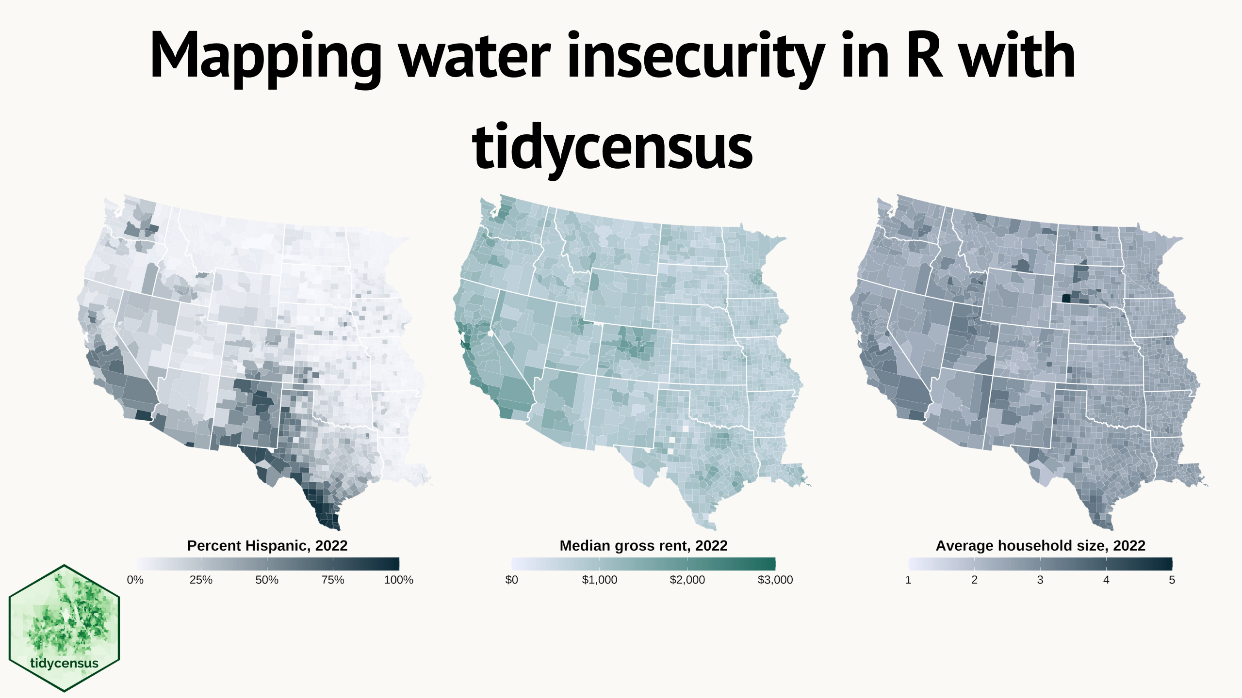
Water insecurity can be influenced by number of social vulnerability indicators—from demographic characteristics to living conditions and socioeconomic status —that vary spatially across the U.S. This blog shows how the
tidycensuspackage for R can be used to access U.S. Census Bureau data, including the American Community Surveys, as featured in the “Unequal Access to Water ” data visualization from the USGS Vizlab. It offers reproducible code examples demonstrating use oftidycensusfor easy exploration and visualization of social vulnerability indicators in the Western U.S.