
User-Centered Design - WDFN Multi-Location Functionality
This blog post demonstrates how we used the core principles of user-centered design, "learn," "build," and "refine" to modernize Water Data for the Nation (WDFN)
What's on this page
User-centered design is a process where we focus our designs based on the context and the needs of our users. We involve users throughout our agile and user-centered development process. The core principles of user-centered design are to learn about the users, build for their needs, and refine your designs based on their feedback.
This blog post focuses on how we used the core principles of user-centered design to modernize the Water Data for the Nation (WDFN) multi-location functionality. Learn more about user-centered design in our previous blog.

The legacy system
Before we talk about the modernized webpages, we have to start at the beginning with what it looked like in legacy NWISWeb. NWISWeb launched in 1995 and included several webpages that provided multi-location functionality that allowed a user to view conditions at more than one location on a webpage. There were two main components to the multi-location functionality—tabular comparisons and graphed data. Some of this functionality is still available at the time this blog post was written but others have been decommissioned. You can read about our decommission process on this blog post: NWISWeb Decommission Campaign Summary .
Tabular comparisons included custom and state lists of continuous, daily value, and other data types. Tabular views could also include custom tables. Users could walk through a selection pane and create a custom list and bookmark it for later.
The image to the right shows an example screenshot of the NWIS current conditions page for Hawaii.

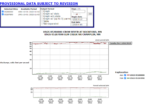
Another aspect of the legacy multi-location functionality was graphed data including a scrollable page of separate hydrographs and a combined hydrograph.
The image to the left shows the legacy combined hydrograph with discharge at two locations in Minnesota.
In 2022, we started the process of modernizing the multi-location webpages. We wanted to maintain important features and improve upon the legacy system. The first step was to discover how people used the legacy system and what they needed from modernized pages.
Step 1: Learn how people use the legacy system
We conduct discovery research through a process called a path analysis. A path analysis helps us understand the problem space and identify a path forward. In a path analysis, we focus on understanding our technical systems and our users’ needs. We conduct a series of user interviews during the 8–10-week path analysis, and we use the findings to finalize our path forward, including product plans, implementation details, and additional research we still need to continue.
The goals of the multi-location path analysis were to understand who uses the functionality, why they use that functionality, and prioritize features to include in the modernized webpages. We spoke with dozens of users including emergency managers, canoe and kayak enthusiasts, USGS hydrotechnicians, river restoration managers, and many others! We asked people to walk us through their typical workflow including why they compare or look at multiple locations, what functionality they need to meet their needs, and what they do after they have the information. From the conversations we got a better sense of their needs and identified roadblocks or pain points in their current workflows. We were able to prioritize features by understanding which features are the most commonly used and how they are used.
We noted several points of confusion with how people interacted with the legacy current conditions state map, how they navigated to the visualization pages, and how they found location IDs of interest. Users expressed interest in a system that helped them find locations of interest, see a list of locations with some summary information or graphs, and use that list with other data tools (like the Monitoring Location Page).
There were two primary use cases for multi-location functionality. First was for operations. These people include USGS hydrotechnicians and cooperators who want to make sure the data is transmitting correctly. Second was for decision making, either for current or future decisions. They used the functionality to understand pulse and travel time between locations and interpolate between locations to make their decisions.
"I like being able to put the three sites on one plot because you see in real time what's going on and follow the crest. You can see when the crest hit the locations and see how long it will take to get to the next point in the system."
-County-level resiliency officer
We used the information we collected to create personas for the primary use cases. These personas helped us keep the user in mind as we moved forward with early designs.

Persona of Arthur, a fictional 72-year-old co-lead of a local fly-fishing group from Jackson, Mississippi.
In this example, we include behaviors, frustrations, goals, and needs in our persona profile. We noticed many people, represented by Arthur, scanned a table of all locations within a state for certain known locations. While this was their behavior, it might not be the most efficient. Why not have a table that only shows the locations a person is interested in?
Using the information we learned about user behavior, use cases, and points of confusion, we were able to prioritize the features to include in the modernized pages.
Step 2: Build modernized functionality with user needs in mind
We developed three pages to start the modernization of the multi-location functionality: Combined Location Hydrograph , My Favorites (and My Favorites-Graphed), and the State Page . I will now walk through how we considered user needs when designing each page.
Combined Location Hydrograph
The Combined Location Hydrograph allows users to view and share the latest data for up to 5 monitoring locations on a single graph. Based on our path analysis findings, we built the page to meet the following user needs:
- Combined location graph that should be on its own webpage
- A graph that does not need to be highly interactive
- A choice of date ranges
- Easier to find location names or IDs
- Legacy features including a graph of at least 3 locations, data auto-updates, and the ability to bookmark
We’re happy with the page but always listen to user feedback on ways to improve the page. One comment we’ve heard and consider is allowing custom date ranges for the graph to allow people to view a specific water event. You can read all about the Combined Location Hydrograph on our previous blog post .
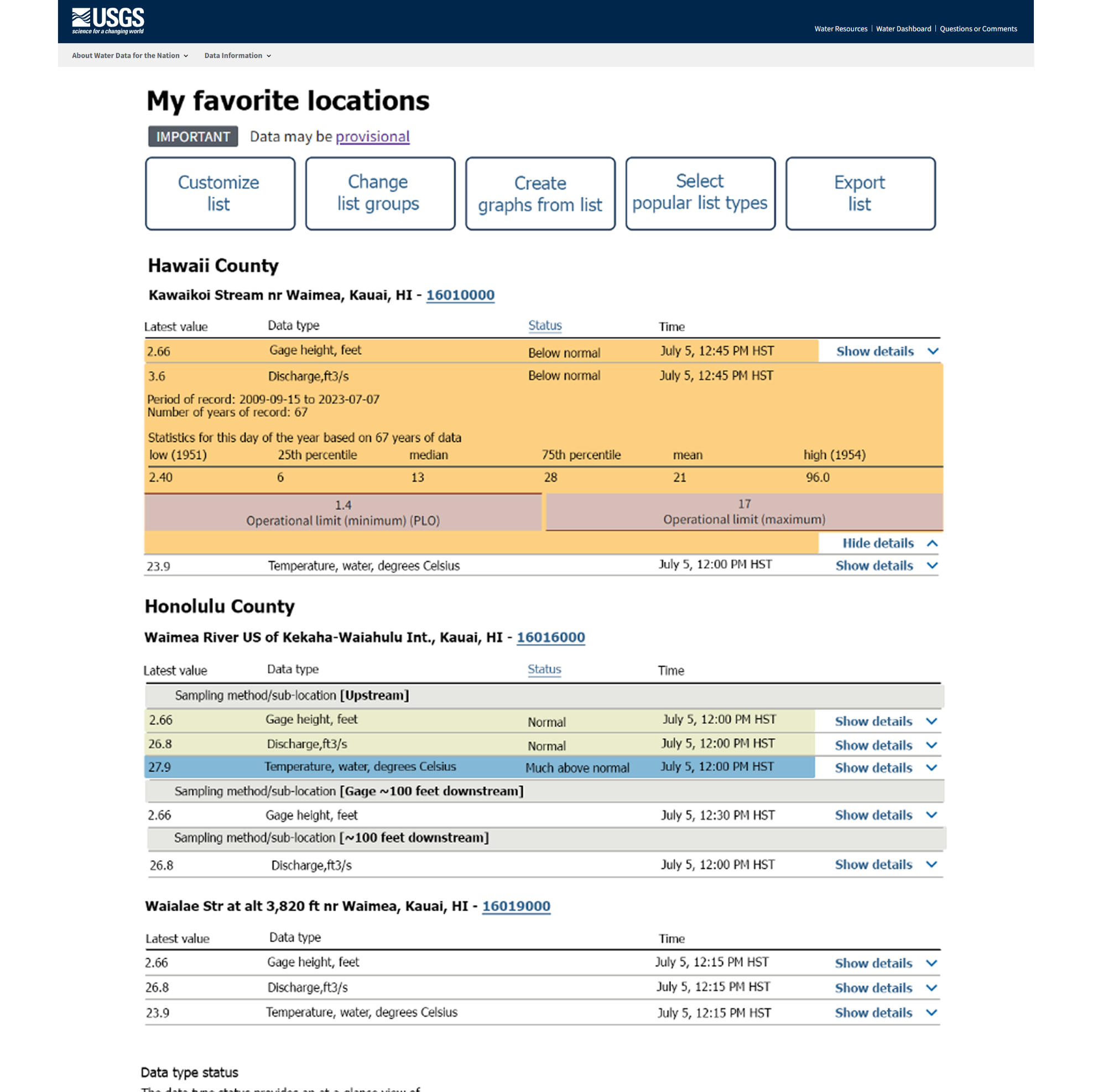
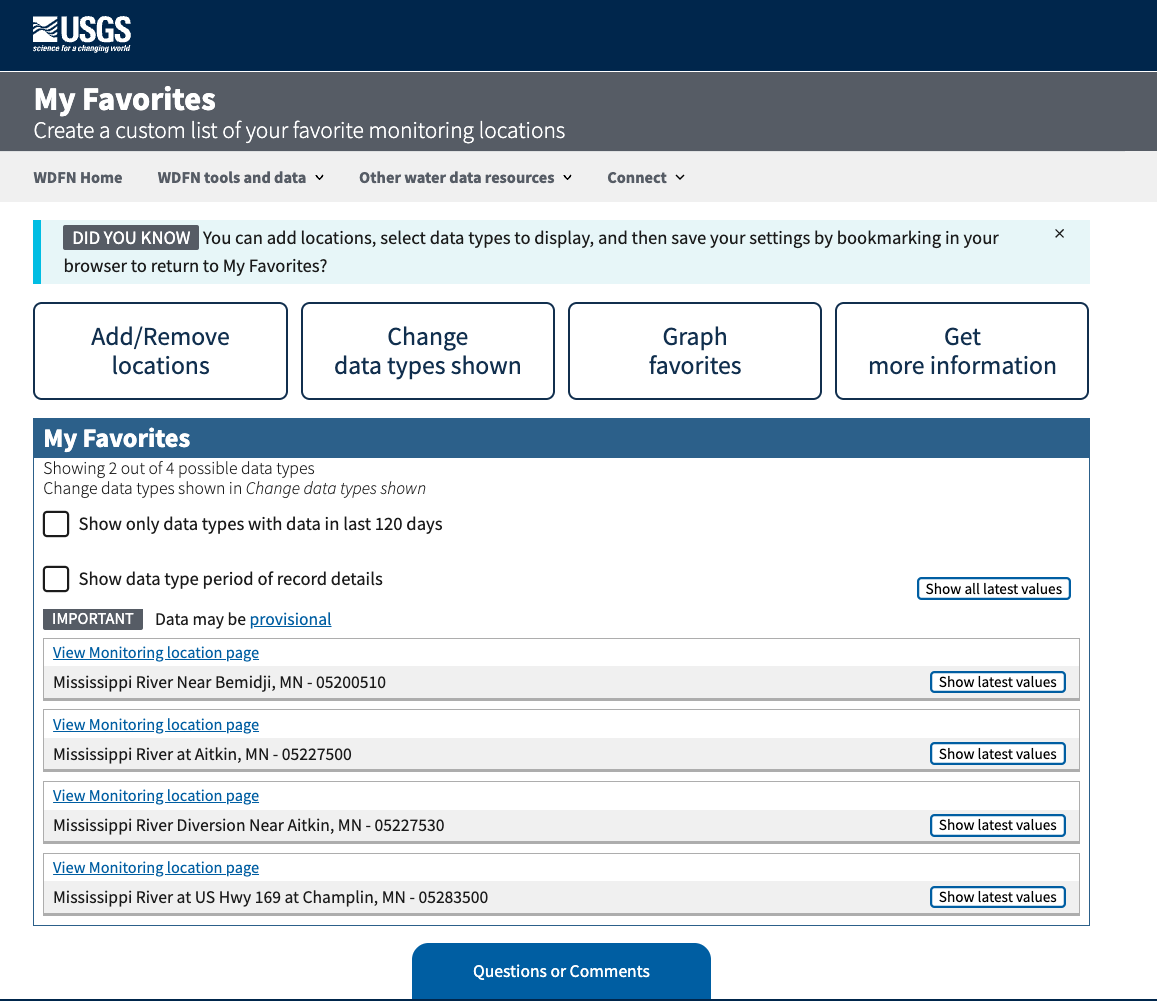
My Favorites
My Favorites is a centralized place to keep track of the monitoring locations a user is interested in. Another way we think about user needs is to create user stories. For example, some user stories for My Favorites are:
- I need to keep track of the monitoring locations that are important to me
- I need an easy way to add and remove locations from my list
- I’d like to decide which data types I’m interested in seeing
- I’d like to see location status as a glance
We think through the features required for each user story and build our designs. We made several updates to the design before it was released. You can read all about My Favorites and My Favorites-Graphed on our previous blog post
These images show an early design of My Favorites compared to the current, released version.
State Page
The final piece of the multi-location functionality to bring your attention to is the State Pages . These State Pages provide a way to see an overview of monitoring locations located in each state that collect continuous data. In our user interviews, we noticed that some people really like using a map to find locations while others prefer a list. That’s why we include both. We considered the following user stories when designing the page:
- I need to keep track of the current conditions of monitoring locations available in the state
- I need to filter the list by data type collected at the location
- I want to see the most recent values of the data types for all applicable locations in a state
- I need to navigate to other pages of interest about these locations
We’re still actively improving the State Page with plans to organize locations by river basin, add flow lines and water bodies to map, and improve “at a glance” information. Read more about our State Pages on our previous blog post .
Step 3: Refine designs with real users
While we designed with user needs in mind, the only way to know if we meet those needs is to ask actual users. We conducted usability tests on early designs of the Combined Location Hydrograph, My Favorites-Graphed, and State Page. In a usability test, we asked people to perform representative tasks on the pages while we observed and identified pain points and roadblocks to completing the tasks. Getting feedback before these pages are available on the web is invaluable, and allows us to make quick adjustments, such as changing color, moving buttons, and identifying areas for future improvements.
For example, talking with users helps us ensure the graph colors are accessible and usable. Usability testing of the Combined Location Hydrograph helped us adjust the colors used on the hydrograph.

These images show the changes to the Combined Location Graph based on usability testing. The image on the left is a prototype and shows green, blue, yellow, and red lines. The image on the right is the current version and includes green, light blue, dark blue, and purple lines on the graph.
User-Centered Design is iterative and ongoing
Once a page is available, we never consider it finished. As new features are added to a page, we perform usability tests of the page to ensure it is meeting the needs of its users. We also test the flow between pages and overall workflows for efficiency. In 2024, we spoke with over 75 people in user interviews and usability testing as we developed additional functionality for WDFN.
In addition to regular usability testing, we also consider the feedback we receive to our Water Data for the Nation (WDFN) inbox. On each webpage there is a blue Questions or Comments box. Every email that we receive has a real person read it and respond. We use a backlog from user emails to help prioritize and identify further refinements.
If you are interested in participating in user interviews or usability testing, please email us at wdfn_usabilitytesting@usgs.gov . If you have general feedback about WDFN you can email wdfn@usgs.gov .
Categories:
Related Posts
User-Centered Design
June 8, 2022
The USGS Water Resources Mission Area (WMA) is the largest provider of real time and historical water information in the world. A major part of our work on information delivery is to build modern web applications and APIs to make these data publicly available.
Highlights from our 2024 WDFN User Survey
February 6, 2025
In October 2024 we asked people to answer a few questions about how they use Water Data for the Nation (WDFN), and over a thousand of you answered. We heard from people around the country, including 47 states, American Samoa, and Puerto Rico. We learned a lot from you and would like to share what we found.
Updates and improvements to the National Water Dashboard
March 19, 2026
The National Water Dashboard (NWD) continues to evolve as we modernize our water-data delivery tools and improve how users discover, explore, and interact with real‑time information. Our latest set of updates focuses on simplifying the map experience, improving usability, adding new ways to customize your view, and continuing our long‑term transition away from legacy services. Below is an overview of what’s new.
Advanced Check Status Users
May 19, 2024
Here at WDFN, we employ user-centered design to build better products and reduce risk. This blog is one of a five-part series on users of WDFN: Are You a USGS Water Data User? | Water Data For The Nation Blog .
Check Status Users
December 29, 2021
Here at WDFN, we employ user-centered design to build better products and reduce risk. This blog is one of a five-part series on users of WDFN: Are You a USGS Water Data User? | Water Data For The Nation Blog .