
A map that glows with the vocabulary of water
Building firefly-style maps in R to see patterns in stream names across United States.
What's on this page
English is the official language and authoritative version of all federal information.
A map that glows with the vocabulary of water
What is your first impression of the map above? To me, it is the shimmer. Thousands of points of light, each one a stream or river, illuminating a darkened basemap. Look closely and a pattern emerges: the country’s waterways form a linguistic constellation. These points are classified not from population data or even explicitly by hydrology. They glow strictly according to the vocabulary used to name them and what can be implied about the hydrology of these streams based on their names.
Stream names do more than tell us where water is, they shape how we imagine it. Names reflect the practical needs of the people who coined them, but they also guide the way later generations perceive the streams themselves.
This glowing effect, sometimes called a firefly map or a glow map, has been popularized for the last decade or so by cartographers and data visualization leaders like John Nelson and Dominic Royé . The idea is simple: place bright points on a dark canvas and let them softly diffuse outward. The glow helps clusters stand out, even when individual points are small or sparse. It’s an aesthetic trick with analytical consequences.
In this post, we’ll build the map from scratch. Well, almost… see Extracting the grammar of U.S. stream names for how to do the stream name text wrangling. The data, the naming logic, the spatial handling, and finally the layered glow that gives everything its luminous character.
The secret dialect of American streams
Travel through the country and streams begin speaking in regional dialects. You’ll find brooks threading New England valleys, licks in Kentucky hollows, runs darting across the Mid-Atlantic, and ritos tucked into New Mexico canyons. The names of these streams are the quiet archaeology of settlement, climate, and culture.
In the United States, stream names tend to follow a two-part structure. A generic name (the feature) describes what kind of stream it is. A specific name distinguishes it from its neighbors. In Moose Creek, “Moose” is specific; “Creek” is the feature.
Most stream names contain a limited set of these features (generic names): creek, branch, run or brook and their region-specific cousins. They are often the final word in the stream name (or hydronym): Adobe Creek, Fletchers Branch, Ashurst Run, Spring Brook. Sometimes they show up elsewhere: Arroyo de la Vaca, North Fork Diamond Creek, and Menorkenut Slough Number 16.
These terms carry meaning. An arroyo suggests intermittent flow in a dry landscape. A branch hints at dendritic feeder streams in humid regions. But the feature can also influence how we mentally frame the water: a name like Willow Springs conjures clarity and freshwater, even before any measurement is taken. Iron Springs Swamp, despite the presence of “Springs,” lands differently; the feature “swamp” colors expectations of murk, tannins, and slow water.
The glow map at the top of the post is built on these feature words. The vocabulary creates the pattern.
Data source: GNIS, lightly pre-cleaned for this tutorial
The U.S. Board on Geographic Names has spent more than a century approving and standardizing geographic names for the federal use. These names and locations are now cataloged in the Geographic Names Information System (GNIS). GNIS serves as an official reference to U.S. place names and currently contains nearly a million domestic place names across dozens of categories, ranging from towns and reservoirs to bays, glaciers, and, crucially for us, streams.
Our focus is on the 220,316 named streams in the lower 48 states (conterminous United States or CONUS). GNIS doesn’t explicitly label the feature term within each stream name, so assigning a feature requires its own parsing logic. That process involves string matching, exceptions, alternate word orders, and a few judgment calls. The full workflow lives in a separate companion post ; this tutorial starts with a cleaned dataset where each stream already has a feature assigned.
The dataset includes four columns:
stream_name: the hydronym from GNISfeature: the derived feature (e.g., “creek,” “branch,” “arroyo”)prim_lat_dec: the representative latitude (NAD83)prim_long_dec: the representative longitude (NAD83)
You can download the cleaned dataset here: GNIS Stream Name Map | code.usgs.gov .
Before diving in, let’s get the R environment ready.
# Install necessary packages
install.packages(c(
  "tidyverse",  # For data manipulation and plotting
  "sf",         # For handling spatial points
  "terra",      # For handling spatial rasters
  "rmapshaper", # For efficiently modifying spatial polygons
  "basemaps",   # For acquiring basemaps
  "tidyterra",  # For plotting spatial rasters
  "sysfonts",   # For downloading Google font
  "showtext"    # For using Google font in ggplot
))

# Attach packages that we'll really rely on
library(tidyverse)
library(sf)
library(terra)
Once the data is downloaded and the packages are installed, load the stream dataset and convert it to a spatial object:
stream_name_sf <- read_csv("path/to/classified_gnis_streams.csv") |>
  # Convert to spatial points using NAD83 decimal degrees
  st_as_sf(coords = c("prim_long_dec", "prim_lat_dec")) |>
  st_set_crs("EPSG:4326") |>
  # Project to Albers Equal Area (CONUS) projection
  st_transform("EPSG:5070")

stream_name_sf
#> Simple feature collection with 220316 features and 3 fields
#> Geometry type: POINT
#> Dimension:     XY
#> Bounding box:  xmin: -2355797 ymin: 281770.6 xmax: 2267405 ymax: 3340592
#> Projected CRS: NAD83 / Conus Albers
#>
#>   stream_name     feature           geometry
#>   <chr>           <chr>          <POINT [m]>
#> 1 Agua Sal Creek  creek   (-1192821 1575113)
#> 2 Agua Sal Wash   wash    (-1192823 1575128)
#> 3 Bar X Wash      wash    (-1298231 1139631)
#> 4 Bis Ii Ah Wash  wash    (-1207931 1510966)
#> 5 Brawley Wash    wash    (-1424135 1154288)
#> 6 Corn Creek Wash wash    (-1340814 1462812)
This gives us a spatial data frame of every named stream point, ready for mapping and glowing 🌟.
Categorizing hydronyms: ephemeral vs. persistent
Before we start glowing up the map, we need to tame the data a bit. Plotting all 220,000 points would turn the display into an unreadable mess, like a sky full of stars with no constellations. This is a good moment to introduce some structure by grouping stream features in a way that’s meaningful for the map(s) we want to build.
For this tutorial, the goal is to explore whether certain stream features hint at the tempo of water on the landscape. Some features mark places shaped by flashiness, water that appears abruptly in dry terrain, while others hint at slowness, meandering, or stagnation. By looking just at the stream names, keep in mind that these aren’t hydrologic truths so much as linguistic hints left by the people who named these waterways. If we want hydrologic truths, we could always investigate actual USGS water data.
Once we assign each stream to one of these categories, we can filter the dataset down and produce a quick exploratory plot. The plot won’t be beautiful yet, just enough to confirm the categories landed where we expect.
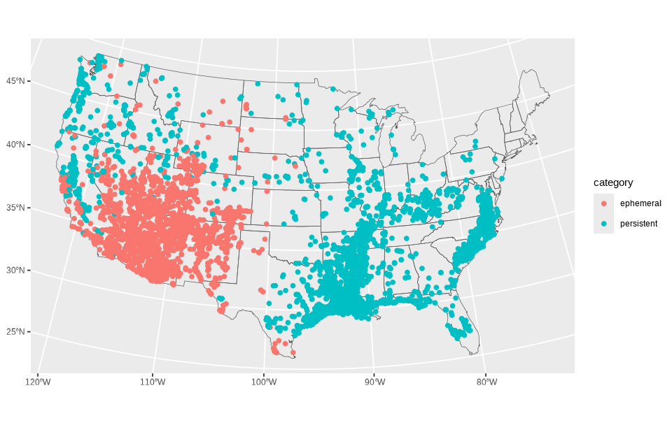
stream_cat_sf <- stream_name_sf |>
  # Categorize data
  mutate(category = case_when(
    feature %in% c("arroyo", "wash", "draw", "gulch") ~ "ephemeral",
    feature %in% c("slough", "bayou", "slue", "swamp", "marsh", "hollow", "lick") ~ "persistent"
  )) |>
  # Filter to only data in our two categories
  filter(!is.na(category))

# Create a base layer for the conterminous US for orientation
conus <- st_as_sf(maps::map("state", fill = TRUE, plot = FALSE)) |>
  dplyr::filter(!ID %in% c("alaska", "hawaii")) |>
  st_transform("EPSG: 5070")

# Create simple plot
ggplot() +
  geom_sf(data = conus, fill = NA) +
  geom_sf(data = stream_cat_sf, aes(color = category))
You’ll notice immediately that the general pattern makes sense: ephemeral features crowding arid terrain and persistent features clustering in wetter regions. But the overplotting makes it hard to appreciate the distribution. This is exactly why the firefly technique helps: density becomes visible without losing the individuality of points.
Building the firefly basemap
The whole point of a firefly map is establishing clear visual hierarchy: you want the reader’s eye to go to the glowing points first, then to the subtle shapes of the land in the area of interest, and only then to the context of the global surroundings. The quick plot above does none of this, with everything sitting on equal visual footing.
To create the right visual hierarchy, the basemap needs to do some quiet lifting. A dark, desaturated background gives the points something to shine against, while a slightly brighter surface within the CONUS boundary helps ground the geography. After all, fireflies’ displays are only really impressive in the dark.
Below is the start-to-finish preparation of that stage. The result will be a two-layer basemap: very dark outside the U.S., subtly brighter inside it.
The first challenge is that most public basemap tiles arrive in Web Mercator, the projection used by online tiled web maps . It’s perfect for interactive browsing, but it distorts the lower 48 in ways that clash with a static visualization. To use a more appropriate projection, Albers Equal Area (EPSG: 5070 ), we’ll grab a slightly oversized chunk of imagery so the edges don’t warp or clip during reprojection.
We’ll start by dissolving state boundaries into a single polygon, simplifying it, and buffering it so our basemap has some breathing room.
# Dissolve the CONUS polygons to remove state boundaries and simplify the shape
conus_dissolve <- conus |>
  rmapshaper::ms_dissolve() |>
  rmapshaper::ms_simplify(keep = 0.15)
Now we fetch the satellite imagery (in RGB, red-green-blue, color space) and convert it into HSV (hue–saturation–value) color space, which makes it much easier to darken and desaturate.
# Get basemap base of world imagery and prepare it
basemap_orig <- basemaps::basemap_terra(
  st_buffer(conus_dissolve, 1200000), # Give an extra 1200km buffer of imagery
  map_service = "esri",
  map_type = "world_imagery",
  map_res = 1
) |>
  # Project and crop it
  terra::project(terra::crs(conus_dissolve)) |>
  terra::crop(st_buffer(conus_dissolve, 100000)) |>
  # Convert to hue-saturation-value color space
  terra::colorize(to = "hsv")
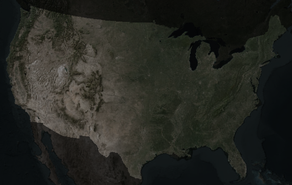
The trick to building our visual hierarchy up is to generate two versions of the same satellite raster: a heavily darkened one for the background, and a slightly lighter one for the United States itself. First for the background:
# Create the background basemap (outside of conterminous US)
basemap_background <- basemap_orig

# Desaturate (to 40% saturation) and darken (to 20% brightness)
basemap_background$saturation <- basemap_background$saturation * 0.4
basemap_background$value <- basemap_background$value * 0.2
And for the foreground map:
# Create the foreground basemap (conterminous US)
basemap_foreground <- basemap_orig

# Desaturate (40% saturation) and darken (50% brightness)
basemap_foreground$saturation <- basemap_foreground$saturation * 0.4
basemap_foreground$value <- basemap_foreground$value * 0.5

# Mask to CONUS
basemap_foreground <- terra::mask(basemap_foreground, conus_dissolve)
Finally, we combine the layers with the U.S. sitting atop its surroundings, then convert back to RGB for plotting.
# Combine basemaps into single raster by covering the background with foreground
firefly_basemap <- terra::cover(basemap_foreground, basemap_background)

# Identify raster as HSV color raster
terra::set.RGB(firefly_basemap, type = "hsv")

firefly_basemap <- terra::colorize(firefly_basemap, to = "rgb")
plot(firefly_basemap)
From here, the map has a stage set for our glowing hydronyms, and all the subsequent layers will build on top of this visual foundation.
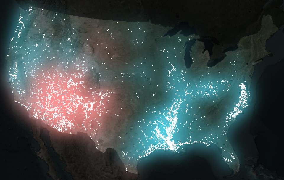
Layering points with the glow technique
Dense point data tend to collapse into an indistinguishable mass. When hundreds or thousands of points land in the same few pixels, the eye loses any intuitive sense of scale. A saturated blob might represent a handful of overlapping points or a whole very dense mass and there is no way to tell.
Here we introduce a technique that leans upon visual intuition rather than statistical abstraction. Each point emits a soft halo that fades outward. As halos accumulate, their shared light intensifies. The result includes patterns designed by both hydrology and language.
To use this effect, we wrap each point layer inside with_outer_glow()
from ggfx
. The catch is that with_outer_glow() works per layer and per color. Since our data have two categories (ephemeral and persistent), we split the data and plot each set separately.
# Split the dataset into a list of two data frames, by category
stream_sf_list <- split(stream_cat_sf, stream_cat_sf$category)

# Generate the plot
ggplot() +
  # Plot basemap
  tidyterra::geom_spatraster_rgb(data = firefly_basemap) +
  # Plot ephemeral points with glow
  ggfx::with_outer_glow(
    geom_sf(data = stream_sf_list$ephemeral, color = "white", size = 0.1),
    colour = "#fe9090",
    sigma = 25,
    expand = 6
  ) +
  # Plot persistent points with glow
  ggfx::with_outer_glow(
    geom_sf(data = stream_sf_list$persistent, color = "white", size = 0.1),
    colour = "#4ed2e9",
    sigma = 25,
    expand = 6
  ) +
  coord_sf(expand = FALSE) +
  theme_void()
The glow parameters (expand for distance, sigma for intensity) depend on output image size and resolution, so it’s best to dial them in only after choosing your final image dimensions.
Adding some finishing touches
To get this plot looking really nice, I’m going to lean on a bunch of cool tricks I learned from the legendary Jazz up your ggplots! blog post.
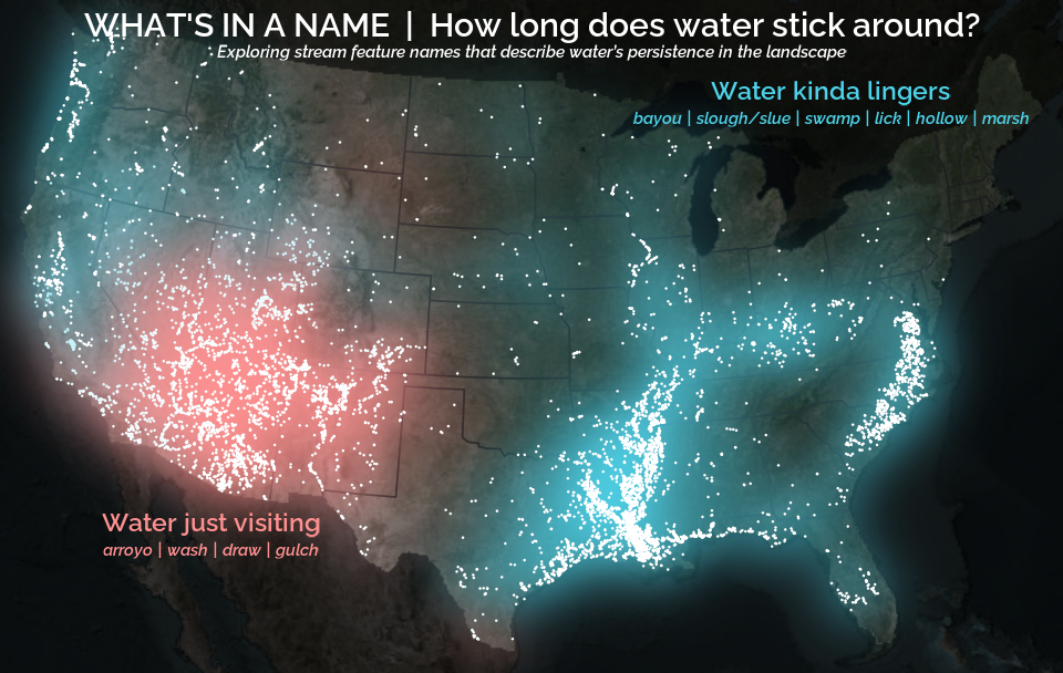
The glow looks nice - we have a glow 🤩 - but it’s not yet clear what we’re looking at. Labels can help articulate the thematic contrasts, and small pieces of visual context help the viewer grasp the lay of the land. Here we assemble those elements systematically.
Labels in ggplot2 can be added in several ways, but annotate()
is well-suited for small clusters of hand-placed text. To keep things tidy, we store all label properties in a companion data frame (text_df) to avoid calling annotate() a bunch of times.
text_df <- data.frame(
  x = c(-50000, -50000, -1500000, -1500000, 1300000, 1300000),
  y = c(3150000, 3150000 - 120000, 900000, 900000 - 120000, 2850000, 2850000 - 120000),
  color = c("white", "white", "#fe9090", "#fe9090", "#4ed2e9", "#4ed2e9"),
  size = c(8, 4, 6, 4, 6, 4),
  face = c("plain", "italic", "plain", "italic", "plain", "italic"),
  label = c(
    "WHAT'S IN A NAME  |  How long does water stick around?",
    "Exploring stream feature names that describe water’s persistence in the landscape",
    "Water just visiting",
    "arroyo | wash | draw | gulch",
    "Water kinda lingers",
    "bayou | slough/slue | swamp | lick | hollow | marsh"
  )
)
These coordinates live in the map’s projected units (meters in Albers Equal Area). Finding them by hand is easiest with the locator() tool, using a temporary base plot to record click positions.
plot(firefly_basemap)
locator(n = 6) # After clicking a couple places in my RStudio Plots pane, I hit the ESC key
#> $x
#> [1] -49125.8  -1347336.3 1379445.9
#>
#> $y
#> [1] 3122826.9 885327.9   2812551.9
With these xy coordinates, I tend to round them to a nicer looking number.
To add geographic orientation without distracting from the glow, we’ll use simplified and subtle state boundaries. I only want inner state lines because the international borders look kind of weird with this basemap.
# Get state boundaries and simplify them
conus_inner <- rmapshaper::ms_innerlines(conus) |>
  rmapshaper::ms_simplify(keep = 0.1)
Finally, we specify a font to give the labels personality and clarity without overwhelming the visual hierarchy. Here the Raleway typeface (which I am partial to because of those fun Ws that remind me of Charles Rennie Mackintosh) is loaded using sysfonts ; showtext is activated so ggplot can render it.
sysfonts::font_add_google("Raleway", regular.wt = 600)
showtext::showtext_auto(enable = TRUE)
Now with the data prepared and the fonts enabled, we can finally plot it.
ggplot() +
  tidyterra::geom_spatraster_rgb(data = firefly_basemap) +
  geom_sf(data = conus_inner, color = "#1d1d1d") +
  ggfx::with_outer_glow(
    geom_sf(data = stream_sf_list$ephemeral, color = "white", size = 0.1),
    colour = "#fe9090",
    sigma = 25,
    expand = 6
  ) +
  ggfx::with_outer_glow(
    geom_sf(data = stream_sf_list$persistent, color = "white", size = 0.1),
    colour = "#4ed2e9",
    sigma = 25,
    expand = 6
  ) +
  annotate(
    "text",
    label = text_df$label,
    x = text_df$x,
    y = text_df$y,
    color = text_df$color,
    size = text_df$size,
    fontface = text_df$face,
    family = "Raleway"
  ) +
  coord_sf(expand = FALSE) +
  theme_void()
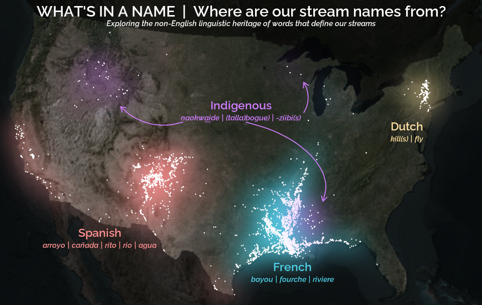
A linguistic variant: mapping stream name origins
Everything we’ve built so far (the basemap, glowing points, labels, custom fonts) can be reused for a new map. This time the goal shifts even more from hydrology to linguistics: observing the distribution and patterns of non-English stream name features.
The workflow barely changes, even as the story expands. Still, we (1) categorize features, (2) split the data, (3) create a label dataframe, and (4) pass each category through its own glowing layer.
# Prep point data
stream_cat_sf <- stream_name_sf |>
  mutate(category = case_when(
    feature %in% c("bogue", "tallabogue", "naokwa\u0331i\u0331de",
                   "aabajijiwani-ziibiinsing", "bgoji-ziibiinhs",
                   "wazhashki-ziibiins", "ziibins" ) ~ "indigenous",
    feature %in% c("arroyo", "cañada", "rito", "rio", "agua") ~ "spanish",
    feature %in% c("bayou", "fourche", "riviere") ~ "french",
    feature %in% c("kill", "kills", "fly") ~ "dutch"
  )) |>
  filter(!is.na(category))

stream_sf_list <- split(stream_cat_sf, stream_cat_sf$category)

# Prep labels
text_df <- data.frame(
  x = c(-50000, -50000, 1600000, 1600000, -1460000, -1460000, 460000, 460000,
        -50000, -50000, -385000),
  y = c(3150000, 3150000 - 120000, 2000000, 2000000 - 120000, 940000,
        940000 - 120000, 600000, 600000 - 120000, 2210000, 2210000 - 120000,
        2210000 - 155000),
  color = c("white", "white", "#ffe0a2", "#ffe0a2", "#fe9090", "#fe9090",
            "#4ed2e9", "#4ed2e9", "#D17DFF", "#D17DFF", "#D17DFF"),
  size = c(8, 4, 6, 4, 6, 4, 6, 4, 6, 4, 4),
  face = c("plain", "italic", "plain", "italic", "plain", "italic", "plain",
           "italic", "plain", "italic", "plain"),
  label = c(
    "WHAT'S IN A NAME  |  Where are our stream names from?",
    "Exploring the non-English linguistic heritage of words that define our streams",
    "Dutch",
    "kill(s) | fly",
    "Spanish",
    "arroyo | ca\u00f1ada | rito | rio | agua",
    "French",
    "bayou | fourche | riviere",
    "Indigenous",
    "naokwaide | (talla)bogue | -ziibi(s)",
    "—" # For the underline to properly render naokwa̱i̱de in Shoshoni
  )
)

# Plot data
ggplot() +
  tidyterra::geom_spatraster_rgb(data = firefly_basemap) +
  ggfx::with_outer_glow(
    geom_sf(data = stream_sf_list$spanish, color = "white", size = 0.1),
    colour = "#fe9090",
    sigma = 25,
    expand = 6
  ) +
  ggfx::with_outer_glow(
    geom_sf(data = stream_sf_list$french, color = "white", size = 0.1),
    colour = "#4ed2e9",
    sigma = 25,
    expand = 6
  ) +
  ggfx::with_outer_glow(
    geom_sf(data = stream_sf_list$dutch, color = "white", size = 0.1),
    colour = "#ffe0a2",
    sigma = 25,
    expand = 6
  ) +
  ggfx::with_outer_glow(
    geom_sf(data = stream_sf_list$indigenous, color = "white", size = 0.1),
    colour = "#D17DFF",
    sigma = 25,
    expand = 6
  ) +
  annotate(
    "text",
    label = text_df$label,
    x = text_df$x,
    y = text_df$y,
    color = text_df$color,
    size = text_df$size,
    fontface = text_df$face,
    family = "Raleway"
  ) +
  geom_curve(
    aes(x = I(0.38), y = I(0.60), xend = I(0.25), yend = I(0.65)),
    arrow = grid::arrow(length = unit(0.5, 'lines')),
    curvature = -0.3,
    color = "#D17DFF",
    linewidth = 0.5
  ) +
  geom_curve(
    aes(x = I(0.51), y = I(0.60), xend = I(0.67), yend = I(0.34)),
    arrow = grid::arrow(length = unit(0.5, 'lines')),
    curvature = -0.5,
    angle = 60,
    color = "#D17DFF",
    linewidth = 0.5
  ) +
  geom_curve(
    aes(x = I(0.63), y = I(0.63), xend = I(0.63), yend = I(0.73)),
    arrow = grid::arrow(length = unit(0.5, 'lines')),
    curvature = 0.3,
    color = "#D17DFF",
    linewidth = 0.5
  ) +
  coord_sf(expand = FALSE) +
  theme_void()
A couple of things stand out in this new version of the same workflow.
- The plot code grows in length but not complexity; adding categories is just stacking more glow-wrapped layers.
- We create arrows with
geom_curve() - The start and end points of the curve live in canvas coordinates using
I(), a quick way to position elements relative to the plotting viewport rather than the map’s CRS. These go from 0 to 1 where (0,0) is the bottom-left corner and (1,1) is the top-right corner. Where I havex = I(0.38), y = I(0.60), we are indicating 38% from the left edge of the plot and 60% from the bottom.
Closing thoughts
Across these maps a pattern emerges: tiny points, a bit of glow, and some thoughtful labeling can reveal surprising structure in something that may be overlooked when focusing on heavy hydrologic data analysis, like the names of streams. Whether the map is tracking hydrologic persistence of water or linguistic ancestry, the technique stays the same.
The glow functions like a visual density estimator, revealing where patterns concentrate. The labels give viewers a foothold in the story, while the basemap keeps the geography grounded and the viewer oriented. Layer by layer, the map becomes something that feels more tangible and intuitive than purely technical.
This post focused on the visualization side of the project, using pre-categorized stream names. Check out the companion article
, which goes upstream into the text itself: cleaning raw place names, extracting the features buried inside them, and building the dataset that makes all of this mapping possible. Here we get into the nitty gritty of how to extract fork from North Fork Diamond Creek, creek from Creek Italian, and river from Upper River Deshee to make this cartography possible.
A quick note on the history of naming
Stream names tell stories, sometimes of local geography, sometimes of history. Today, official names are standardized by the U.S. Board on Geographic Names , established to ensure consistency across federal maps and records. Over time, naming conventions have shifted, and in many cases, names introduced by settlers became official. Today’s official names reflect the historical development of geographic naming and administrative decisions in the United States.
Categories:
Related Posts
Extracting the grammar of U.S. stream names
February 27, 2026
English is the official language and authoritative version of all federal information.
Extracting a stream’s feature
The names of streams (hydronyms ) contain, hidden within them, the power to show us the linguistic patterns within the United States. In the United States, stream names tend to follow a binomial structure: a specific name (“Moose,” “Columbia,” “Snake”) paired with a generic feature word (“creek,” “river,” “fork,” “bayou”). The specific portion is endlessly variable, but the generic part is surprisingly stable. In fact, if you look at stream names across the country, the diversity of generic terms is relatively small, but shaped by centuries of hydrologic realities, settlement history, and local tradition.
Reproducible Data Science in R: Say the quiet part out loud with assertion tests
September 2, 2025

Overview
This blog post is part of the Reprodicuble data science in R series that works up from functional programming foundations through the use of the targets R package to create efficient, reproducible data workflows.
Reproducible Data Science in R: Flexible functions using tidy evaluation
December 17, 2024

Overview
This blog post is part of a series that works up from functional programming foundations through the use of the targets R package to create efficient, reproducible data workflows.
Reproducible Data Science in R: Iterate, don't duplicate
July 18, 2024

Overview
This blog post is part of a series that works up from functional programming foundations through the use of the targets R package to create efficient, reproducible data workflows.
Reproducible Data Science in R: Writing better functions
June 17, 2024

Overview
This blog post is part of a series that works up from functional programming foundations through the use of the targets R package to create efficient, reproducible data workflows.