
A New Take on the Water Cycle
On October 13th 2022, we released a new water cycle diagram! This update re-envisions the water cycle, placing human activities at the forefront. We designed it to emphasize scientific accuracy, information design, and usability in educational settings. We hope that students of all ages better understand how humans affect where water is on Earth and how it moves, so that we can work towards using water more sustainably.
Our new Water Cycle Diagram, complete with a title, legend, and inset text.
Folks - this is big news.
On October 13th 2022, we released a new water cycle diagram !
View and download the diagram by visiting the Water Science School .
Read more about the two teams who collaborated on this: VizLab and Web Communications.
As the United States Geological Survey, we collect data and observe phenomena in the natural environment. In Water Resources Mission Area, we focus on environmental data related to water. We make observations in the natural environment, then we communicate those observations through depictions like the water cycle diagram.
This diagram provides a jumping-off point for people to relate to the hydrologic cycle. It informs how people understand where water is stored (pools) and how it moves between those locations (fluxes).
It’s important to get these snapshots right. At all stages of education, we rely on broad-stroke depictions of scientific concepts and processes. For people to walk away with a representative understanding of the water cycle, the diagram must accurately and effectively depict key concepts.
The science is clear: humans impact the water cycle. Our new water cycle diagram includes human activity and human water use, providing a complete picture of where water is on Earth and how it moves. It’s also modern, user-friendly, and visually appealing.
Motivation for the Re-design
The legacy USGS water cycle diagram was first published in 2000. It was translated into over 60 languages. With 4 million pageviews annually, it is one of the most visited web pages on the USGS Water Science School .
As a core representation of hydrological science, the legacy diagram was used in labs, classrooms, and textbooks worldwide, helping to educate millions of students. It has shaped how students, educators, researchers, and policymakers understand hydrology.
The retired USGS Water Cycle Diagram, first published in 2000, was used in labs, classrooms, and textbooks worldwide, helping to educate millions of students.
Since the publication of the legacy diagram, our understanding of the water cycle has evolved thanks to advances in the field of hydrology. We better understand where water is on Earth, how it moves, and how human actions affect water resources.
With ongoing environmental change and global water issues such as drought, flooding, and other natural hazards that impact water availability, the role of humans in the water cycle is increasingly important to understand. Human activities were not represented in the legacy version of the diagram, providing an incomplete picture of the global water cycle.
The water cycle diagram redesign was motivated in part due to a 2019 publication titled “Human domination of the global water cycle absent from depictions and perceptions” (Abbott et al. 2019). The authors analyzed the content of over 450 water cycle diagrams from around the world, including the legacy USGS diagram. They found three common problems when they compared the diagrams to current scientific understanding of the water cycle. Most diagrams omitted human interaction with the water cycle, depicted only a single watershed, and left out key pools and fluxes.
A New, Modern Water Cycle Diagram
Over an 18-month period, our interdisciplinary team of scientists, designers, and user experience experts redesigned the USGS water cycle diagram, putting humans at the forefront. The new diagram emphasizes scientific accuracy, design, and usability in educational settings.
Scientific Accuracy
Geographers demonstrate that 75% of the Earth’s ice-free land surface has been disturbed by humans (Ellis et al., 2010). Water use and human activities change when and how water moves, how much water there is, and how clean water is.
However, Abbott et al. found that most diagrams (including the legacy USGS diagram) do not show how humans interact with the water cycle. So in the new diagram, we included human activity and water use. We added some of the major categories of water use in the U.S. , a few of which are thermoelectric power generation, irrigation water use, and domestic water use.
Some types of water use in the U.S. (photos) and where those categories of water use are depicted in the new diagram (illustrations). Humans use and interact with water through the production of our food, products, and energy. In order to get a full understanding of the water cycle, we must visualize all the components that affect it. Humans are one of those components affecting the water cycle.
In addition to depicting ways in which humans interact with the water cycle, the new diagram provides a more comprehensive representation of pools and fluxes. We took a data-informed approach when designing the new diagram, using global water estimates aggregated by Abbott et al. 2019 to identify key pools and fluxes of water on Earth.
The new diagram features 15 pools and 18 fluxes and is complemented by an interactive data visualization showing the magnitude of each pool and flux . Five of the ten largest pools are groundwater, permafrost, saline lakes, wetlands, and soil moisture, but they’ve been omitted from 50% or more of existing diagrams (Abbott et al. 2019). So, we made sure to include them, and represent their magnitude appropriately.
We also offer a new, detailed view of groundwater and its subsurface dynamics. We intentionally emphasized groundwater, as it is a large pool that is often less understood than familiar features like lakes and rivers. The new depiction tackles a common misconception by illustrating groundwater in pore spaces and cracks, rather than in underground rivers.
Additional details show aquifers that are confined and unconfined, as well as those with and without pathways for recharge. We added wells withdrawing groundwater from multiple aquifers, hydraulic fracturing, saltwater intrusion, and over pumping that leads to a cone of depression. All these details provide a framework for educators to teach students about the movement and residence time of groundwater.
The new diagram demonstrates a common occurrence wherein humans pump groundwater in greater quantities with higher frequency than it is recharged, resulting in what is called a cone of depression.
Single-watershed diagrams often use large, circular arrows, depicting one large cycle. And 95 percent of the diagrams that Abbott and colleagues analyzed only depict a single watershed. But water moves between watersheds and at continental scales. Prior diagrams fail to communicate the complexity of the global cycle, which is comprised of many interwoven cycles.
So our new diagram includes multiple watersheds: a coastal basin, a dry closed basin, a wet glacier-fed basin, and a basin dominated by agriculture and grazing. The new diagram employs a series of distributed small arrows and an inset showing generalized flux pathways, communicating that water moves at both large and very small scales through many interconnected cycles. We’re more accurately representing multi-catchment dynamics such as evapotranspiration from the land surface, which can be an important driver of precipitation in downwind watersheds.
Our goal was to convey that while there is this broader cycling of water, there are also many nested cycles occurring within it, many of which are due to human activities and natural processes.
Highlighted view of one of the multiple watersheds depicted in the diagram.
The use of small-scale arrows in the primary diagram is complemented by a mini overview of water fluxes, which provides a high-level overview of how water moves through and across the landscape.
Design
A cluttered visual landscape can feel visually overwhelming. People don’t know where to look. But we needed to include appropriate arrows and color to effectively guide people through the diagram. So, we followed principles of design by choosing visually receded arrows and by focusing on one color: blue.
Landscape features and human activity are drawn in grayscale, and only the water, either fresh or saline, is shown in color. This restricted use of color helps with attention pacing. When a user first sees the diagram, their eyes are drawn to the most important component of the diagram – water features. Then, the user is drawn to the labels and arrows, and finally the user’s eyes explore the background landscape and the inset cycle.
Distributed across the diagram, the small arrows are visually tied to the depicted fluxes. This reinforces that water is moving everywhere, always. Broad categories of water movement, such as evaporation, precipitation, and discharge, are distinguished using distinct arrow styles.
The new diagram features multiple types of arrows indicating different fluxes of water, as seen here near the saline lake and fresh wetland.
Beneath the diagram, a narrative description of the water cycle further supports users’ interpretation of the visuals and provides context for key terms.
Usability
The design choices outlined above helped to make the diagram more usable from a design perspective. We also wanted to be sure that the diagram was usable from an educational standpoint. Throughout the design process, we worked with educators to ensure that the terminology and depiction aligned with science standards and met teachers’ needs.
We heard from teachers about how they use the water cycle diagram in their classrooms, how students engage with the water cycle, and what accompanying content would be useful. This invaluable input shaped our design and led us to create additional materials, such as a glossary of terms and fill-in-the-blank worksheets.
Many thanks to the educators who collaborated with us on this! We’d love to have an ongoing conversation with our users. It’s the way we know what we’re doing is working for you. Please reach out to wdfn_usabilitytesting@usgs.gov to inquire about trying out future products before their release, or otherwise participating in research.
What We Hope Comes Next
In the water data community, our understanding of how we interact with and affect the water cycle is important to everyone. Depictions of the water cycle, like the USGS diagram, play an important role in communicating the water cycle and shaping human awareness of water.
The goal of this redesign was to create a scientifically accurate water cycle diagram that included human impacts, was aesthetically pleasing, and would be used by educators, students, and the general public. With this new, clean and visually appealing presentation, we hope that students of all ages better understand how humans affect where water is on Earth and how it moves, so that we can work towards using water more sustainably.
Our Virtual Party
We hosted a virtual party on October 13th to celebrate the release of the new diagram. USGS scientists told short, compelling stories of the science behind the diagram. Drippy, our friendly water mascot, took us on a journey through the many cycles of water.
Check out the full play-by-play of the release party on Twitter .
Catch the recording below or watch it on YouTube or on our website .
Meet the Design Team
The updated diagram illustration was done by VizLab , in collaboration with the Web Communications Branch and other USGS scientists.
VizLab
VizLab is a data visualization team in the Data Science Branch of the USGS Water Resources Mission Area that brings expertise in communicating complex data-driven topics through compelling visuals.
Hayley Corson-Dosch (she/her) led the design effort throughout the iterative design process and diagram review. She contributed to social media development.
VizLab team lead Cee Nell contributed to the design work, provided oversight, and coordinated the formal scientific review of the diagram.
Althea Archer (she/her) contributed graphic design work during the review stage.
Former Vizlab team member Ellen Bechtel (she/her) contributed key graphic design work during the initial design and planning stages.
Web Communications
The Web Communications Branch of the USGS Water Resources Mission Area provided expertise in user-centered design, communications, outreach, and educational engagement.
Rachel Volentine (she/her) led usability testing.
Jen Bruce (she/her) contributed to the product planning and design.
Nicole Felts (she/her) contributed to Water Science School web development and designed and led communications.
Rebekah Redwine (she/her) contribute to social media development and other communications.
Charlotte Riggs (she/her) contributed to usability testing, communications, and Water Science School web development and provided oversight and coordination.
Emily Read (she/her) contributed to product planning and provided oversight.
Other USGS contributors included Diane Lopez-Trujillo (Spanish translation) and Tara Gross (Water Science School web development).
Literature Cited
Abbott, Benjamin W., et al. “Human domination of the global water cycle absent from depictions and perceptions.” Nature Geoscience 12.7 (2019): 533-540.
Ellis, Erle C., et al. “Anthropogenic transformation of 307 the biomes, 1700 to 2000: Anthropogenic transformation of the biomes.” Global Ecology and Biogeography: 586-308.
Categories:
Related Posts
Jazz up your ggplots!
July 21, 2023
At Vizlab , we make fun and accessible data visualizations to communicate USGS research and data. Upon taking a closer look at some of our visualizations, you may think:
Origin and development of a Snowflake Map
January 11, 2023
The result
It’s been a snowy winter, so let’s make a snow cover map! This blog outlines the process of how I made a snowflake hex map of the contiguous U.S. The final product shows whiter snowflakes where snow cover was higher, which was generally in the northern states and along the main mountain ranges. I used a few interesting tricks and packages (e.g., ggimage , magick ) to make this map and overlay the snowflake shape. Follow the steps below to see how I made it.
Purrrfect mini-maps - Visualizing water availability across the U.S.
April 20, 2026
The National Water Availability Assessment Data Companion provides nationally-consistent modeled water data, including the surface water supply and use index (SUI) , which is an indication of water limitation across the lower 48 United States. This tutorial shows how to plot monthly SUI from 2010 to 2020 across the lower 48 United States.
A map that glows with the vocabulary of water
February 27, 2026
English is the official language and authoritative version of all federal information.
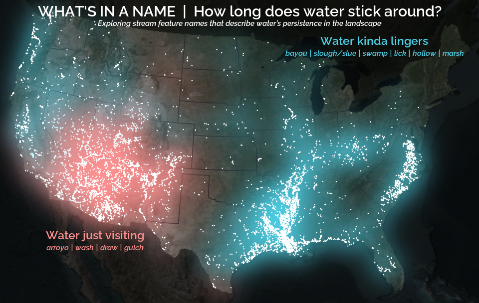
A map that glows with the vocabulary of water
What is your first impression of the map above? To me, it is the shimmer. Thousands of points of light, each one a stream or river, illuminating a darkened basemap. Look closely and a pattern emerges: the country’s waterways form a linguistic constellation. These points are classified not from population data or even explicitly by hydrology. They glow strictly according to the vocabulary used to name them and what can be implied about the hydrology of these streams based on their names.
Extracting the grammar of U.S. stream names
February 27, 2026
English is the official language and authoritative version of all federal information.
Extracting a stream’s feature
The names of streams (hydronyms ) contain, hidden within them, the power to show us the linguistic patterns within the United States. In the United States, stream names tend to follow a binomial structure: a specific name (“Moose,” “Columbia,” “Snake”) paired with a generic feature word (“creek,” “river,” “fork,” “bayou”). The specific portion is endlessly variable, but the generic part is surprisingly stable. In fact, if you look at stream names across the country, the diversity of generic terms is relatively small, but shaped by centuries of hydrologic realities, settlement history, and local tradition.