
Data Graphs in Water Data for the Nation
A look into the different data graphs available in WDFN
What's on this page
This blog has been recently updated!
In 2025, we refreshed this blog to describe the graphing features that have come out in the WDFN ecosystem since 2023.
WDFN offers a variety of graphs to help visualize our data, each with its own purpose. The purpose of this blog is to describe the different ways Water Data for the Nation (WDFN) graphs data.
Where can I get my favorite data graphs?
In 2025, you are able to access your favorite views of data on WDFN in several different pages:
- Monitoring Location Page : This page offers an interactive hydrograph that allows users to look at up to two types of data on one graph for a custom date period. The graphs available are specific to the data available at each location.
- Monitoring Location Pages: All Graphs : This page allows users to see all the most recent data collected at one monitoring location, on one long webpage with a series of graphs. This page allows users to look at all the data we’re monitoring with sensors, with each on its own graph allowing you to review recent conditions and status of a location at a glance with minimal clicking.
- Combined Location Graph : This page allows users to look at data from multiple monitoring locations all in one graph. Users specify the type of data they want to see and can compare it to that same data type at up to five other locations.
- Daily Graphs : This page includes graphs for discharge and groundwater level data where the last two years of daily data is graphed alongside the day-of-year statistical context to understand whether the conditions are out of normal based on the historical data.
- My Favorites: Graphed : This page allows users to see all the most recent data collected at a custom list of locations, on one long webpage with a series of graphs.
One key difference between the data graphs is how much data can be shown in a single graph—some are designed for quick snapshots, while others can handle larger time spans or multiple sites. It all depends on what kind of insight the user is looking for.
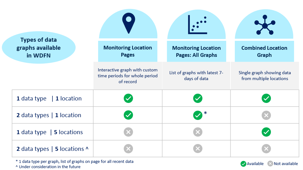
Types of data graphs available in WDFN.
Where can I find the features I need?
The Monitoring Location Pages serve as a homepage for all the information you need about any place we collect data. This page offers site metadata, such as location and funding information, and access to data summaries. It is also where you plot and interact with recent or historical data and explore the different types of data that are collected at the location. The graphs on the Monitoring Location Pages are the most interactive graphs available in WDFN, with options to change the data shown on the graph and time spans to customize the view of our data. These pages let you explore continuous, daily, and field measurement data for a specific site. By default, you’ll see the latest conditions and field measurements with quick options to view up to a year of data. You can also graph the full historical record if you want to dig deeper.
We also have two related pages: Monitoring Location Pages: All Graphs and My Favorites: Graphed. Both show series of graphs for continuous data with field measurements when available and with a new graph for every real-time data. The key difference between these pages? My Favorites: Graphed page is built from a user-defined list of sites, which makes it perfect for users who need to track a custom set of locations usually for repeated monitoring of data. The Monitoring Location Pages: All Graphs is designed with operations use cases in mind, but is for a single location and it includes local alerts from the Water Science Center staff as well as key location context from SIMS to help pass your messages onto the users.
The Combined Location Graph page is where you can compare data from several monitoring locations, such as locations that are on the same river or to see how different streams or rivers were impacted by a recent storm. The graph shows a single continuous data type from multiple locations, so you can simultaneously see the data from several locations you’re interested in.
The Daily Graphs show discharge or groundwater levels against day-of-year statistical percentiles for locations that have at least 20 years of data to help users answer the question: ‘Is this value normal for this time of year?’. It is the only graph with the statistical percentiles provided on the background of the image.
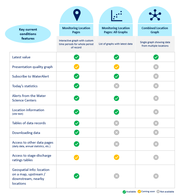
Key current conditions features and how they map to WDFN features.
Which WDFN page is best for me?
Each user should determine which product is best for their needs. The Monitoring Location Pages serve as the main home for data and metadata at each location. It may serve you well as your bookmarked entry point to WDFN to access all the related content. This page serves to help you:
- Learn more about the location
- Graph historical data
- Summarize data records and metadata
- Easy access to related graphs and tables: such as All Graphs, Combined Location Graph, and legacy data views
While the Monitoring Location Pages hold a lot of different details about locations, it may not work well if you need fast access to the latest data. In that case, Monitoring Location Pages: All Graphs may be a better fit. All Graphs serves to help you:
- Graph the latest data for a single location
- See the latest info from the Water Science Center
- Provides the easiest transition from legacy, as it looks and feels most similar to legacy current conditions
If you like Monitoring Location Pages: All Graphs but have more than one location you regularly view at the same time My Favorites: Graphed may more easily see the data. This page serves to help you:
- Graph the latest data for multiple locations
- Customize the list of locations and which data graphs to show
- Two ways to order the graphs: by location or by data type
When interesting water events are occurring, it can be helpful to look at several locations’ data together on the same graph. If you have a set of related locations you are interested in, Combined Location Graph can be configured with your locations and bookmarked for easy access when the next water event occurs. Combined Location Graph serves to help you:
- Compare latest data for several locations
If you are interested in comparing current streamflow and groundwater levels with the historical context, the Daily Graphs gives the past 2 years of data to reference. For locations with over 20 years of daily data, Daily Graphs serves to help you:
- Graph the last 2 years of daily discharge or groundwater levels data
- Put recent daily data in statistical context with day-of-year statistics for discharge and month-of-year statistics for groundwater levels
- Graph the recent cumulative daily mean data for discharge alongside the 25th to 75th percentile bins to compare with historical accumulations
Many of you may find that your needs change over the year, which is why we have provided easy access to these different graphs from the Monitoring Location Pages under a button called “View related graphs”.
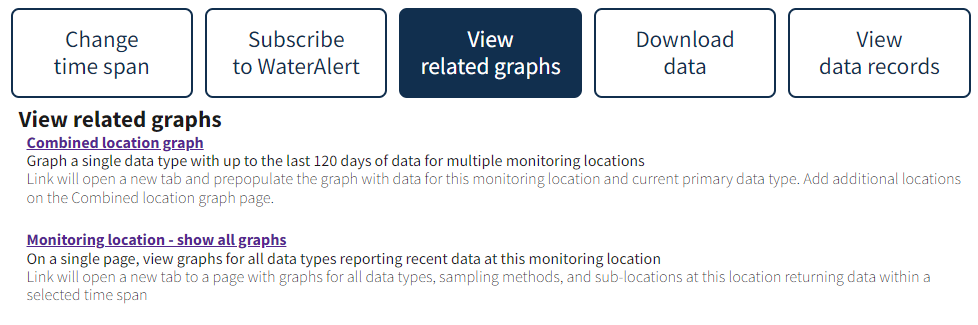
View related graphs on the Monitoring Location Page to access Combined Location Graph and All Graphs.
What if I have more questions?
Please reach out to us at gs-w_waterdata_support@usgs.gov with any questions. Subscribe to the Water Data for the Nation newsletter to receive updates about changes to water data delivery and modernization efforts.
Categories:
Related Posts
Daily data in Water Data for the Nation
November 21, 2025
There have been a lot of changes to how you access USGS water data as we work to modernize data delivery in WDFN and decommission NWISWeb. As we centralize and re-organize data delivery in WDFN, we have recently set out to describe different types of water data according to data collection categories . We started with re-organizing and expanding the data collection categories that are delivered on the Monitoring Location Page and are now working to deliver additional data collection categories on other WDFN pages as well. This blog is part of a series to help orient you to where you can find different types of data in WDFN pages and services. In this post, we want to focus on how you can access daily data in WDFN.
New Feature - Field Measurements
September 23, 2025
We are excited to announce a new feature on Monitoring Location pages that provide field measurements, which are physically measured values collected during a field visit to a monitoring location.
Modernization of Statistical Delivery and WaterWatch Decommission
June 10, 2025
USGS is modernizing how statistical information is delivered through a suite of new features and products. These are replacing WaterWatch , which offered unique statistics delivery that differentiated it from the core data delivery through legacy NWISWeb. WaterWatch and Water Quality Watch are set to be decommissioned by the end of 2025 as new products become available. This blog details where you can find the statistics previously offered on WaterWatch.
Big changes to USGS Water Data in 2025
May 28, 2025
Public USGS Webinar: Water Data for the Nation – New Features and NWISWeb Decommissioning
In this webinar, we highlight important changes in how we deliver water data. These changes are part of a long-term effort to modernize our Water Data for the Nation (WDFN) systems, improve performance, and better serve both internal and public users.
Metadata in Water Data for the Nation
December 29, 2025
Introduction
Metadata are crucial to interpreting and understanding USGS water data. Metadata are data that provides information about other data. They provide important context to the water data you are viewing on WDFN pages or downloading from USGS Water Data APIs . USGS water data metadata includes codes and abbreviations, such as parameter codes, method codes, and observed properties.