
What is the USGS Vizlab?
Water data visualizations at USGS in 2021
The USGS Vizlab is a collaborative team that uses data visualization to communicate water science and data to non-technical audiences. Our mission is to create timely visualizations that distill complex scientific concepts and datasets into compelling charts, maps, and graphics. We operate at the intersection of data science and science communication. To get a sense of our work you can check out our new portfolio site.
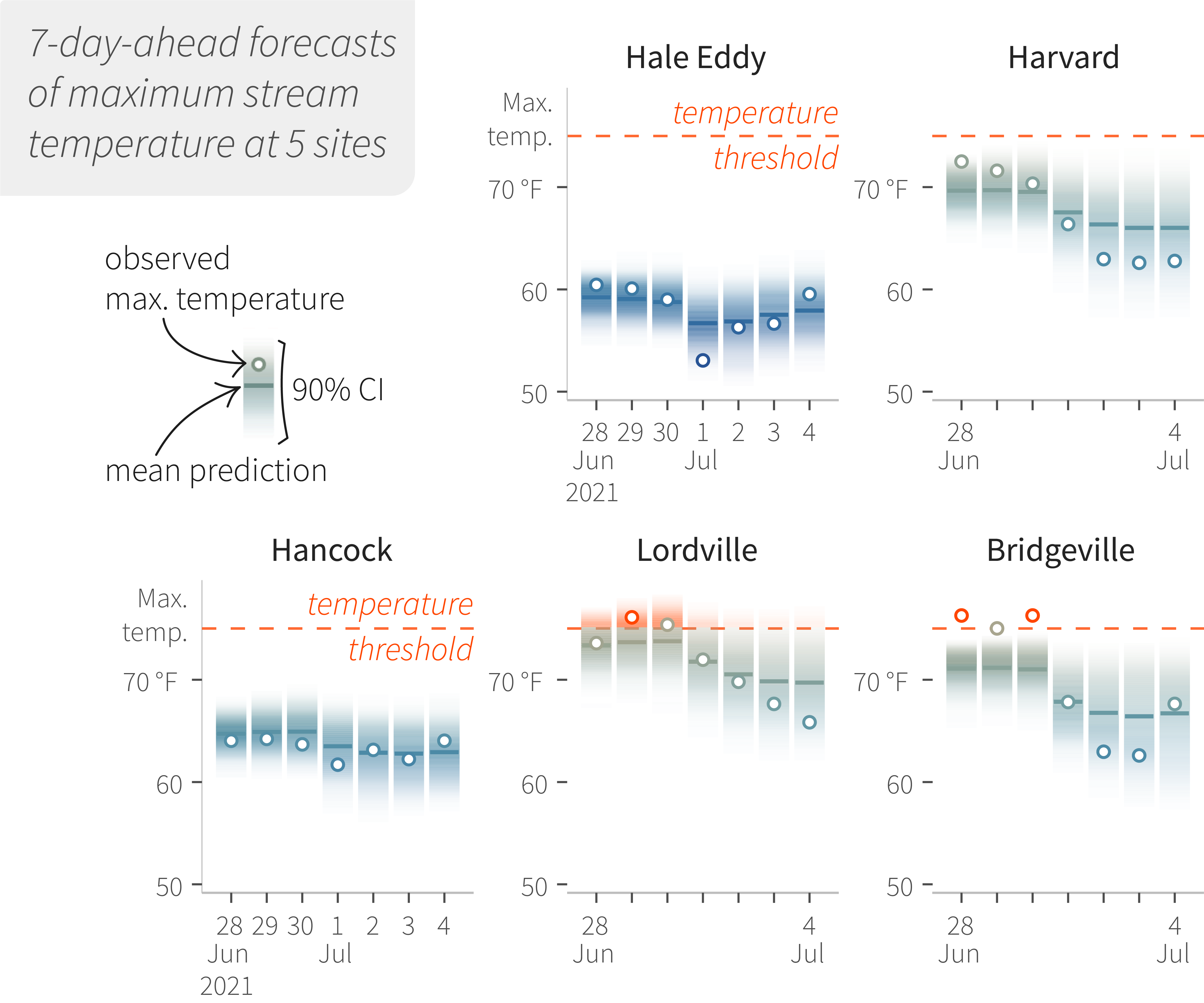
Predicting temperature exceedances with 7-day-ahead forecasts of maximum stream temperature at 5 sites.
The origin of the Vizlab goes back to 2014, rising from collaboration among data scientists and researchers with an interest in science communication. Our early work leveraged open data sources to depict drought conditions in Colorado and California, explored the impacts of climate change on freshwater fish, and visualized 2015 water use across the U.S. This work has been featured by the Washington Post, linked by National Geographic, and received several awards. This success motivated further investment and laid the groundwork for where we are today.
As part of the Data Science Branch in the USGS Water Mission Area, the Vizlab is embedded in a vibrant community of researchers, data scientists, modelers, and technical experts. We function as a creative extension of these research efforts - developing visualizations and graphics that help communicate and disseminate key findings. In the coming year, we’re excited to support their innovative work in the areas of knowledge guided machine learning and ecological forecasting. We also plan to continue to work on the critical topics of climate change, drought, water use, and water availability in the coming year.
How we work
We work using an iterative design process. At each stage of project planning and development, we think critically about how best to communicate the data (from a scicomm and scientific perspective), carefully consider the visual design (from an information design and usability standpoint), and strategize on how to best engage target audiences. This process embraces diversity in design, and we often exploring multiple ways to look at the same data. We encourage creativity through regular “idea blitzes” aimed at providing a low stakes environment to explore new ideas, and support one another with critical feedback at all stages of develoment. We commonly collaborate with domain-specific experts, integrating their expertise and feedback into our final products, and ensuring a high standard of scientific integrity.
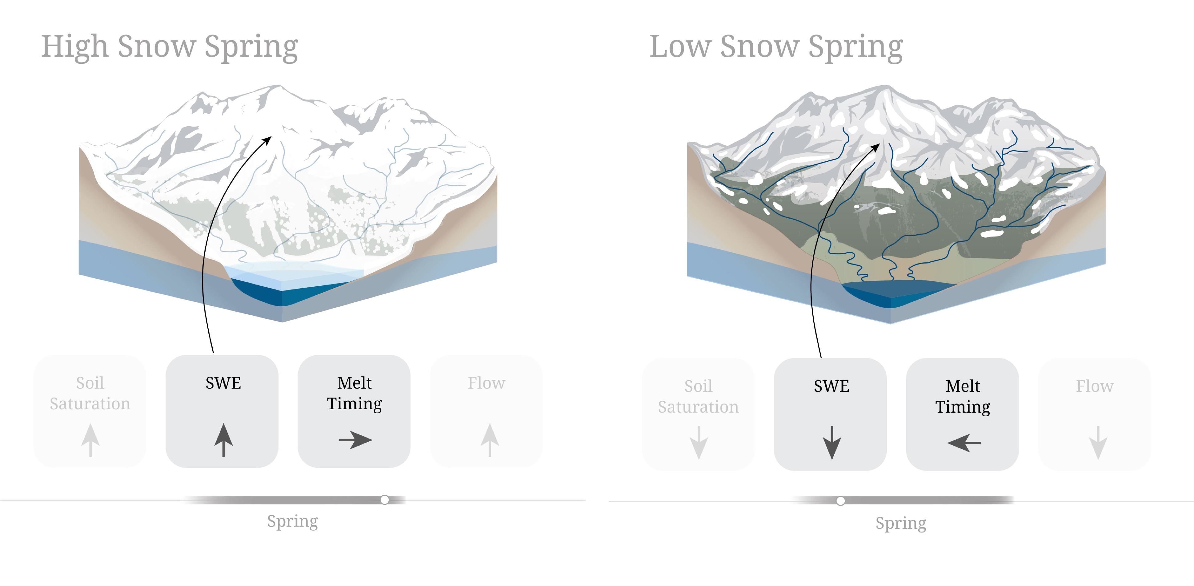
Changes in the magnitude and timing of snow
As data scientists, our workflows are rooted in the use of programming languages like R, python, and javascript to gather, process, and visualize data (find us on github). In addition to these programming languages, our workflows often incorporate graphic design tools such as Adobe Illustrator in order to elevate the visuals of our final products. Our approach to implementation and our incorporation of both code and graphic design is always evolving, and is informed by the goal of the visualization, design best practices, advances in visualization techniques and, of course, the data itself. An example of a purely code-based workflow can be seen in this recreation of our U.S. River Conditions animation in R. An example of a design-based workflow is in our ongoing project to redesign the classic USGS water cycle diagram to include human impacts. Check out this timelapse of the redesign process. We’re always exploring new ways to visualize data and new ways for doing so in an effective, transparent, and accessible manner.
In the last year, we’ve tried new narrative styles aimed at communicating data in context, developed fully reproducible data visualization pipelines, and worked to engage new audiences through social media and outreach efforts.
Communicating data in context
In our development process we value our ability to experiment with new tools and approaches to communication in order to reach our target audience. One major focus has been to develop interactive “explainers”. These are visualizations that dig deep on an interesting dataset or concept in water science. For example, in “From Snow to Flow” we worked with a USGS snow-hydrology team to look at what changing snowmelt means for water in the Western U.S. Before that, we published a visualization on how wildfires change watersheds and impacts to water availability, motivated by the devastating wildfire season in 2020. These projects aimed to capture the timeliness of major annual events in an effort to engage new users with water science.

Stream temperature variability at stream reaches in the Delaware River Basin.
A project we’re particularly proud of is the two-part series on USGS efforts to monitor and model stream temperature in the Delaware River Basin (DRB). In the first part in the series, “Monitoring”, we looked at the availability and variability of stream temperature data in one of the most well-observed water systems in the US. It features maps and charts with paired interactions that allow users to explore the data in both time and space. In the second part of this project, “Modeling”, we used a scrollytelling (scrolling + storytelling) approach to layer in complex information and build a narrative. This allowed us to describe how knowledge-guided deep learning can be used to make accurate environmental predictions when data are limited.
Projects like this are an exciting opportunity to communicate cutting-edge USGS research. From scrollytelling to D3-force transitions to animations made with flubber, the development of the DRB temperature explainer page stretched the bounds of our javascript skills.
Reproducible data visualizations
Another area of focus is the development of reproducible data processing and visualization pipelines. Reproducible visualizations are efficient and allow us to respond quickly to current events, like storms during the Atlantic hurricane season, since they can be easily generated with only minor modifications and rapid execution of the code. For example, changing to the date, bounding box, and storm code in our hurricane pipeline will automatically trigger a download of precipitation data from NOAA, storm event data from the National Hurricane Center, and water levels from USGS streamgages. This same pipeline will also create the final output video file visualizing the water footprint of the storm. Similarly, our reoccurring U.S. River Conditions animations that depict current streamflow conditions across the country are generated entirely in R. This allows us to efficiently regenerate the visualization for any time period of interest. By capturing all the steps needed to get data from its source into its final, beautifully visualized form, we save development time and produce a stream of reliable, consistent visual products. We are excited by these capabilities and are looking to expand them to new events and data sources in the coming year.
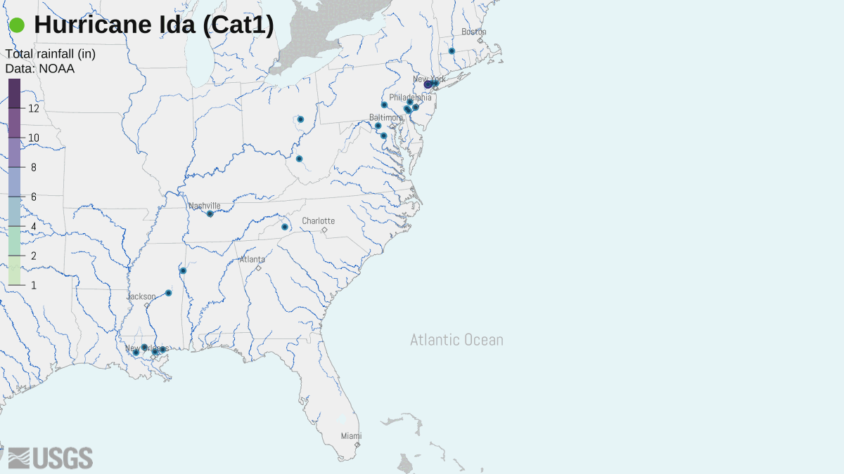
The water footprint of Hurricane Ida, 2021
Engaging new audiences
Our overarching goal is to bring water science and data to new audiences, and in support of that effort we’ve invested in our social media presence through the USGS Data Science twitter account. We are also frequent contributors to USGS Water social media (twitter and instagram). We use these accounts to share our processes, get feedback on our latest work, and connect with the larger water science and data viz community. We have found social media to be a great way to find inspiration. One major highlight of last year was participating in the #30DayChartChallenge on twitter during the month of April. It was really fun to think creatively about how to fit the daily chart themes and explore new datasets to visualize. See our contributions on the Water Data for the Nation Blog.
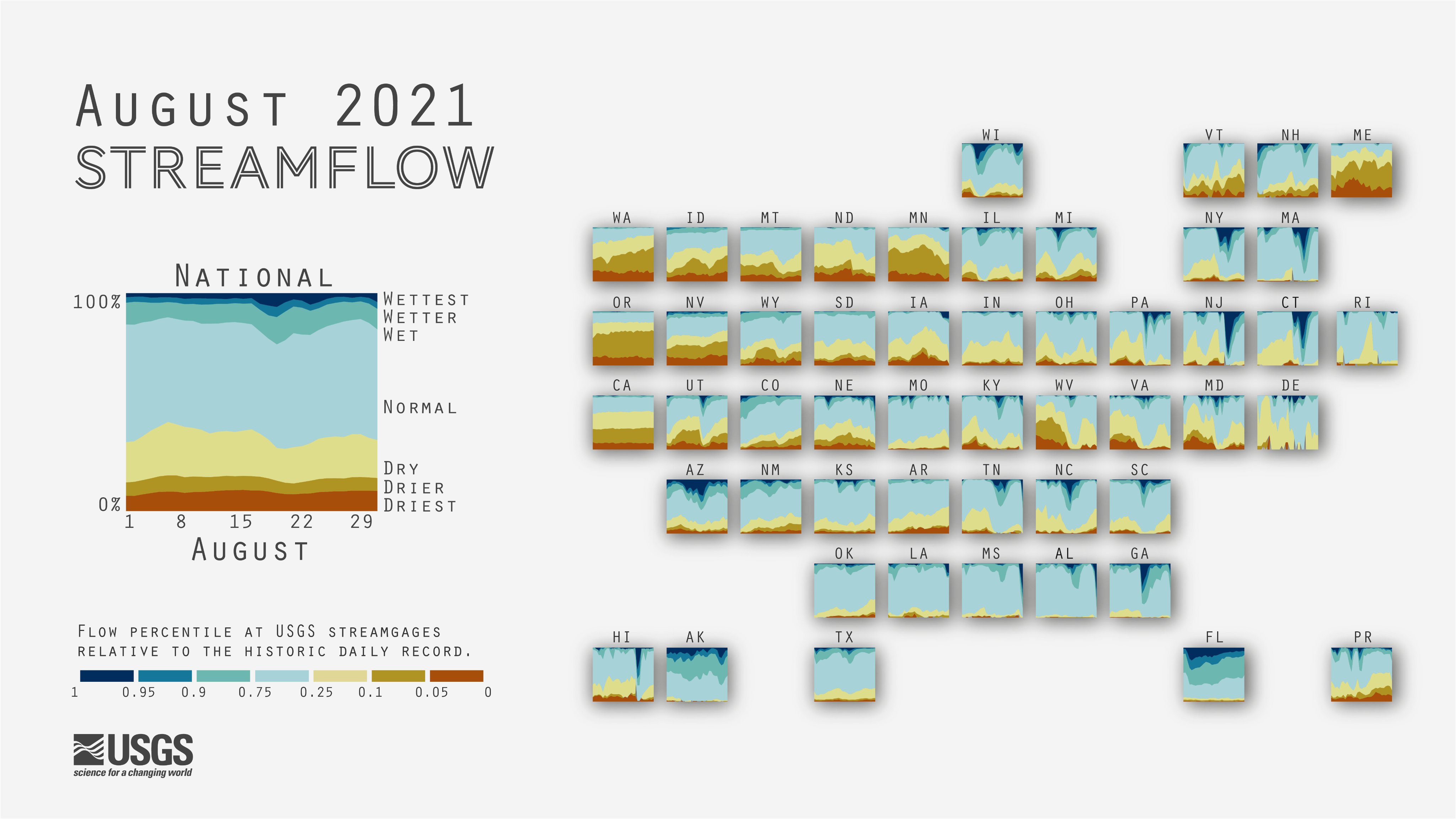
Cartogram of streamflow conditions for the month of August.
We are hiring!
We’re looking for Data Visualization Specialists to join our team at multiple levels of experience (GS-09 and GS-12 general schedule grades). These positions will be open to applications on USAjobs.gov November 17th to November 23rd.
We’re always happy to connect to discuss ideas or collaborate. Reach out to team lead Cee Nell at cnell@usgs.gov
Any use of trade, firm, or product names is for descriptive purposes only and does not imply endorsement by the U.S. Government.
Categories:
Related Posts
Recreating the U.S. River Conditions animations in R
March 29, 2021
For the last few years, we have released quarterly animations of streamflow conditions at all active USGS streamflow sites . These visualizations use daily streamflow measurements pulled from the USGS National Water Information System (NWIS) to show how streamflow changes throughout the year and highlight the reasons behind some hydrologic patterns. Here, I walk through the steps to recreate a similar version in R.
Water Data Science in 2021
March 5, 2021
Where the USGS Water Data Science Branch is headed in 2021
It is an exciting time to be a data science practitioner in environmental science. In the last five years, we’ve seen massive data growth, modeling improvements, new more inclusive definitions of “impact” in science, and new jobs and duties. The title of “data scientist” has even been formally added as a job role by the federal government and there are all kinds of data science needs spelled out in the new USGS science plan .
A map that glows with the vocabulary of water
February 27, 2026
English is the official language and authoritative version of all federal information.
A map that glows with the vocabulary of water
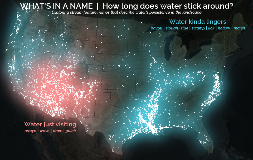
What is your first impression of the map above? To me, it is the shimmer. Thousands of points of light, each one a stream or river, illuminating a darkened basemap. Look closely and a pattern emerges: the country’s waterways form a linguistic constellation. These points are classified not from population data or even explicitly by hydrology. They glow strictly according to the vocabulary used to name them and what can be implied about the hydrology of these streams based on their names.
Extracting the grammar of U.S. stream names
February 27, 2026
English is the official language and authoritative version of all federal information.
Extracting a stream’s feature
The names of streams (hydronyms ) contain, hidden within them, the power to show us the linguistic patterns within the United States. In the United States, stream names tend to follow a binomial structure: a specific name (“Moose,” “Columbia,” “Snake”) paired with a generic feature word (“creek,” “river,” “fork,” “bayou”). The specific portion is endlessly variable, but the generic part is surprisingly stable. In fact, if you look at stream names across the country, the diversity of generic terms is relatively small, but shaped by centuries of hydrologic realities, settlement history, and local tradition.
Easy hydrology mapping with nhdplusTools, geoconnex, and ggplot2
November 28, 2025
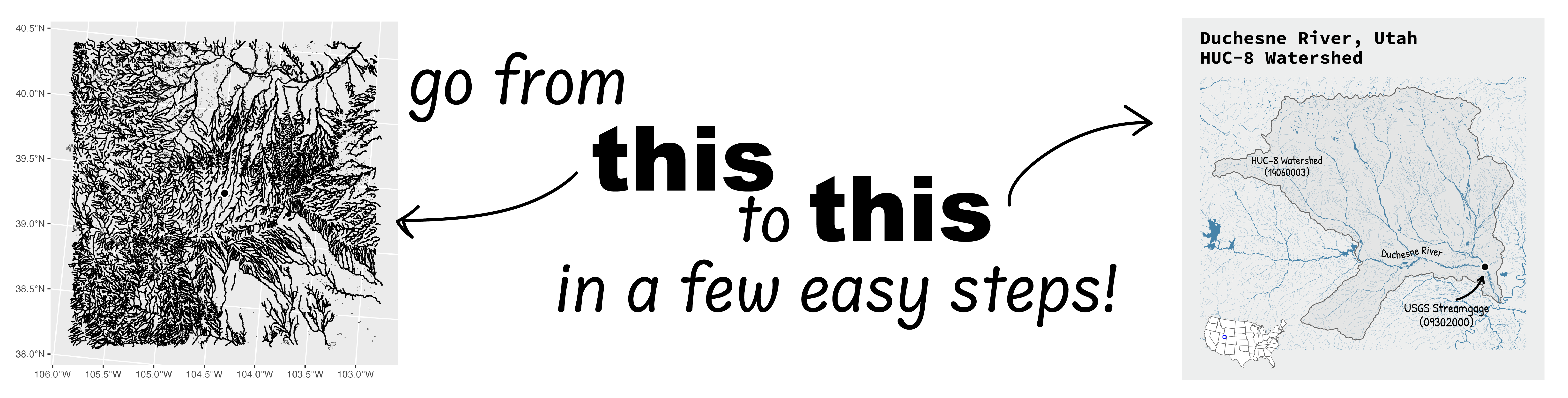
Go from hard-to-read default visuals to easy-to-read river maps in a few easy steps!