Introducing hyswap: A software package for understanding local- to national-scale stream flow data with historic context
hyswap is an open-source Python package that is designed to enable cooperators, stakeholders and the public to calculate summary hydrologic statistics and create maps, tables and visualizations for critical decision-making. Access the package at https://github.com/DOI-USGS/hyswap.

Overview
As a water resources professional or researcher, understanding the nuances of local river and stream conditions is essential for informed decision-making and effective management practices. Are the water levels in your local river or stream consistent with seasonal norms? How does today’s streamflow measure up against historical high and low records? What volume of runoff was generated by the recent storm event? These critical questions can be addressed using hyswap
, the hydrologic surface water analysis package.
hyswap is a peer-reviewed, open-source Python package that provides convenient access to key statistical computations for assessing water availability. hyswap makes it simple to compute historic streamflow percentiles
, calculate area-based runoff
, and generate useful visualizations such as flow duration curves
. This package empowers users to analyze and interpret hydrologic data at local, regional and national scales, thereby enhancing your ability to monitor and understand surface water dynamics.
Additionally, hyswap can perform calculations and generate visualizations that meet a user’s specific needs. For example, users can:
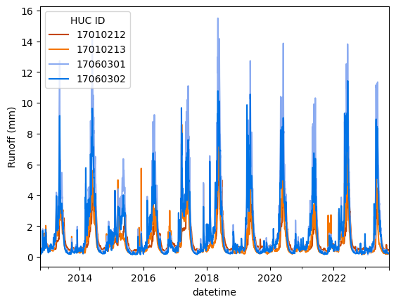
- plot a time series of runoff for multiple HUCs
- view data in a map
- choose from several default color schemes or use your own
Since the package is open-source, you can download the code base and make modifications to meet your use cases.
For the past two decades, the USGS has provided web-based statistical tools for obtaining and visualizing streamflow data to meet the needs of various users. Now, the USGS is improving its mapping and data visualization offerings to meet modern use cases. hyswap contributes to this modernized suite of offerings by enabling cooperators, stakeholders, researchers and the public to create customized water information products that have become so critical to their operations. The package includes extensive documentation and example workflows to help users get started.
Basic package functionality
We’ve coded up a few examples of hyswap in action:
Code example #1: visualize historical streamflow with customizable plots
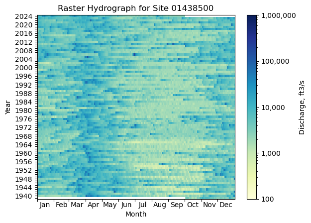
Create insightful, publication-quality visualizations to illustrate complex and multi-dimensional data, such as raster hydrographs. Graphics produced from the hyswap package are compatible with the common matplotlib package and can be easily customized in the same way. hyswap also includes functionality to generate non-standard but increasingly popular visualizations, such as correlation or distance heatmaps.
The package is designed to work seamlessly with USGS streamflow data, which is accessible using dataretrieval-python
, but it can be applied to other data types and sources as well (e.g. water quality data or other environmental monitoring datasets where visualizing the historical context for repeated measurements are needed). Check out some example code, below.
First, we’ll pull some historical daily streamflow values for one of the winners of the Gage Greatness competition, Delaware River at Montague, New Jersey:
# import required libraries
# note that dataretrieval-python is just called dataretrieval
# when installing and importing
import dataretrieval
import hyswap
import matplotlib.pyplot as plt

# fetch some streamflow data from NWIS using dataretrieval
site_no = "01438500"
df, _ = dataretrieval.nwis.get_dv(site_no,
                                  parameterCd="00060",
                                  start="1776-01-01",
                                  end="2024-09-30")
Next, we’ll create a raster hydrograph showing streamflow values through time:
# format the data for the raster hydrograph plot
df_formatted = hyswap.rasterhydrograph.format_data(df, '00060_Mean')

# plot
fig, ax = plt.subplots()
ax = hyswap.plots.plot_raster_hydrograph(
    df_formatted, ax=ax,
    title=f"Raster Hydrograph for Site {site_no}")
plt.show()

Raster hydrograph showing daily streamflow at the Delaware River at Montague, New Jersey gage site from water year 1940-2024. The blue-yellow color ramp indicates the discharge. The code for creating the graphic is available in the ‘Simple Examples – Raster Hydrographs’ section of the hyswap documentation pages.
Code example #2: calculate and visualize summary statistics
Users can also calculate flow statistics using fixed (long-term, overall) percentiles or variable (by day-of-year) percentiles, with all methods and calculations described in the package documentation for easy reference.
Continuing with the Delaware River data from above, check out the code snippets below showing how to calculate both types of percentiles using hyswap. Similar examples (and more!) are available in the Simple Examples
section of the hyswap documentation pages.
Fixed Percentiles
# Define percentile thresholds to use
percentile_thresholds=[5, 10, 25, 50, 75, 90, 95]

# calculate fixed percentiles for entire dataset
fixed_percentile_values = hyswap.percentiles.calculate_fixed_percentile_thresholds(
    df['00060_Mean'], percentile_thresholds)

# print percentile values (corresponding to 5th, 10th, 25th,
# 50th, 75th, 90th, and 95th percentiles)
print(fixed_percentile_values)

#>           min     p05     p10     p25     p50     p75      p90      p95       max     mean  count start_yr end_yr
#> values  412.0  1450.0  1690.0  2190.0  3750.0  7160.0  12500.0  17300.0  187000.0  5967.56  31047     1939   2024
Variable Percentiles (by day of the year, using the same thresholds as above)
# calculate variable percentiles for each day of the year
variable_percentile_values = hyswap.percentiles.calculate_variable_percentile_thresholds_by_day(
    df, "00060_Mean", percentile_thresholds
)
print(variable_percentile_values.head())

#>               min     p05     p10     p25     p50     p75      p90      p95      max     mean count start_yr end_yr
#> month_day
#> 01-01      1300.0  1600.0  1900.0  2945.0  4690.0  8260.0  13060.0  19330.0  49800.0   7018.0    85     1940   2024
#> 01-02      1100.0  1630.0  1960.0  2700.0  4500.0  9090.0  14700.0  19900.0  29600.0  6704.94    85     1940   2024
#> 01-03      1200.0  1680.0  2300.0  2925.0  4800.0  9210.0  13440.0  19850.0  42200.0  6824.35    85     1940   2024
#> 01-04      1300.0  1895.0  2360.0  3025.0  4220.0  8740.0  12960.0  15480.0  31400.0  6349.88    85     1940   2024
#> 01-05      1200.0  1812.0  2360.0  3100.0  4570.0  8625.0  12880.0  15280.0  19700.0  6272.94    85     1940   2024
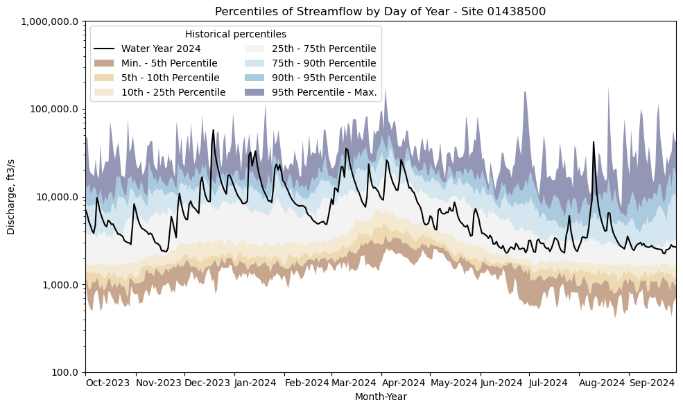
Finally, we’ll take the variable percentile output and use it to understand how a recent water year of streamflow values stacks up to the entire streamflow record at the Delaware River. hyswap’s streamflow duration hydrograph plots put data into perspective:
# get year/doy information
df_year = hyswap.utils.define_year_doy_columns(df,
                                               year_type='water',
                                               clip_leap_day=True)

# plotting percentiles by day with line shade between
fig, ax = plt.subplots(figsize=(10, 6))
# filter down to data from 2022
df_2024 = df_year[df_year['index_year'] == 2024]
# plot data
ax = hyswap.plots.plot_duration_hydrograph(
    variable_percentile_values,
    df_2024,
    "00060_Mean",
    ax=ax,
    data_label="Water Year 2024",
    title=f"Percentiles of Streamflow by Day of Year - Site {site_no}"
)
plt.tight_layout()
plt.show()

Example graphic showing daily streamflow percentiles from the 2024 water year compared to historical percentile values for the Delaware River at Montague, New Jersey.
Jump in with example workflows for comparing surface water conditions over time and across sites and regions
Not sure where to start? The package includes ample documentation and user resources to make it easy for users to get started. We want to reduce the barrier to entry by creating ready-to-use example scripts and workflows illustrating some common use cases. You can view the notebooks in their rendered formats in the documentation
pages, or open the Jupyter notebooks
located in the GitHub repository and edit to suit your needs. Examples of extending hyswap to create mapping products (like the interactive example below) with common python geospatial packages (e.g., geopandas) are also included.
An additional resource for calculating regional statistics: the hyswap geospatial package
hyswap is supported by a geospatial code repository, called hyswap-geospatial-data-assembly
, for obtaining watershed boundary and hydrologic unit code (HUC) spatial data layers.
These data are used to generate a spatial data table
(included in the hyswap package) that is a required input for hydrologic unit (huc8)
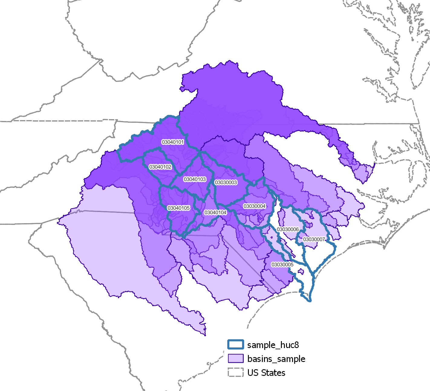
runoff calculations in hyswap. The figures below show (a) the spatial datasets used to create the spatial data table and (b) estimated runoff for four hydrologic units using the spatial data table.
hyswap-geospatial-data-assembly is peer-reviewed and is available for users who want to use different geospatial datasets in hyswap or other downstream applications. The code comes preset to pull data from the USGS National Hydrography Datasets (NHD)
using pynhd, and obtains basin shapefiles from the USGS Streamgage NHDPlus v1 Basins 2011
data release.

(a) Map of overlapping geographic areas denoting hydrologic units and the watershed basins contributing to the streamflow measured at a given stream gage.

(b) Time-series plot of estimated runoff data in four hydrologic regions at the HUC-08 scale.
Contact us!
Do you think we missed something, or have an idea of something that would fit perfectly into hyswap? Feedback and contributions are welcome! Report bugs or submit feature requests by creating an Issue in GitHub
, or email the team at CompTools@usgs.gov
.
Citing hyswap
Hamshaw, S.D., Hariharan, J., Hinman, E.D., Sleckman, M.J., Stanish, L.F., 2024, hyswap: A USGS software package for hydrologic data analysis, v1.0.0, doi: 10.5066/P13SKXA2
Categories:
Related Posts
Tutorial of dataRetrieval's newest features in R
November 26, 2025
This article will describe the R-package
dataRetrieval, which simplifies the process of finding and retrieving water from the U.S. Geological Survey (USGS) and other agencies. We have recently released a new version ofdataRetrievalto work with the modernized Water Data APIs . The new version ofdataRetrievalhas several benefits for new and existing users:Updates and improvements to the National Water Dashboard
March 19, 2026
The National Water Dashboard (NWD) continues to evolve as we modernize our water-data delivery tools and improve how users discover, explore, and interact with real‑time information. Our latest set of updates focuses on simplifying the map experience, improving usability, adding new ways to customize your view, and continuing our long‑term transition away from legacy services. Below is an overview of what’s new.
Daily data in Water Data for the Nation
November 21, 2025
There have been a lot of changes to how you access USGS water data as we work to modernize data delivery in WDFN and decommission NWISWeb. As we centralize and re-organize data delivery in WDFN, we have recently set out to describe different types of water data according to data collection categories . We started with re-organizing and expanding the data collection categories that are delivered on the Monitoring Location Page and are now working to deliver additional data collection categories on other WDFN pages as well. This blog is part of a series to help orient you to where you can find different types of data in WDFN pages and services. In this post, we want to focus on how you can access daily data in WDFN.
New Feature - Field Measurements
September 23, 2025
We are excited to announce a new feature on Monitoring Location pages that provide field measurements, which are physically measured values collected during a field visit to a monitoring location.
Data Graphs in Water Data for the Nation
September 16, 2025
This blog has been recently updated!
In 2025, we refreshed this blog to describe the graphing features that have come out in the WDFN ecosystem since 2023.

